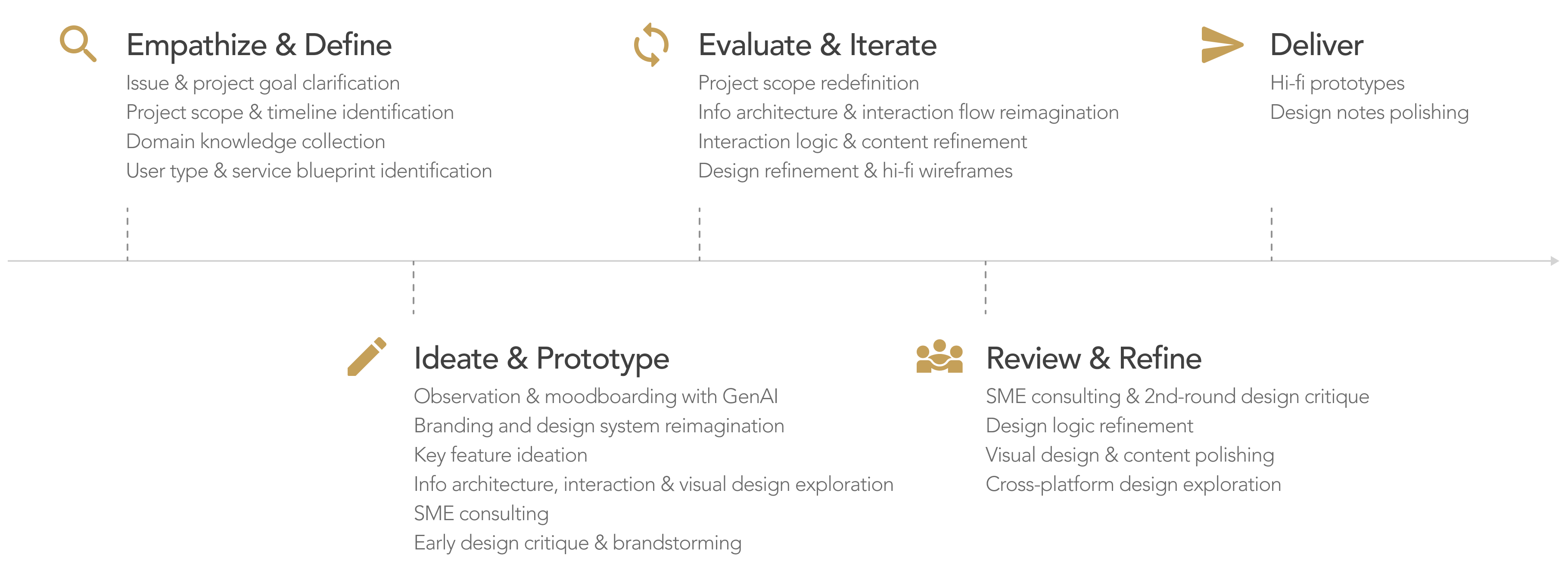
Project Type: |
Independent Product Design Exploration |
Duration: |
Nov. 2025 – Jan. 2026 |
SMEs: |
2 GenAI product designers, 1 research scientist specializing in GenAI |
My Role: |
Sole product designer, acting as design lead and product manager, driving the project from concept to completion. |
Impacts: |
Accelerated currency exchange with less effort and greater confidence. |
4xLabs is a Singapore-based fintech company specializing in digital solutions for the foreign exchange (forex) industry, with a mission to bring greater transparency and efficiency to the physical cash exchange market. It operates two primary platforms: Biz4x (a SaaS operating system for money services businesses), and Get4x (a consumer-facing currency exchange aggregator). The Get4x mobile app and website have long faced challenges in usability, consistency, and branding. This project therefore takes the opportunity to redesign Get4x — primarily focusing on the mobile app — from visual style to core functionality, aligning it with current industry trends. The goal is to better bridge modern travelers and traditional money changers while enhancing transparency and efficiency in the currency exchange experience.
Gain domain knowledge and understand regulatory requirements in the currency exchange industry, as well as emerging technologies such as GenAI design, to clarify opportunities, constraints, and current design norms. |
|
Revise existing interaction flows while leveraging new technologies to support efficient task completion and align with modern usage habits. |
|
Refine products' visual style to align with company branding and current industry trends, building user trust and reducing cognitive load. |
|
Design new interaction patterns that enable efficient use and align with industry trends, ensuring external relevance and meeting user expectations. |
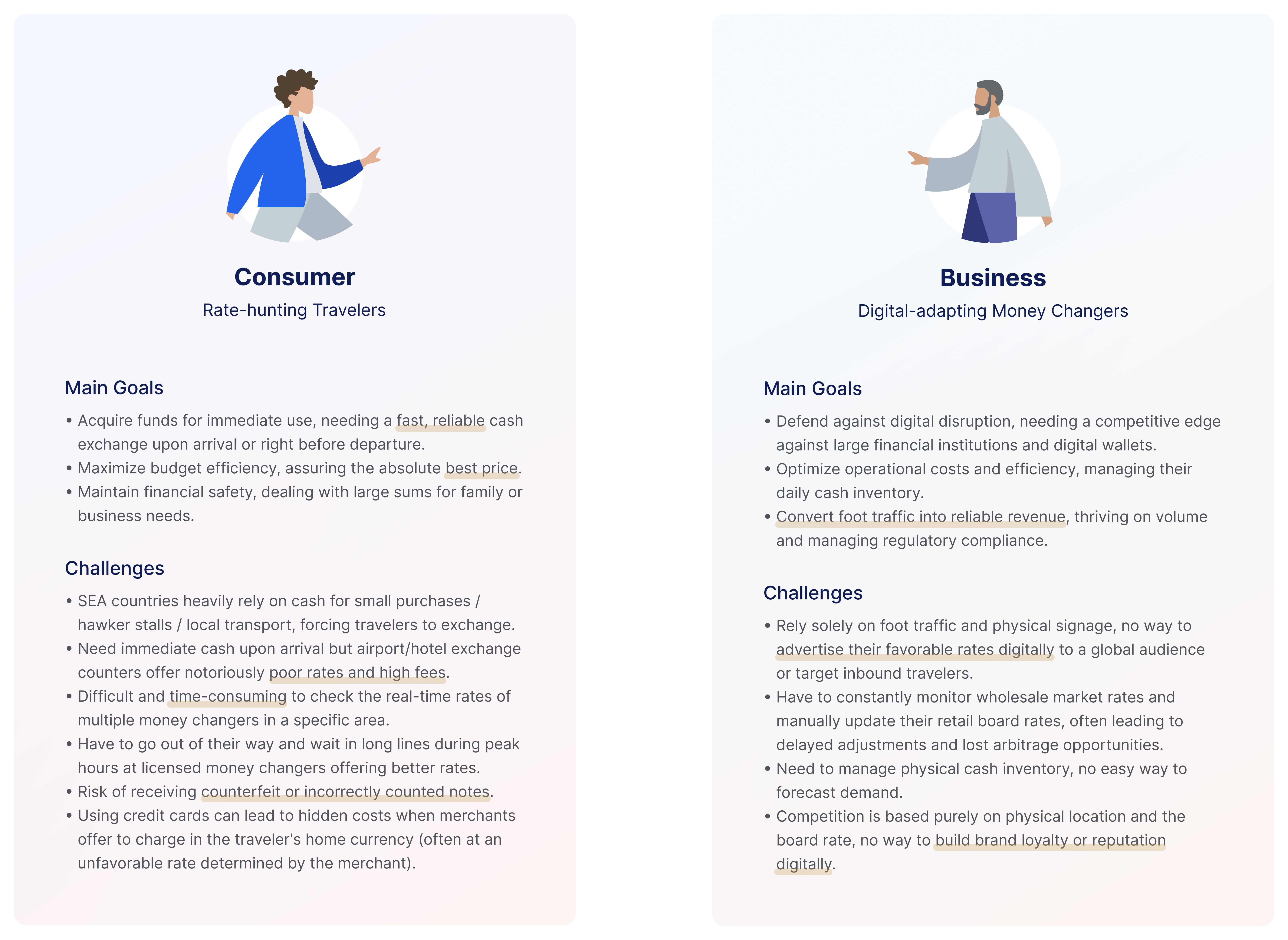
In many regions, including Southeast Asia, Oceania, Central Asia, and Africa, cash remains essential for daily expenses. Travelers often turn to local money changers (foreign exchange providers) for better exchange rates than banks. However, traditional money changers largely relied on foot traffic and physical signage, making it difficult to promote their rates online or reach inbound travelers. Meanwhile, 
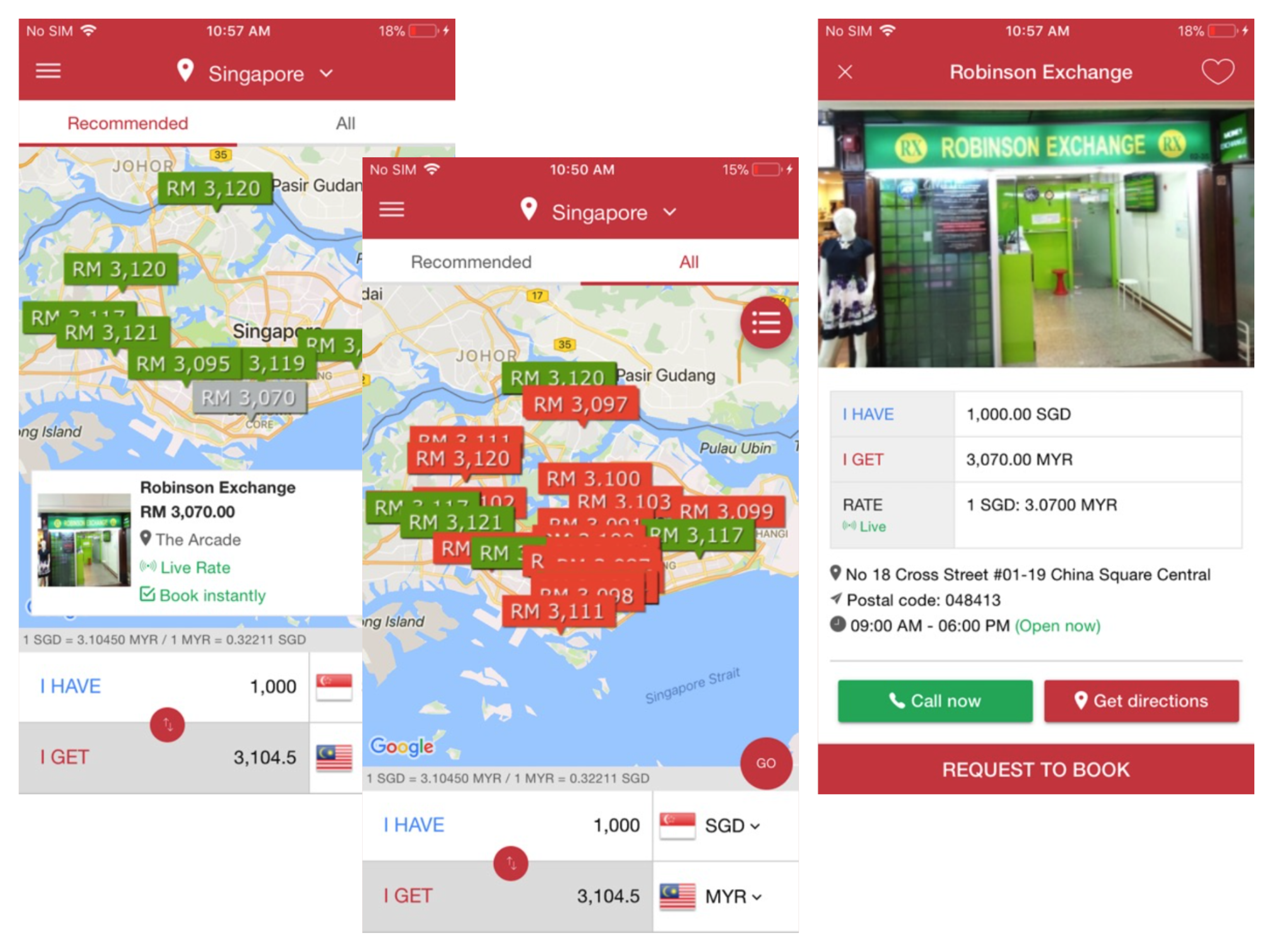
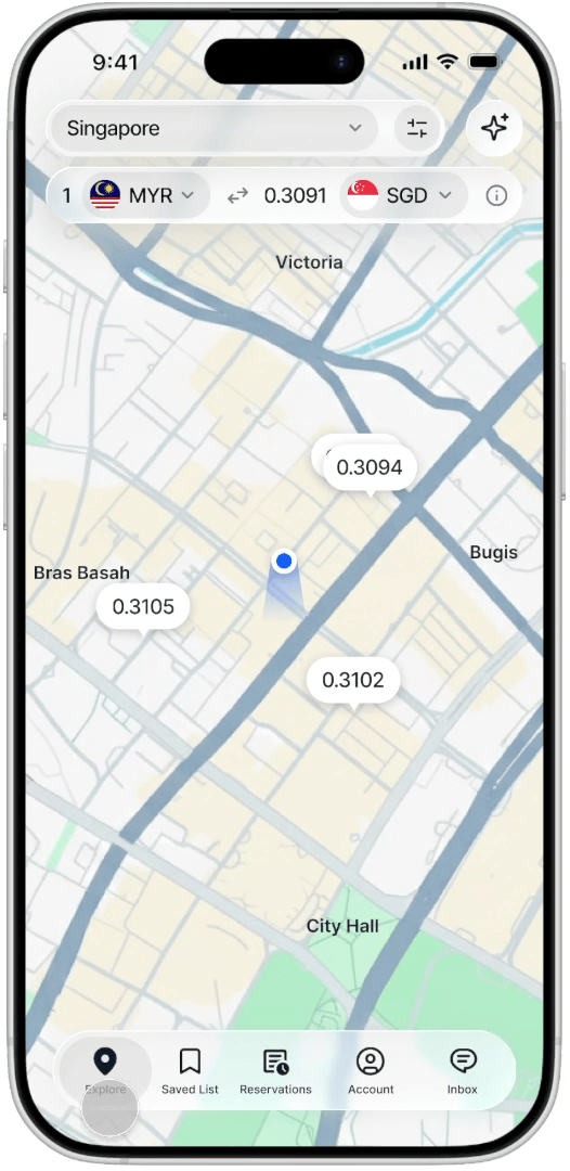
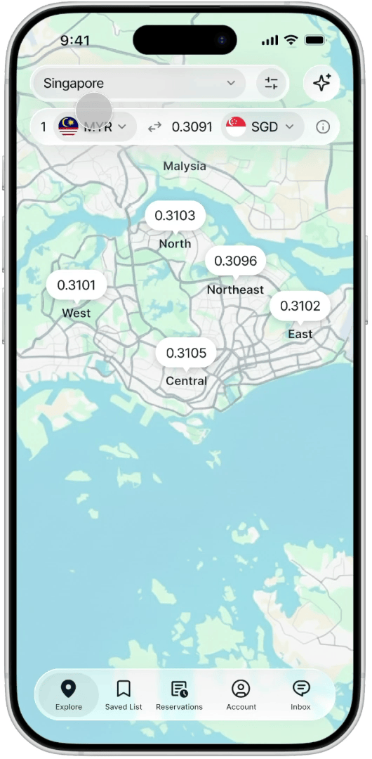
travelers face the opposite problem — finding nearby money changers and comparing rates is often time-consuming and inconvenient. To address this gap, Get4x was developed by 4xLabs, a Singapore-based fintech 
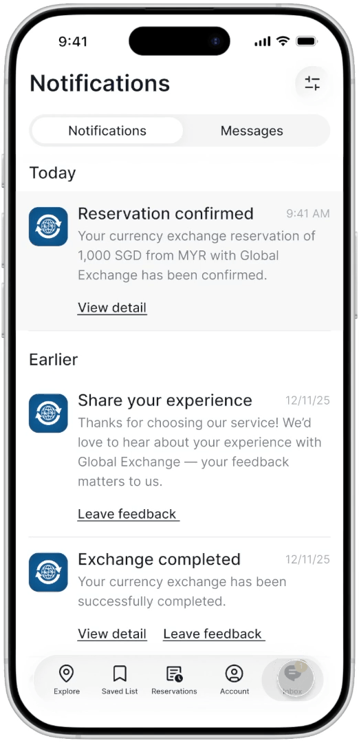
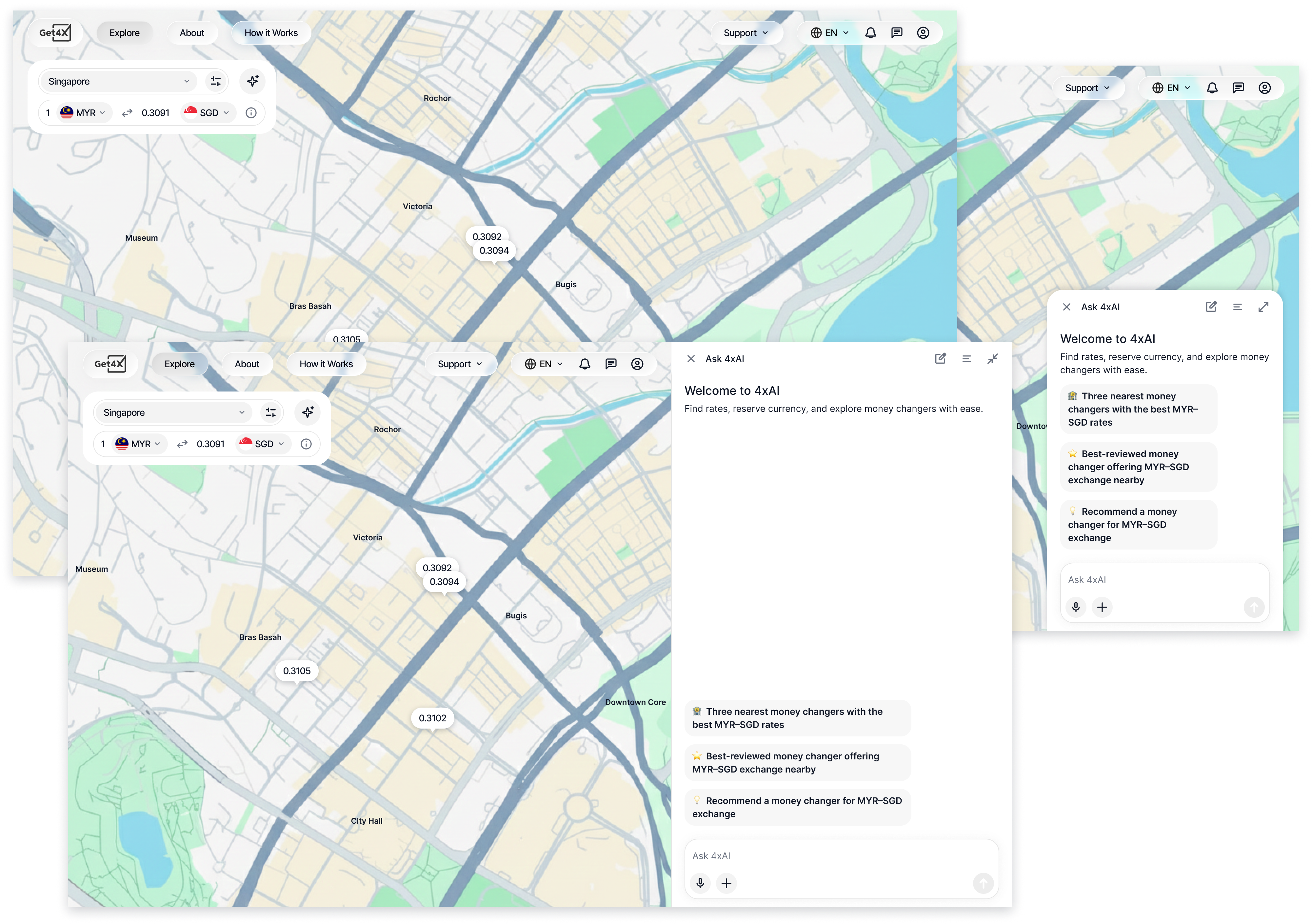
company, to bridge travelers and physical money changers. Through Get4x app and website, travelers can search for and compare real-time exchange rates offered by nearby money changers, and reserve a rate before arriving at the store.
During my internship at 4xLabs years ago, I primarily worked on new feature design for Biz4x, a Point of Sale (POS) and Financial Transaction Monitoring System (FTMS), and assisted in identifying issues within Get4x. When I revisited the product years later, I found that many remained unresolved — particularly around usability, consistency, and branding. I therefore saw an opportunity to redesign Get4x in alignment with the company’s brand and current industry trends, with the goal of better connecting modern travelers and traditional money changers while improving transparency and efficiency in the currency exchange experience.
I re-evaluated the Get4x and identified seven usability issues across three heuristic categories (according to Jakob Nielsen’s heuristic principles):
Consistency and Standards (Users should not have to wonder whether different words, situations, or actions mean the same thing. Follow platform and industry conventions.):
|
|
Flexibility and Efficiency of Use (Design for both novice and expert users, allowing experienced users to perform tasks more quickly without overwhelming beginners.):
|
|
Aesthetic and Minimalist Design (Interfaces should not contain information that is irrelevant or rarely needed.):
|
After clarifying the key issues, I defined the project goals and scope. The redesign aimed to align the experience with the company's brand and modern design standards while improving the transparency and efficiency of currency exchange. Since the mobile app is the primary customer touchpoint and the website largely mirrors its functionality, serving as a supporting channel and a way to promote the app to users, I focused the effort on the mobile experience. The website was used selectively to demonstrate how the new visual system could scale across platforms. I also scoped the project to a 3-4 month effort centered on the most critical user journey — from exploration to reservation and confirmation.
In addition to solving existing usability issues, I explored opportunities to improve core workflows and introduce new capabilities with emerging technologies that could further streamline the experience. I will share more about the product thinking and design decisions behind these improvements in the following sections.
To ensure the project is executed efficiently and effectively, and the new design meets standards of viability, desirability, and feasibility, I applied the following approaches throughout the process:
Leveraging GenAI to accelerate research, ideation, and content refinement: I used Gemini for background research; experimented with vibe coding and ideation using MagicPattern, Figma Make, Lovable, AI Studio, etc.; and utilized ChatGPT to refine content and microcopy. |
|
Building domain expertise through secondary research: Drawing from both prior experience and online research, I developed a deeper understanding of user challenges, service objectives, market positioning, competitors, and regulatory constraints. I also clarified key domain concepts, such as the difference between overview rate (mid-market rate) and transactional rate (actual exchange rate), and gained knowledge in relevant regulatory and operational areas — using Singapore as a reference — including Know Your Customer (KYC), Anti-Money Laundering (AML), the Personal Data Protection Act (PDPA), Technology Risk Management (TRM) guidelines, reservation codes, audit trails, etc. |
Applying structured design frameworks: I used methods such as Jobs to Be Done (JTBD) and service blueprints to clarify target users, uncover unmet needs, and map the end-to-end experience. I also leveraged interaction flows to visualize, refine, and validate user journey and interaction design ideas. |
|
Collaborating with subject matter experts (SMEs) throughout the process: To better understand the opportunities and constraints of emerging technologies, I consulted with two GenAI product designers and one research scientist specializing in GenAI, from early exploration and feasibility check to final design refinement. |
During my internship at 4xLabs, I gained a foundational understanding of the company’s business model and customer base — serving both money changers and travelers, generating revenue primarily through Biz4x, and using Get4x as a traffic-acquisition channel. To deepen my understanding of user types and their challenges, I began with secondary research.
Through the research, I identified two primary user groups for Get4x:
Travelers who need cash for daily expenses and seek either speed or the best rates to maximize their travel budget. |
|
Expats who live and work locally, exchanging larger amounts regularly for personal or business needs. |
While their contexts differ, both need a reliable and transparent way to find and secure competitive exchange rates.
Since cash is required for small purchases (e.g., hawker stalls), and local transportation, they are often forced to exchange currency either upon arrival or right before departure. They need to discover nearby money changers, compare exchange rates and reliability, and visit physical storefronts to complete the transaction.
My research uncovered four key common challenges:
Lack of Price Transparency: Exchange rates are often hidden or only indicative. Travelers frequently experience “rate shock” when the price at the counter differs from what they saw online. Additional hidden costs may also arise when using credit cards, due to unfavorable exchange rates set by merchants. |
|
Time Inefficiency: Unfavorable rates and high fees at airport and hotel exchange counters push travelers to seek better options elsewhere. Finding the best deal often requires visiting multiple shops in person — an exhausting and impractical process. Long queues at licensed money changers with better rates further add to the inconvenience. |
|
Inventory Uncertainty: There is no reliable way to confirm whether a specific currency is available. Travelers may spend time visiting a location only to find the currency out of stock. |
|
Trust Gap: It can be difficult for travelers to assess whether independent money changers comply with local regulations or offer fair, regulated rates. There is also a risk of receiving counterfeit notes or incorrectly counted cash. |
Get4x already addresses many of these pain points by helping users discover and compare money changers, reserve exchange rates in advance, and lock in those rates before visiting a store. It also brings rate comparison, navigation, reservations, and transaction records into a single experience, creating a smoother end-to-end journey. However, as identified earlier, there is still significant room for improvement. This redesign focuses on resolving those usability issues while enhancing the core user journey to deliver a more transparent, efficient, and user-friendly currency exchange experience.
In addition to user and service studies, I also clarified key terminology, such as the difference between overview rate (mid-market rate) and transactional rate (actual exchange rate). I further built domain knowledge in relevant regulatory and operational areas — using Singapore as a reference — including Know Your Customer (KYC), Anti-Money Laundering (AML), the Personal Data Protection Act (PDPA), Technology Risk Management (TRM) guidelines, reservation codes, and audit trails.
With a clear understanding of the workflow, I reimagined what an ideal interaction flow could look like.
Based on the journey and scope defined, I began exploring solutions that could help users efficiently complete tasks and achieve their goals.
Browsing and comparing nearby money changers for specific currency needs, with tools to narrow down results:
|
|
Saving preferred money changers (and managing related notification settings): saved list. |
|
Asking currency exchange-related questions: integrated customer support and an AI assistant. |
|
Reserving exchange rates and reordering (login required): reservation form, confirmation, reservation records, and transaction history. |
|
Tracking reservation status and updates: notifications with filtering. |
To support a more efficient currency exchange experience and better align with modern travelers’ needs and usage habits, I explored how these functionalities could be redesigned and enhanced through a GenAI assistant. This approach aimed to streamline the exchange process, improve planning and decision-making, and provide timely, contextual support throughout the journey.
I also evaluated traditional chatbots, GenAI assistants, and hybrid approaches. GenAI offers stronger contextual understanding, multilingual support, and more flexible problem-solving, making it a better fit for currency exchange scenarios and a more scalable foundation for future growth.
With the idea of leveraging GenAI, I conducted online research and consulted GenAI subject matter experts (SMEs), including one research scientist specializing in GenAI and two GenAI product designers.
My references included GenAI design guidelines such as Shape of AI and the Horizon Design System, as well as YouTube talks, LinkedIn and Google Skills courses on GenAI and conversational design, and a range of consumer GenAI apps and products with embedded GenAI features. My goal was to follow research-based principles and current industry norms to ensure the interaction feels smooth, intuitive, and trustworthy for users.
I also visualized the GenAI interaction flow and iterated on it through ongoing discussions with SMEs, refining the concept into a more usable, feasible, and viable solution.
With the key features defined, my next step was to explore the information architecture.
In my initial concept, the Browse feature retained the original design, allowing users to switch between map view and list view, while introducing new capabilities such as filtering, sorting, and sharing. The AI assistant was designed as an independent feature, enabling users to complete exploration and reservation tasks through conversational interactions. I also placed the Saved List and Messages under the Account section, treating it as a hub for user-related information and settings.
However, after further consideration and consultation with SMEs, I revised this structure. I embedded the AI assistant into the browsing experience to streamline exploration and reduce context switching, and renamed the category to Explore to better reflect its expanded functionality. Given the available space and the needs of frequent users (particularly expats), I moved the Saved List to the first navigation level for quicker access. Since Messages and Notifications both represent incoming information that users need to review, I grouped them under a unified Inbox category. As the feature set matured, I also added Reservation Draft management to the Account section to support incomplete or ongoing tasks.
Moving forward, I used GenAI tools to support ideation and brainstorming. My vibe-coding process began with a brief concept description, followed by a more detailed prompt outlining key functionalities. I then iterated multiple times to explore different variations, and imported outputs into Figma when possible.
In parallel, I reviewed over 20 consumer apps, including those focused on online ordering, shopping, and trip planning experiences. Among them, more than 15 incorporated GenAI-related features, which helped inform patterns, expectations, and best practices for the design.
While exploring design concepts, I also reimagined the product’s visual identity. The original experience suffered from several consistency issues: color usage conflicted with common UI conventions, the visual language lacked alignment with the company’s brand, and the overall interface felt outdated.
My goal was to create a cohesive visual system that strengthened trust, reduced cognitive load, and aligned with both 4xLabs branding and modern design expectations, creating stronger internal consistency while ensuring external relevance.
To achieve this, I chose a dark theme as the foundation of the redesign. It reinforces the company's branding, creates a more cohesive and recognizable experience across products, and delivers a modern, professional feel that keeps users focused on key content. Building on that foundation, I refined the product logotypes and leveraged GenAI tools to explore and define a scalable color system, including secondary, tertiary, neutral, functional, and semantic palettes.
I also used AI-assisted exploration to evaluate typography options that conveyed professionalism, trust, and elegance while maintaining excellent readability. I ultimately selected Inter — an open-source typeface optimized for digital products that is clean, highly legible, and widely adopted across modern fintech experiences.
The existing browse experience helps users discover money changers within a city, but it does not sufficiently support filtering based on specific needs — such as identifying the lowest rates, highest reviews, or nearest options. It also lacks support for different usage scenarios. Additionally, the location and currency selection flow can be streamlined, and the interactions for viewing details and reserving currency remain inefficient and outdated.
I hypothesized that users would prefer a map-first experience, so instead of requiring upfront location and currency selection, I redesigned the flow to bring users directly into the map experience, enabling immediate exploration from the moment they open the app. Users can then easily adjust the location and currency to match their specific needs. To improve transparency and user control, I replaced the opaque “Recommendations” feature with a criteria-based filtering system that breaks decision factors down clearly. Based on early exploration, I identified exchange rate, cash inventory, reviews, distance, and operating status as the most important criteria. I initially explored distance and area-based filters, but later removed them, as there are relatively few money changers within a given area, and users can easily assess proximity through pinch-to-zoom on the map. Physical distance or shared area does not always correlate with convenience either. I also considered retaining the “Recommendations” option, but ultimately removed it to avoid conflicts with manual filters. The final design focuses on four key criteria with "available inventory" and "review at lest 4.0" applied by default as recommendations to help users narrow results quickly while retaining full control over filtering. Besides, for iOS, I followed platform-specific navigation patterns, interaction behaviors, and the latest visual design guidelines to ensure consistency with current conventions and achieve strong external relevance. |
For the map view, I designed for three primary scenarios. When users are in a supported city, the app displays the corresponding city map with their current location and nearby money changers. Default currencies are preselected based on the city's most commonly exchanged pairs, and users can tap a rate label to view a money changer’s profile and reserve instantly right below the page (in the bottom sheet). When users switch to a city they are not currently in, the map shifts to a region-based view, highlighting the best available exchange rates in each area. Based on the hypothesis that exchange rate is users' primary decision factor, this view helps them quickly identify promising regions. Users can tap a rate label to zoom into a region and explore all money changers within it. If users are outside supported cities, the experience defaults to Singapore, 4xLabs' primary market, providing a consistent fallback experience. |
Beyond the existing map and list views, I explored a new GenAI-powered discovery flow to unlock a more intuitive and personalized exploration experience.
I initially envisioned the AI assistant as a standalone experience within the app. After iteration and SME consultation, I embedded the AI assistant directly into the browsing experience to create a more seamless discovery flow. I also renamed the section Explore to reflect its expanded role. I replaced the list view with the AI assistant, as most of its use cases can now be handled more effectively through GenAI, and it was used less frequently than the map view and likely the conversational entry points. To better support expats who frequently return to the same money changers, I elevated the “Saved List” to the primary navigation, making use of the freed-up space. I also reworked the conversation structure — shifting from a single conversation thread to scenario-based channels driven by user filters and entry points. This later evolved into starting a new conversation by default, while still allowing users to revisit past sessions. This approach helps reduce hallucination risks and prevents outdated information from carrying over and potentially misleading users. Finally, I shifted the AI assistant from a general help tool to a more guided, personalized experience powered by suggested queries. I also finalized the service logic: the assistant is only available after login to protect user privacy, ensure data security, and optimize system resource allocation. |
For the query input, I introduced suggested prompts to eliminate the blank-state problem and help users get started quickly. I also made the input flexible, allowing users to type, use voice, or attach media. To keep the interface clean and intuitive, I grouped related functions together and aligned interaction patterns with familiar GenAI conventions. During iteration, I replaced the expand input control with a clear-all action. Since the input field auto-expands and queries are typically short in this context, expansion added little value. This change also improved space efficiency on mobile. |
For the generation output, I initially structured the response to include a summary, a data grid with map context, follow-up query suggestions, additional actions (feedback, copy, voice playback, regeneration, and sharing), and data sources to ensure transparency and traceability. After consulting with SMEs, I refined the visual hierarchy and introduced status tags to improve scannability. I also made the data grid and follow-up suggestions more interactive, allowing users to quickly review details and act on them. Upon further consideration, I realized that exchange rates and store availability change over time. Without real-time updates, the information could quickly become outdated and potentially mislead users when they return. To ensure accuracy, I redirected users from the data grid to the money changer’s main page, where they can verify real-time rates and availability before reserving. To build trust, I also added a brief explanation of how the results were generated, helping connect the output with the follow-up suggestions. Finally, to improve one-handed usability and account for varying dexterity as well as cases with multiple suggestions, I introduced recommended query buttons, making it easier for users to scan, tap, and continue the conversation. |
Regarding the assistant’s scope, my initial idea was to go beyond currency exchange to cover broader finance-related questions to drive more engagement. Topics included resource allocation guidance, investigation suggestions, or even definitions and regulatory lookups. I also considered allowing more open-ended conversations with the assistant responding first and then gently steering users back to finance topics. However, I later realized this could lead to inefficient resource usage and generate low-value data for 4xLabs, given its focus on financial services. Taking the company’s strategic direction into account, I ultimately chose a more constrained approach: clearly defining the assistant’s scope and guiding users more directly toward finance-related queries while minimizing frustration. |
As the core user flow evolved and AI responses improved, I expanded the design to cover additional scenarios beyond non-financial queries. For risky or harmful inputs, the system clearly communicates its limitations and gently redirects users back to relevant exchange topics. I also addressed cases where questions cannot be answered. These decisions were guided by a few key principles: clarity and brevity, proactive interaction guidance, and dynamic error handling through clarifying questions. |
Once users select a money changer, they can initiate the reservation process by completing and submitting a reservation form to lock in the exchange rate and amount. Upon submission, users receive a notification for status update and a confirmation that can be presented at the storefront. This project also covers the ideal end-to-end reservation flow to ensure a smooth and reliable experience.
Reservation is a login-required feature that relies on user profile information. Through iterative design, I introduced several key improvements: clearly surfacing the pickup window, displaying the final exchange rate and calculated amount upfront, and enabling auto-save when users leave the flow. These changes reduce cognitive load and make the reservation process more transparent and forgiving. I also improved how reservation drafts are handled. Drafts are securely saved to the user's account, with sensitive information (e.g., ID numbers) masked to comply with the Personal Data Protection Act (PDPA) requirements. Accessing a saved draft requires re-authentication, such as SMS verification, and inactive drafts are automatically deleted after 14 days to protect user privacy. |
Notifications are designed to proactively keep users informed, send timely reminders, and surface promotions to drive engagement. Through iteration, I made two key improvements: replacing generic notification icons with money changer logos — prioritizing the user’s relationship to a specific money changer over notification type — and shifting from a separate notification detail page to a tap-through model that takes users directly to the relevant item, supported by clear action buttons. I also defined a comprehensive notification taxonomy, balancing business goals with user experience. The system supports eight notification types: reservation confirmation, reservation cancellation, exchange completion, feedback reminders, reservation draft reminders, reservation deletion reminders, rate-drop alerts (from saved money changers and frequently exchanged currencies, configurable in settings), and new money changer promotions — designed to benefit both users and money changers without becoming intrusive. In addition, I designed flexible notification filters, including notification type, time range, location, money changer, and currency pair (exchange from/to), enabling users to quickly find and manage relevant updates. |
Below are the hi-fi prototypes demonstrating the core user flow of the redesigned Get4x — from exploration and reservation to confirmation. In addition to mobile app (iOS) version, I also created a web mockup using the Explore first layer as an example to show how the new visual style and design patterns translate seamlessly to the web experience.
The core user flow begins with a map-based exploration experience, where users select a location (country and city) and currency pair. If they are in the selected city, the map centers on their current location and surfaces nearby money changers. Users can pinch to zoom to refine their search and tap rate labels to view detailed profiles. From there, they can contact the money changer, get directions, consult the AI assistant, reserve currency, or save and share the listing. For a more guided experience, users can also discover through the AI assistant. |
|
When users explore a city they are not currently in, the map highlights the best exchange rate across different regions, helping them quickly identify promising areas. Tapping a rate label zooms into the region and reveals available money changers. As users navigate deeper, the bottom sheet updates in real time and can be swiped up to show more detailed information and actions. |
|
Users can easily switch cities, choose currency pairs, and narrow their options through filtering. By default, “Available inventory ≥ 1,000” and “Review rating ≥ 4.0” are preselected as recommended filters to help users quickly find reliable options. Users can further customize the filters to match their specific needs and preferences. |
|
Users can also explore through the AI assistant, starting with suggested prompts or using text, voice, or even media input. For finance-related queries, the assistant provides transparent reasoning behind its recommendations and suggests relevant follow-up questions to guide users forward. Users can then either act on the suggested options or continue the conversation to further refine their choices. |
|
Users can reserve currency directly from a money changer's page within the AI assistant. Registration information is automatically prefilled, allowing users to focus only on the remaining reservation details. If they exit before submission, their progress is automatically saved as a draft, making it easy to resume later. |
|
Users can access reservation details directly within the AI assistant, with contextual prompts guiding their next steps. If they have special requests or need additional support, they can simply ask the AI for assistance. |
|
Once a reservation is submitted, users receive a notification confirming its status. Tapping it takes them directly to the reservation details page, where they can review active and past reservations or quickly start a new one. |
|
Users can access the same services on the web, designed to closely mirror the mobile experience for seamless cross-platform consistency. The AI assistant is integrated as either a side panel or a compact floating interface, allowing users to explore without disrupting the map experience. |
|
The redesigned Get4x streamlines the entire currency exchange journey, creating a smoother connection between travelers and money changers. It not only reduced the number of steps for a task, but also provided more accurate information for decision-making — helping users discover, compare, reserve, and exchange currency with greater confidence and less effort.
Through this project, I deepened my fintech domain knowledge, including industry standards and regulatory considerations. I also strengthened my expertise in GenAI and conversational design through extensive research and collaboration with product designers and engineers in the field. By analyzing more than 15 consumer products with GenAI capabilities, I also gained valuable insights into emerging interaction patterns and design conventions.
The project primarily addressed the core user flow. |
|
Additional edge cases and exception scenarios remain to be explored. |
Validate assumptions about user behavior and preferences by testing key design decisions with real users (e.g., map-first exploration, contextual AI assistant entry points, etc.). |
|
Measure trust and experience quality through adoption, retention, task success, and user satisfaction metrics. |
|
Integrate human customer support with the AI assistant to provide seamless, end-to-end assistance. |
|
Introduce dark mode to reduce eye strain, improve accessibility and inclusivity, enhance focus, and optimize battery usage. |
Regulatory constraints must be considered from the start, as compliance can directly shape user flows and determine feature feasibility. |
|
Close collaboration with experienced practitioners proved invaluable, helping refine functionality and uncover blind spots early. |
|
AI assistant interaction design deserves deeper exploration, as it directly impacts both usability and perceived product value. |