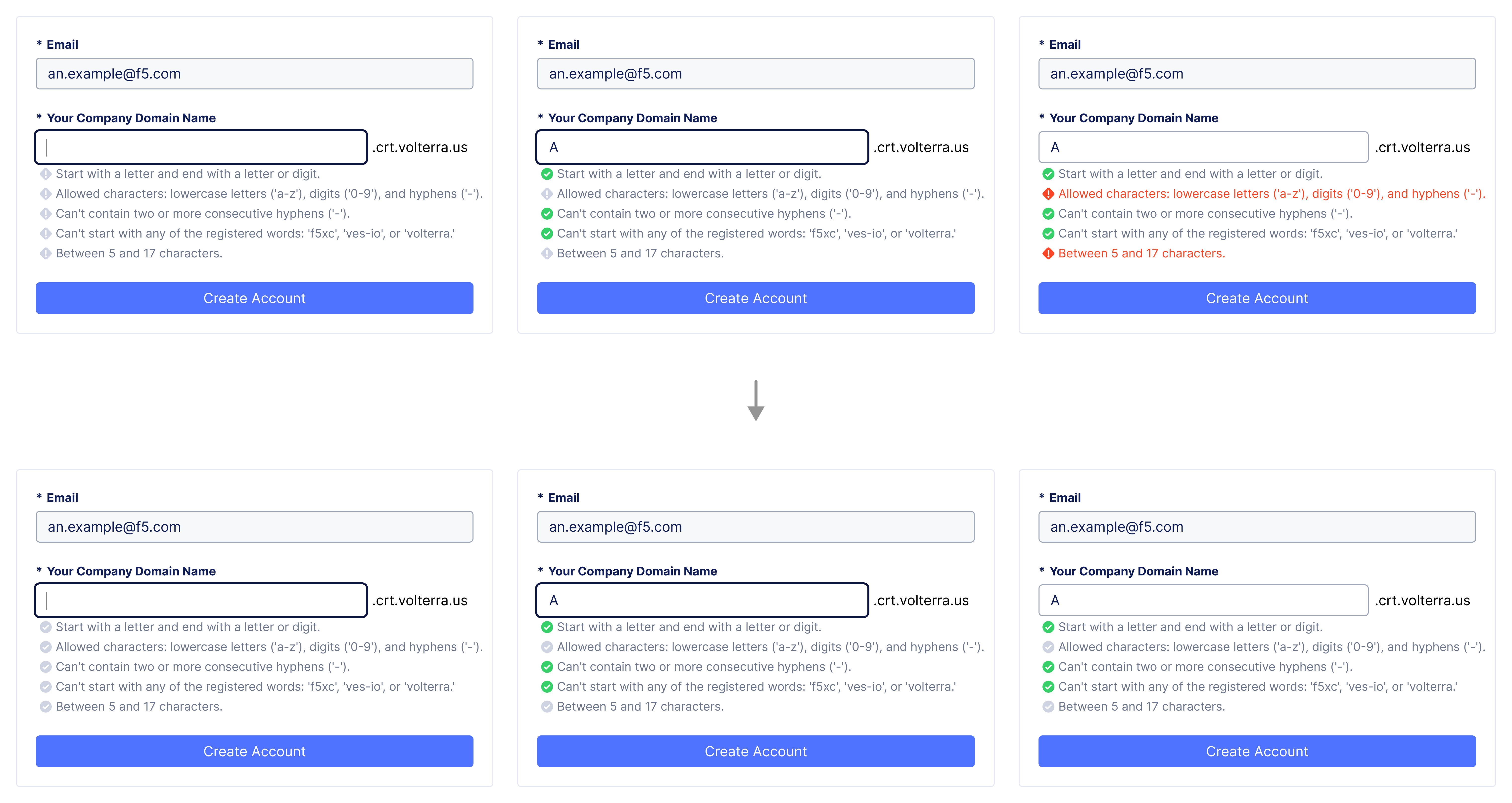
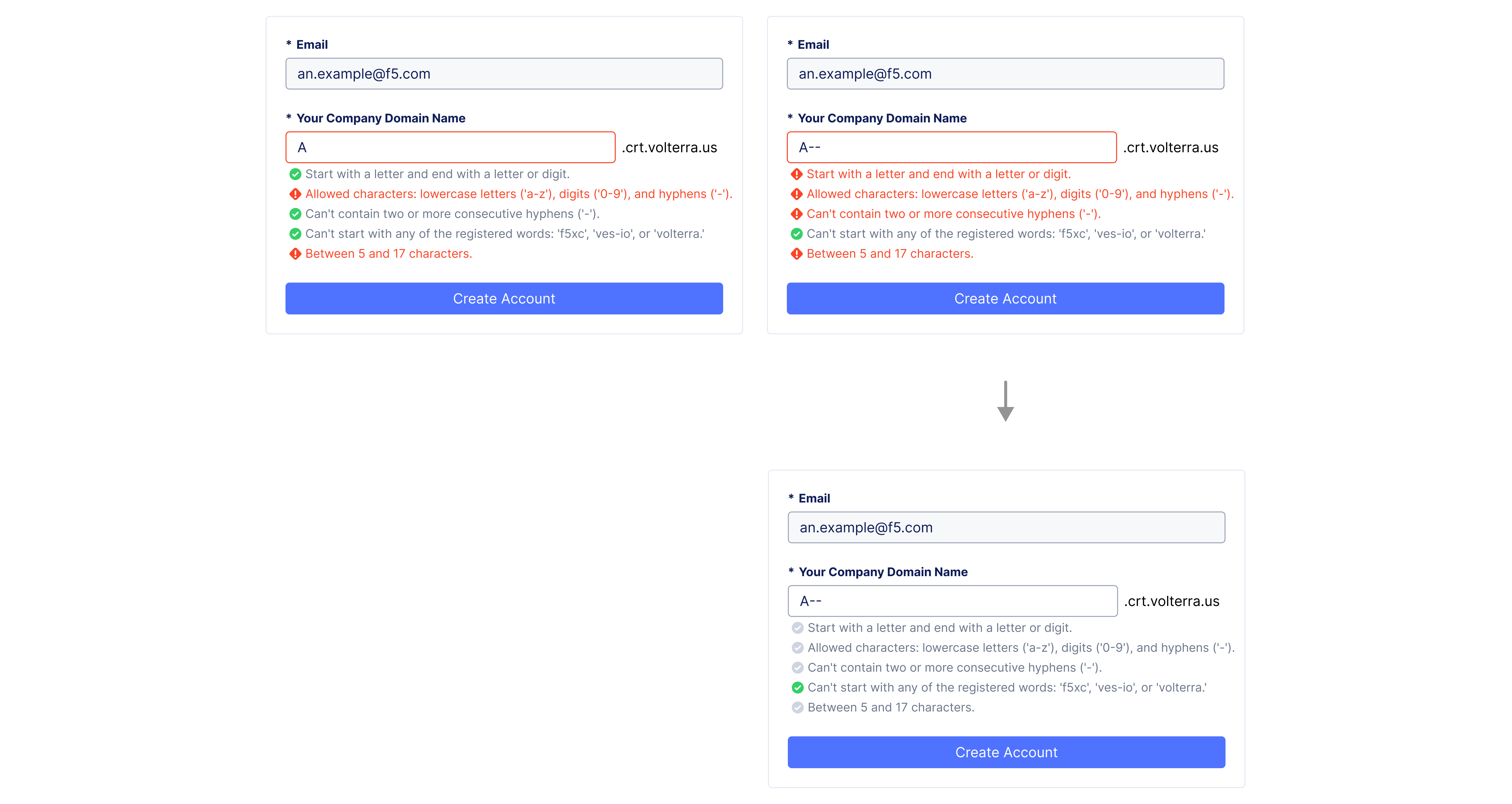
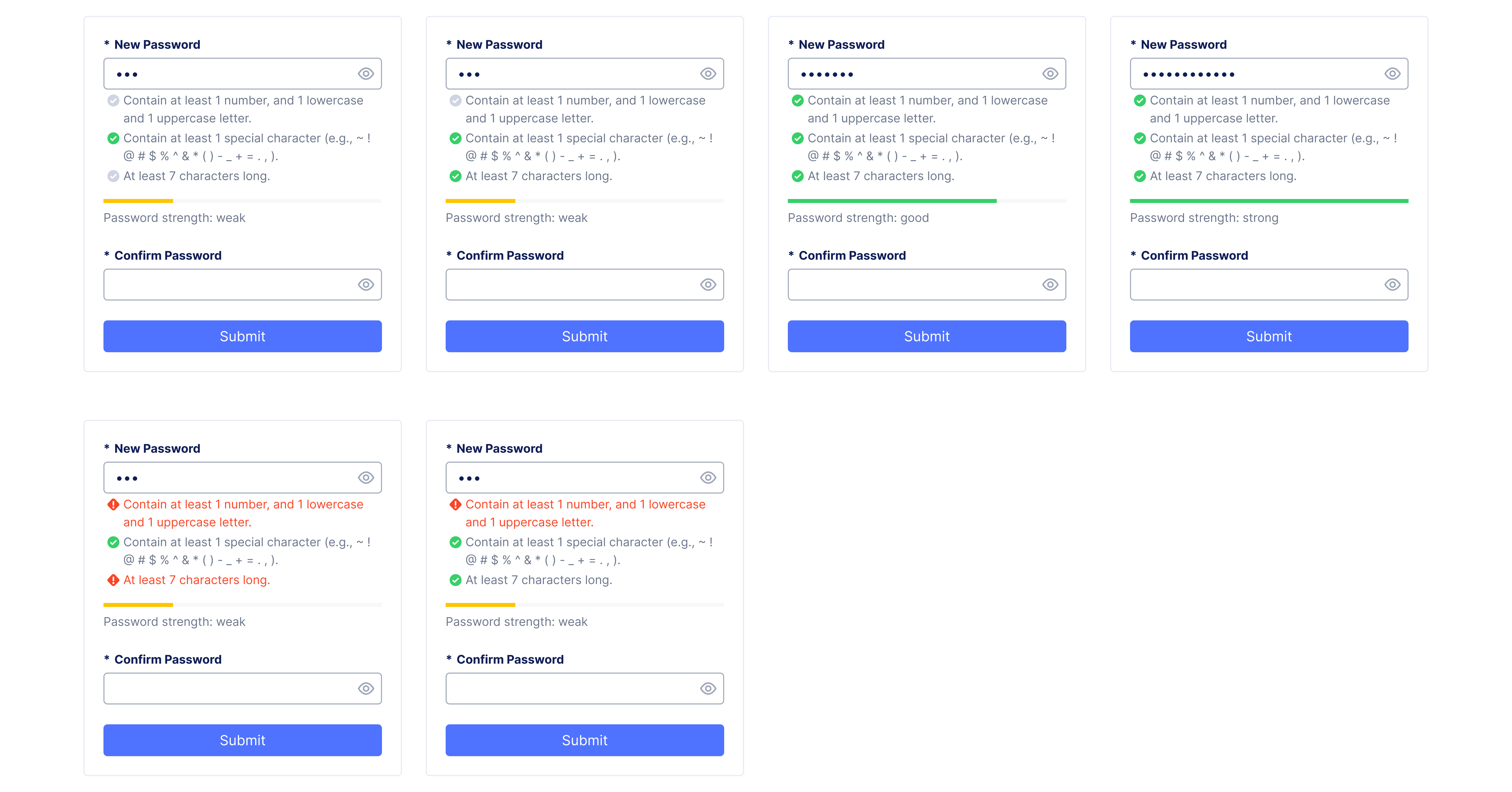
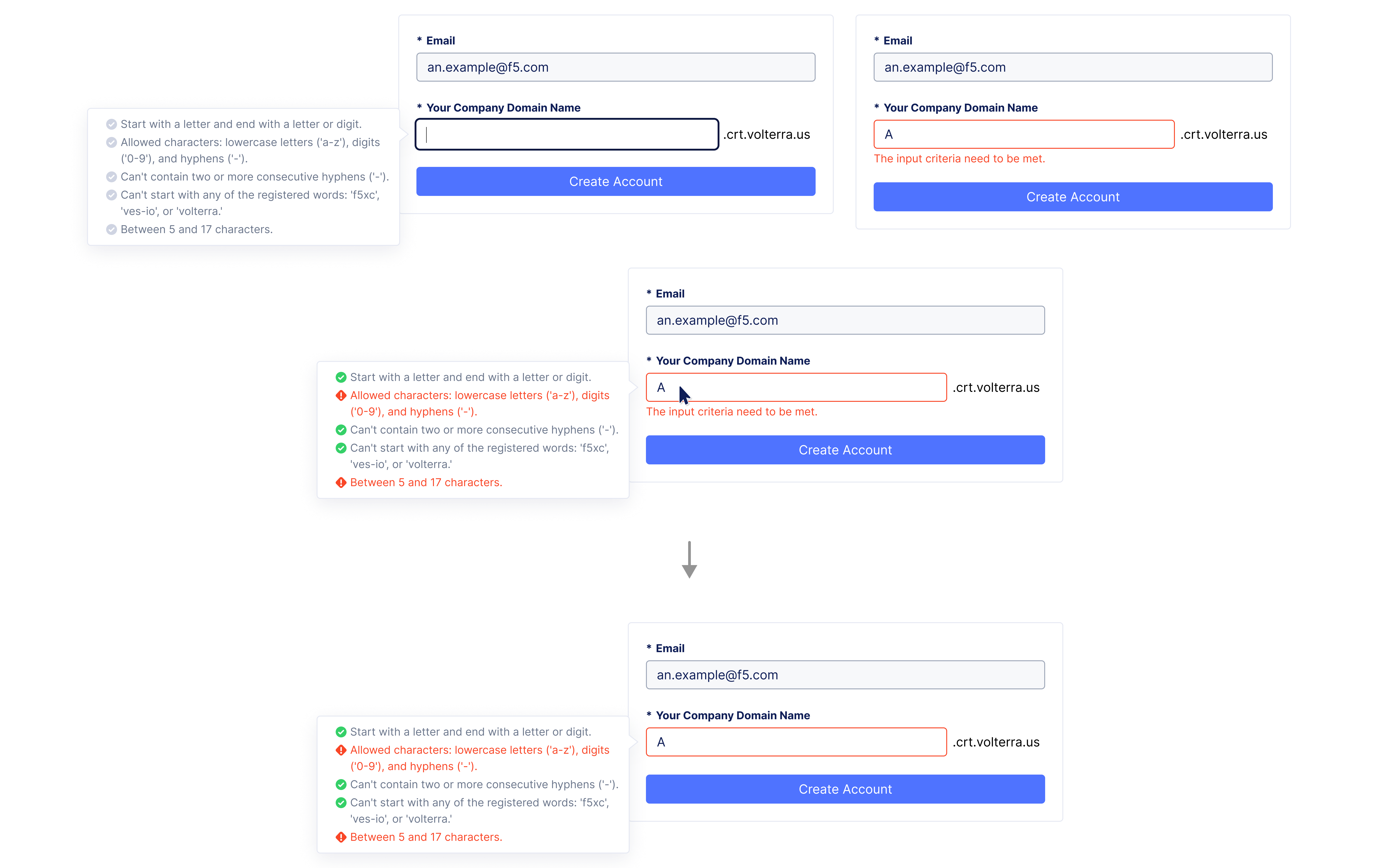
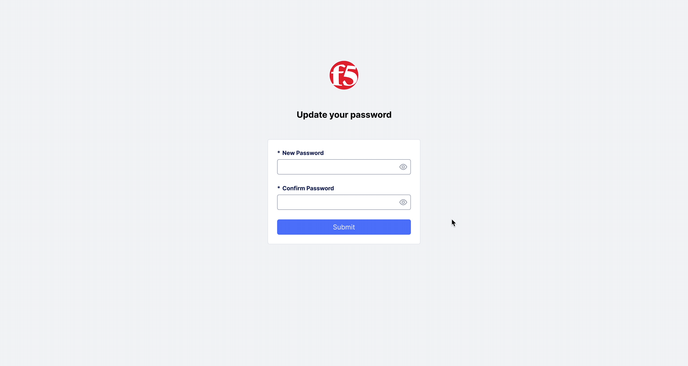
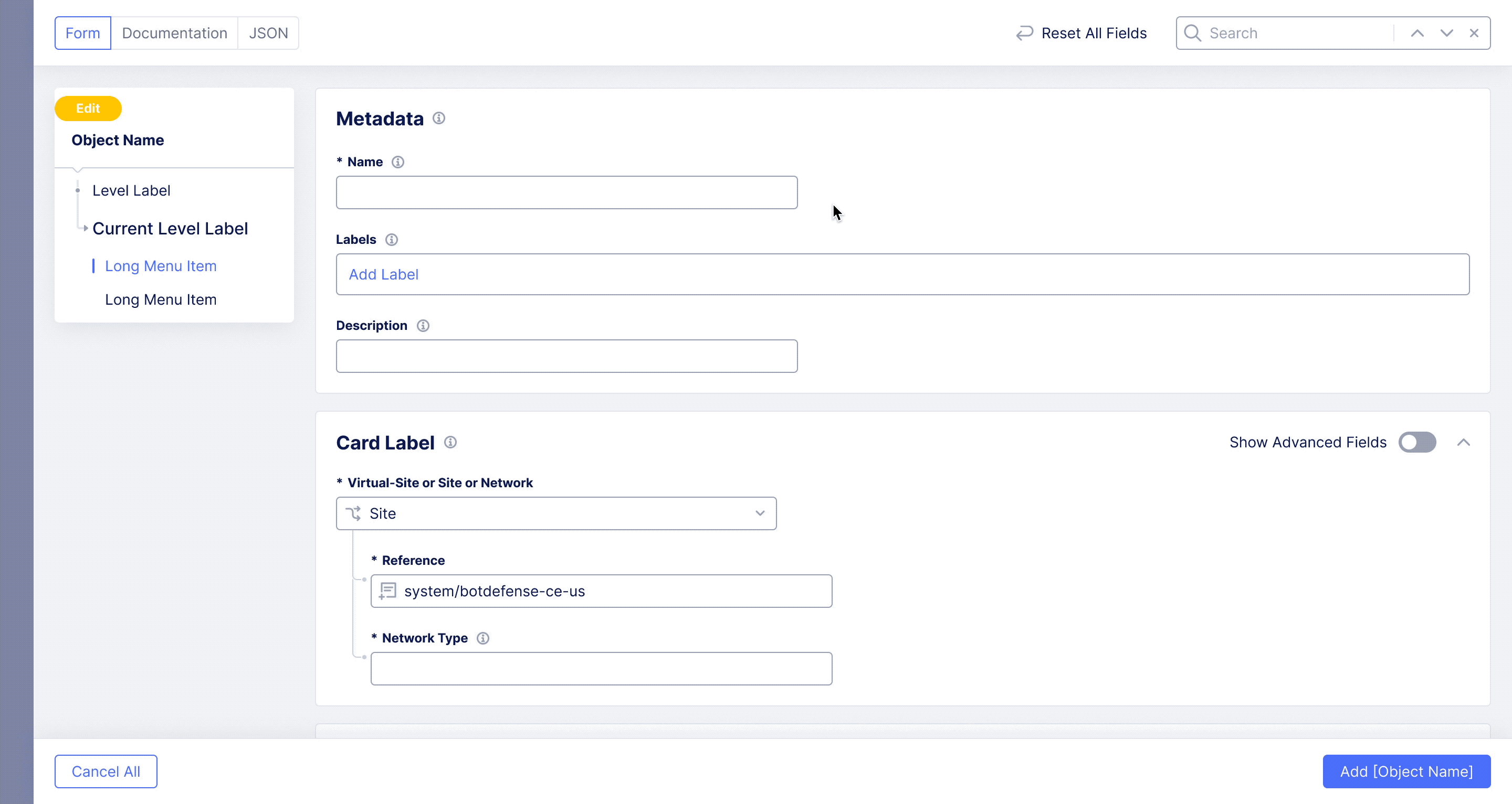
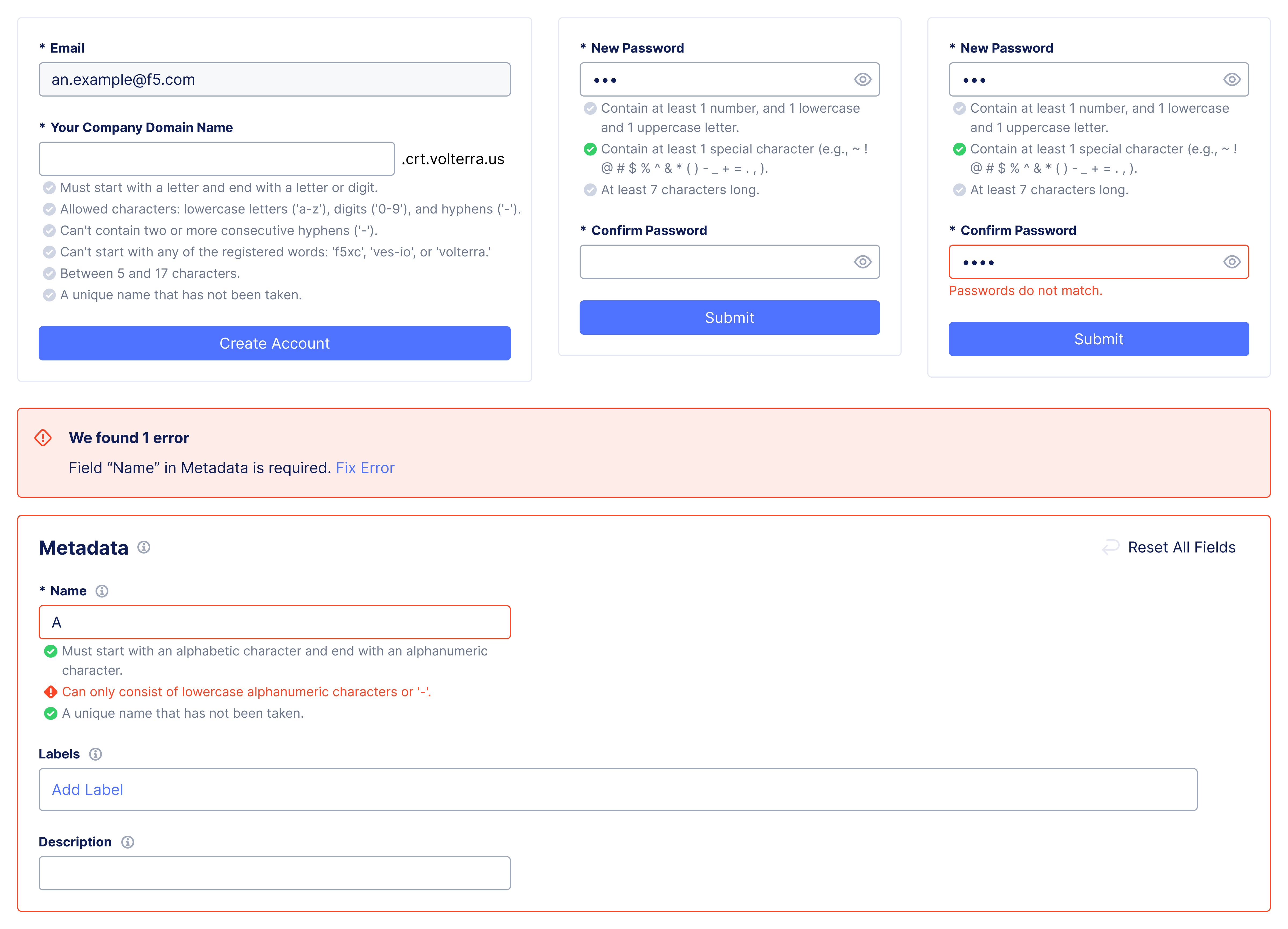
Project Type: |
UX Designer at F5 |
Duration: |
Jun. – Jul. 2025 |
Members: |
5 designers, 3 developers |
Practice Areas: |
Interaction design, visual design |
My Role: |
I served as a UX design lead and co-worked closely with design system (DS) team members. |
F5XC (Distributed Cloud) is a SaaS-based platform that provides unified management, security, and networking for applications deployed across multi-cloud, on-premises, and edge environments. During the onboarding setup, users needed to create a domain name and password. They both required multiple criteria to ensure uniqueness and security. However, poor readability and unclear feedback made it difficult for users to understand which requirements were unmet and how to correct errors. A similar issue appeared in the configuration wizard when creating object names. To solve this, we addressed all three scenarios together by designing a standardized interaction pattern. The new pattern helps users easily check requirements, understand their current status at a glance, and clearly see what must be fixed before proceeding.
Figure out a standardized new design pattern that can be applied to all similar use cases in the platform. |
|
Follow established design system rules while aligning with current industry trends. |
|
Ensure accurate status feedback, clear instructions, and a concise visual experience to avoid distractions or frustration. |
|
Resolve other unclear input error messaging with the new pattern creation. |
At the start, we discovered that the instructions and error message presentation for both domain name and password creation in the F5XC platform made it difficult for users to understand input requirements, restrictions, and errors. It was because multiple criteria were crammed into one paragraph, and there was no clear and specific feedback for user input. We later found the same issue in the object name creation process within the configuration wizard. After discussing with the design system (DS) team, I decided to include this use case in the project as well. As a result, the project focused on four main scenarios:
Domain name input. |
|
Password creation |
|
Password reset |
|
Name input in configuration (wizard). |
I evaluated the current implementation and identified six usability issues across five heuristic categories (according to Jakob Nielsen’s heuristic principles):
Visibility of System Status (The design should always keep users informed about what is going on, through appropriate feedback within a reasonable amount of time.):
|
|
Consistency and Standards (Users should not have to wonder whether different words, situations, or actions mean the same thing. Follow platform and industry conventions.):
|
|
Error Prevention (Even better than good error messages is a careful design that prevents a problem from occurring in the first place.):
|
|
Aesthetic and Minimalist Design (Interfaces should not contain information that is irrelevant or rarely needed.) & Help Users Recognize, Diagnose, and Recover from Errors (Error messages should be expressed in plain language (no error codes), precisely indicate the problem, and constructively suggest a solution.):
|
While identifying current issues, I also reviewed the guidelines and best practices for error message creation in the F5XC Design System. The key takeaways include:
Error messages appear after a user action to indicate something went wrong and guide users on how to recover or proceed. Since users often scan rather than read in detail, error messages need to be clear, concise, and actionable. |
|
The message should address: "what happened," "why it happened and whether it might recur (if known and relevant)," "the impact, if any (only when helpful)," and " how (what actions to take next) to resolve the issue." |
|
The tone and terminology should be specific and clearly describe the problem to avoid confusion. It should feel human, avoiding unnecessary technical jargon or a robotic tone. It should remain neutral — approachable yet credible. Avoid blaming the user or using all caps and excessive punctuation, as these can create feelings of alarm or aggression. |
With design principles in mind, I conducted feature benchmarking by reviewing around 20 tech systems to see how they handle multi-criteria input validation. From this research, I made several design decisions:
Break a paragraph into multiple bullet-point checks. |
|
Start with a clean view, and display input instructions once users focus on the field. |
|
Provide instant feedback — show which criteria are met and which still need work. (Instruction list updates dynamically with colors and icons as users type.) |
|
Display all instructions and corresponding error messages simultaneously for easier reference. |
|
After submission, give specific feedback indicating which exact criteria failed. |
Before moving into ideation, I clarified the interaction flow and defined all the statuses to cover in the design — from initial, focus, and unfocus states to typing, proceed, and error states.
Following the F5XC design system and drawing inspiration from other tech platforms, I began ideating potential information presentation and interaction methods, defining the visual style, and involving DS team members throughout each design stage to gather instant feedback and ensure a smooth, concise experience. Below are the key improvements made throughout the iterations:
![]() |
When users focus on the input field, all criteria appear as checkpoints. Initially, I used alert icons for unfulfilled items, which then switched to warning messages when the field was unfocused. After feedback from the DS team, I shifted to a more neutral approach — using a grey check icon to indicate “to-do” status both during typing and when unfocused — to reduce frustration and avoid negative feelings. |
![]() |
When users proceeded and triggered an error, my initial idea was to keep the error status visible until all criteria were met. Later, considering users' feelings, I adjusted this by switching to a neutral “to-do” status while users typed, better reflecting the "in-progress" state and reducing annoyance. |
![]() |
From my observation, some systems use visual indicators to show password strength. At first, I explored this idea, thinking it might be helpful. However, after discussions with the DS team, we realized this approach works better when there are only one or two requirements. In our case, password strength could be addressed by simply increasing the minimum length (e.g., 12+ characters). Since multiple validations were already in place, the visualization wouldn’t add much value. Ultimately, I decided not to pursue this approach. |
![]() |
Alongside inline instructions and error messages, I also considered using floating dialogs to avoid changes in input section height. However, keeping the dialog always visible could confuse users, and in the configuration wizard, it would block the navigation bar. For these reasons, I ultimately chose to move forward with the inline message approach. |
![]() |
I explored different color and icon options while following design system rules. Discussions with the DS team revealed that small outlined icons had poor legibility at 100% size compared to filled ones. For the initial status, both outlined and filled grey icons could work, but creating a new outlined icon just for this case would not be reusable. |
I also tested for color blindness (e.g., protanopia, deuteranopia, achromatopsia) to ensure status differentiation. Eventually, I selected the option that best balanced legibility, consistency, and resource efficiency. |
![]() |
While reviewing object name creation in the configuration wizard, I noticed that for the name taken scenario, the error message “Object already exists” was unclear and confusing — users would not know how, where, or what to fix. Ideally, the system should specify “the name has been taken” and highlight the name field for correction. With this in mind, I explored several solutions: using a section notification, highlighting the input field and section with a red border, adding an inline error message below the field, renaming “Name” to “Unique Name,” or integrating uniqueness into the validation checkpoints. After feedback from the DS team, I decided to make uniqueness an independent requirement, supported by a progressive frontend API check while typing, rather than a backend-only check after submission (even with a delayed API call to reduce the number of requests). |
![]() |
To make the criteria easier for users to understand, I worked with the DS team to break down long paragraphs into checkpoints and reorder them for better logic. We refined the wording to be more straightforward and intuitive, and I proposed adding examples for special characters (any ASCII character is accepted, and leading/trailing spaces are not trimmed) to give users clarity. During this process, I also noticed inconsistent terminology across different places. By collaborating with the DS team, we clarified definitions and documented standardized terms in the design system for future reference. |
The following hi-fi prototypes illustrate how the new design pattern works in three scenarios:
![]() |
The input starts with a clean view. When users focus, instructions appear as multiple checkpoints. As they type, the status updates progressively. If users proceed without meeting requirements, checkpoints turn into an error status. Once they continue typing, the status switches to “to-do.” When all requirements are met, checkpoints turn into a success status, allowing users to proceed. |
![]() |
In password creation and reset, the same interaction pattern is applied. This scenario also covers cases where passwords do not match. |
![]() |
For object name creation in the configuration wizard, the same interaction pattern is applied. The existing error pattern in the wizard is respected, with the new pattern integrated into it. |
The new standardized design pattern enables users to efficiently review and verify multiple input criteria. This project also provided an opportunity to resolve other error message issues in configuration, clarify input character and letter terminology, and define their usage in the design system.
Designed around four known scenarios, with potential adjustments needed for future expansions. |
Conduct testing to ensure messages are clear and free of unnecessary noise. |
|
Collaborate with researchers to gather additional user feedback. |
Defining different interaction statuses upfront can greatly aid later design exploration. |
|
With an additional API, we can perform frontend validation of user input. |