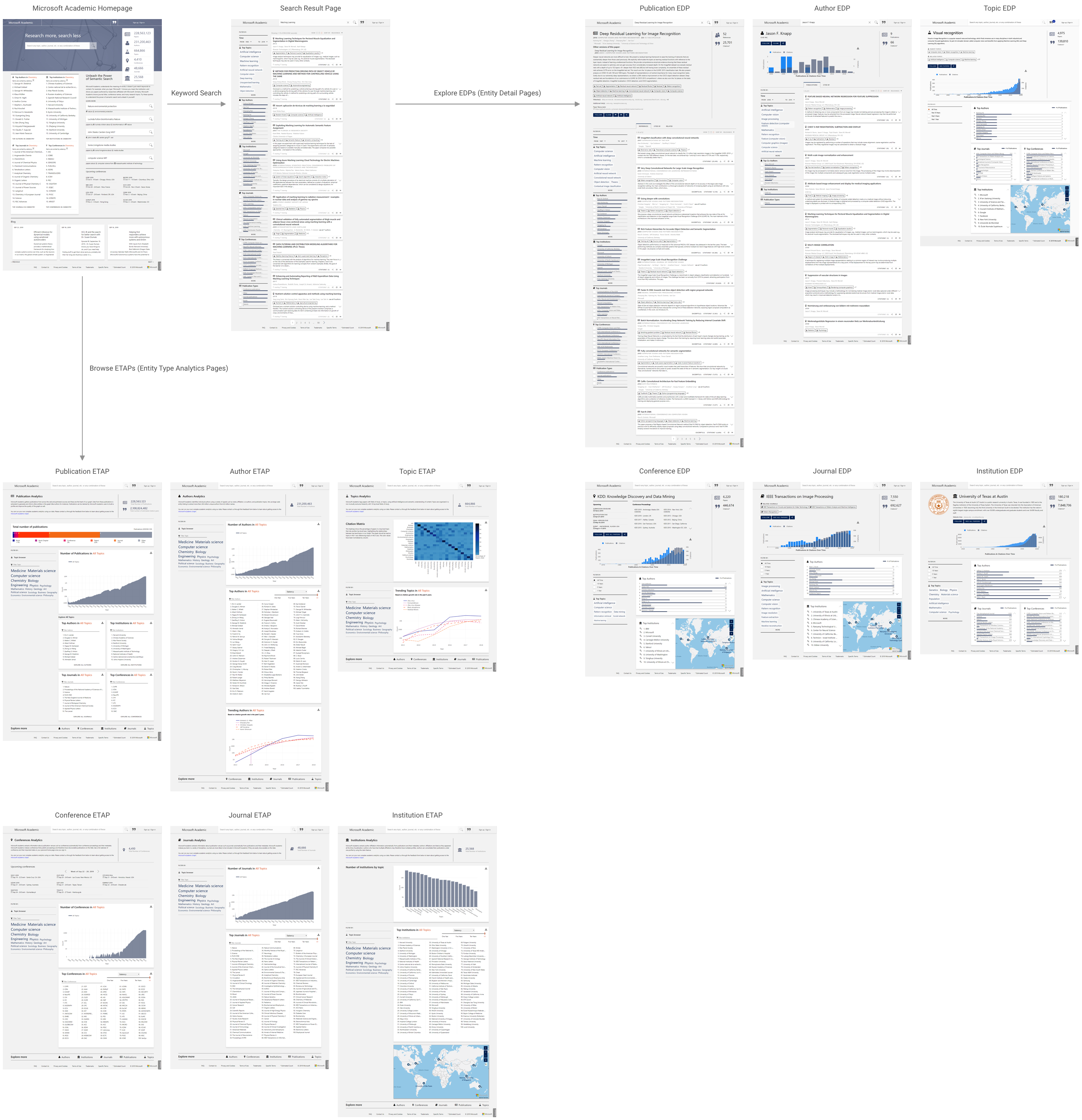
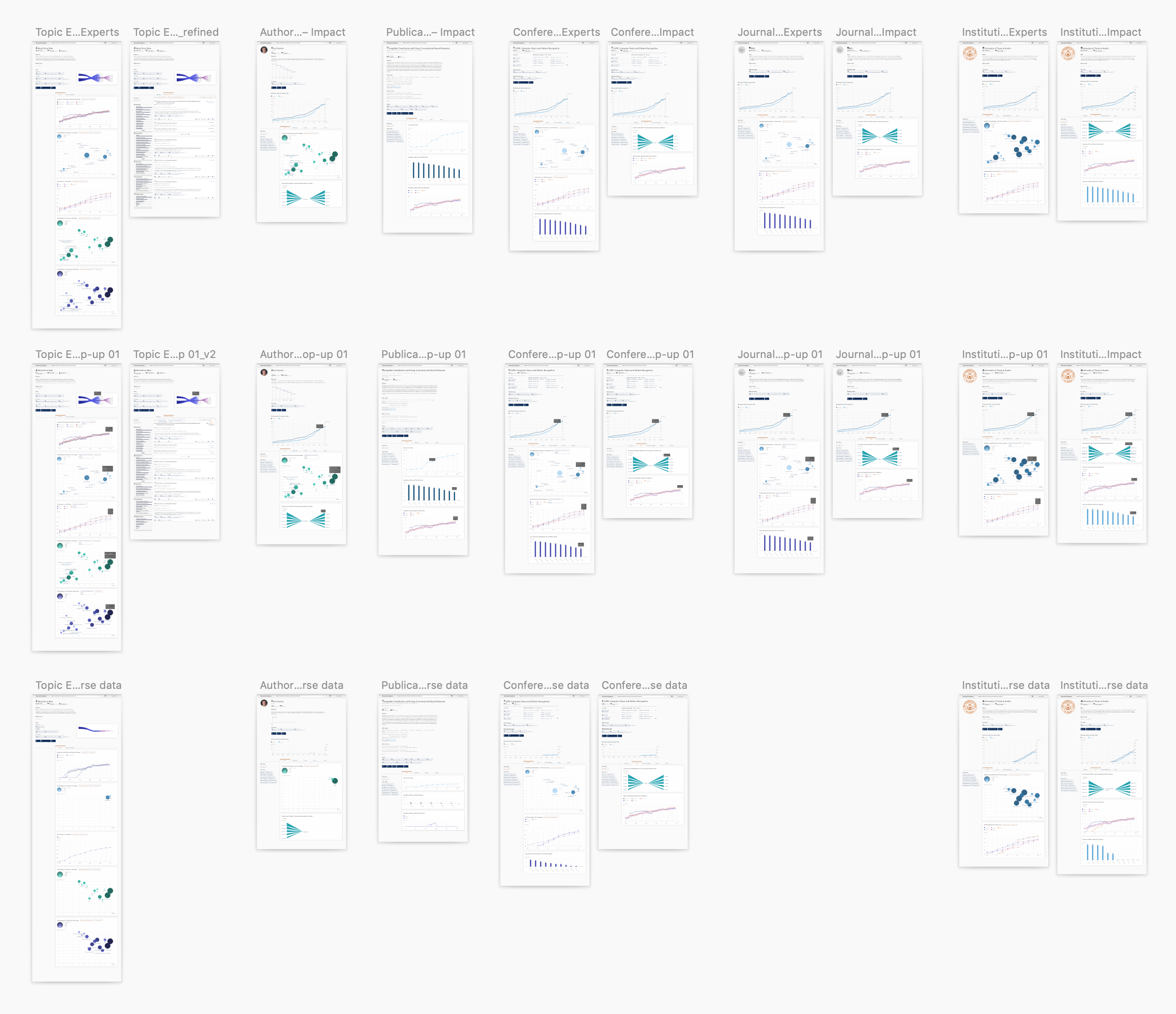
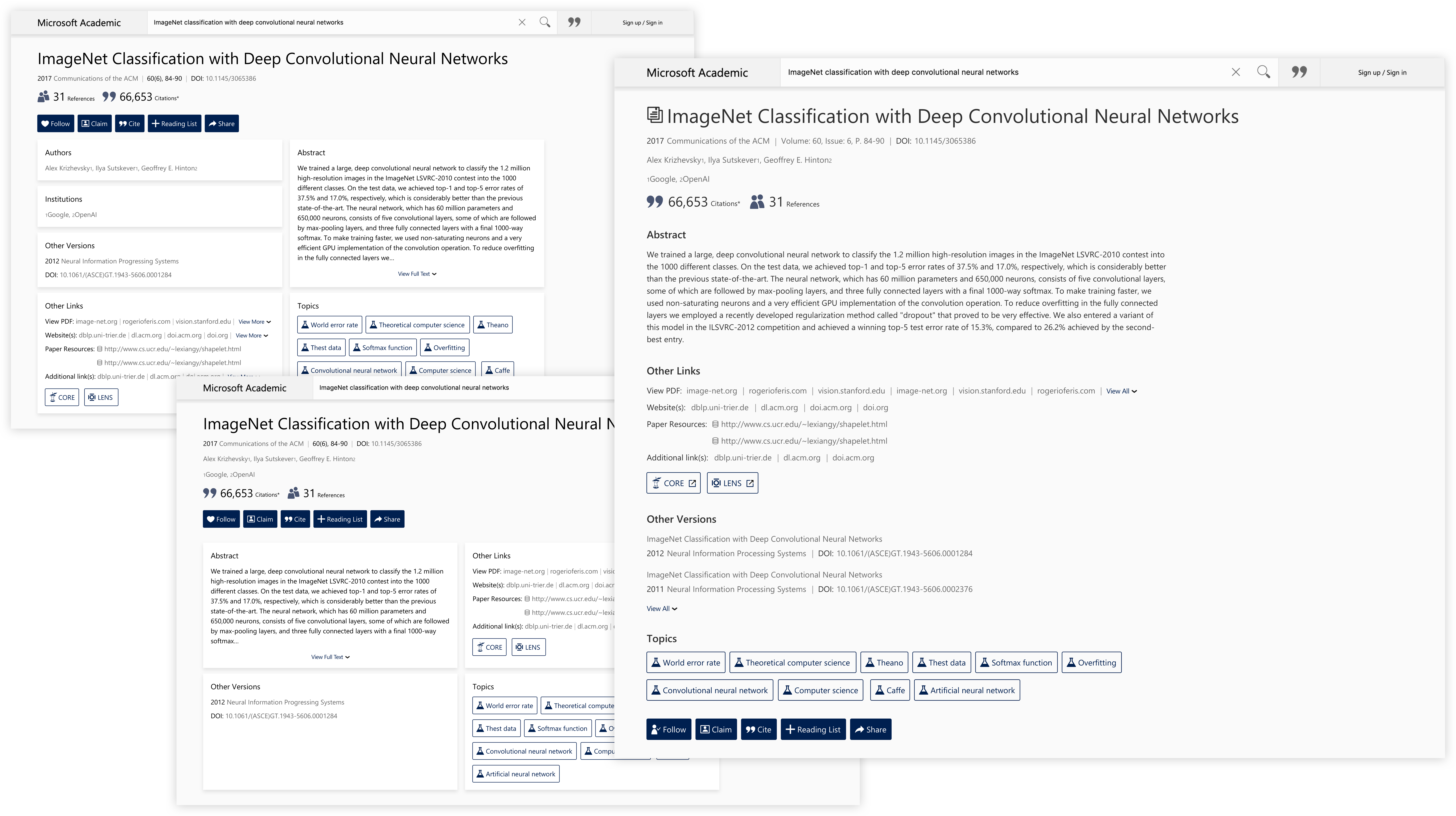
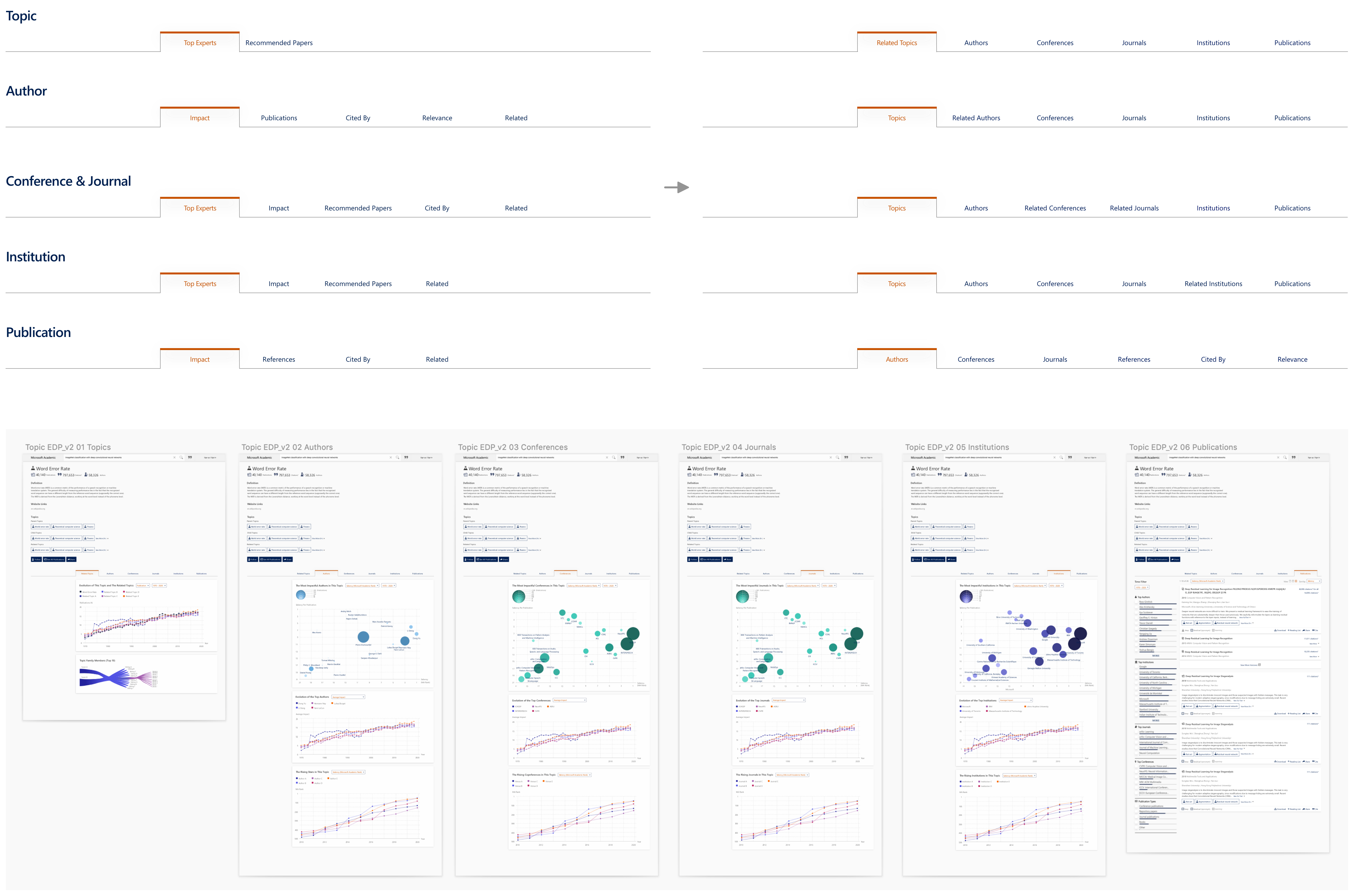
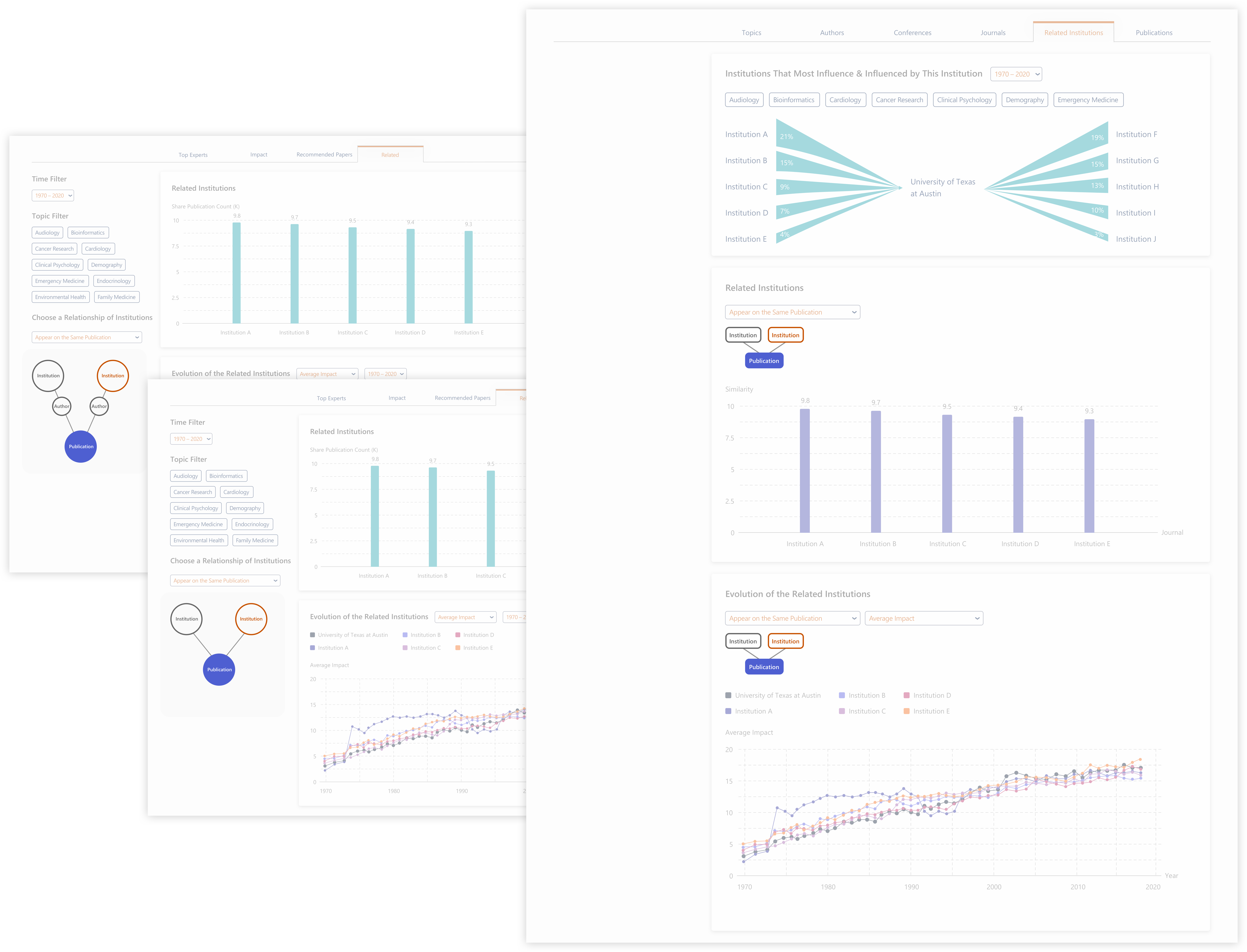
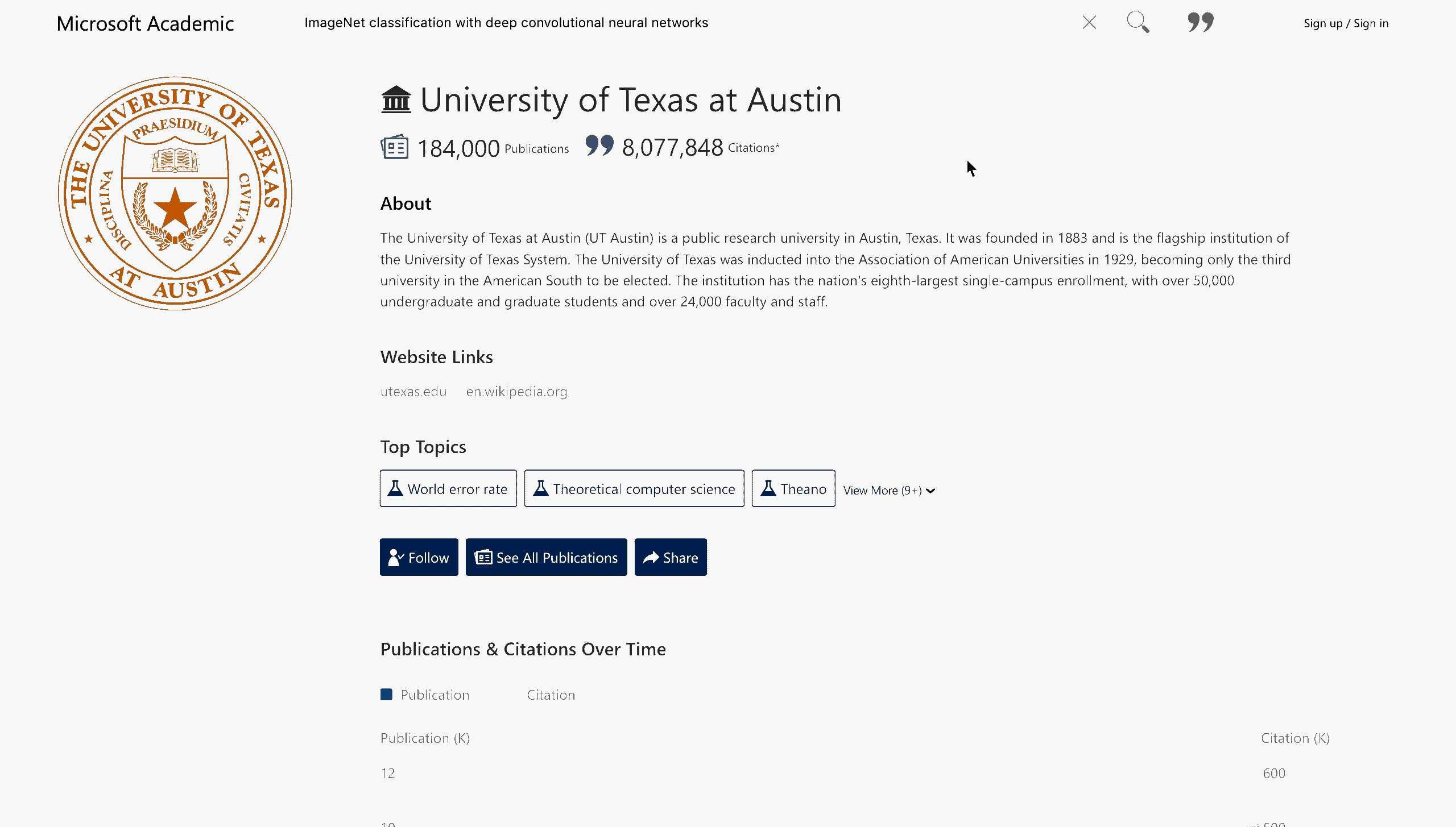
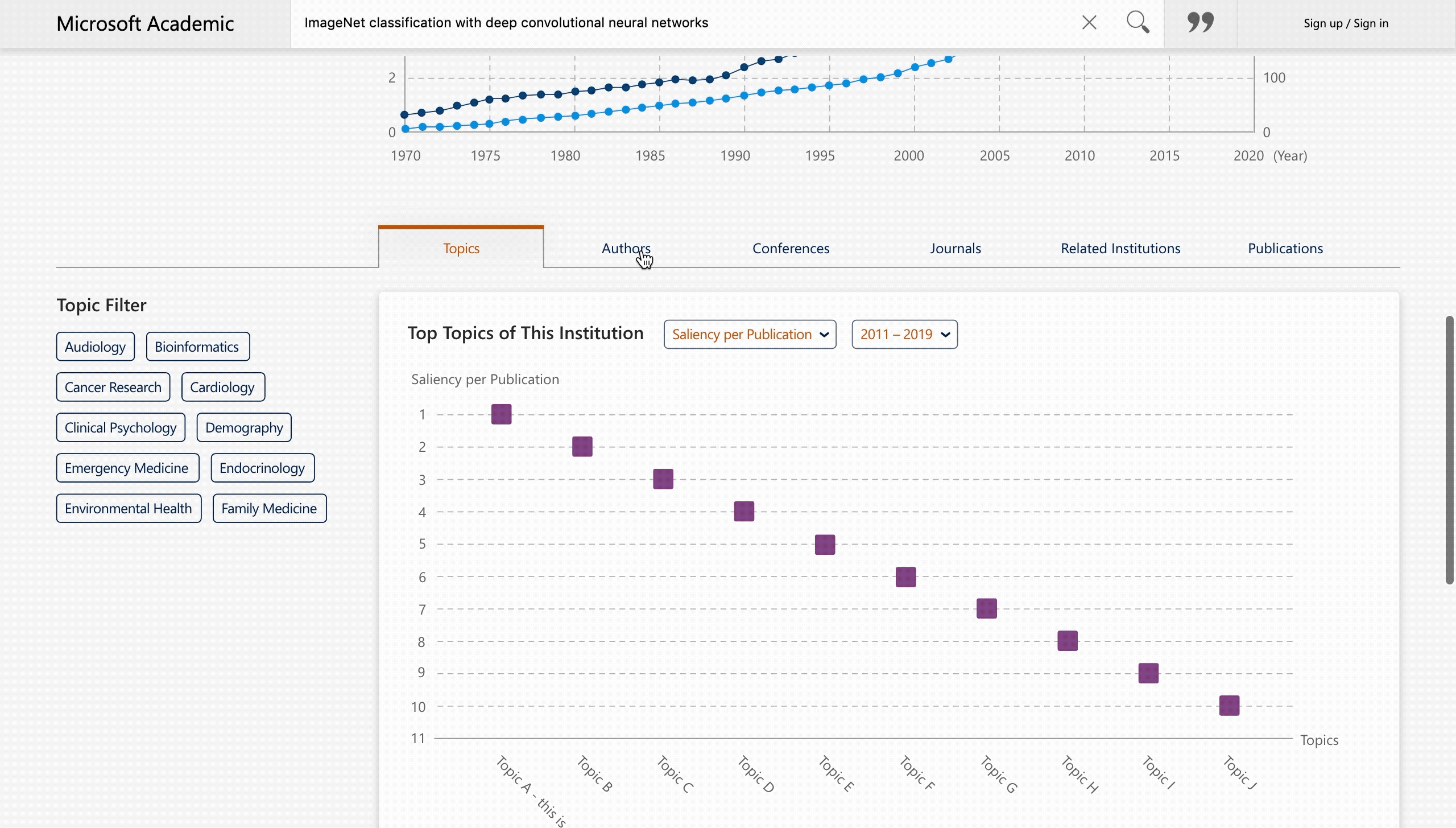
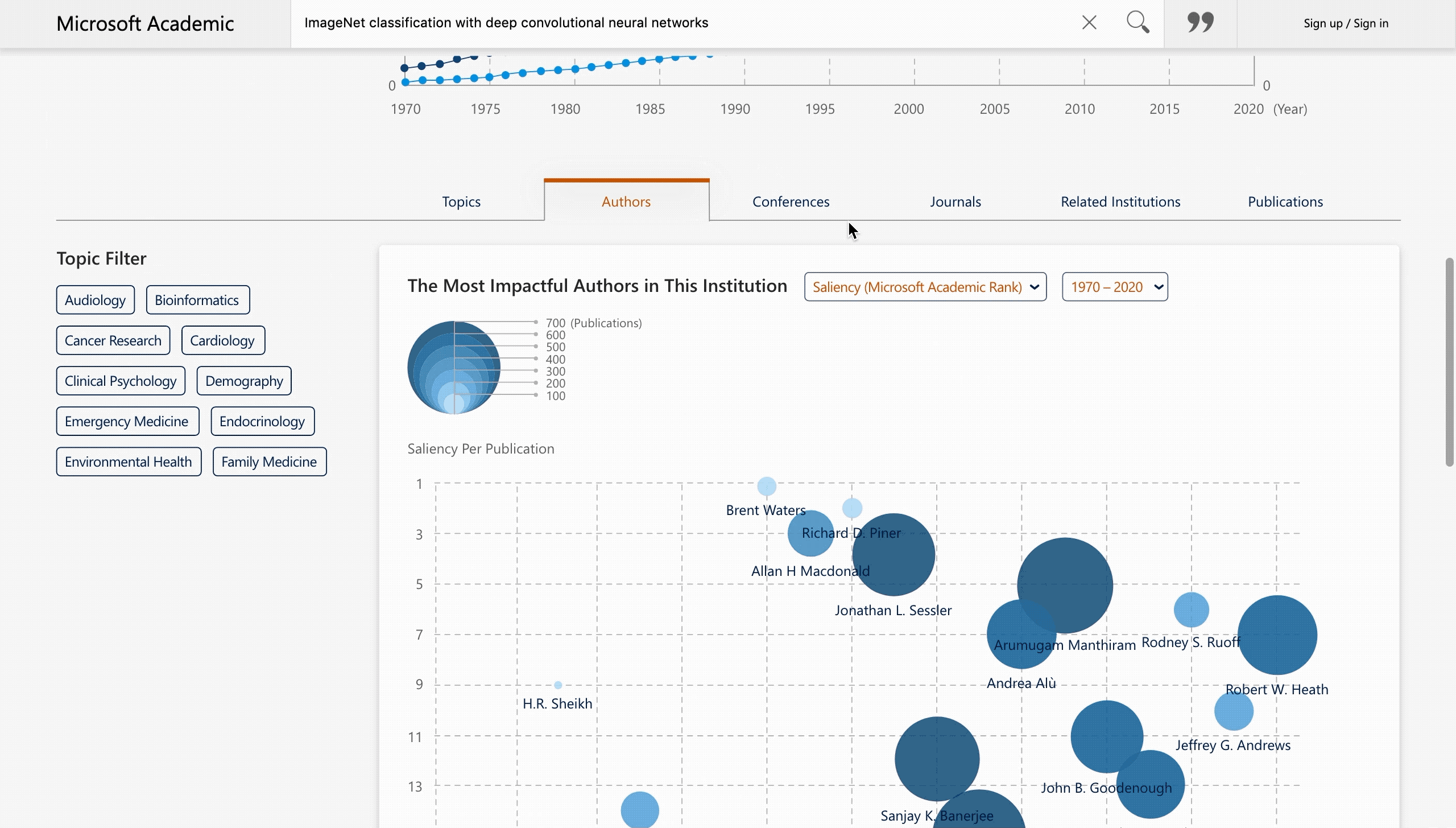
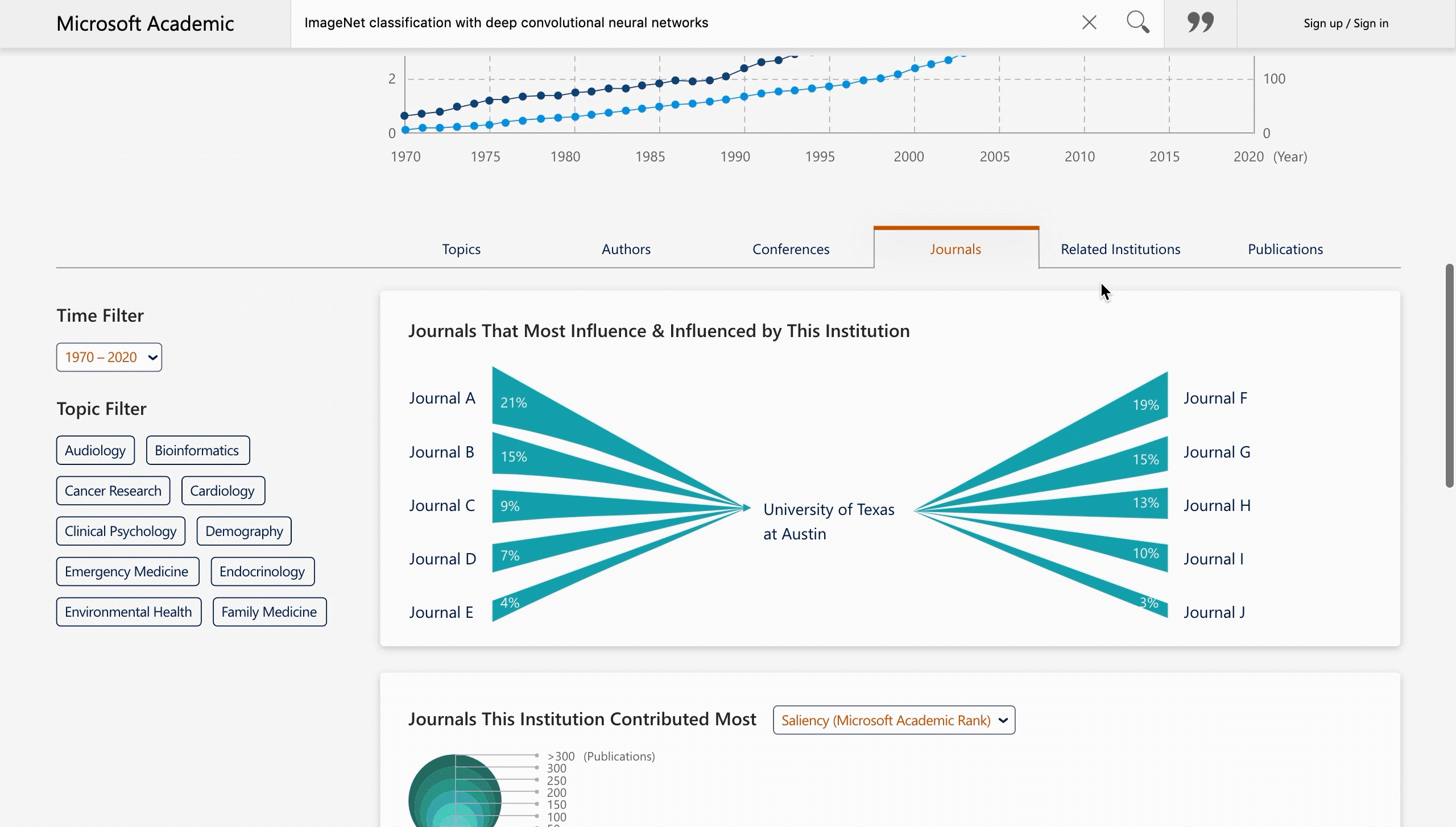
Entity Detail

Providing insights on research trends.

Project Type:

UX Designer at Microsoft Research

Duration:

Nov. 2019 – Jan. 2020

Members:

2 engineers, 2 data scientists, 2 PMs

Practice Areas:

UX design, visual hierarchy, typography, interaction design, data visualization

My Role:

I served as a design lead and worked closely with PMs, engineers, and data scientists.

Project Vision

Microsoft Academic is a knowledge graph which supports academic influence evaluation and academic publication access for academic institutions and researchers (more than one million/month). There are six types of entities in this knowledge graph – publication, author, topic, conference, journal, and institution. Each entity has a detail page for users to quickly grasp its development trend, impact, and the most related entities. The team had abundant data to support researchers, which was much more than what was on the website, but they were not clear about how and what to present. Therefore, I tried to clarify the most desirable information to researchers, and figured out an efficient and engaging way to present a large amount of data that can be consistently applied across all entity detail pages. Also, readability issues regarding typography were addressed along the way.

Challenges

Design a favorable layout that can be applied to all entity detail pages with various types of information.

Visualize data in a concise and engaging way with limited understanding of user needs and expectations.

Help users easily understand how the similarity is generated based on the "multi-sense" data.

Prevent information overload while providing multiple visualizations.

Microsoft Academic EDP Overview

Design Process

Design Process

Current Issues & Design Requirements

Support researchers quickly grasp an entity they are interested in, including its impact and its related entities.

Entity detail page (EDP) is the main page for each entity where basic information, development trend, impact, and the most related/important entities of the entity are presented for users to quickly understand a new area of interest / field of study. (The pictures beside are the previous version hero area of a publication EDP and an institution EDP as examples.) I clarified the project goals through a kickoff meeting with PMs and data scientists at the data team. I also discussed the current issues defined in my previous heuristic evaluations for the website with the PMs. We decided to solve the current issues while building the new features together at the same time:

The layout made the information presented in publication EDPs' hero area (above tabs) crowded with low readability, so we wanted to modify the typography to create a visually appealing experience and apply it to all types of EDPs.

There was much more data than what had been presented on the website, so the team hoped to redefine the EDP experience by figuring out what and how to present to serve researchers efficiently and adding values in all types of EDPs.

The data team had generated a special type of data that could compute the similarity of entities based on multiple "senses," and we wanted to present this "multi-sense data" for all types of entities in a comprehensible way for users.

Current Design – Publication Entity Detail Page Current Design – Institution Entity Detail Page

User Studies

Understand user types, goals, needs and challenges.

With a better understanding of the project goals, I started to clarify the target users of our service. By reviewing previous interview documentations and talking with PMs, I learned that Microsoft Academic website was serving researchers across various career stages and fields with different needs. We had five main groups – Institutional Researchers, PhD Candidates, Post Doc, Under Grads, and Institution Admins (university, company, journal, government, etc.). They could be roughly divided into two main types – established researchers, and novice researchers.

For established researchers, they already know what information they need and what to search for. They aim to make impact and unique contributions to their fields. They need to stay up to date in their fields, secure research fundings, and identify opportunities of interdisciplinary research.

Persona – Established Researcher

As for novice researchers, they are new to a field and eager to gain master knowledge about the core concepts, but do not have a clear idea about how to search and what to look for. They need to know the structure of their research fields and build a mental map.

Persona – PhD Student . Novice Researcher

In addition, I clarified the user flow of the website to know how users used our service and how we served users. Starting from the homepage, users could browse through highlighted resources and entitiy type analytics, where the development trend of each entity type was presented. Users could also use keyword search to look for related entities. In this project, the information presented in Entity Detail Pages was what we focused on.

Main User Flow

Ideation

Strategically construct content based on various user needs and collaborate with data scientists to clarify available datasets.

Based on the above understanding and requirements, I utilized brainstorming sessions with PMs to discuss the information that target users care about by listing down the questions they might have. For example, in a field of study, they might want to know what shall they study, who and what shall they follow, who shall they collaborate with, and where do they rank, etc. We started with the topic entity, and then expanded the scope to the other five entities – publication, author, conference, journal, and institution.

User Types

With the above lists, I constructed content for each EDP with spreadsheets, and iterated on them together with PMs. I marked those new content that had not been presented on the webpages to remind myself and keep other team memebers on the same page.

Content Construction

With the content defined, I proposed a reasonable design for the new EDPs, including layout for the content and the way to present data. Since interactive visualization is an efficient and engaging way to present information, I moved forward with this potential solution.

In this stage, I was not sure if all the data in the proposed content was available, so my next step was to work closely with data scientists and engineers to clarify which data was accessible and to ensure my ideas for data visualizations were feasible. Through the close collaboration, we were able to conduct the project effectively by designing visualizations and generating usable data at the same time.

Multi-sense Relationships

Among all the datasets, the "multi-sense data" was the most complex one. It was to present the similarity between two entities from different perspectives. “Sense” was like a metric. It was a method we used to compute the similarity. With the concept clarified, I tried to visualize the seven types of "senses" for computing the similarity to support efficient communication with my team members. At that time, only the similarity within the same entity types was generated, and there would be cross-entity ones in the future. In addition to the similarity of entities, the "senses" were also used in computing the similarity of medical topics, but we only focused on the general ones for entities in this project, and planned to tackle the medical ones in future stages.

Design Decisions

Cluster related info to improve reading path, give user control in filtering desirable info, and apply visualizations to efficiently convey complex concepts.

With layout and data visualization sketch drafts in hand, I made several design decisions to better serve user needs and ensure readability before moving toward the wireframing stage:

Category Icon

Grouping related information together in one section and following the idea of using tabs to categorize and present information for users to easily browse through.

Quadrant Icon

For multi-dimensional data visualizations, presenting the most important attributes on X-axis and Y-axis so that the values can be easily compared.

Sense Icon

For multi-sense data visualizations, visualizing the "senses" to help users comprehend the concept.

Relationship Icon

Allowing users to choose and see the similarity based on their desired "senses."

Modern Icon

Engaging users with an energetic, modern, and up-to-date impression by using a cleaner, brighter, and softer style for visualizations that could be applied to the website's original visual style.

Color Icon

Applying theme colors for entities so that users can quickly know which entities the visualizations are representing for. Complementary colors with the same values were avoided in the same diagrams to take care of color blindness.

Wireframes & Prototypes

Visualize ideas to collect feedback, and take care of edge cases in data visualizations.

Keeping the decisions in mind, I started visualizing the design with wireframes. Below are visualizations of how the "senses" were applied to different entities to generate similarity.

Wireframes

I also utilized different types of visualizations to efficiently present multi-dimentional data sets. According to Mackinlay's ranking, position was the most efficient visual attribute for both quantitative and ordinal data, and position was more effective than area and saturation in quantitative data. Therefore, in two-dimentional data sets, I used bar chart and dot chart to support value and ranking comparison, and used line chart to present the variation across time. In three-dimentional data sets, bubble chart was applied, with ranking values encoded with position, and publication amount encoded with area and saturation. Also, Sankey diagram was used to present the flow rate from one set of values to another.

Wireframes

By prototyping the first and second layers of EDPs, I was able to present design ideas to my coworkers and collect feedback from them. Besides, the extreme cases with less or very limited data available for one entity were visualized to present how it would look like and ensure the design ideas could apply.

Wireframes

Iteration

Provide abundant info with efficient and engaging reading experience by updating typography and icon style, and creating visualizations within the constrain of data generation.

To guarantee the usability and feasibility of the new design, I went through multiple iterations. Below are the key changes made in four main parts along the way:

Hero Area Layout
Number 1

Regarding the layout of the hero area, I tried to group relevant information with cards in the beginning, placed the impact-related info right below the entity name to give users a quick summary at the first sight (taking care of the reading path), and made the icon and text style of action buttons consistent. Based on team members' feedback, authors and institutions would be used to differentiate publications along with venue info, so I placed them closer to the title in the second version. The order of sections was also adjusted based on the importance and frequency of usage. Besides, other EDP versions and those with more and less content on cards in left and right columns were created. The design could work in various cases, but the interaction would look wired and hard to implement if we expect the cards in the left and right columns share the same height no matter the content is expanded or not. In addition, it was arguable that without applying the card visual treatment to author, institution, venue, and impact info made the top area inconsistent with other parts. Therefore, we eventually discarded the card design, but kept the idea of adding section titles to create visual hierarchy and added the entity icon back in front of the entity title to help users quickly tell the entity type.

Icons Redesign
Number 2

While working on the layout, I also fixed visual style issues along the way. In addition to the color issues which had been addressed in the Topic Filter project, icons in the website sharing different styles required to be updated as well. Based on the discussions with PMs, existing icons were serving as identifications for different entities and features. Users might have been used to the current ones, so it was better to keep the adjustment in a minor degree. Therefore, I tried to keep the original characteristics while redesigning all the icons. The missing icons and new icons for new features were tackled as well. Besides, for entity icons, I also explored another set of possibilities for future reference. When there is a good timing to change icons, those can be taken into consideration.

Content Iteration
Number 3

In the early stages, the contents for new EDPs were constructed focusing on the core user needs. As the iteration went on, we noticed that we could provide more insightful and inspiring content to support users, add values to the service, and made all the EDPs more consistent. Therefore, the second version layout for tabs was generated, where each EDP had six corresponding tabs for visualizations and publications.

Data Relationship
Number 4

To support users to efficiently view highly related entities, easily comprehend how similarity was generated, and see the similarity based on their desired "senses," I created multi-sense data visualizations with different "sense" selections. When users selected a "sense" to check out the similar entities, a corresponding visualization for the "sense" would be shown below for user reference. For this visualization, I placed "author" between "institution/conference/journal" and "publication" since "author" was the bridge between these two. However, PMs pointed out that users were familiar with the relationships between authors and other entities, so they did not need to see this extra info to comprehend the concept. I later removed it and make the visualization simpler in the second version. Owing to the content expansion, an "incoming and outgoing citation" visualization was added to the same tab (the Related tab). At that time, we were unable to support filtering citations based on "senses." Therefore, I eventually changed the "sense" filter design from applying to the whole tab to a new one just for each multi-sense data visualization section.

Final Design

Demonstrate the new EDP design with a complex case.

Through the above iteration, the new EDP design was generated. In the below section, an Institution EDP was chosen to be showcased for it was one of the most abundant and complicated EDPs.

Topic Tab
Number 1

In the beginning, users could see the entity name, its impact summary, a brief introduction, some external resources, tagged topics with some action buttons, and a publication and citation evolution visualization. They could have a quick grasp of this entity through the hero area. If they want to learn more, they could scroll down to explore tabs with different topics. The first one is "Topics," where users could know the most excellent research areas of this institution across time. They could spick their desired topics, criteria, and time frame to filter data. Regarding the criteria, in addition to citation count, publication count, and H-index, Microsoft Research had its own measurement called "Saliency," which wss a comprehensive method to compute the importance of entities. Based on this method, we also generated "Average Impact (Saliency/Citation)" and "Average Productivity (Saliency/Publication)" (the term was going to be refined). To promote this comprehensive method, we placed it as the first item in the drop-down menu list.

Author Tab
Number 2

The second tab was "Authors," users could easily see the most impactful authors and their evolution in this institution through bubble charts and line charts. To encourage young generations and new scholars, a visualization for "Rising Stars" is presented, in which authors rising rapidly in the past ten years could be seen.

Conference & Journal Tabs
Number 3

The third tab was "Conferences," and the next one was "Journals." They share the same visualizations, including incoming and outgoing citations, the conferences/journals most influenced by this entity, and the evolution of the top conferences/journals. Through these two tabs, users could easily learn which conferences/journals influence this entity most and how this entity influences others across time.

Related Tab
Number 4

The last tab for visualizations was "Institution." In this case, "institution" is also the entity type of this EDP, so the tab became "Related Institutions." In the "related" tab, users could know the related entities in the same types, including incoming and outgoing citations of this entity with the same types of entities, and the related entities with their evolution based on different selected senses.

At the end of this project, the wireframes, prototypes, and the visualization graphics for "senses" were handed over to developers. I also updated the design system along the way to ensure the consistency across the platform and to support smoother cooperation between team members.

Design Guideline

Hi-fi Prototypes

Part of the design is now online! Feel free to check out and play around here: Microsoft Academic Institution EDP

Impacts

Enhance the value of Microsoft Academic.

After the release of the new EDP design, I was glad to hear positive feedback from direct users and see user number increased. The visualizations of the most impactful authors, institutions, and conferences/journals in a field of study were really helpful for users to build a mental map and identify research opportunities efficiently.

Reflection

Limitation

First-hand user studies could be conducted to collect user preferences and to know more about edge cases.

The design may not be able to meet all user expectations due to the restriction of data generation.

If given one more chance, I would utilize some online tools which I learned after this project to help with color picking for data visualizations, so that the colors could be chosen in a more efficient and scientific way.

Next Step

Evaluate the design with target users to validate user need assumptions, find out usability issues, and iterate the design based on their feedback.

Create a version for mobile users.

What I Learned

In data visualization design, not only accessibility of the data itself could be a challenge, but generating usable data, especially from a massive dataset, is also restricted.

Working closely with data scientists in an early data visualization stage is an effective strategy in creating feasible design.

Consistency across visualizations is what designers could take care of while designing multiple / a series of visualizations for a platform.