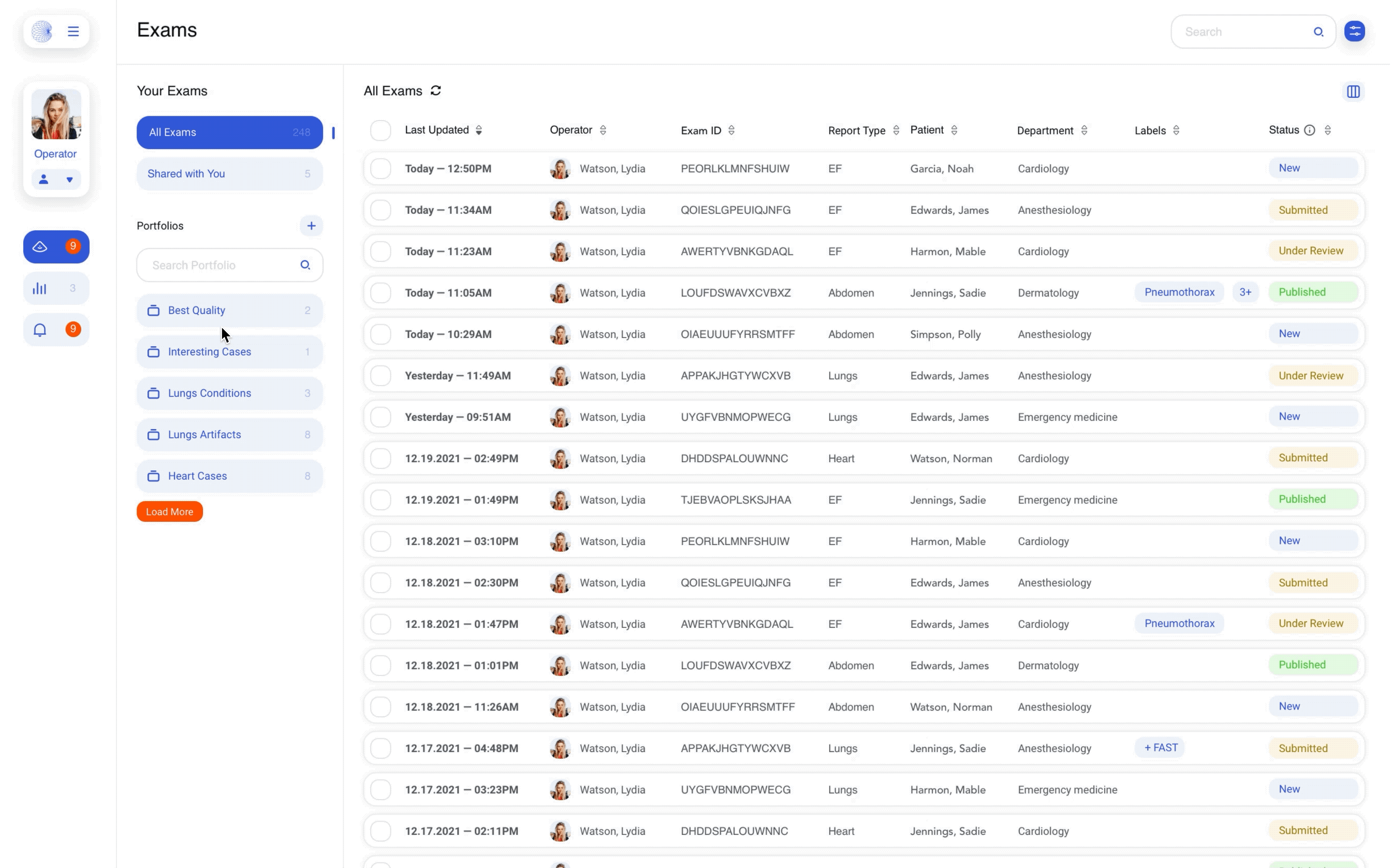
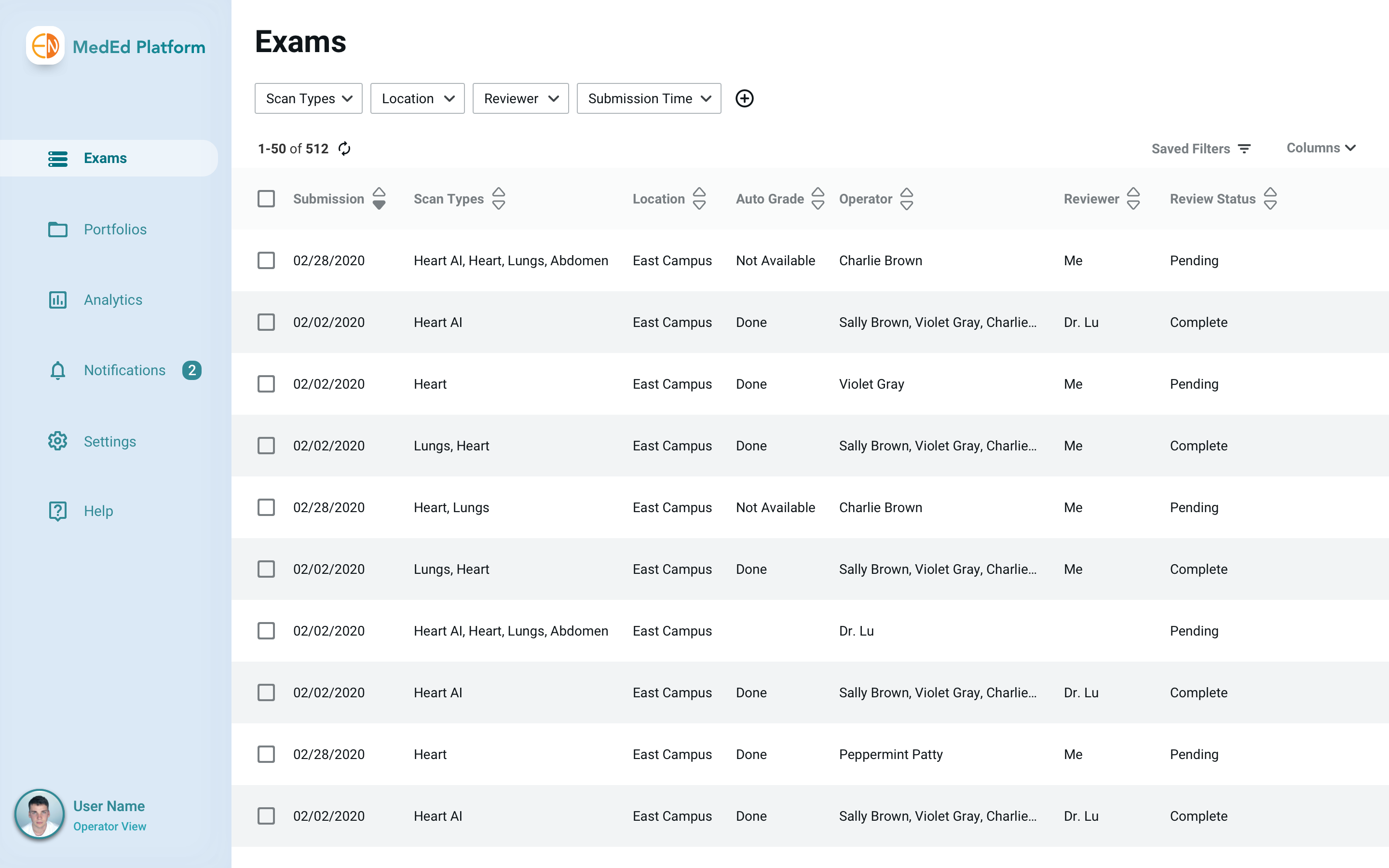
KOSMOS UP
Supporting clinical exam management.
Project Type: |
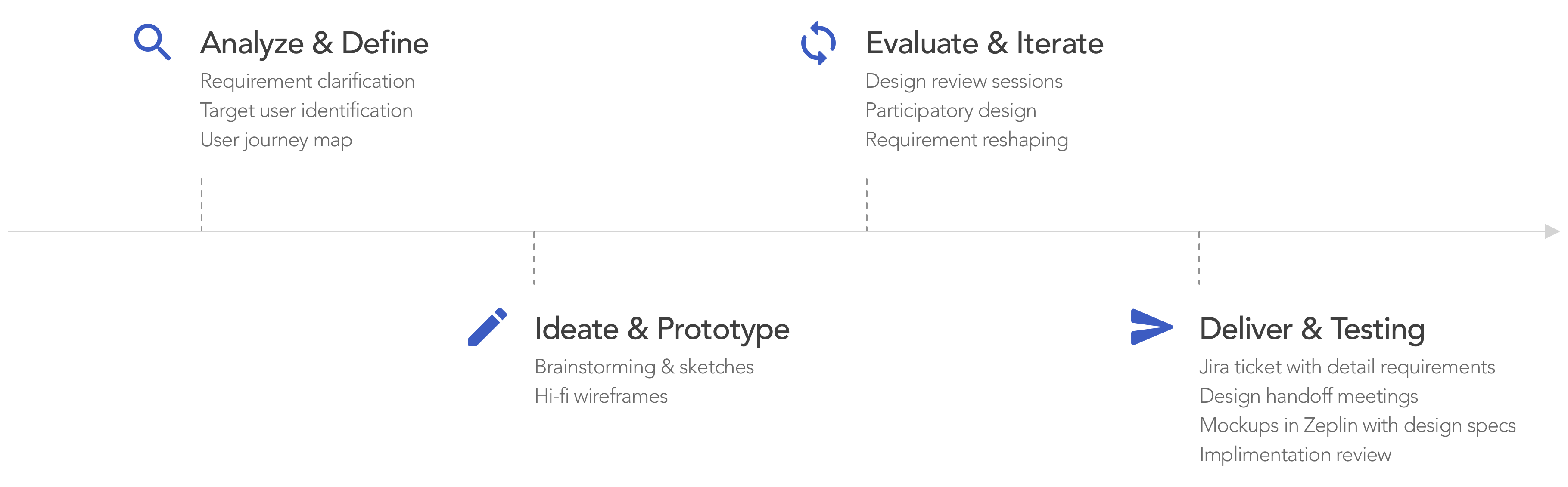
Design at EchoNous |
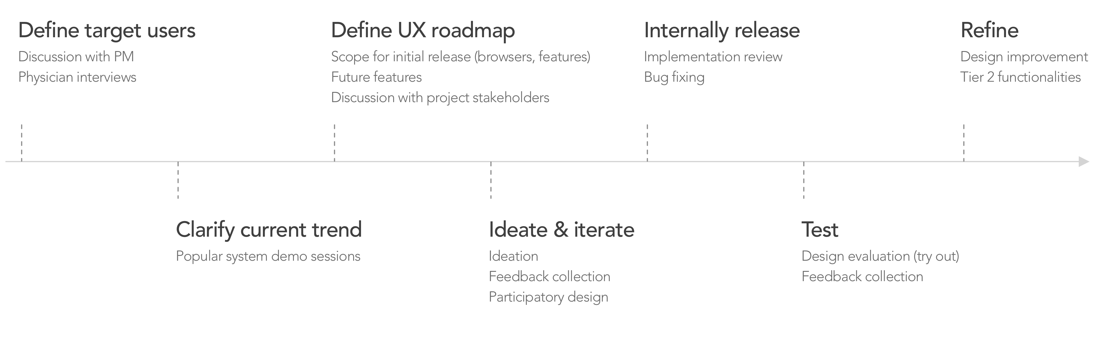
Duration: |
Feb. 2021 – Apr. 2022 |
Members: |
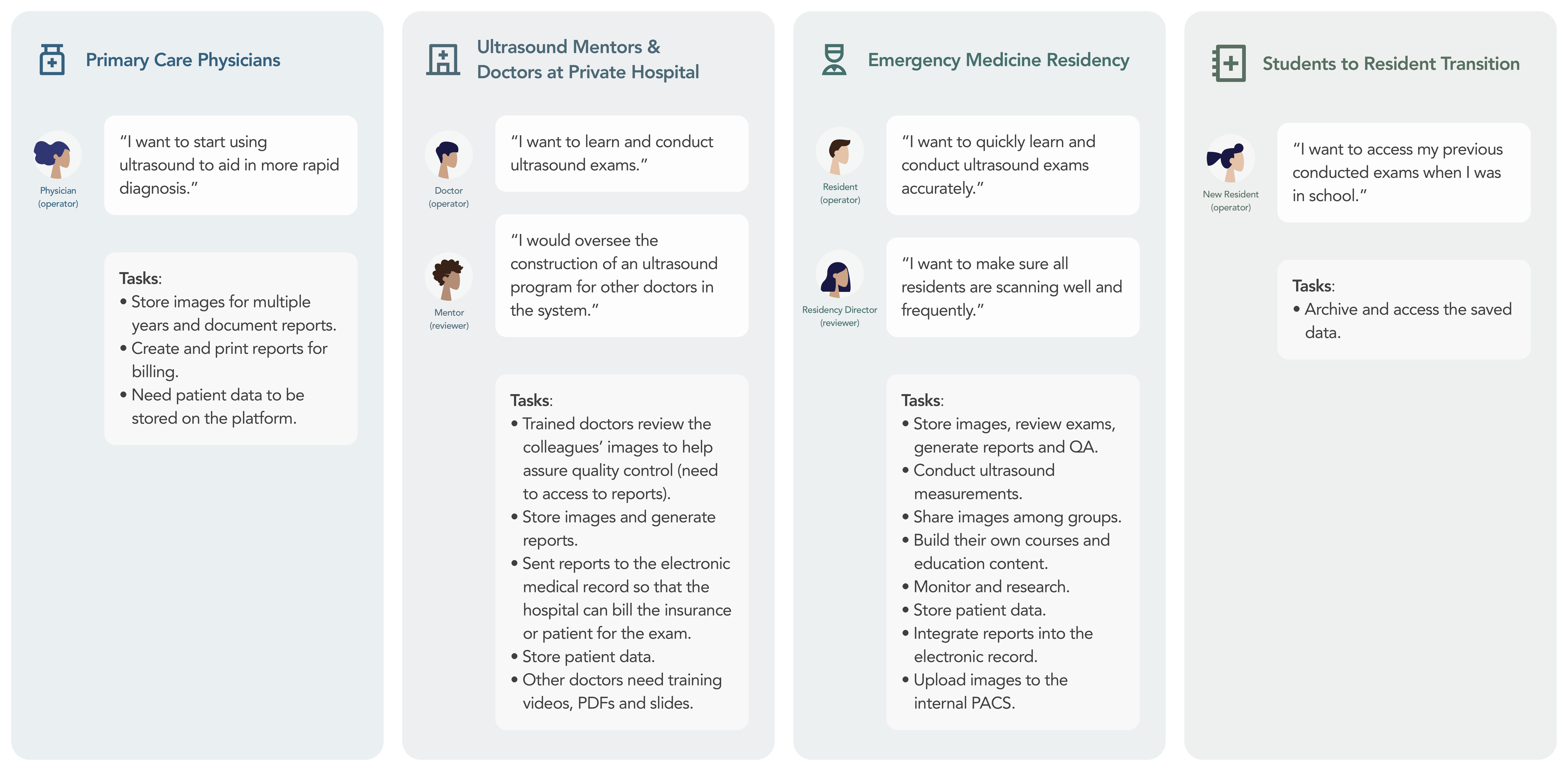
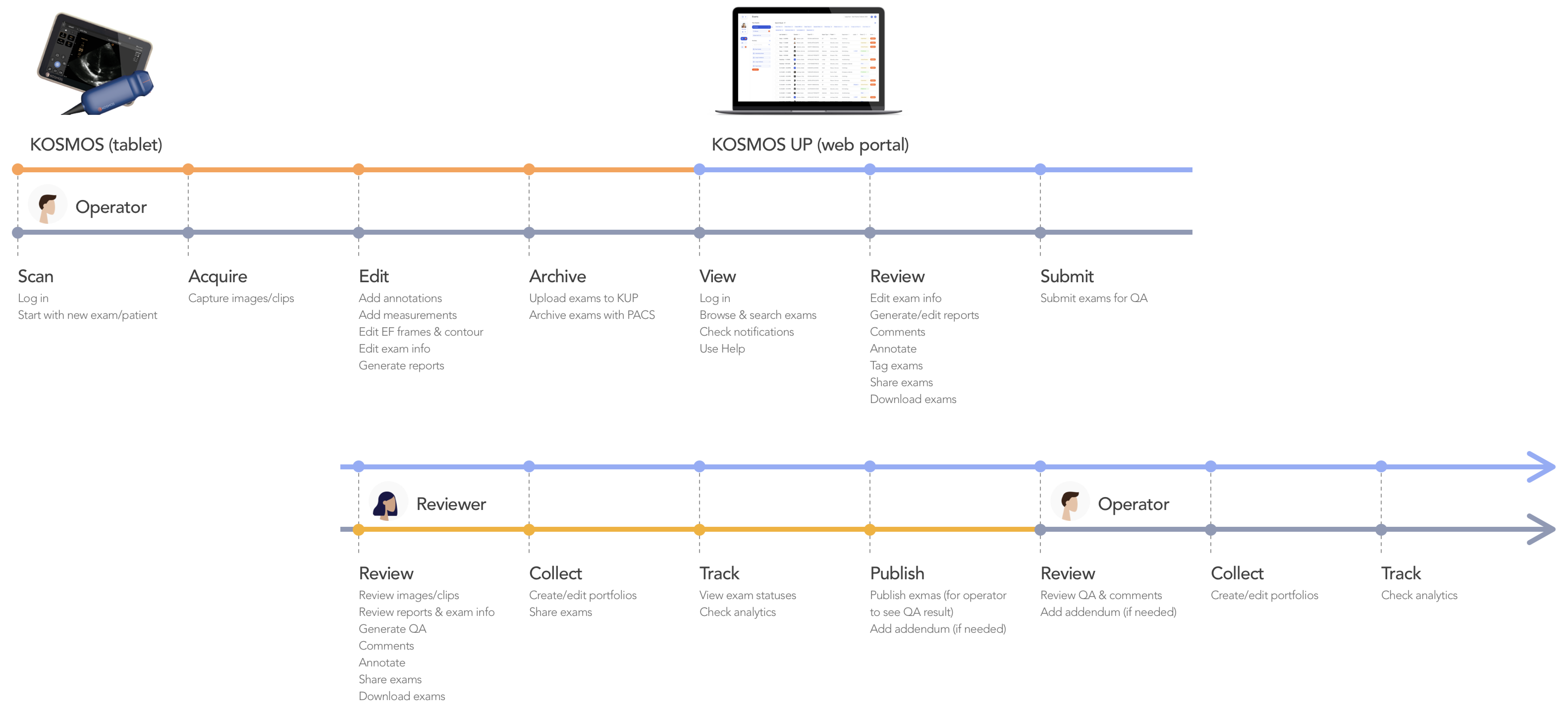
2 designers, 6 engineers, 1 PM, 8 physicians |
My Role: |
UX design lead, co-working closely with other UX and UI designers, PMs, and project stakeholders. |
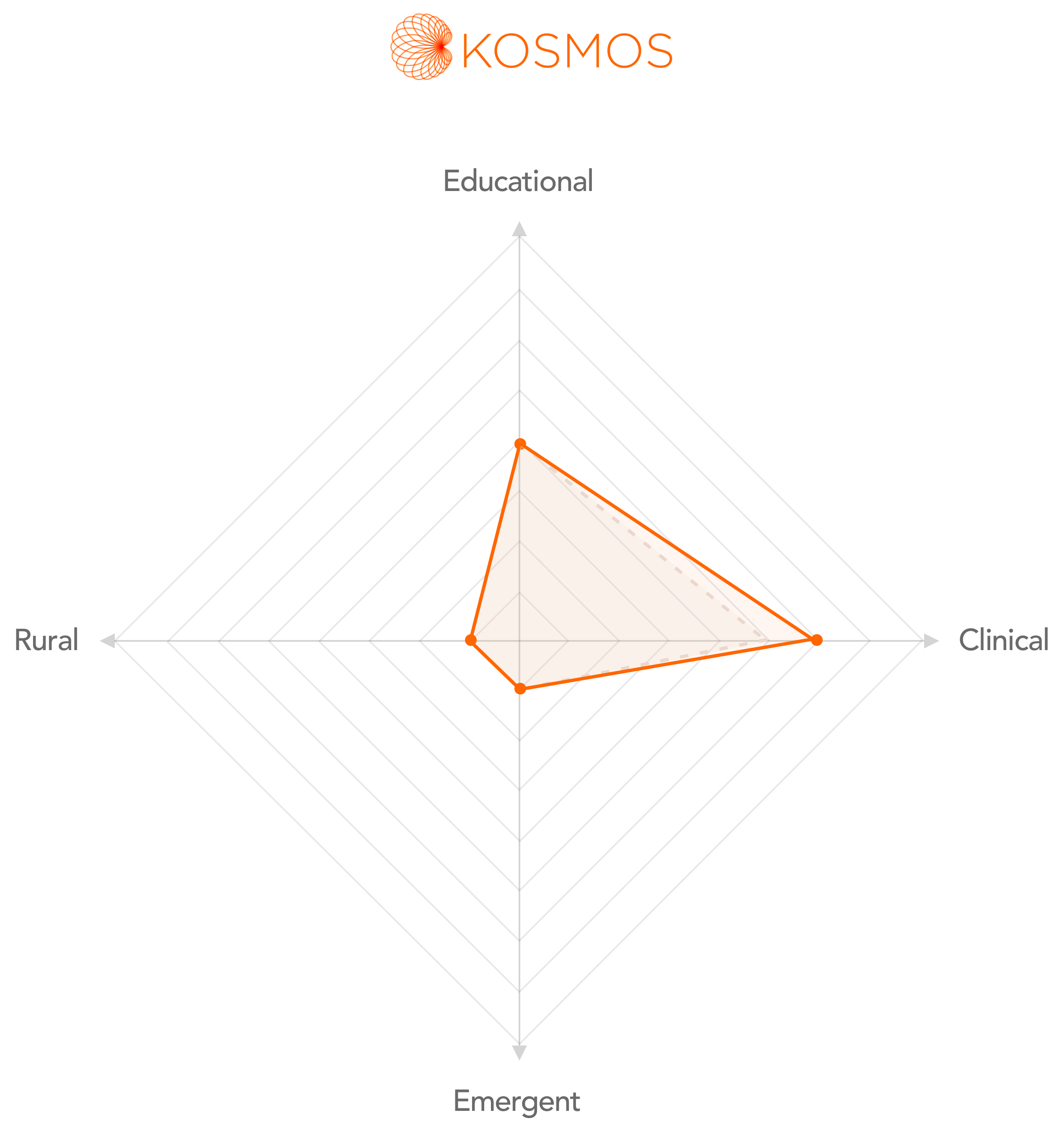
Impacts: |
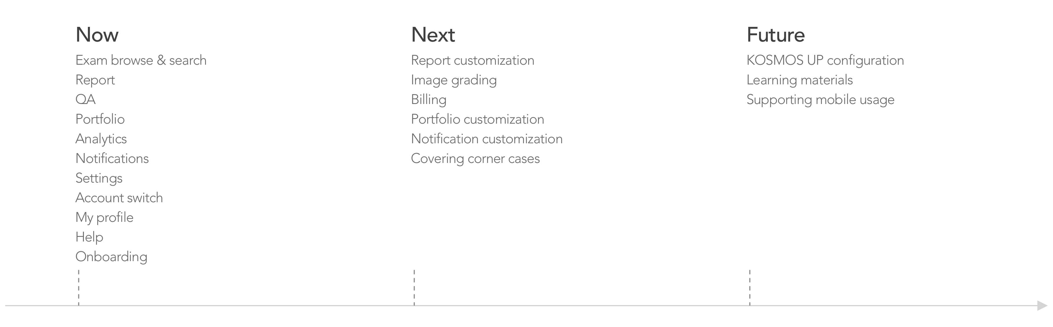
Expanded into the clinical market, extending services from medical students to physicians in clinics and teaching hospitals. |