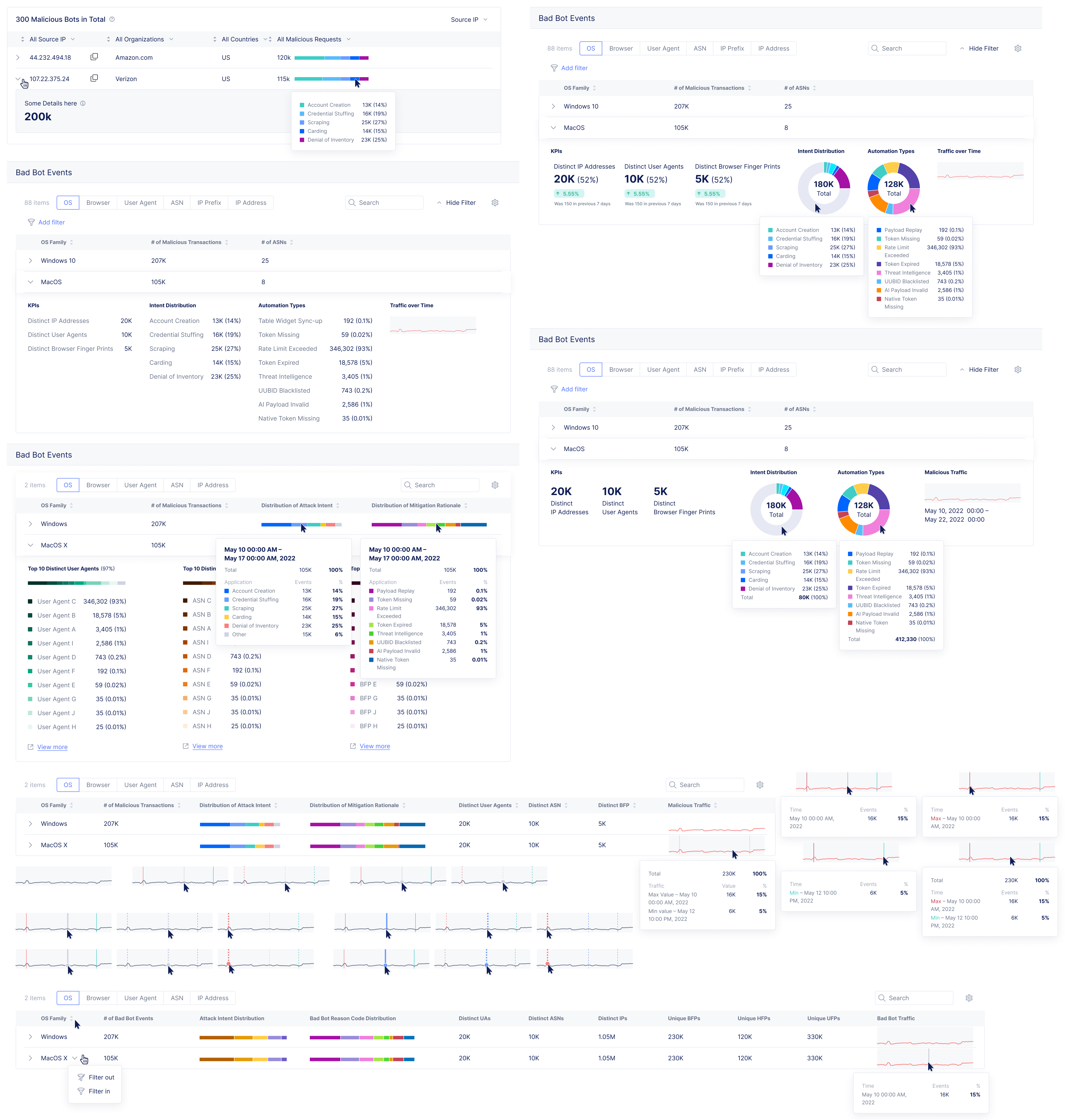
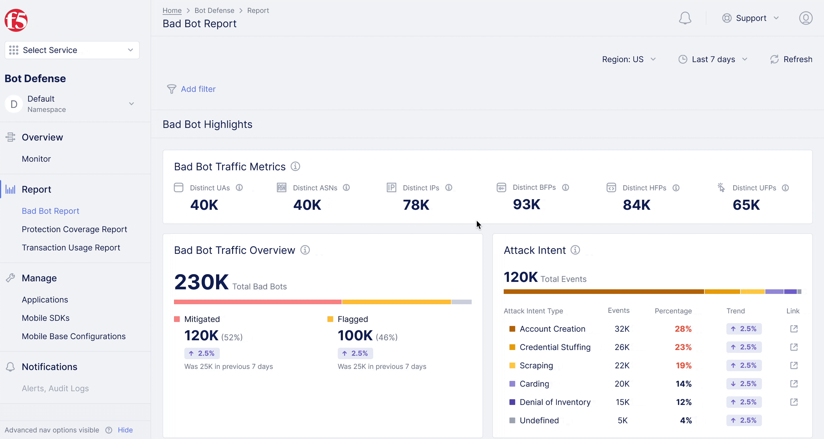
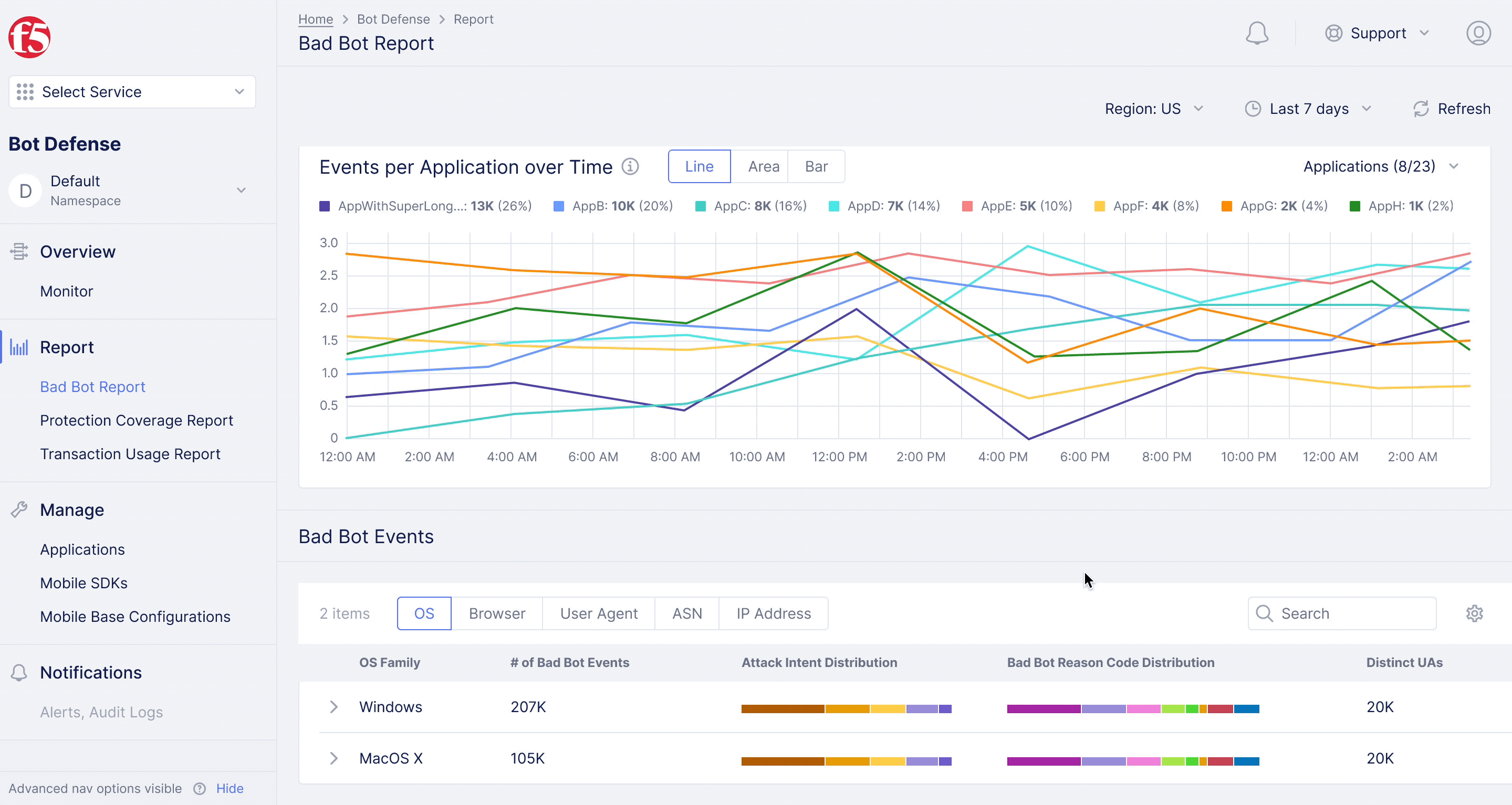
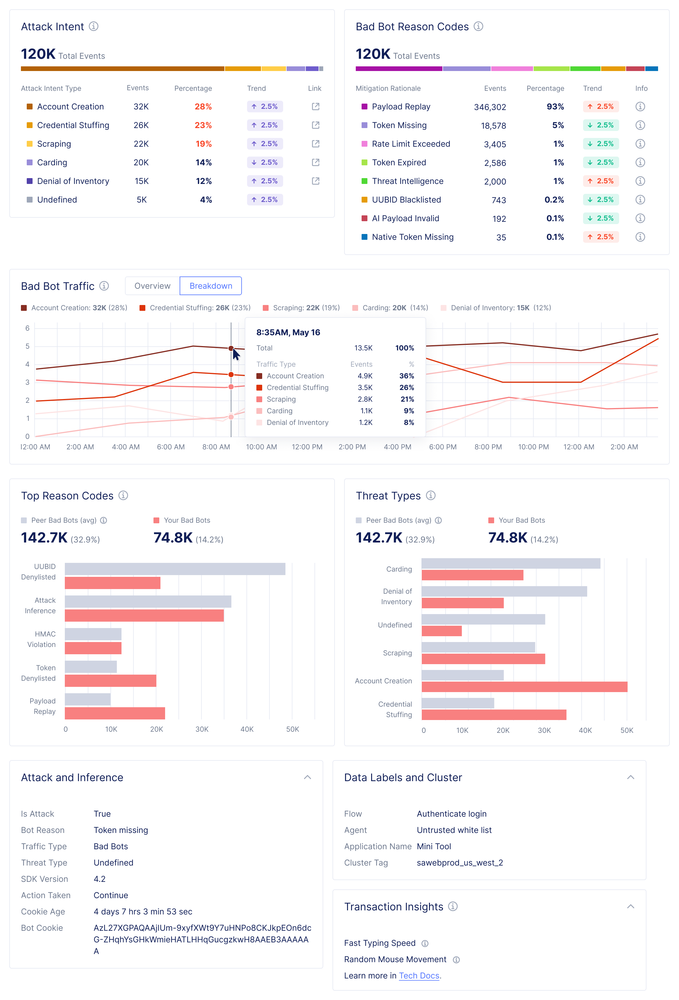
Bad Bot Report

Diving deeper into analytics for bot defense.

Project Type:

UX Designer at F5

Duration:

Sep. – Oct. 2022, Jan. – Mar. 2023
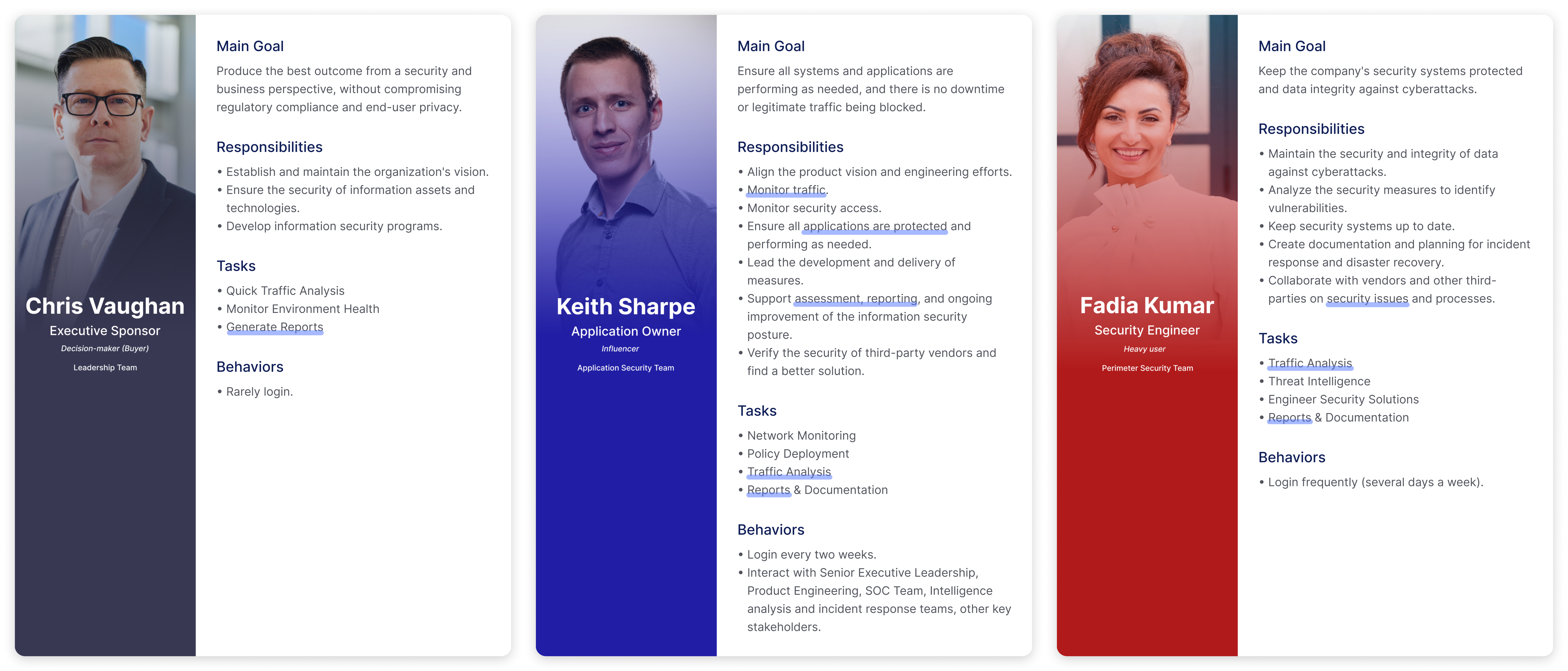
Members:

5 designers, 7 developers, 1 PM, 3 data scientists, 1 data visualization engineer, 2 security support engineers, 1 solution architect, 1 consulting manager, 2 technical account managers

Practice Areas:

UX design, information architecture, interaction design, information visualization

My Role:

I served as a UX designer and co-worked closely with PM and multiple project stakeholders.

Project Vision

F5XC (Distributed Cloud) is a SaaS-based security, networking, and application management console, on which Bot Defense is one of the workspaces that is migrated from the Shape Protection Manager (SPM) which could identify and mitigate malicious bots to protect Internet applications from automated attacks. During the migration, we came up with a new service roadmap, aiming to fix the information overload and inefficient presentation issues, and improve the UX with self-serviceability and operation efficacy. Reports are the new sections that we came up with to support application owners (AOs), and security engineers to efficiently take a deep dive as the first step of making policy configuration decisions. One of them is the Bad Bot Report, which focuses on bad bot traffic analysis and the intent behind attacks.

Challenges

Navigate through ambiguity and iterate design to meet changing requirements due to user needs and tech constraints gathering along the way.

Present complex data in a logical, readable, digestible, and intuitive way for users.

Follow the existing design patterns to achieve consistency but meanwhile innovate new patterns to support new functionalities and improve user experience.

Bad Bot Report Overview

Design Process

Design Process

Project Goals & Design Requirements

Clarify target user goals, workflow, pain points, and define project scope.

Bot Defense protects Internet applications from automated attacks. It identifies and mitigates malicious bots using telemetry collected from web and mobile endpoints, and applies configurable mitigation actions to block or redirect harmful traffic before it reaches the application. It has been migrating from the SHAPE Security Platform (SPM) to the F5XC console (to enable users to access multiple services through a single pane of glass) with the improvement of information architecture, data organization and presentation, and functionalities to support better self-serviceability.

Service Migration & Improvement

We envisioned an improved Bot Defense service, informed by our user journey study on 3 persona types, feature benchmarking, and competitive analysis.

Feature Benchmarking

With the above, we created an integrated user journey starting with the onboarding stage, including account and configuration setup, threat briefing, and next, checking out the data summary and diving deeper to gain more insights. Later, users could review reports for particular use cases, investigate events, and configure policies to mitigate the threats.

User Flow and Roadmap

I own the design of the Reporting and Investigation journey within the service, primarily targeting Application Owners and Security Engineers. These users frequently monitor and analyze traffic, manage reports and documentation, and rely heavily on dashboard and report pages.

Bot Defense Personas

Our customers needed visibility not only into traffic from malicious bots but also the underlying intent of the attackers behind them. While we positioned Bot Defense as a solution for security use cases like "Credential Stuffing" and "Content Scraping," these scenarios were conspicuously absent from the customer experience. To bridge this gap, we developed the Bad Bot Report – designed to surface malicious traffic, reveal attacker intent, and provide clear mitigation rationales for users.

Design Challenges & Iteration

Propose new layouts, info architecture, data presentation, and its interactions.

Through recurring meetings with PMs and subject matter experts (SMEs), I clarified customer needs and requirements throughout the design iterations. I also leveraged Maze to gather feedback from over 20 SMEs, which informed decisions aimed at making the information presentation more logical, readable, and digestible. Below are the key challenges faced during the information visualization and interaction design process:

Layout Iteration
Number 1

To help users quickly browse and focus on key information, I proposed organizing the content into clearly defined sections. The page was designed to address user needs by including insights such as changes in trends, percentage distribution across flows and endpoints, breakdown of actions (e.g., monitored vs. mitigated bad traffic), and distribution of malicious traffic by protected application. Based on these topics, we divided the page into three main sections: highlights (overview and summary), traffic trends, and event breakdown. The highlights section was placed above the fold for immediate visibility. As SMEs contributed more data and we gathered feedback from customers, I iterated on the widgets (infographics and data visualizations), and explored various layout options to ensure a logical, easy-to-digest reading flow.

Traffic Overview Iteration
Number 2

In the highlights section, our goal was to give users a clear overview of traffic activity. Initially, I considered showing a comprehensive traffic breakdown across all types, including total volume, percentage distribution, trends, and a 7-day comparison. However, based on feedback from SMEs, I narrowed the focus to highlight only bad bot traffic to align the content more closely with the report’s core topic and helped users concentrate on the most relevant data. I also explored various layouts, visualization styles, and typography choices to present the information more effectively and enhance readability. Lastly, we added an “Unknown” category (alongside “Mitigated” and “Flagged” traffic) to better reflect the actual data landscape and maintain transparency with users.

Reason Code Iteration
Number 3

In addition to the traffic overview, we aimed to provide users with a broader context by grouping and categorizing flow labels to reveal not just that traffic originated from malicious bots, but also the intent behind those attacks. Ideally, the interface would show different attack intents observed on an application, their prevalence, and trends such as changes in directionality and velocity over time. We began with a tagged traffic breakdown infographic, which later evolved into a more focused representation of attack intent and mitigation rationale. As part of this iteration, I replaced the donut chart with a distribution bar chart to improve readability and optimize space usage. I also explored several enhancements, including brief explanatory text, links to reference material (e.g., OWASP Automated Threats to Web Applications), percentage visualizations, trend indicators, and suggested actions. Design iterations also addressed visual emphasis, color harmony, and accessibility (color blindness considerations).

App Selection Iteration
Number 4

In the traffic trends section, one of our goals was to help users easily understand event patterns across applications over time. There was internal debate about whether to prioritize percentage or absolute event counts, so I proposed a new tooltip design that displays both metrics, along with a total summary for added context. For application selection, I explored several interaction options to improve usability. These included displaying separate lists for available and selected apps, showing event counts and percentages within the dropdown, pre-selecting the top 10 apps by default with a “Reset to Top 10” option, and supporting a “Clear All” function. I also ensured users were informed about how many apps were available and how many had been selected, set a maximum selection limit, and added a reminder message prompting users to select at least one app when none were chosen.

Transactions Data Grid Iteration
Number 5

For the traffic breakdown of transactions, we grouped data by patterns and explored multiple presentation methods. This included using a data grid and accordion layout, where each row displayed summary KPIs, and expanding it revealed top data points. I experimented with different typography styles to enhance clarity and hierarchy. In the detailed view, KPIs were sorted from highest to lowest, helping users quickly understand the percentage occupied by the top ten items, with the option to view the full dataset in a secondary layer.

I also explored various visualization types to improve data presentation, ranging from donut charts to distribution bar charts, aiming to enhance readability and make more efficient use of space. For line charts, I focused on improving clarity by making lines bolder and highlighting key data points such as the maximum and minimum values. Additionally, I proposed an improved tooltip design that summarized the total count, along with event numbers and percentage shares. Throughout the iteration process, we dedicated to help users access richer insights in a more concise and easily understandable format.

Final Design

Demonstrate the final version of Bad Bot Report.

In the later stages of the project, I collaborated closely with the design system team to review and refine all visual details of the infographics and data visualizations. I also partnered with the development team through a formal TOI (Transfer of Information) session and multiple follow-up discussions to ensure the design was fully understood and could be implemented smoothly.

Below are the hi-fi prototypes of the Bad Bot Report design:

Highlight
Number 1

Starting with the highlight section, users can quickly review key metrics, top attack intents, and mitigation rationales (reason codes) for bad bot traffic within a specific region and time period.

Trends
Number 2

Scrolling down, users can explore traffic trends broken down by different categories. They can switch between different visualization types based on their needs, narrow the time range, and filter data by specific applications right in the widgets.

Events
Number 3

Lastly, transaction details can be viewed with different groupings, allowing users to uncover insights and patterns from the top items in each category.

Impacts

Present malicious traffic trend and bridge the gap for product.

With the new report, we delivered not only traffic analysis of malicious bots but also valuable insights into the attackers' underlying intent. The project also helped bridge the gap between marketing and product by aligning messaging with technical capabilities.

As the first report of its kind, we demonstrated the ability to identify and present attack intent by tagging each transaction based on page purpose and bot signature. This laid the foundation for a broader view of high-level trends driven by intent – such as the types of attack intents observed on an application, their prevalence, and how their patterns and distributions shift over time. This approach sets the stage for more advanced data presentation and filtering features to be offered to customers in future iterations.

Attack Intent Related Widgets in Bot Defense

Reflection

Limitation

Only tier one data was presented.

Encounter design pattern constraints include widget types, data grid presentation, color usage, etc.

Next Step

Provide further data analysis for each transaction.

Support configurable or even customizable reports.

Refine design patterns alongside feature iterations.

What I Learned

Involve data scientists and visualization engineers early in the feedback loop to ensure the feasibility and accuracy of the design.

Collaborate closely with the design system team to propose new design patterns and improve overall functionality.