Shard

Streamlining design workflow.

Project Type:

Mastery course

Duration:

Feb. – Apr. 2019

Team Size:

3 members

Practice Areas:

User studies, UX design, information architecture, interaction design, visual design, usability evaluation

My Role:

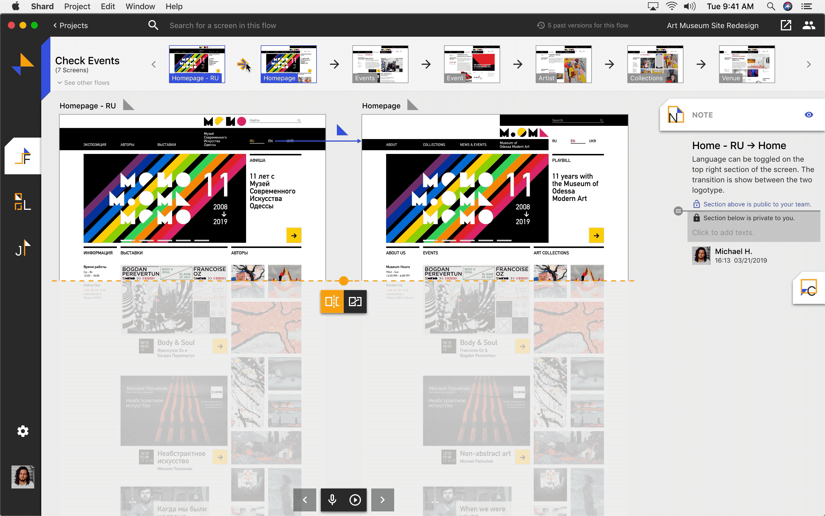
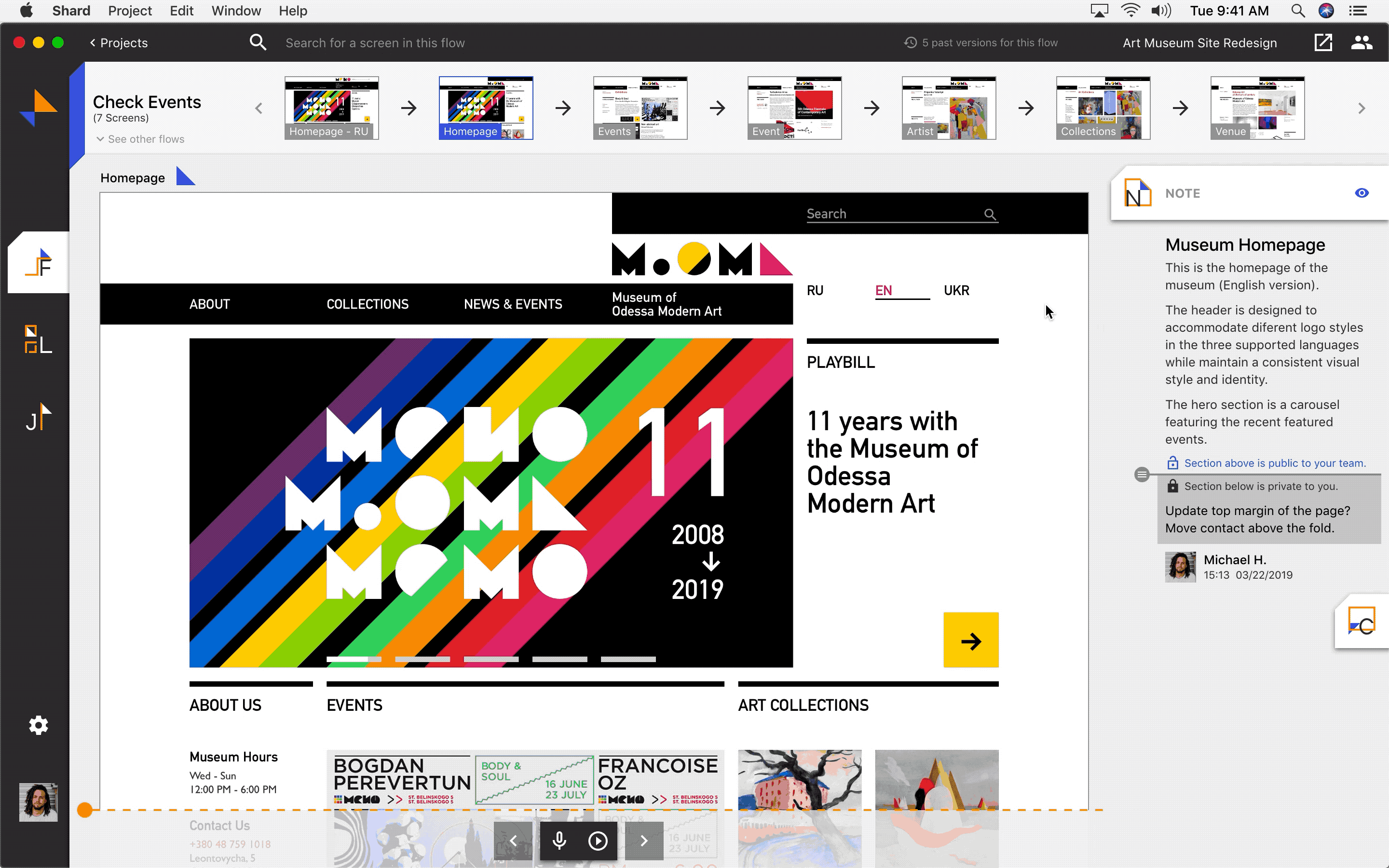
I served as both designer and researcher, mainly focusing on info architecture, design guide, and interaction part of Flow and Comment features.

Project Vision

Shard is a web-based design cooperation tool with plugins of design tools to support efficient cooperation for design teams. With the needs of an effort-saving design documentation process and efficient design presentation to stakeholders, Shard aims to streamline collaboration, communication and documentation as projects iterate.

Challenges

Support easier transforming ideas and feedback into presentable design rationales.

Provide a seamless way of showcasing design details and interactions.

Make design progression more accessible to stakeholders.

Shard Overview

Design Process

Design Process

User Studies & Competitive Analysis

Need sufficient support in interaction presentation and final documentation.

Based on literature review and our observation, information integration, design documentation, and design presentation among designers and project stakeholders were challenging. To have a better understanding of user needs and pain points, we interviewed and surveyed UX professionals, and conducted competitive analysis on collaboration, communication, and note-taking tools. We utilized an affinity wall and got 6 key findings in design collaboration and documentation:

Research Affinity Wall
Task Icon

Designers had four main documentation types: running list of tasks, meeting notes and logs, design files, and final documentation. They thought documentation had intended audience.

Face Icon

People preferred face-to-face verbal communication.

Document Icon

Static documentation was hard to be updated along with an iterative process, and the production of final documentation was painful.

Chat Icon

Existing tools could not support efficient transfer of information and multimedia among various channels.

Design Icon

Efficient presentation of user flow and interaction design on hand-off & presentation tools were needed.

Folder Icon

Documents were hard to be found after project wrap-up.

Design Requirements

Construct requirements based on user needs and give them three different importance ratings.

Following the above research findings, we tried to match user needs with our project prospect and developed 7 main requirements. With our internal discussion and voting, we prioritized the most important ones as our MVP in this stage:

Encouraging documentation in an early stage (Must have – MVP)

Providing guides for documentation (Must have – MVP)

Supporting multimedia usage in documentation especially visual elements and actual design (Must have – MVP)

Making the documentation process iterable (Must have – MVP)

Streamlining the process of transforming informal notes into formal documents (Should have)

Providing ways to digitize notes gathered from face-to-face meetings (Should have)

Accommodating different styles of documentation (Nice to have)

Further Analysis

Clarify user workflow and determine our market position.

In order to have a whole picture of how our product could support designers' workflow and bridge information gap, we utilized a user journey map and an information flow.

User Journey Map & Information Flow

We also used a value proposition to identify the market needs, pain points, pain relievers, and the benefits we could bring to users.

Value Proposition

Design Concepts

Streamline workflow by transforming documentation into presentable materials accessible for project stakeholders.

With the above analysis, we narrowed down the project scope, focused on the MVP requirements and developed four main design concepts:

Easier documenting ideas and feedback and transforming those into presentable design rationales later.

Making design progression more accessible to stakeholders, thus facilitating easier feedback back and forth.

Providing a seamless and lossless way of showcasing design details including user flow and interactions, and allowing them to be automatically updated as design iterates.

Creating a timeline for team members to keep track of design changes and progression.

Product Features

Design Features

Focus on five key features on two platforms.

We also discussed what features to provide for users through which platforms, and gave different priorities to them:

Features on Design & Communication Tools

Note (+Integration) (Must have)

Flow (+Demo) (Should have)

Features on a Standalone Platform

Note (Must have)

Comment (Must have)

Flow (+Demo) (Must have)

Journal (+ Daily Prompt) (Should have)

Library (Nice to have)

Design Decisions

Tackle the most painful issues professionally.

With a clear project direction, we planned to move on to the design prototyping and iteration stage. Before that, we discussed our product position and made three important decisions:

Prioritizing Documentation & Presentation

Prioritizing Documentation & Presentation

From our user and market studies, we learned that design documentation and showcase were the most painful parts for designers in their workflow. Therefore, with limited time, we chose to focus more on providing pain relievers in these two parts.

Nondistracting & Engaging Experiences

Nondistracting & Engaging Experiences

We identified our product as a cooperation tool, aiming to support smooth workflow for design teams. Therefore, we tried to create a comfortable working space with nondistracting and engaging experiences for design team members.

Robust & Savvy Style

Robust & Savvy Style

We hoped users would feel our product trustworthy, robust, and savvy, so we applied a sharper visual style, and borrowed some visual and interaction design ideas from Material Design guideline.

Ideation & Prototypes

Update info and design from other tools to the standalone platform – Shard, and collect feedback from it.

Keeping the above decisions in mind, we started doing wireframes and prototypes to demonstrate how we could integrate design tools and communication tools (Sketch and Slack as examples) with our standalone platform – Shard to support information integration, design presentation, and design documentation by providing features such as Note, Comment, Flow, and Demo.

Below are some key screens with the key features iterated for several rounds:

Shard Wireframes

In design tools, designers could create user flow and voice record explanations for the design. They could also take notes and import information from communication tools. The design and relevant information could be updated to Shard for other stakeholders to view and give feedback.

In the hi-fi prototyping stage, we focused more on the design of Shard. We borrowed the design style of Material Design and created our own design guide.

Evaluation & Refinement

Ensure intuitive interaction of Note, Comment, and Flow features focusing on Shard.

We walked through mid-fi wireframes and hi-fi prototypes with target users to collect feedback from them. Below are key changes we made focusing on design documentation and presentation features on Shard – Flow, Note, and Comment.

Note Feature
Number 1

We found that designers needed a place to document private notes. Therefore, instead of complicating Note by adding extra settings or spaces, we added a handle for them to control private and public part of their notes.

Note Feature
Number 2

Users pointed out that they wanted to see the corresponding part of a comment, so we allowed people to mark the part of the design for other people’s reference.

Note Feature
Number 3

We tried to support a better presentation of interaction design by adding a toggle for users to shift between a comparison view and a transition view.

Note Feature
Number 4

Users may need to compare the current version design with a previous one, so we refined Journal and added this history feature in Flow to make it more convenient to check out the latest versions.

Note Feature
Number 5

We learned that project stakeholders did not need to see all the artboards at one time, and they preferred to see a larger view for design demo, so we modified the demo view based on their preference.

Hi-fi Prototypes

UX Specification & Realization Plan

Utilize prototypes, design style guidelines, and interaction maps to support smooth cooperation.

Along with design iteration, we created a branding style guideline, typography, color palette, different system states and a component library for Shard. The logo and the name of the application were chosen based on our potential users’ feedback. The sharp triangles represent common elements in design tools such as “pixel” and “grid.” They can also be viewed as different roles of a team. The two triangles’ touch point reflects our goal of bridging the gap.

Shard Wireframes

We chose blue as action color for it provides a sense of stability and professionalism, and good contrast on both light and dark mode interface. Orange was picked as the secondary color because it complements to blue and adds a more active vibe to our product. Besides branding colors, we made sure all used color combinations pass the WCAG AA standard.

Shard Wireframes

We also created interaction logic and interaction map to support better communication and smooth design delivery.

Shard Wireframes Shard Wireframes

Reflection

Limitation

Shard may have limitations in serving all types of cooperations within all types of design teams.

We focused more on serving digital products with traditional interaction design, so cutting-edge interaction design such as voice and gesture interaction was not covered.

Next Step

Complete "should have" and "nice to have" features.

Collect feedback from various roles of design teams to ensure that our design meets the different needs of stakeholders.

What I Learned

Clarifying both market opportunities and user pain points could help us understand what values to emphasize, better narrow down the project scope, and prioritize features to focus on.

Creating a design guide is super helpful for designer cooperation in one project, and ensuring consistency across design pieces.

Effectively using typography and colors is crucial to creating nondistracting and engaging experiences.