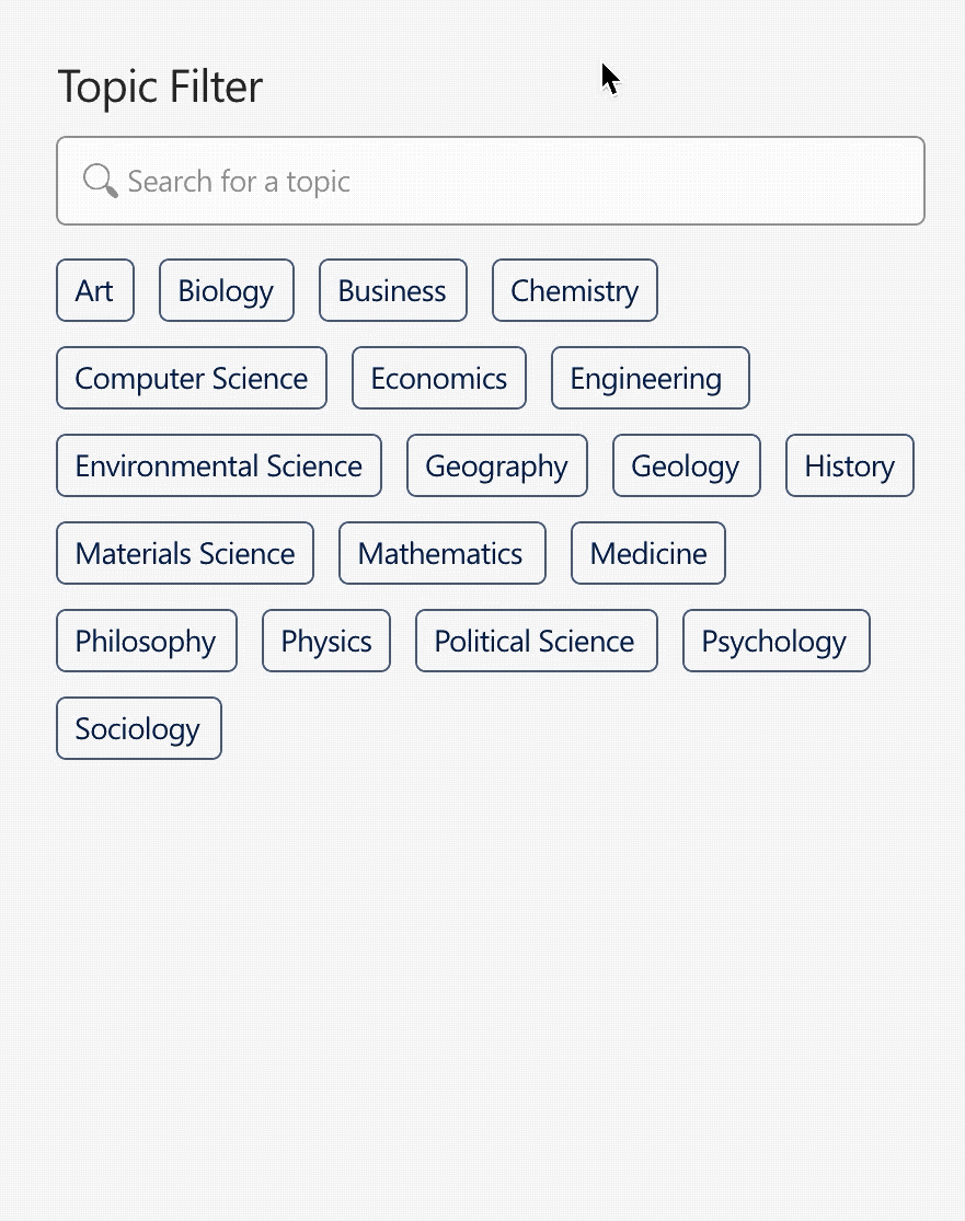
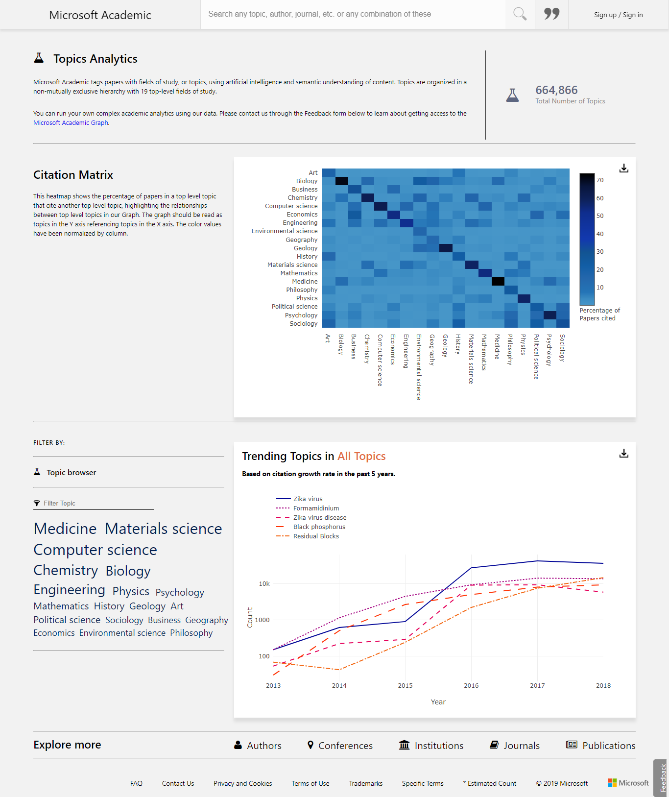
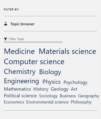
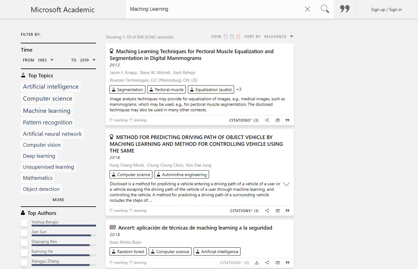
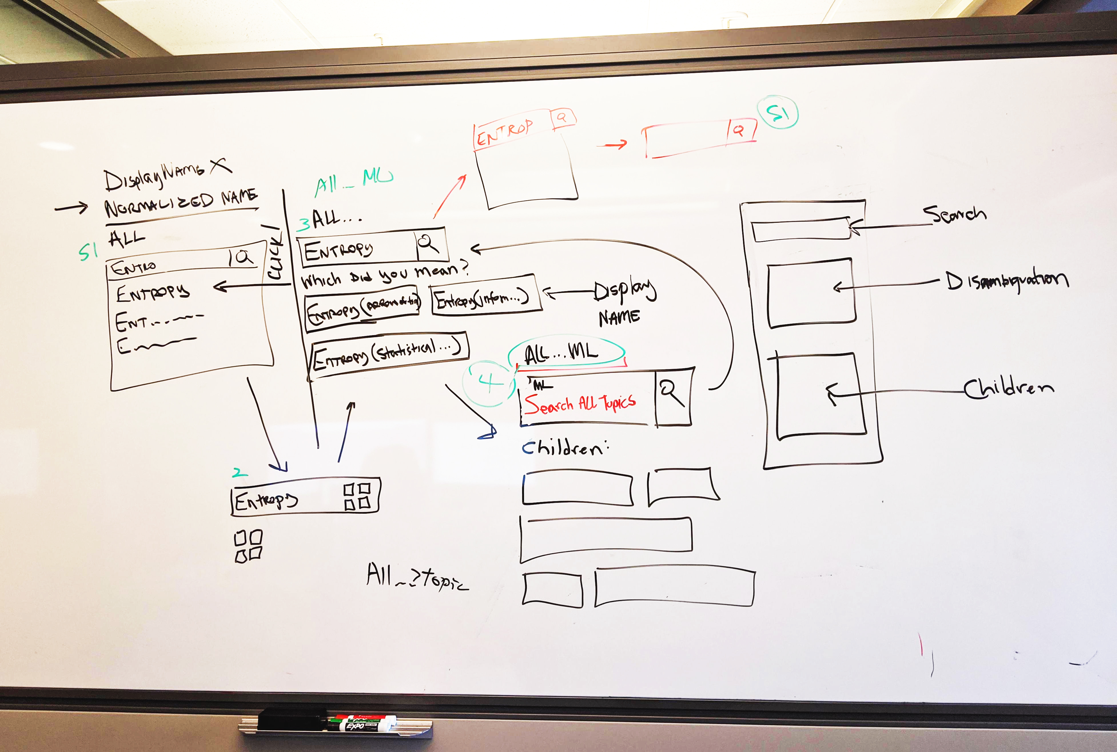
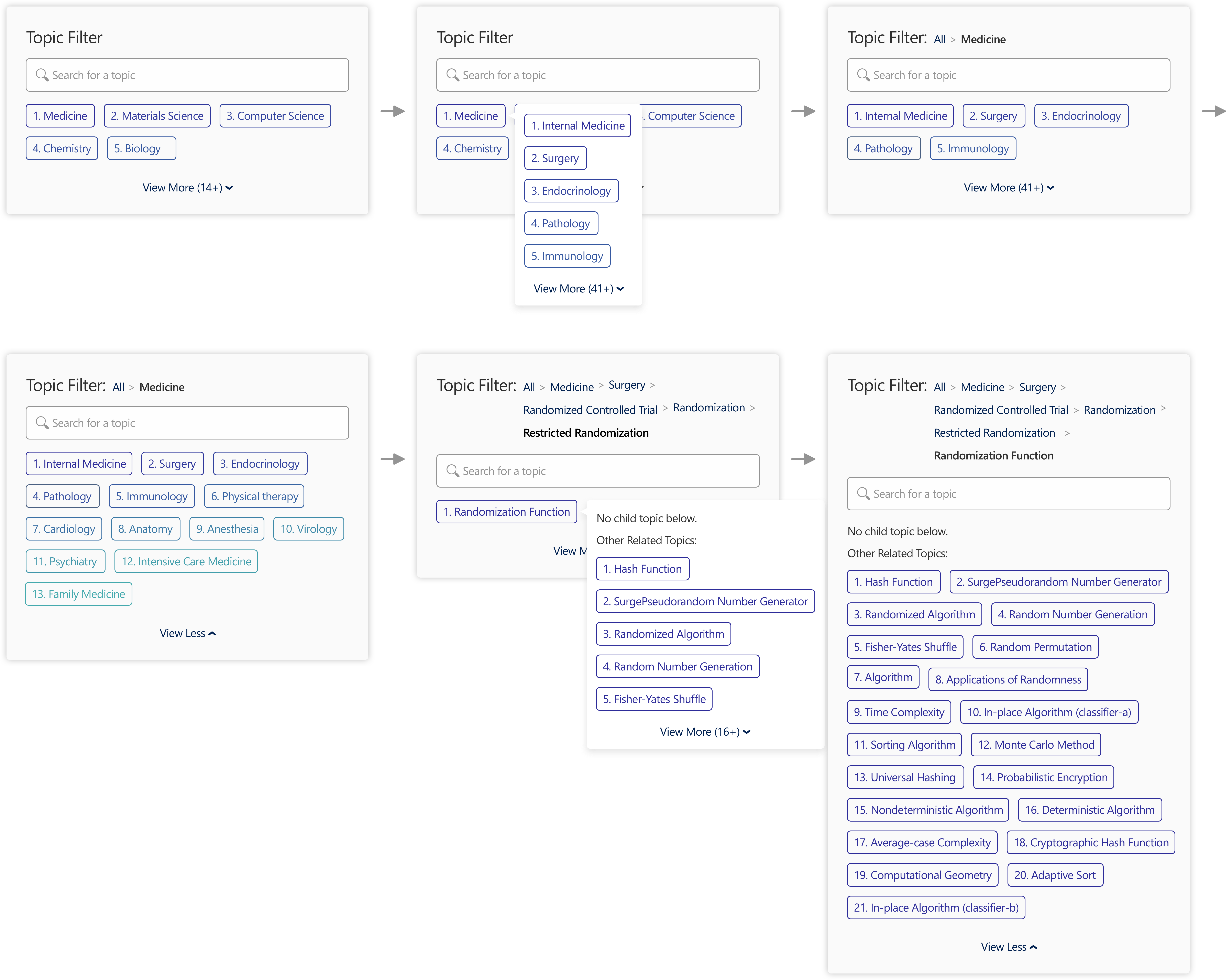
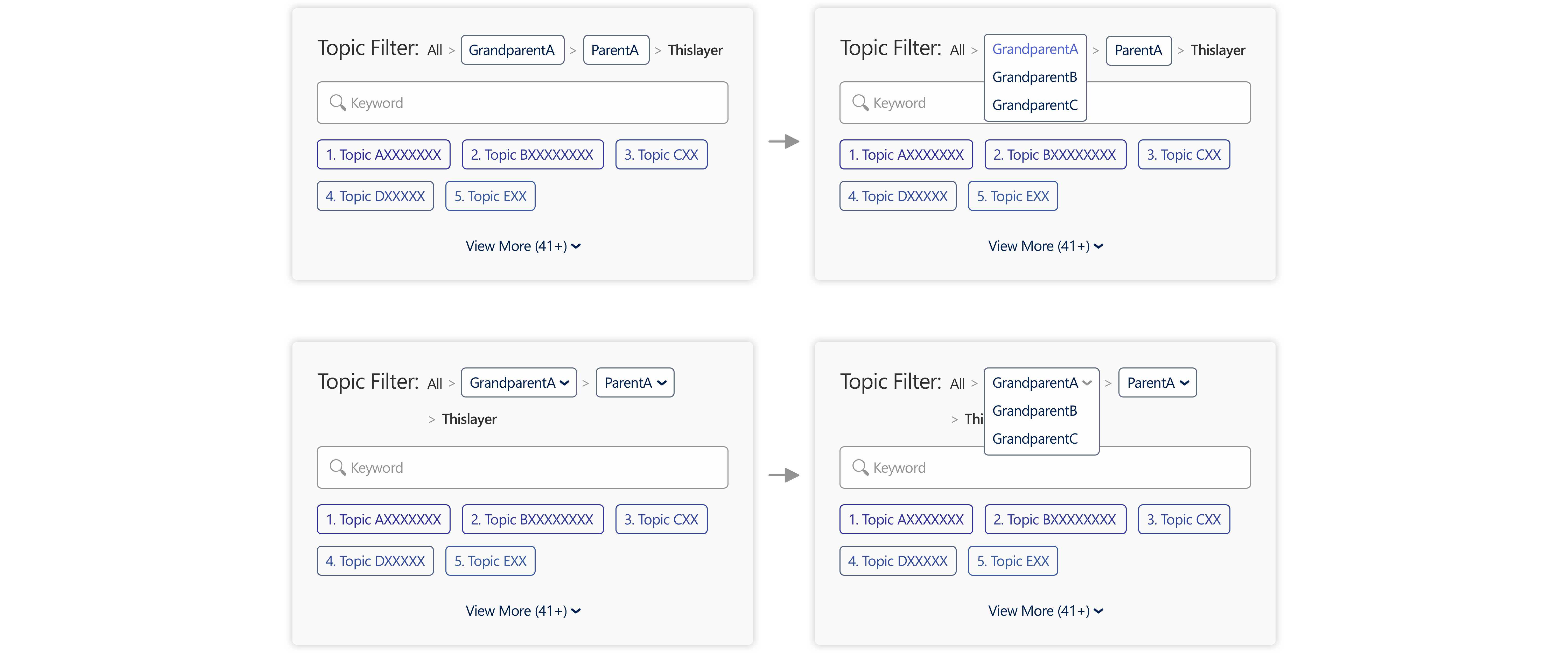
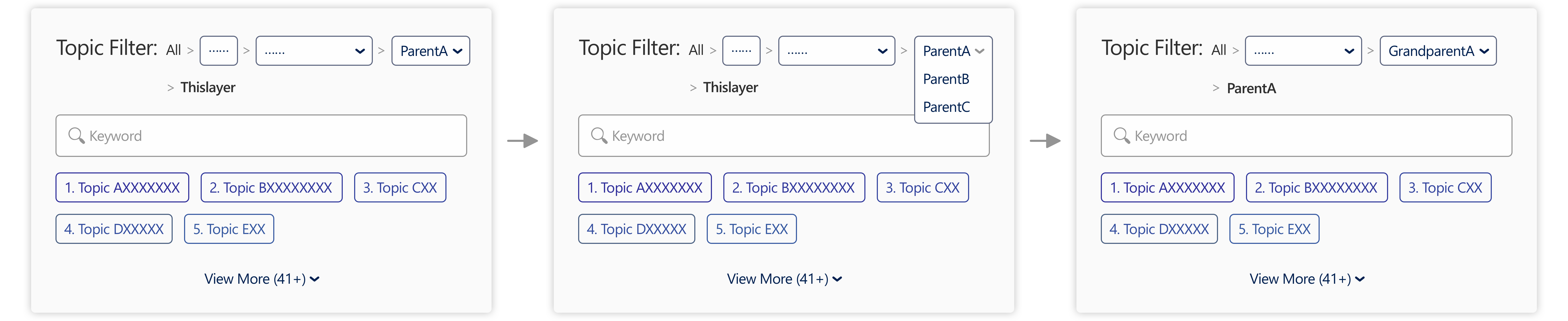
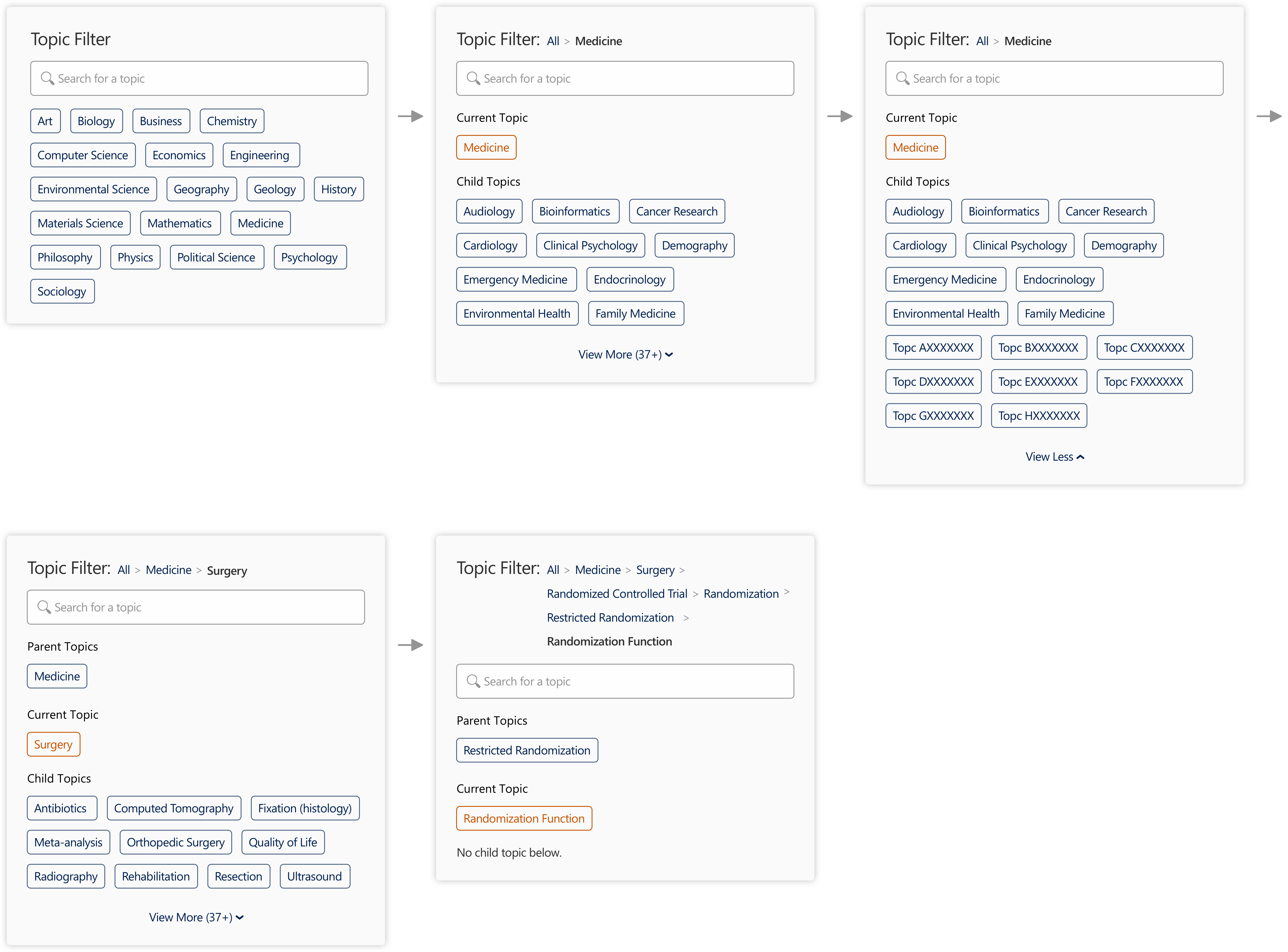
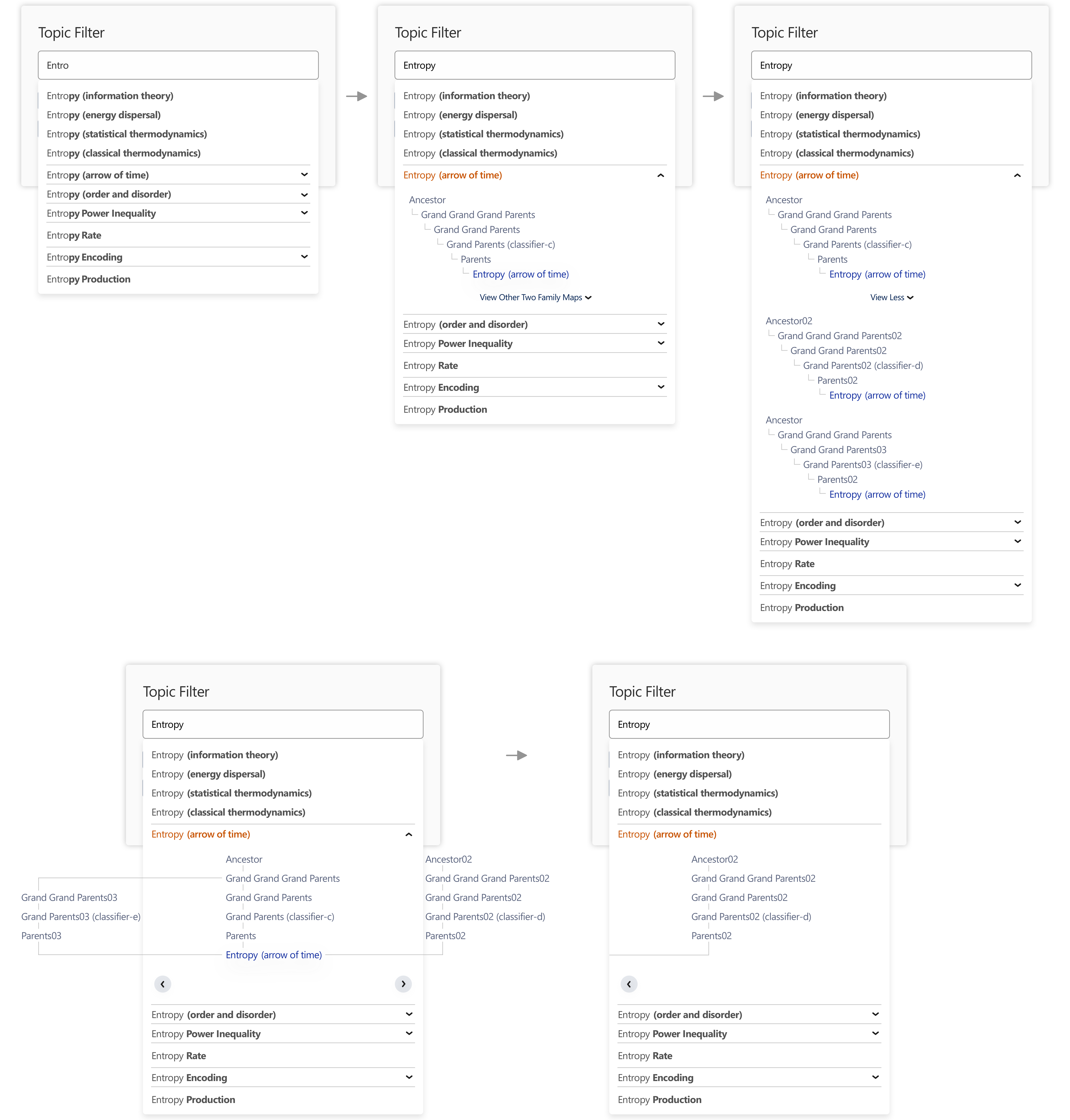
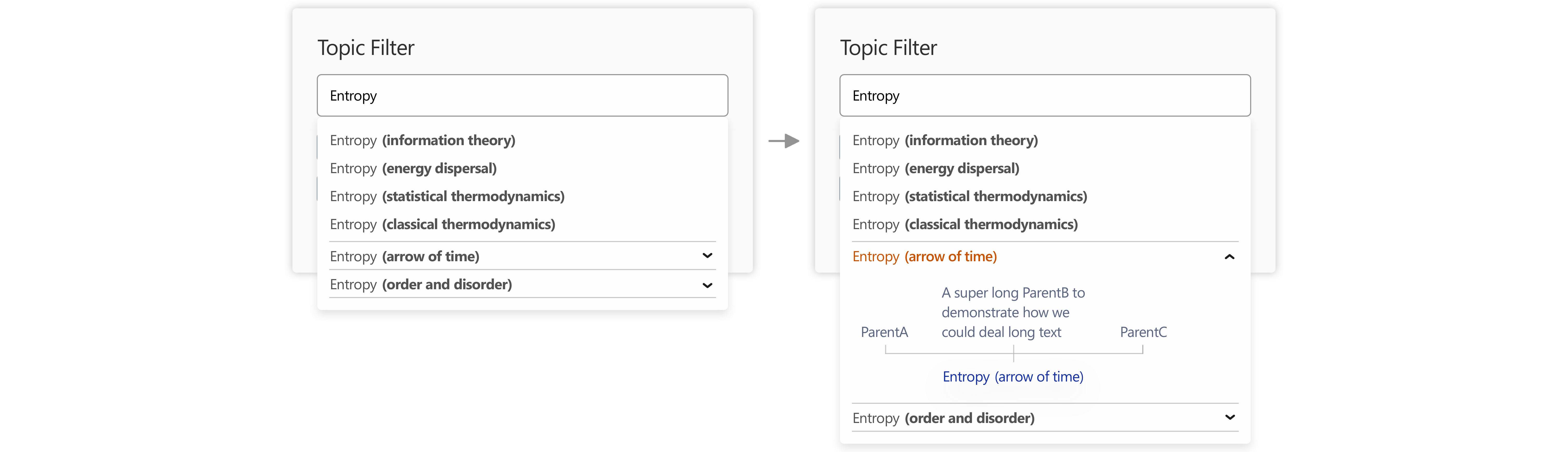
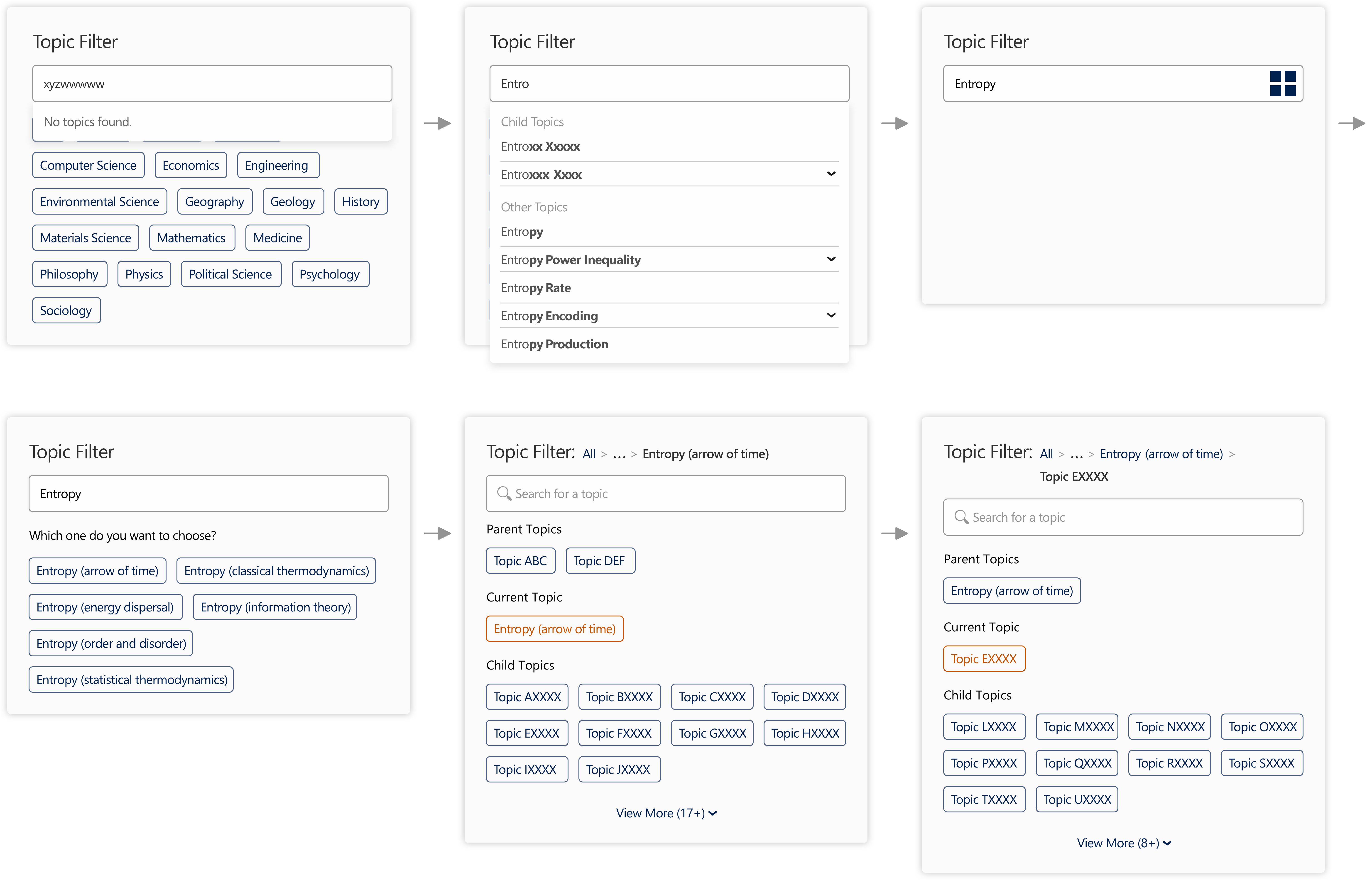
Topic Filter

Providing insights on research trends.
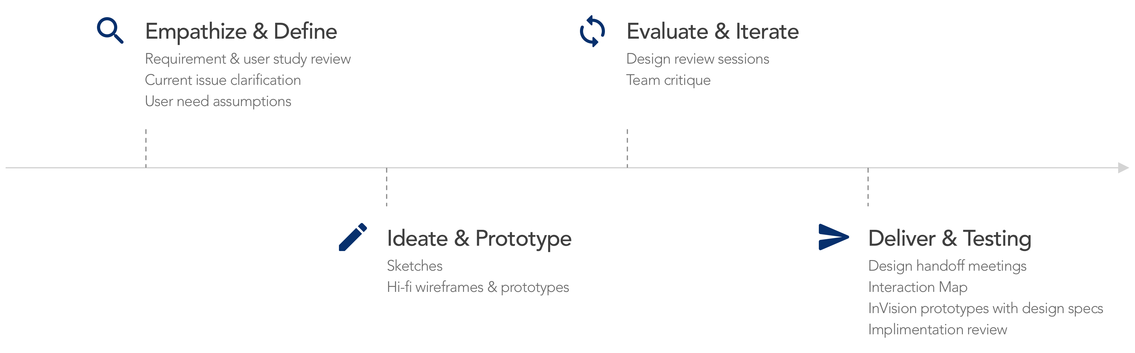
Project Type:

UX Designer at Microsoft Research

Duration:

Nov. 2019

Members:

2 engineers, 2 PMs

Practice Areas:

UX design, visual hierarchy, typography, interaction design, visual design

My Role:

I served as a design lead and worked closely with PMs and engineers.

Project Vision

Microsoft Academic is a knowledge graph which supports academic influence evaluation and academic publication access for academic institutions and researchers (more than one million/month). There are six entity types in this knowledge graph – publication, author, topic, conference, journal, and institution. Each of them has a corresponding Entity Type Analytic Page (ETAP) with topic filters and data visualizations to present its development trend. In this project, I focused on redesigning the topic filter feature to solve usability and readability issues. By allowing both topic browse and search, presenting topic hierarchy, and applying different visual treatments, I aimed to help users quickly understand the knowledge graph and smoothly operate the feature to easily access the trend analysis summary in their interested topics (aka field of studies).

Challenges

Give users a clear idea about the topic hierarchy structure in Microsoft Academic knowledge graph – a family DAG (Directed Acyclic Graph) instead of a family tree.

Present topic relationships in the filter feature within the constrain of limited space, API calls, and website loading issues.

Support users in tracking their navigation path in the topic hierarchy from the first layer to the currently selected topic, covering the cases of having multiple parent topics for one topic.

Add and redefine the main functional and assistant colors to respect legibility and achieve color harmony all together with the predefined website theme and primary action color.

Topic Filter Overview

Design Process

Design Process

Current Issues & Design Requirements

Improve the accessibility of information and make the knowledge graph more understandable.

In the very beginning of the project, I tried to clarify the serving purposes of the topic browser feature. It is for users to filter their interested field of studies to see the trend analysis (mainly in data visualization format) in Entity Type Analytic Pages (ETAPs). (The picture beside is the previous version of Topic ETAP as an example.) Through a kickoff meeting, I had a better understanding of how this feature worked and the direction for improvement. I also noticed some readability issues by evaluating the website, so I proposed a plan to fix them together with this project. Below are the key issues and action items:

Allowing only browsing and filtering topics shown on the current layer were insufficient, so we planned to support a searching experience for users to easier access their desired topics.

Unclear about topic relationships was a pain point, so we wanted to present the topic hierarchy to show topic relationships for users to easily understand in this feature.

The smaller topics were hard to read and easy to be ignored in the tag cloud (the font size of text representing the number of publications), and when there were so many topics in one layer, it was overwhelming. We could apply other visual treatments on topic "tags" to enhance readability and reduce information overload.

Some functional colors were undefined or misdefined, and the color contrast of some color combinations were not enough, so redefining colors for different action statuses (e.g., hover, selected, inactive, etc.) and data visualizations to solve cognition issues was an urgent need.

Topic ETAP Previous Version Topic ETAP Previous Version

User Studies

Support topic exploration for researchers at different career stages.

By reviewing previous user studies, I learned that the target user groups of Microsoft Academic website were researchers across various career stages and fields. They could be students who just joined the academic community without a clear idea about what to focus on, and were eager to explore and learn more. They could be established researchers who were overwhelmed by their works and wanted to have a quick view of the development trend of particular topics they cared about, as well as their related topics.

Persona – Established Researcher Persona – PhD Student . Novice Researcher

Therefore, this feature could serve as not only a filter, but also a quick view of different topics and their relationships for users to easier understand the academic field, and build a mental map of thier field of studies.

Besides, I also clarified the user flow of the website to know how users used our service and how we served users as a whole. Starting from the homepage, users could browse through highlighted resources, use keyword search, or explore Entitiy Type Analytic Pages (ETAPs). The topic filters on the ETAPs were what we focused on in this project.

Main User Flow

Data Structure

Understand the DAG (Directed Acyclic Graph) structure before starting the design work.

Based on the above design requirements, I tried to clarify questions regarding the topic hierarchy structure with my manager. I realized that it was a complex DAG (Directed Acyclic Graph) instead of a tree. There were 700,000 topics in the knowledge graph, and they were organized into a six-layer hierarchy. For each layer, we showed at most 200 top topics according to the API.

Data Structure Comparison

At that time, there were two types of unaccessible topics, including orphan topics without an ancestor and descendant, and those topics not in the list of the top 200 in each layer. For the first issue, the data team has been putting effort to fix it. As for the second one, we were hoping to solve it through a search feature in the new design.

Design Decisions

Break down the project into actionable tasks to ensure smooth progress and moving forward on the right track.

After clarifying the feature related questions, I made several decisions as a project owner to ensure a smooth execution process and intuitive user experience:

Style Icon

Taking legibility issue fixing and functional color redefining as the first step so that the new design can follow the new color guideline through the whole iteration process.

Filter Icon

Changing the feature name from "Topic Browser" to "Topic Filter" to make it more aligned with its functionality.

Search Icon

Replacing the feature of filtering topic names in the current layer with a global topic search feature to enhance the accessibility and usability. The orphan topics would be accessible as well.

Topic Icon

Presenting top topics in a layer as default to avoid information overload, and allowing users to expand all if needed.

Tag Icon

Making topic "tags" in entity type analytic pages look more consistent with hyperlink tags in other pages (e.g., search result page, entity detail page, etc.) (as shown in the pictures below).

Breadcrumb Icon

Keeping the idea of using "breadcrumbs" to support efficient navigation and present the topic hierarchy.

Search Result Previous Version
Paper Entity Detail Page Previous Version

Ideation

Fix accessibility issues first and ideate possible solutions for topic browse and search.

With the decisions in mind, my next steps were exploring possible solutions for new colors, thinking about different use cases for the filter feature, and sketching down interaction ideas with reasonable user flow. Meanwhile, I had frequent discussion sessions and design review meetings with my managers and engineer teammates to keep them on the same page and collect feedback instantly.

I noticed that not all the colors on the website were updated to the design guideline, so I reviewed both of them together to identify issues. The main color sets in the previous version website are presented below. The key issues include:

Some colors and background colors did not have enough contrast, such as hover color and line color.

Colors selected for data visualizations were hard to differentiate and the order would lead to misconception either.

Colors for different statuses were missing, such as highlight, clicked, selected, inactive, etc.

Typefaces & Colors

I tried to fix the above issues through several rounds of iteration, and eventually, figured out new color sets with which our team reached a consensus. The new color design guideline is shown below, in which hover, line, and background colors were redefined, colors for data visualizations were adjusted, and new colors for different functionalities were added on.

Overall, color contrast, color blindness, and color harmony were taken care of. I tended to pick colors with lower values to create a comfortable reading experience for users. By making these changes, I also tried to add a more energetic, modern, and up-to-date vibe to the website.

Typefaces & Colors

As colors redefined, I started ideating new filter design. By sketching down ideas and utilizing whiteboards, I was able to communicate efficiently with team members.

Brainstorming Filter Design on Whoteboard

In the following stage, I created hi-fi wireframes for design review and iteration. By breaking down the project into "browse" and "search" two sections, I was able to iterate them one by one.

Design Iteration – Topic Browse

Present topic relationships and efficient navigation within the constrain of API calls and website loading time.

In the browse part, I ran through four rounds of iteration to ensure intuitive interactions:

Topic Browse Version 1
Number 1

In the beginning, I changed the style of topic tags from tag cloud to buttons to make them aligned with other pages and solve the readability issue. The order of topics was kept, numbers were added on, and a color gradient was applied to present the idea of having more to less publications. To avoid information overload, I also presented only the top five topics as default, but allow users to expand and view all. Besides, a hover pop-up was designed for users to view and explore the next layer. When it came to the last layer, there was no child topic, so other related topics were placed on the page for users to explore more.

Topic Browse Version 2
Number 2

Through discussions with PMs and engineers, I found that users may want to see other ancestor topics of a topic, so the first version design was not sufficient. Besides, the hover pop-up to show topics in the next layer would require the second API call, and it might take longer to load, so this design was not preferred. Based on the feedback, I removed the hover effect and designed two other "breadcrumbs" to present the topic hierarchy – hover or click to see other ancestors in the layers above.

Topic Browse Version 3
Number 3

Later, I realized that the "breadcrumbs" in the second version would take longer to load, so I tried the third version where ellipsis was utilized for the layers above the parent topic layer. In this way, the topics would only need to be loaded when users want to check out and click the dropdown menu. Although this design could work, it required changes on API and was hard to implement. Therefore, the team decided not to take it at that time.

Topic Browse Version 4
Number 4

My fourth round iteration was also the final round for the browse design. In this version, a way of easily presenting topic hierarchy without extra API calls or loading issues was figured out. We presented the hierarchy right on the page of each layer. In addition to the currently selected topic, one layer above (the parent topics) and one layer below (the child topics) were shown on the page. Based on this logic, we decided not to show other related topics in the last layer. I also kept the "breadcrumbs" as what it was, applied alphabetical order to topics, presented the first 10 topics as default for each layer, and expand all for the first layer to make it convenient for users.

Design Iteration – Topic Search

Design search suggestions, differentiators for terms with multiple meanings, and efficient navigation within the constrain of space and APIs.

For the search part, I went through three rounds of iteration to ensure a smooth user flow:

Topic Search Version 1
Number 1

In the first version, I designed search suggestions with differentiators for users to select topics with multiple meanings. Users could expand a topic to see its family DAG (Directed Acyclic Graph). Based on what I learned from PMs, the maximum amount of parent topics in the extreme cases was three. Therefore, I made demos for the edge cases. I thought about two ways to show the hierarchy graph. One was presenting each family graph individually, while the other was merging all in one and allowing users to swipe and see the whole picture.

Topic Search Version 2
Number 2

By talking with PMs, I later realized that showing the whole family DAG might not work because the structure could be very complex, such as each parent topic might have multiple parent topics, and we did not have a large space for it. As for showing family DAG individually, many topics might be duplicated, which was not ideal either. Therefore, I considered showing only one layer above for user reference. This design could work, but it would take time and effort to change API and was "nice to have" after all. Thus, we reached a consensus to push it to a future stage.

Topic Search Version 3
Number 3

Eventually, we picked the third version design. Here, we moved the differentiators from search suggestions to a transition page to solve a potential loading issue. Users would see regular terms without differentiators in search suggestions. When they click a term, if it has multiple meanings, the transition page would show up with differentiators for users to select. To smoother user experience, we borrowed the loading animation from the website and placed it for the loading status (before the transition page showing up). A rule for the situation when input terms did not match any topics in the graph was also designed. The result would be reflected right in the search suggestion area to save user time. Besides, I figured out a way to support navigation through "breadcrumbs" in search scenarios by presenting the topics starting from the topic selected from the search result to the latest selected topic. For the layers that users did not go through between the first layer and the first selected topic, ellipsis was applied.

Final Design

Handover design deliverables to developers.

At the end of the project, I utilized an interaction map to support better communication and created hi-fi prototypes with InVision, where engineers were able to see design specs as well.

Topic Filter Interaction Map

This new feature is now online! Feel free to check out and play around here: Microsoft Academic Topic ETAP

Topic Filter Demo

Impacts

Improve the accessibility and comprehensibility of topics.

With the topic filter search and browse features improved, users were able to quickly grasp the overall topic structure and the relationship in between. So far, we have received high praise from our customers and we were happy to see users explore topics smoothly.

Reflection

Limitation

If given more resources, user studies could be conducted to know more about user behaviors and preferences regarding entity type analytics and the topic filter feature.

If the APIs could be changed, more possibilities in the design could be explored and implemented.

If given one more chance, I would utilize some online tools which I learned after this project to help with color picking, so that the colors could be chosen in a more efficient and scientific way.

Next Step

Evaluate the design through usability testing and interview with target users, and iterate the design based on research insights.

Design a mobile-friendly version taking ETAP as a whole set.

What I Learned

legibility and readability are the basics of UX Design that should always be considered while doing design.

DAG (Directed Acyclic Graph) is really a complex data structure and challenging to visualize.

Bringing in engineers and other team members in an early design stage is beneficial in multiple aspects, such as clarifying technology limitations so that designers can conduct projects accordingly, realistically, and effectively. It is also easier for them to buy in the design in later stages since they have participated in and better understood the project.