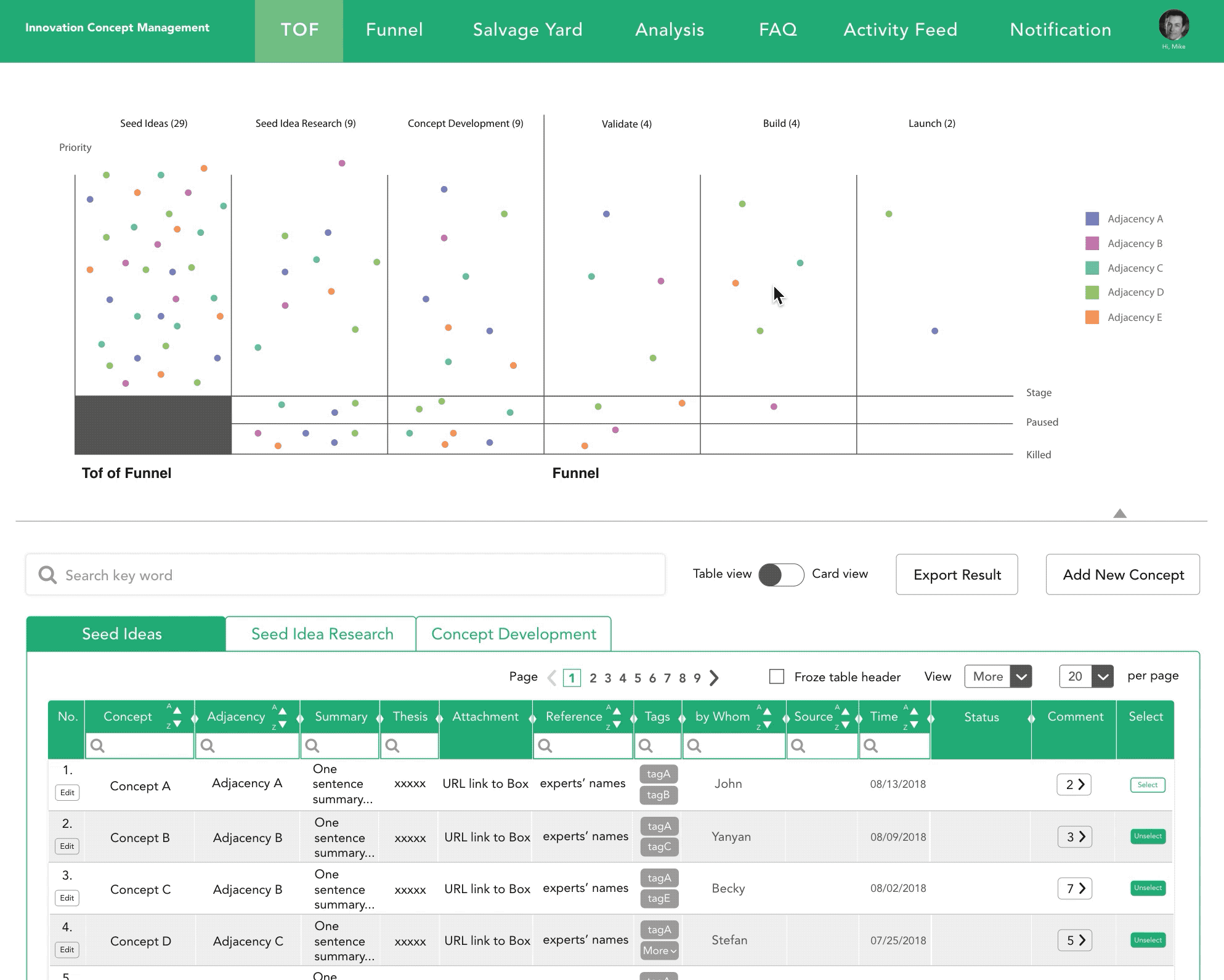
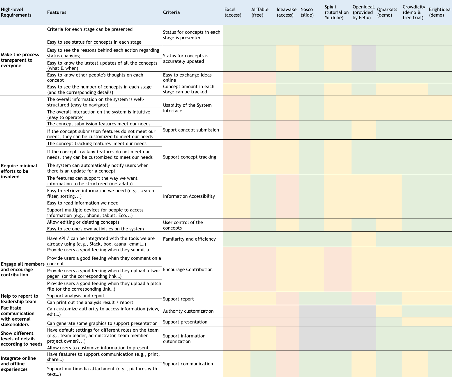
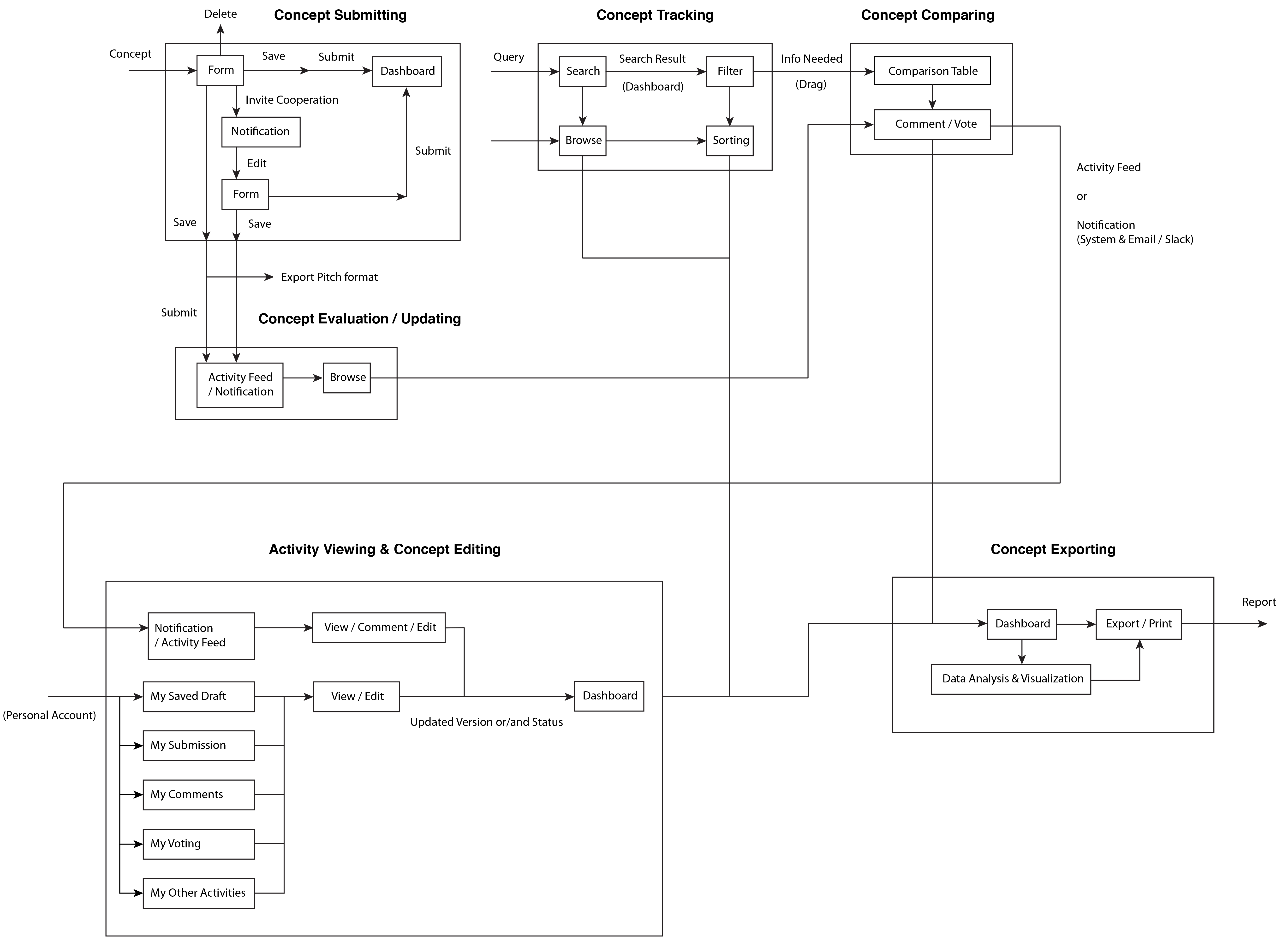
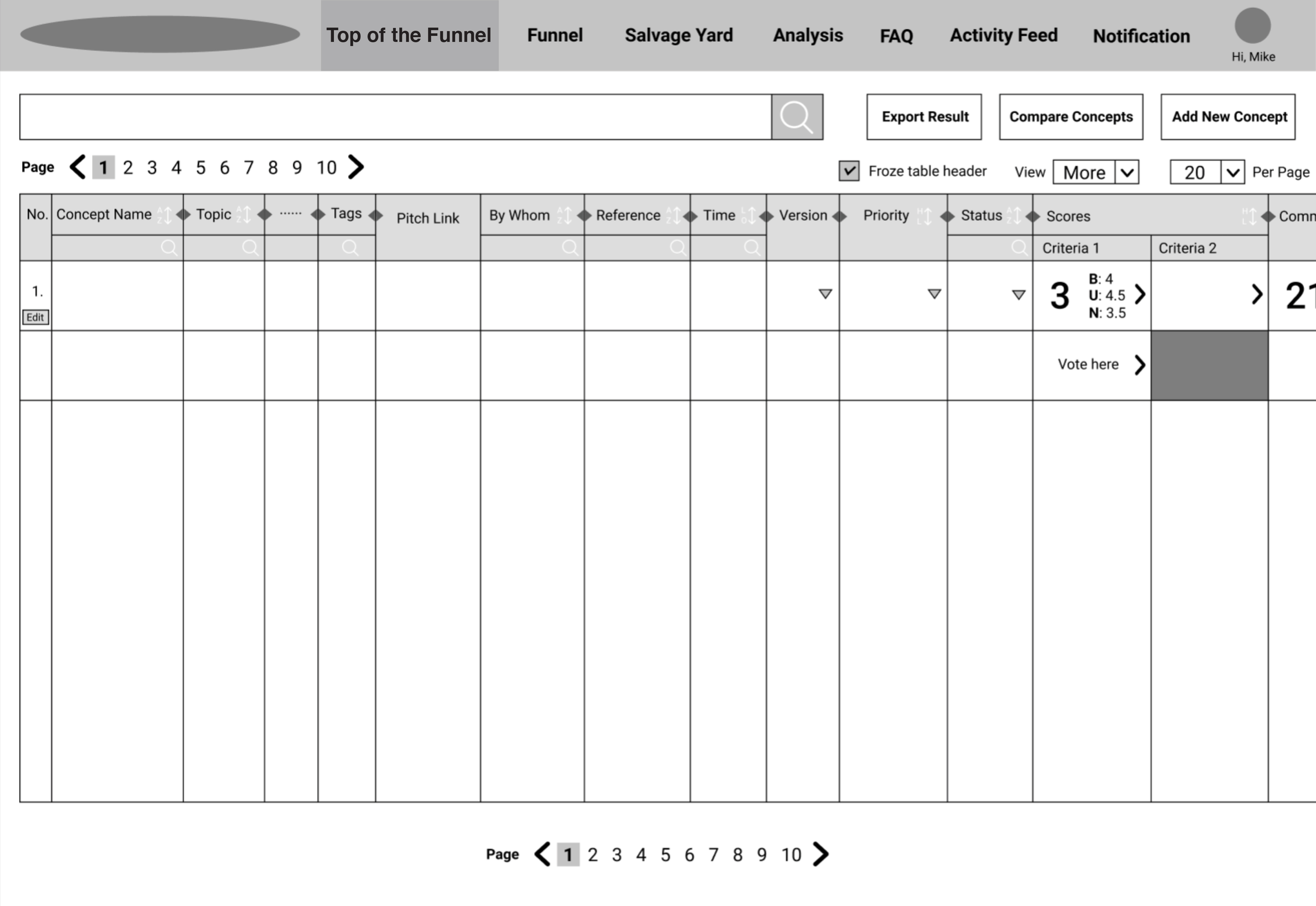
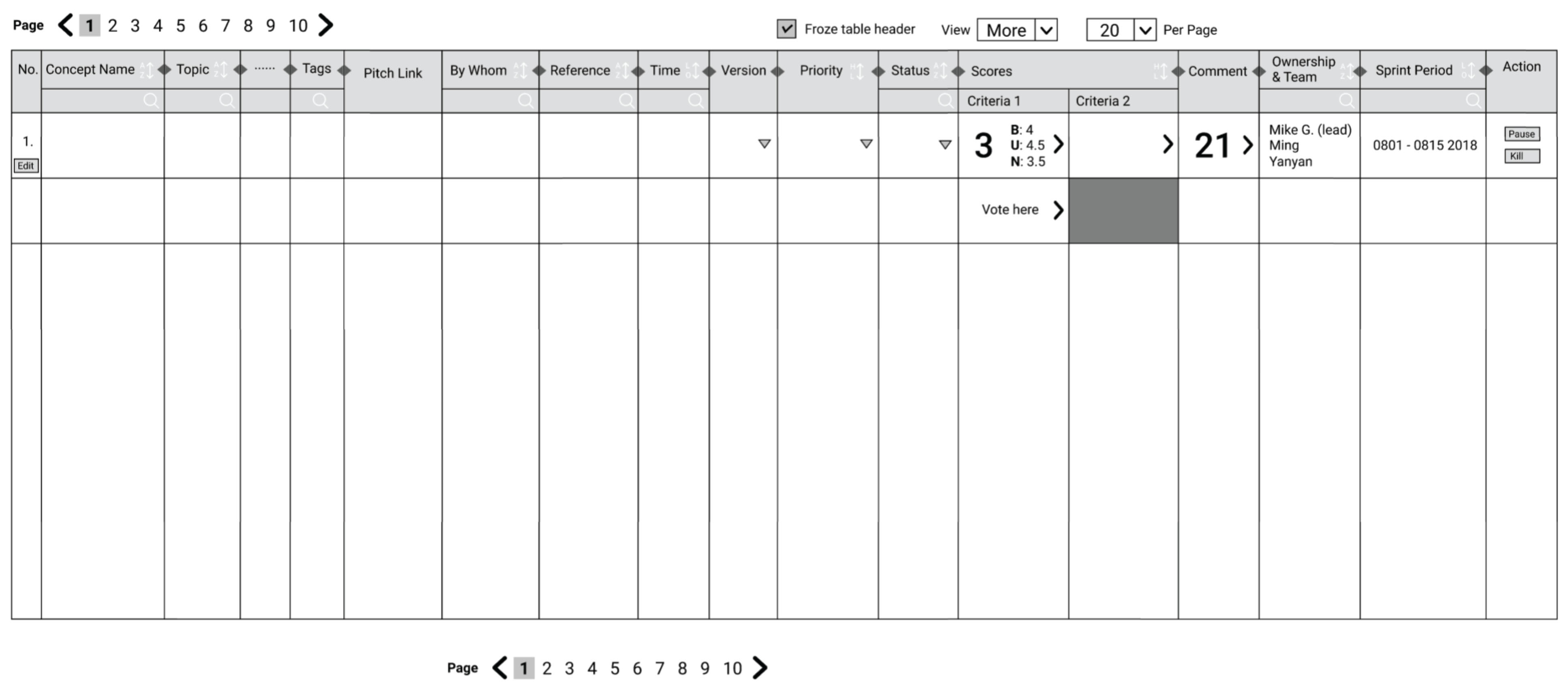
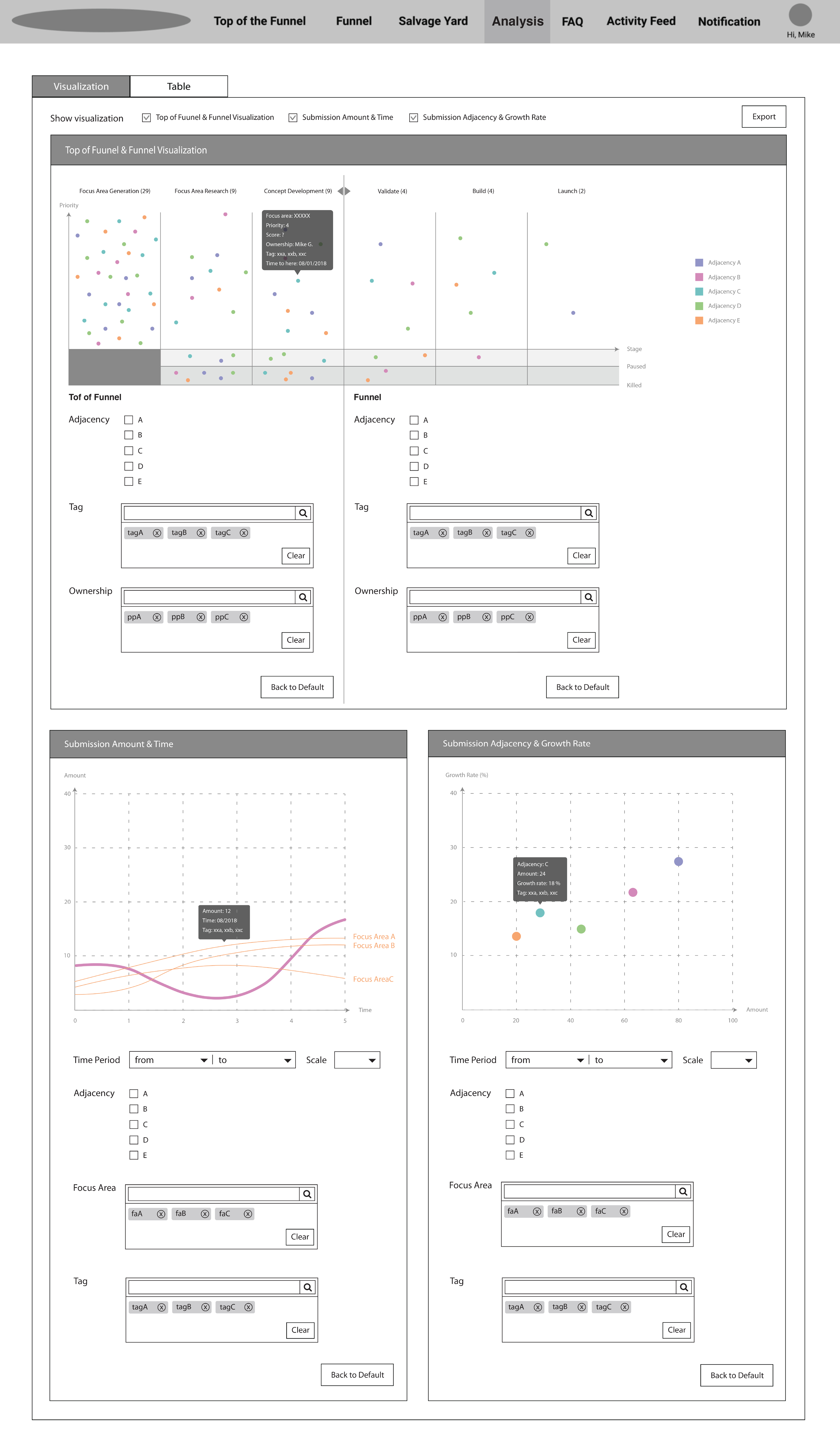
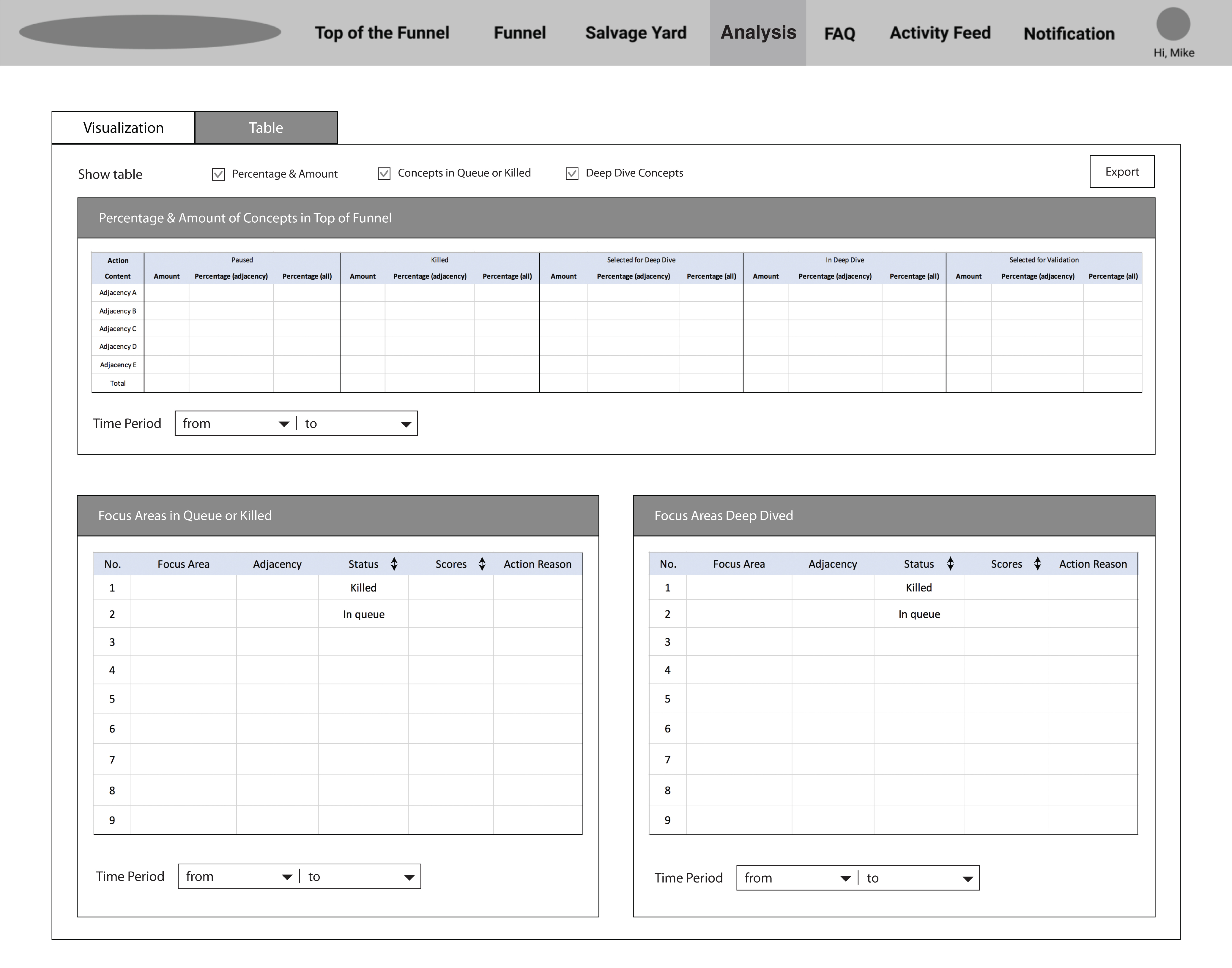
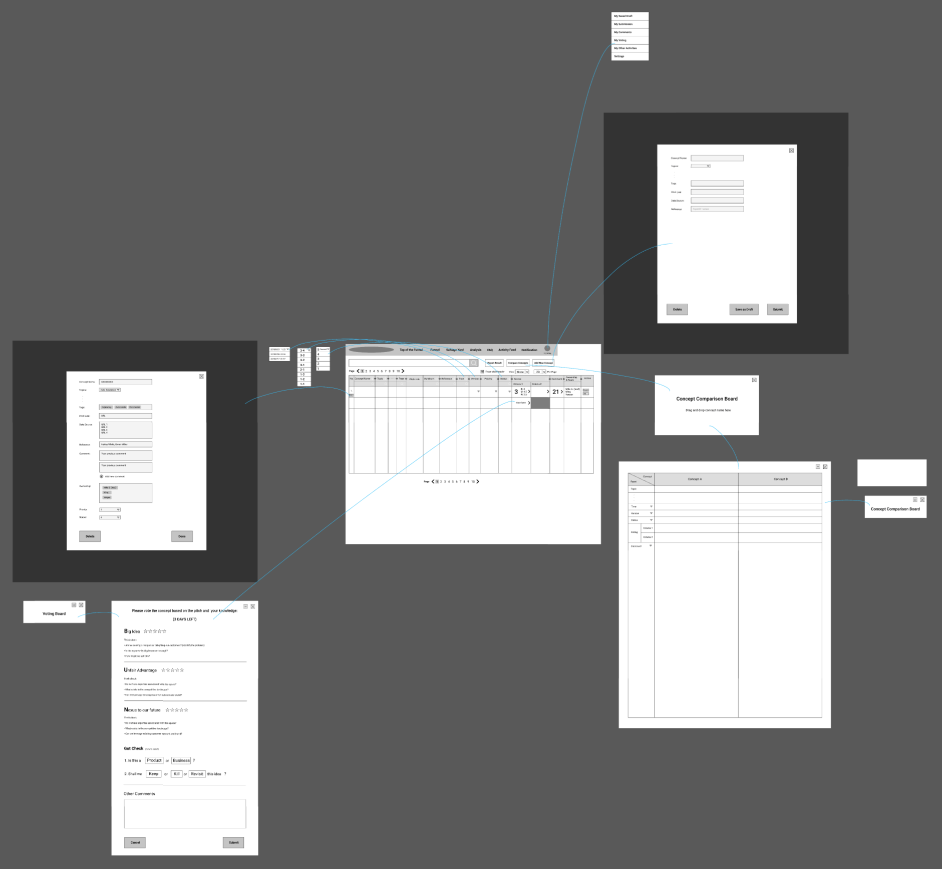
Concept Management

Enhancing team productivity.

Project Type:

Innovation design intern (UX/visual design) at American Family Insurance

Duration:

Jul. – Aug. 2018

Members:

2 designers, 1 design intern, 3 engineers, 2 marketing analysts

Practice Areas:

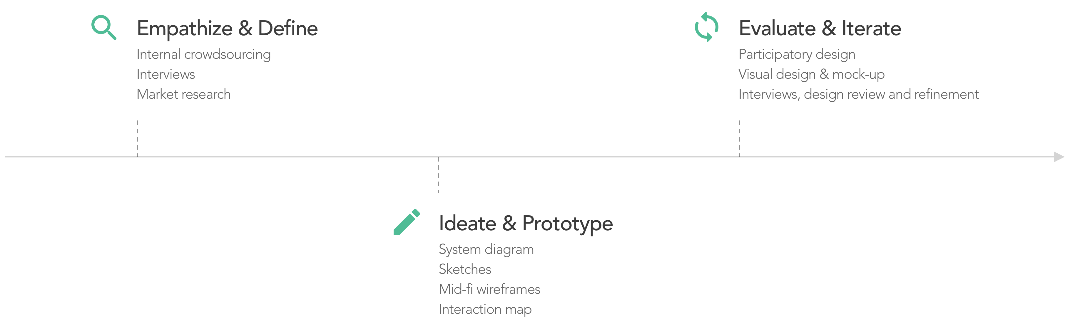
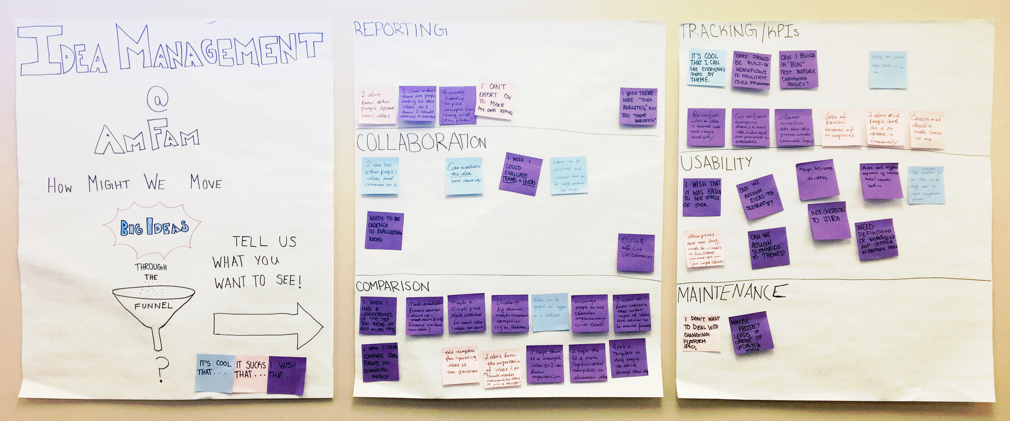
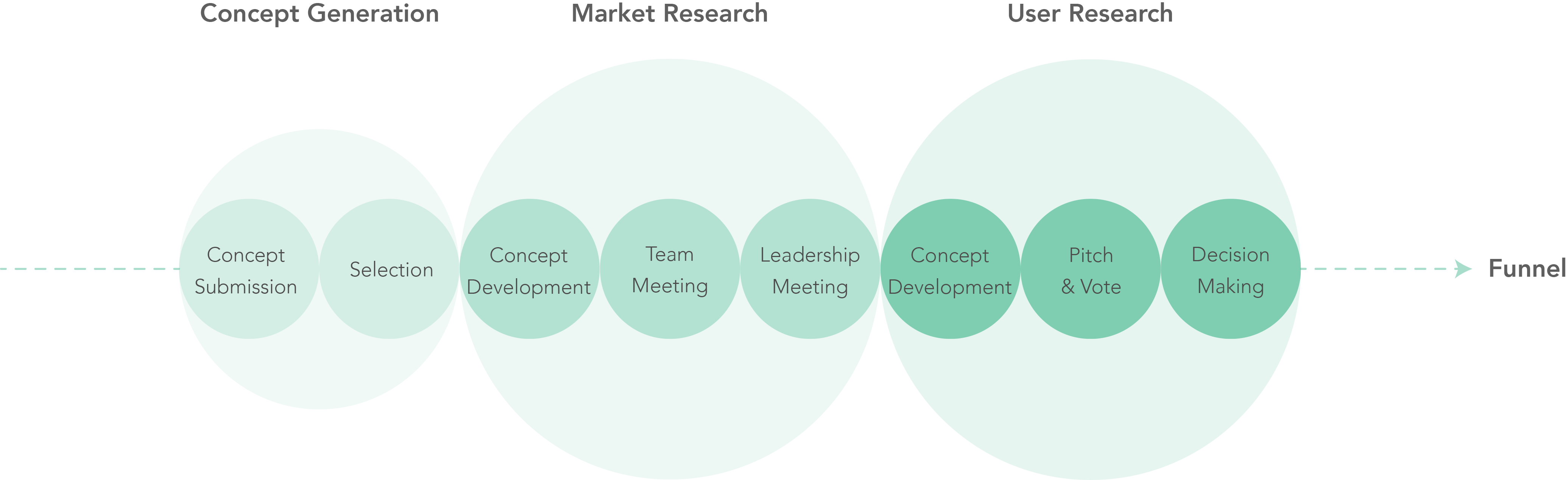
User studies, market research, UX design, information architecture, interaction design, data visualization, visual design, usability evaluation

My Role:

I was given ownership of the whole project.

Project Vision

Concept management system aims to support efficient and engaging concept submission and tracking. The Innovation Design Team at American Family Insurance is a venture building studio that adopts design thinking and lean methodologies to support innovative business development. The team was in an experimental stage and did not have an efficient way to manage hundreds of generated concepts and ongoing ventures. Therefore, I designed this new platform aligning with the continuous changing development process to serve the team members.

Challenges

Engage all of team members in the whole concept development and even venture development process.

Support online and offline collaboration among multi-discipline team members.

Align with the continuous changing development process.

Present the productivity and the contribution of the team.

Concept Management System Overview

Design Process

Design Process

User Studies

Need supports in concept input, continuous cooperation, and productivity evaluation.

In the beginning, I cooperated with another design intern to collect user feedback on the currenct development process, the pain points of using existing tools, and expectations toward an ideal concept management tool. We conducted internal crowdsourcing by placing a set of posters on the office wall for people to post their thoughts, and interviewed 6 team members specializing in business, technology, and design. I was later given ownership of this project and analyzed the research data to support the next step design work.

Internal Crowdsourcing Posters

I found that the Innovation Design Team has its own development process which involved two main sections - the Top of the Funnel (TOF) and the Funnel. In the TOF process, we developed concepts in some focus areas which belonged to particular adjacencies defined by the team, and used methods such as concept pitch combining with scorecards and leadership team meetings to evaluate concepts. If a concept moved on to be a venture, it would go into the Funnel process. Ultimately, a venture would be launched and become a new business or a new product. The visualization below shows a brief summary of our TOF development process.

Top of the Funnel Concept Development Process

Besides, the main issues and expectations could be categorized into 4 facets:

Guidance for Input

Guidance for Input

"Categories doesn't make sense to me."

"I hope there is a more sophisticated template to document ideas and help people think through their ideas."

"I don't know the expectation of ideas I put (e.g., should market research be done or just a thought?)"

Multimedia Support for Documentation

Multimedia Support for Documentation

"Ideas can be visualized, and visualized ideas can be presented to facilitate communication (just simple sketch)."

"Pitch document can be easily access and view."

Continuous Collaboration

Continuous Collaboration

"Be notified when there is a new idea submitted, prompted to evaluate, or moved into next stage and why."

"I want to know there are people looking at those ideas, so I know I should continue to."

"I wish that it was easier to see the status of ideas, and a timeline (milestone) for the ideas can be easily seen for project management purpose."

Customized Report

Customized Report

"I can't export CSV to make my own report."

"There is no way to show our productivity and impact."

Market Research

Need a concept management system instead of tools for crowdsourcing ideas.

With users’ expectations in mind, I started researching on some existing resources to find out if there’s anything we could use or ideas we could borrow from. 10 of the most popular idea management tools were evaluated from design, technology, and business perspectives. From the design stand point, concept submission, tracking, and report were emphasized. I found that none of these systems could sufficiently fulfill our requirements, while remaining in our price-point.

Market Research Spreadsheet

The key findings were:

The main goal of these systems were crowdsourcing ideas internally or externally at large enterprises which did not align with our goals.

The systems were designed for the usage of over 100 people.

The report features could not adequately show the production and impact of the team.

The annual fee was quite high.

The research result consolidate the direction of designing a new system that could support innovative teamwork with efficient concept submission, tracking, and report for our team to reflect on. The higher priority was given to the top of the funnel concept development process at this early stage.

Ideation_Session

Design Decisions

Guide team members in contributing concepts and keep them updated.

As the expectations and requirements clarified, I started the ideation work and decided to emphasize these values that were important to our team members in the system design:

Prioritizing Documentation & Presentation

Efficiency

To serve busy team members and save their time, the data structure shall be well defined and the system shall be easy to operate to meet our needs. Features such as supporting multimedia, export, and different authority for editing were included.

Nondistracting & Engaging Experiences

Transparency

Knowing why a concept was moved on, killed, or put in the queue was expected by team members, and they would like to know others' opinions on a concept as well. Therefore, comment feature for each concept would be designed, and a digital scorecard for a set of criteria was developed for people to evaluate concepts.

Robust & Savvy Style

Engagement

In order to engage all the team members in the process and encourage contributions to concept development, the system would be designed to integrate with the communication tools used by the team, such as Slack and email, provide notifications, and allow editing items simultaneously.

Ideation & System Diagram

Develop high-level design concepts for the system and the main features.

With the above values in mind, I started the design work. My first step was creating a system diagram to help clarify how the system could work as a whole picture. While doing the diagram, I also developed high-level design concepts for the main features of the system, such as submission form, notification, comment, scoreboard, search, browse, and report features.

System Diagram

Information Architecture & Wireframes

Visualize design concepts focusing on the two key pages – the homepage and the analysis page.

Based on the design concepts, I created wireframes to visualize the features and present the information architecture of the system. I focused on the key features for TOF in the very beginning, trying to make the system align with the development process and serve both online and offline collaborations. Below are the most important two pages of the system – the homepage and the analysis page.

On the homepage, team members can submit concepts, give feedback, track status, and export information through a dashboard.

Concept Management System Homepage Homepage Dashboard

On the analysis page, team members can easily see the productivity of the team and the submission trend through visualizations and spreadsheets.

Analysis Page - Visualization Analysis Page - Table

I also made a simple interaction map to support internal communication and design evaluation.

Interaction Map

Participatory Design

Simplify the layout, support different user needs, and enhance engagement with information visualizations.

To ensure that my design could eventually meet the needs of various stakeholders, and that I could make changes in the right direction, I took the first-version wireframes as boundary objects and interviewed different roles of the team to see what was unclear or missing. Afer discussing with my mentor, we decided to focus on the design of the hompage dashboard and the information visualization report in this early stage. I also defined the schema for the database along the way. The following are the the most important changes I made based on the team members' feedback:

Table Refined
Number 1

Users pointed out that placing all the TOF concepts in one table was hard to read, so I separated concepts in three milestones individually by dividing a dashboard into three sections to support people easier focusing on one at one time.

Number 2

Too many fields caused information overload, so I set most important fields as default view and allowed users shifting from "less" to "more" to see the whole picture.

Number 3

Based on administrators’ feedback, they did not need an extra default view different from regular users. Therefore, I applied the same layout for them and supported taking more actions through more action buttons on the page.

Card View
Number 4

Through discussion with my mentor, I was also inspired to design another layout which might be more engaging to users. User feedback on this version was collected in later sections.

interactive Bubble Chart
Number 5

Users expected to easily see which concepts in progress within which focus areas and adjacencies. Therefore, I created an interactive bubble chart with color and size as visual codes to present the information.

Report
Number 6

Through the interview, I also validated that some team members and higher level managers do prefer reading paper-based reports. Therefore, I designed a print-out report mockup to serve the need.

Visual Design & Mock-up

Collect feedback on two different dashboard layouts – table view ans card view.

In the next phase, I made two mock-ups to show what dashboards could look like. One was a table view, and the other was a card view. These mock-ups were later used to validate the refined design and to collect people's preferences on information presentation in different ways.

Table View Card View

I also created a simple visual design guide for internal communication and future reference.

Deisgn Guide

Design Iteration

Keep both layouts for users to choose and give them an easy overview in the very beginning.

By interviewing with all the team members with the mock-ups, I had a deeper understanding about people's preferences on the interface. Speaking with the leadership team and the design team also helped me improve the design. The three main findings and key changes I made at this stage were:

Prototypes
Number 1

People would like to have an easy overview of concepts in progress before looking into details at the beginning of using the system, so I added a TOF visualization on the top of the homepage. It could also be hidden for space saving.

Number 2

Based on user feedback, table view was good for presenting a great number of items at one time, general information sorting, and deep dive, while card view was better for presenting fewer items or mobile usage. Therefore, I kept both layouts and gave user control to shift between as they like.

Number 3

People would filter idea/concept names and adjacencies to quickly access information, so I added these two fields on the filter section to support the need.

By the end of the internship, I handed over the wireframes, mockups and documents regarding the research, design and data structure to my mentor as final deliverables.

Reflection

Next Step

Complete the design of the secondary features such as notification, settings, and FAQ in the system.

Design the Funnel dashboard to support venture development process, and integrate concept management (in TOF) and venture management (in Funnel) into the management system.

Continually update the design to align with the changing development process.

Design versions for mobile devices.

Define the annual budget planned for maintaining the system, and research on the resources for building our own system or modifying existing ones.

What I Learned

Documenting ideas along the way is always helpful for design and communication.

Speaking stakeholders' languages and using terms easy to be understood are very helpful for multi-discipline cooperation.

Being flexible is critial to working through ambiguity.

While focusing on design, having a clear view of the core values, the available resources, and the business development process can help us prioritize works properly and guide us to the right direction.

A complete solution requires not only product itself, but corresponding regulations and procedures involved.