KOSMOS – Scales & Controls

Facilitating ultrasound scans and disease diagnosis.

Project Type:

UX Designer at EchoNous

Duration:

Mar. – May. 2020

Members:

2 designers, 2 engineers, 1 PM

Practice Areas:

UX design, information architecture, visual hierarchy, typography, interaction design

My Role:

I served as a design lead in this project, and co-worked closely with other designers, researchers, PMs, and engineers.

Project Vision

KOSMOS is a point-of-care ultrasound (POCUS) service combining AI technologies to facilitate ultrasound scans and disease diagnosis (non-invasive diagnostic test), especially for emergency cases, telemedicine, and medical educational purposes. With new scan modes and features developed, the original control design encountered its restriction to present functionalities and serve users efficiently. Besides, for both control panels and scales for depth, PRF (Pulse Repetition Frequency), and sweep speed controls, there were existing usability and readability issues to be solved. Therefore, the team decided to redesign all the scales and control panels to enhance scan operation experiences. I took ownership of the project, developed new rules for scale presentation with new visual treatments, and designed a scalable layout with transient sliders for control panels which could be applied across all scan modes.

Challenges

Define tick marks for scales in different regular and zoom in statuses, taking care of readability and elegance.

Develop sets of rules for scales in different regular and zoom in statuses, with huge ranges – "1-30" and "40- 200," for various window sizes (heights).

Design a new layout and new interactions that can support users operate controls with fingers smoothly within a limited control panel space.

Control Demo

Design Process

Design Process

Current Issues

Empathize readability, unintuitive, and rough operation issues.

In KOSMOS, there were two main scan types – free flow, and protocol-driven flow. The free flow was a more basic type focusing on the heart, lungs, and abdomen, in which B, M, and C modes were provided, with PW and CW new modes added on. B mode was the most basic mode in which the amplitude of the returned echoes was used to create images. While in Doppler modes (PW & CW), the change or shift in frequency of the returned echoes were used to detect and quantify blood flow velocity, direction, and flow patterns. The above modes were what we mainly focused on in this project (and later the similar new design was applied to the protocol-driven flow). Each mode had its own scan views (aka imaging views), generally with control panel and imaging window two parts (as shown in the picture below).

Interaction Map

Through kickoff meetings with the PM and other designers, I realized that the current critical usability issues for cardiologists and sonographers were:

The control widgets for depth and gain that required circular motion of fingers were hard to operate and locate to an accurate value.

Small and crowded buttons on the control panel led to frequently tapping wrong buttons by mistake.

The folding and expanding control panels for the B and C mode control shifting in C mode was easy to be ignored.

The control label text was too small and hard to read from a certain distance.

The tick marks on the scale were too thin, dim, long, and crowded in some cases, which was hard to read and occupied too much space in the imaging area (for the field of view (FOV)), not ideal as a reference.

Design Requirements

Clarify the functionalities and window heights of all modes, and redesign scales, controls, and control panels.

At the very beginning of the project, I also clarified the expectations for the new design:

Typography Icon

A new layout for control panels and interactions for controls were required. Transient sliders could be a potential solution for depth, gain, TGC (Time Gain Compensation – for image brightness and contrast), and PRF (Pulse Repetition Frequency – for velocity in PW/CW) controls.

Switch Icon

As PW/CW developed, new intuitive mode shifting (accessing) and control switching features were required.

Ruler Icon

The depth scale should be able to serve users in efficiently knowing the physical location (the distance from the “skin line” to an object) and the size of the field of view (FOV) (the two-dimensional region the anatomy shown in the image), and in making informal/approximate measurements. (Both time scale and velocity scale were also serving as references.)

Date Icon

The new design was expected to be released with PW and CW new features in May 2020.

This project could be broken down into three main parts – scale redesign, control redesign, and control panel redesign. To conduct the project efficiently, I followed this order and broke the tasks into separate actionable items together with the PM.

Besides, the user flow of the free flow and the functionalities of each mode, including the controls and mode access, were clarified with other designers' help. Starting from B mode, users were able to access all the other modes. In each mode, there were two control panels for users to switch between (except in M mode). One was for ultrasound controls. The other was for ECG (electrocardiography) and DA (digital audio) controls. Also, there were different accessible modes for users to choose. They could go back and forth to shift between different modes.

Controls in Modes Controls and Functionalities

I also tried to clarify all the imaging window sizes (heights) to be covered. There were eight layouts with 5 types of imaging window sizes. They could be roughly categorized into three groups – larger (1080, 945, 810 px), medium (720, 540 px), and smaller (360, 300 px) groups.

Imaging Window Dimension

User Studies

Understand user types, goals, needs and frustrations.

With a better understanding of the project scope and the product, I started to understand the target users and their needs through reviewing previous user research documentations and talking with designers and the PM.

At that time, we had two target user groups – cardiologists, and medical students, and two secondary user groups – EMT (Emergency Medical Technicians), and rural physicians, which were our future market opportunities. For the target users, their goals were more education and research-oriented. Therefore, a portable, easy-to-operate device with guidance to teach them how to scan was critical.

Persona – Cardiologist
Persona – Medical Student
Persona – Cardiologist
Persona – Medical Student

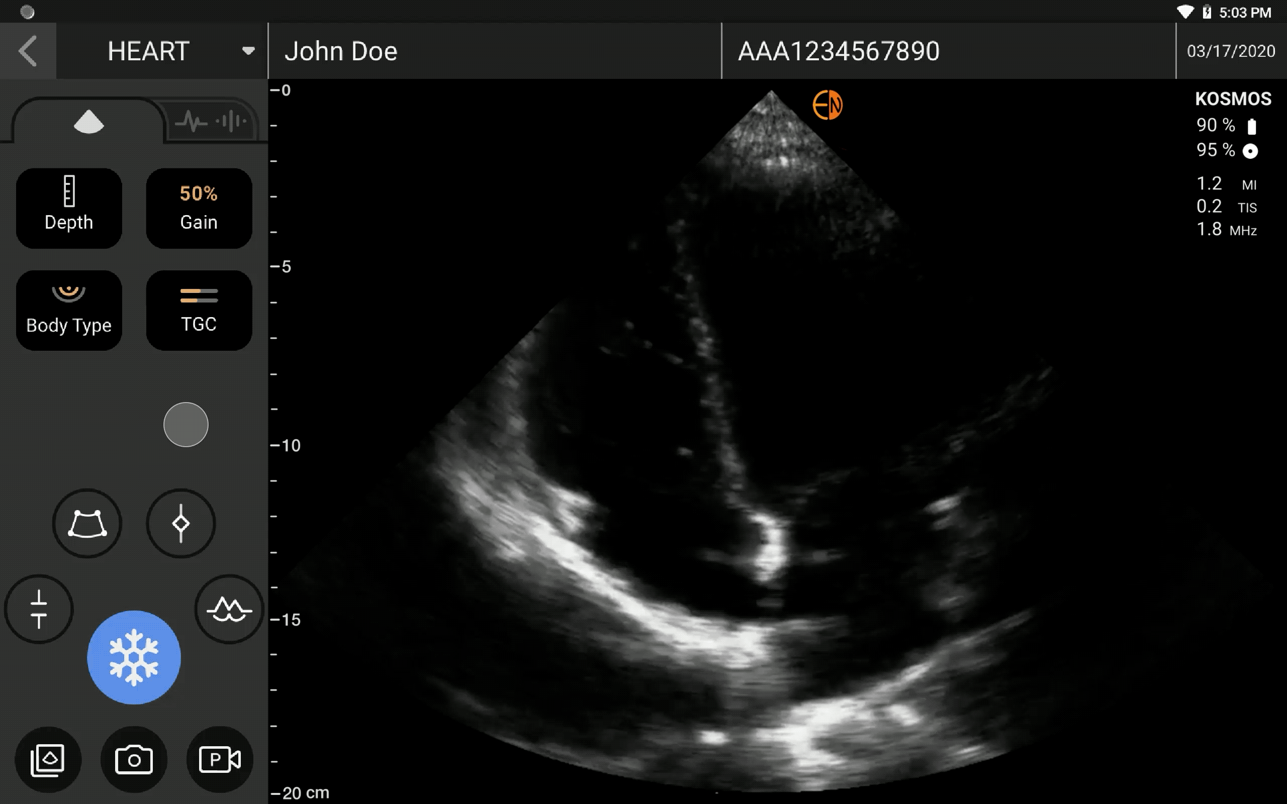
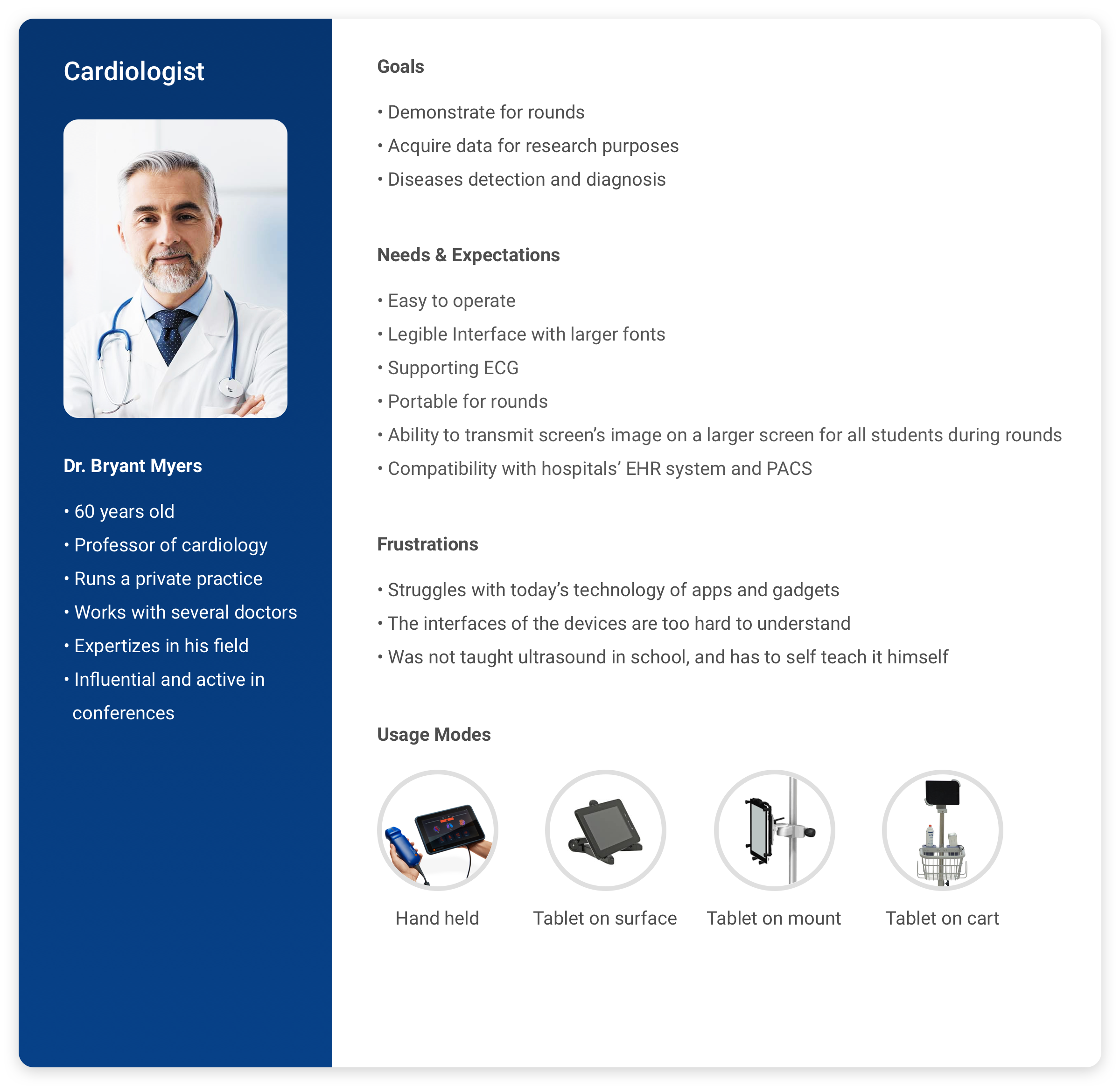
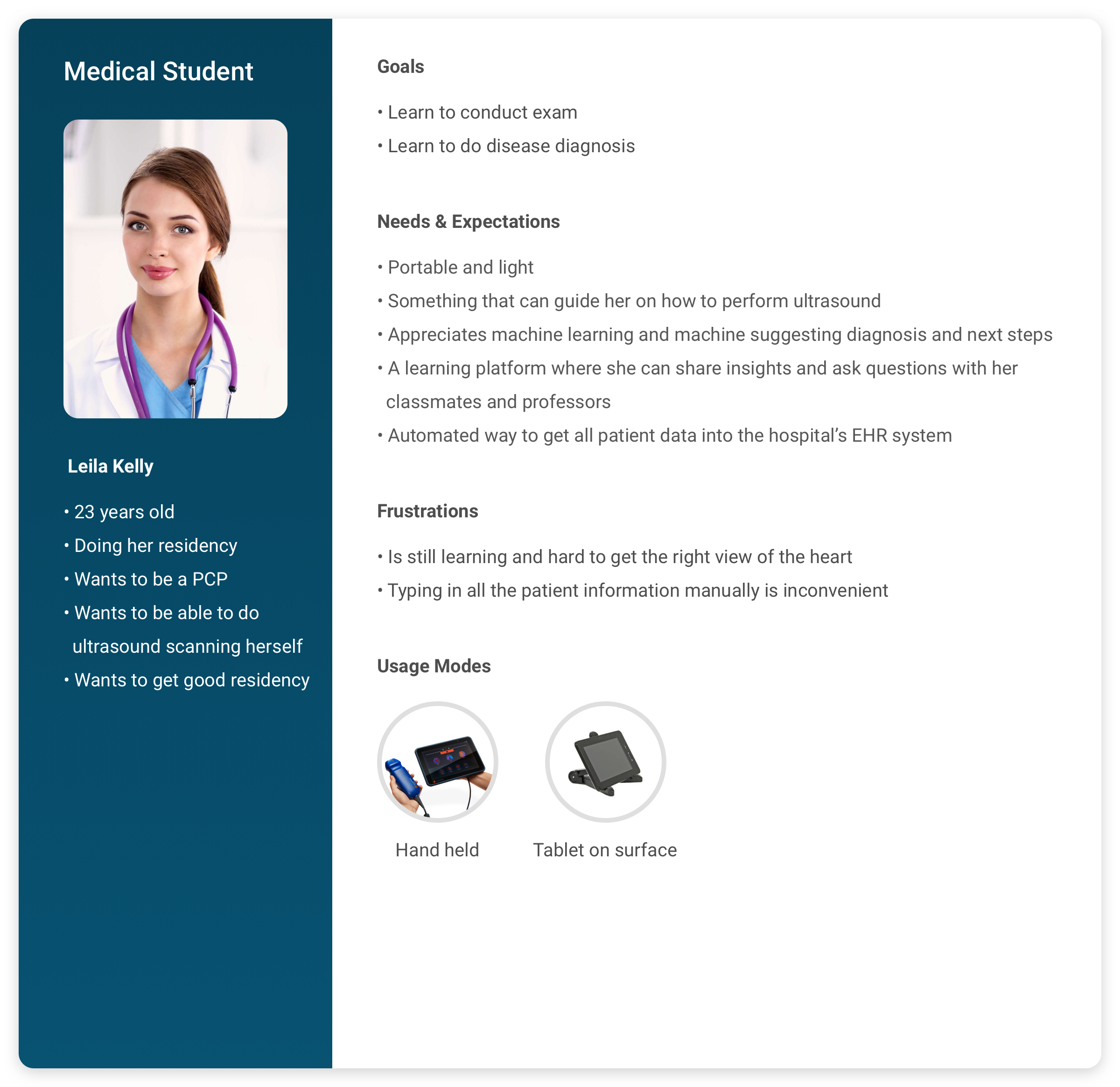
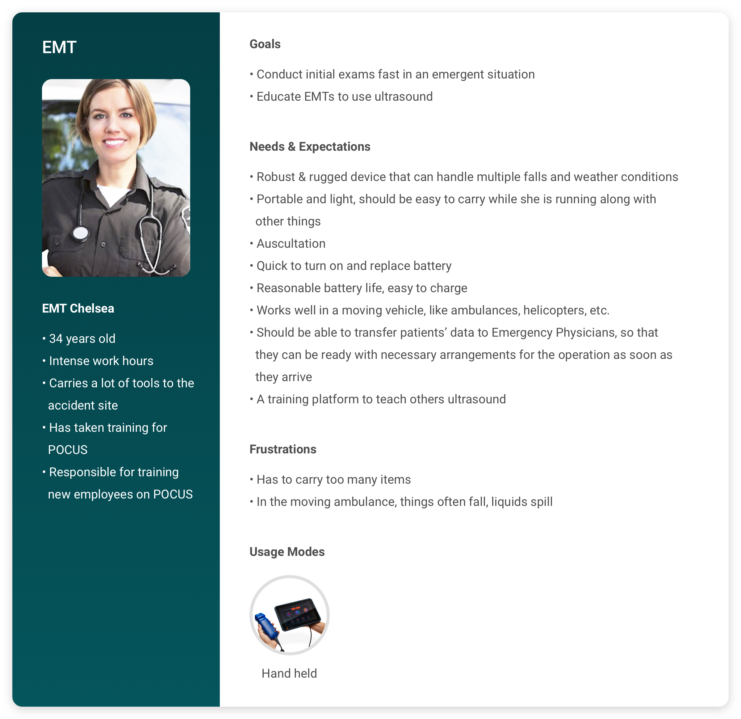
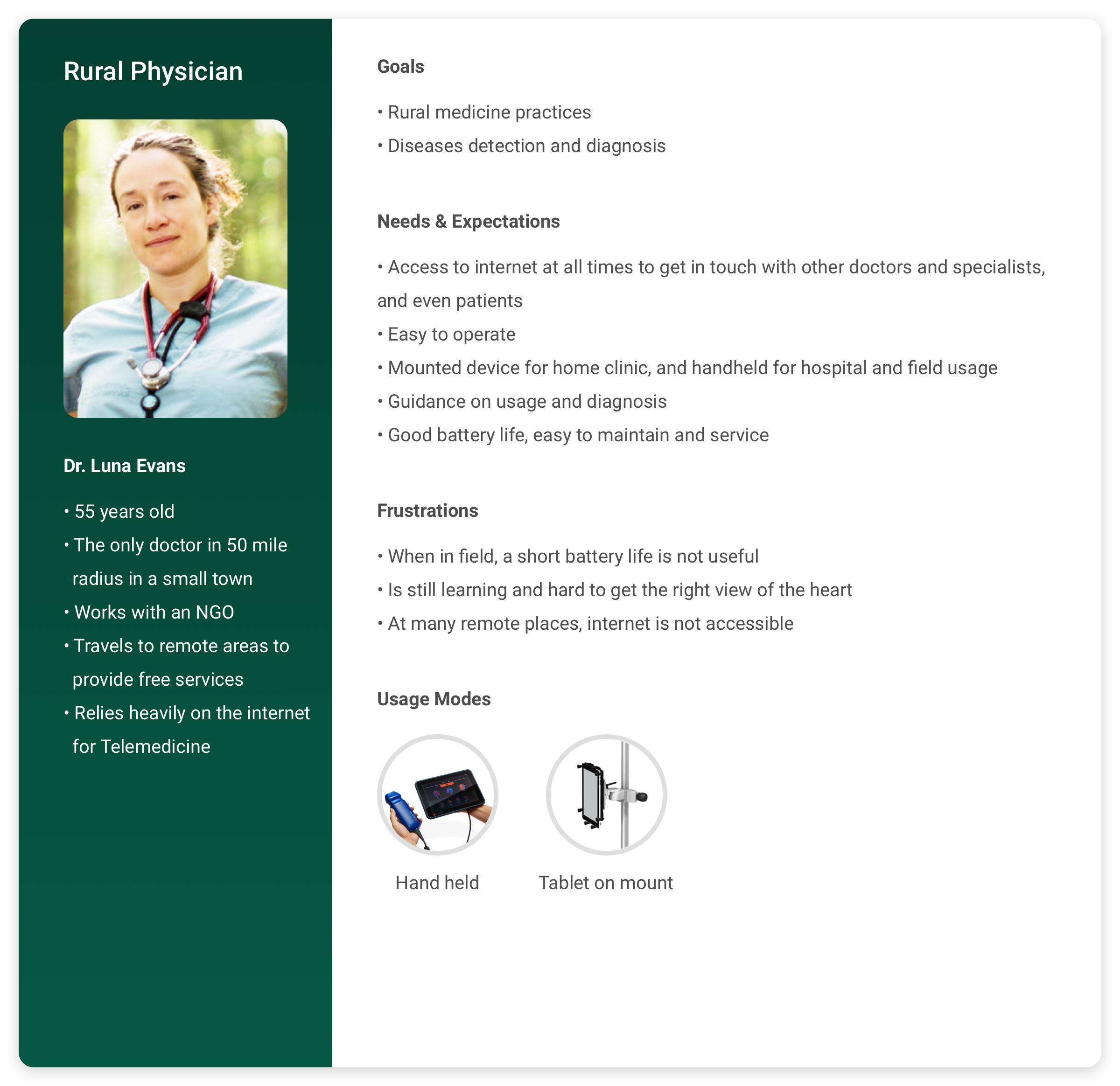
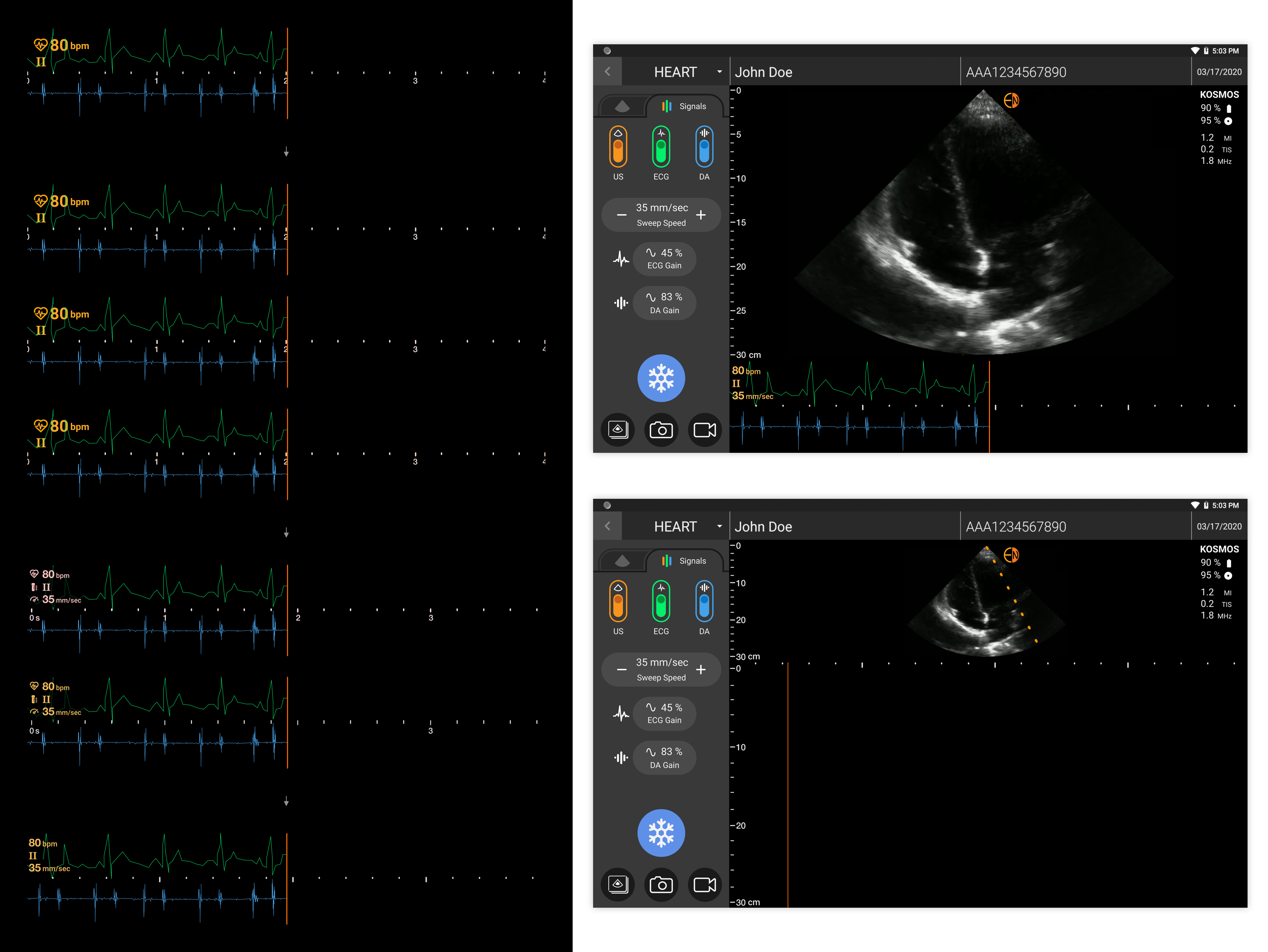
Besides, I learned that there were four usage modes – handheld, tablet on a surface, tablet on a mount, and tablet on a cart. Among these, handheld and tablet on a surface were the most common ones for our target users, so the scenarios of one-hand usage and reading from a certain distance had to be taken care of.

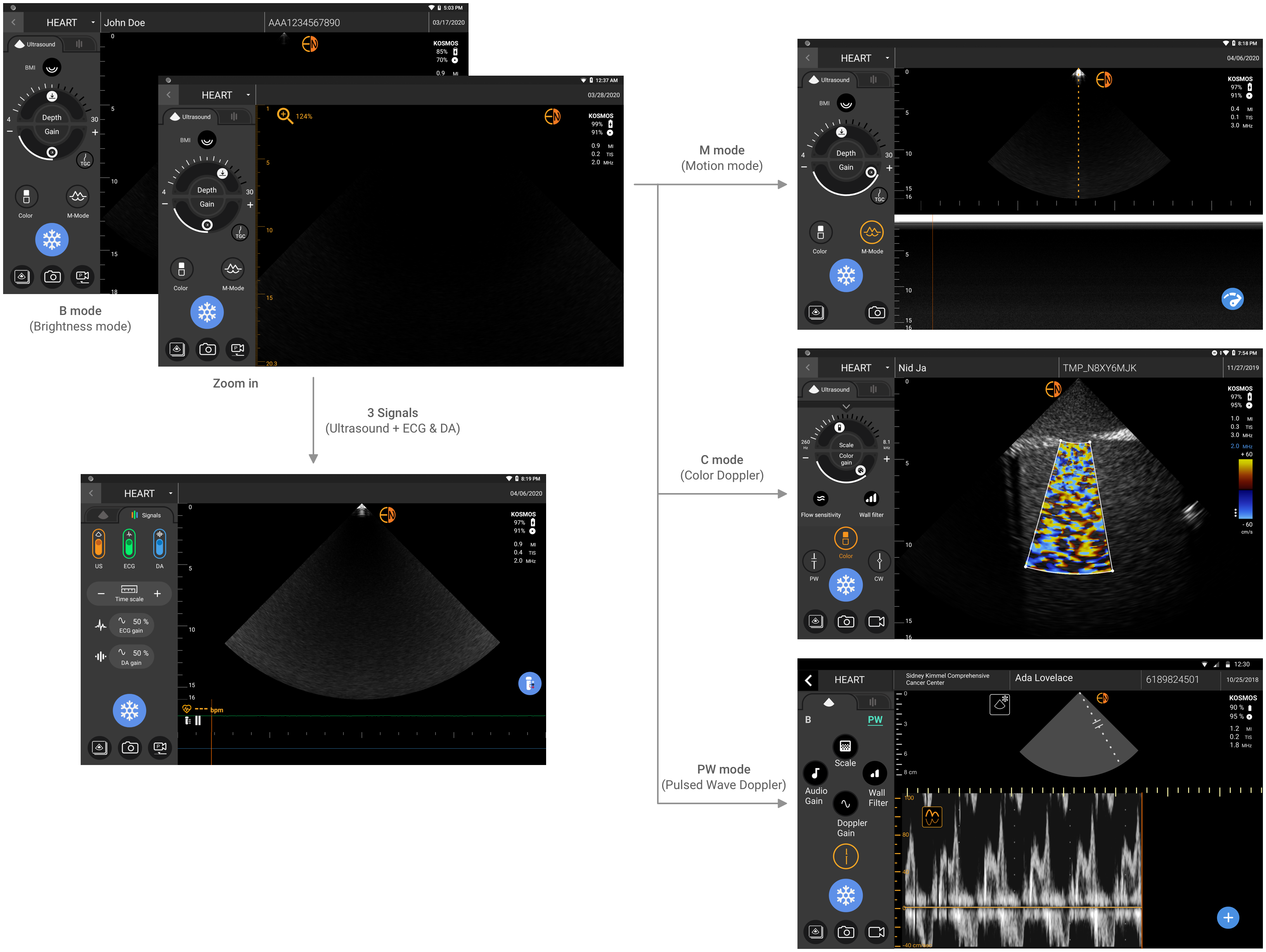
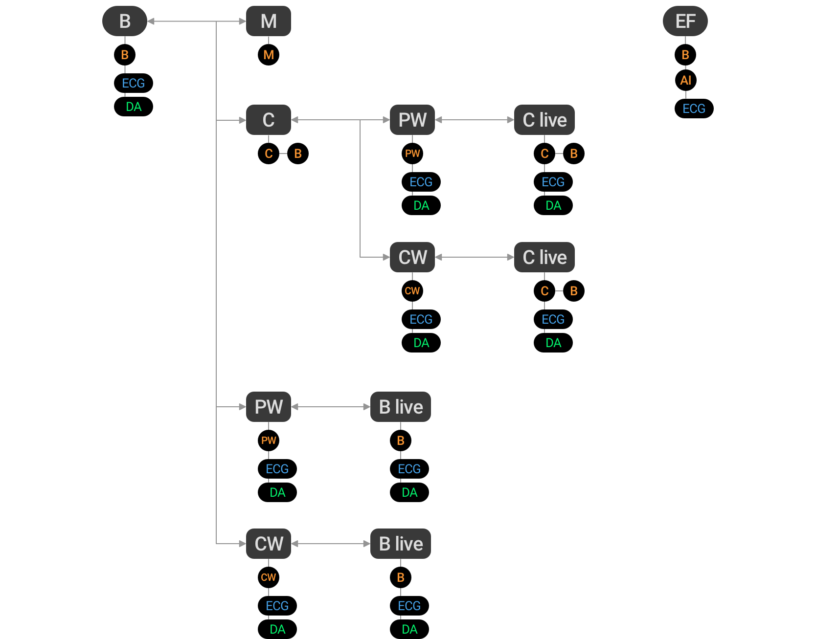
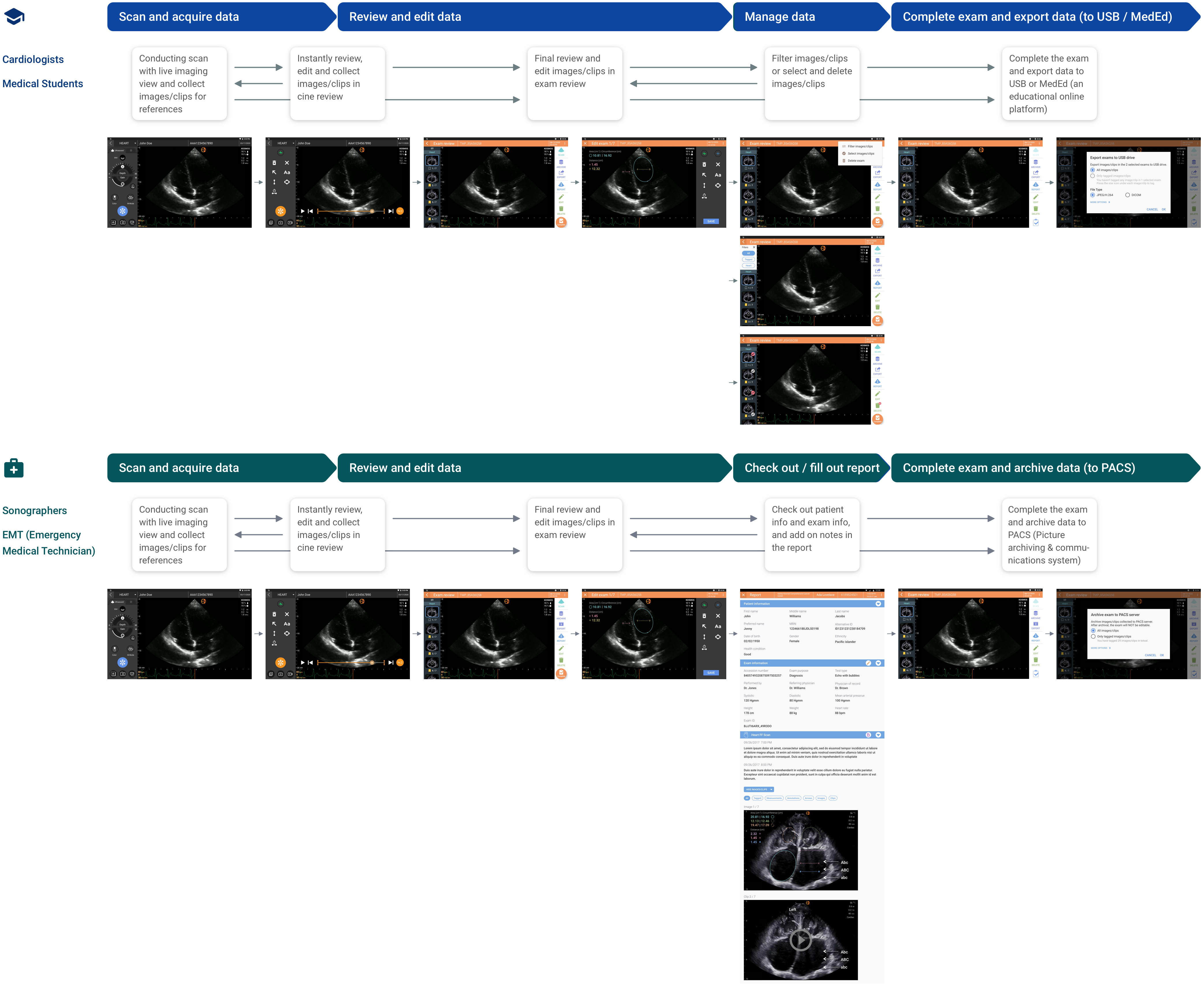
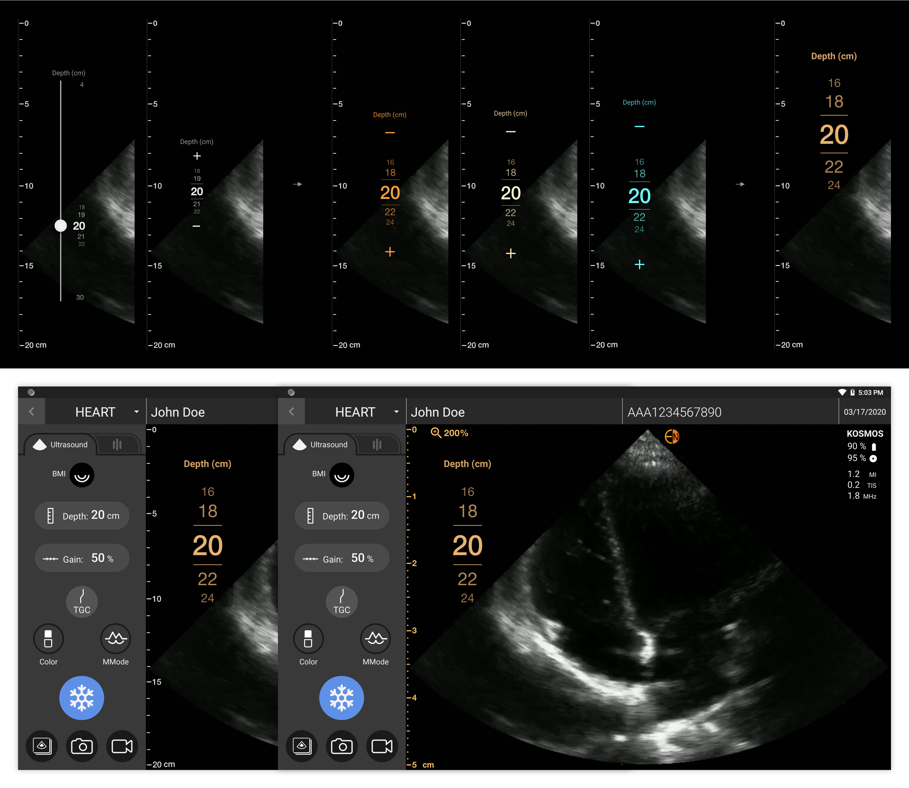
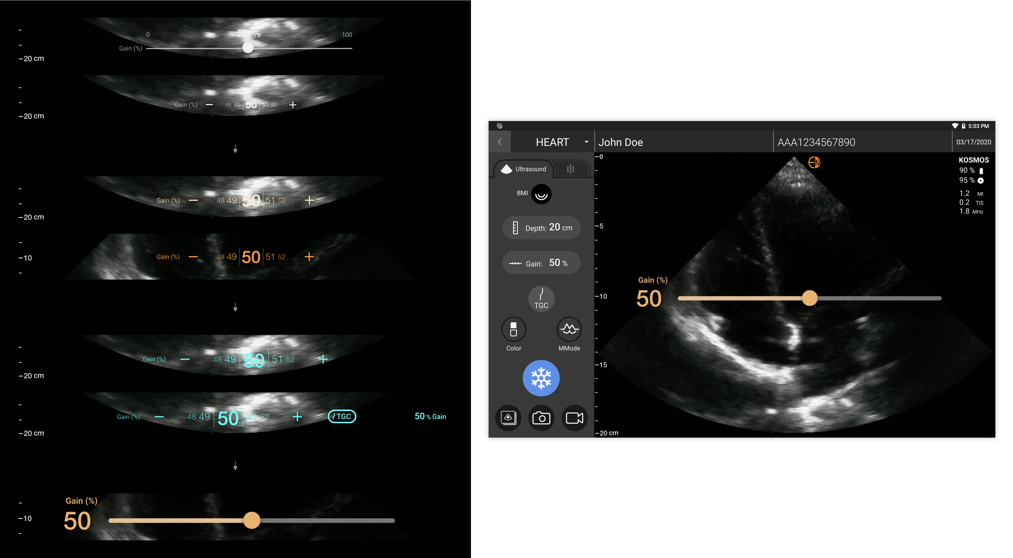
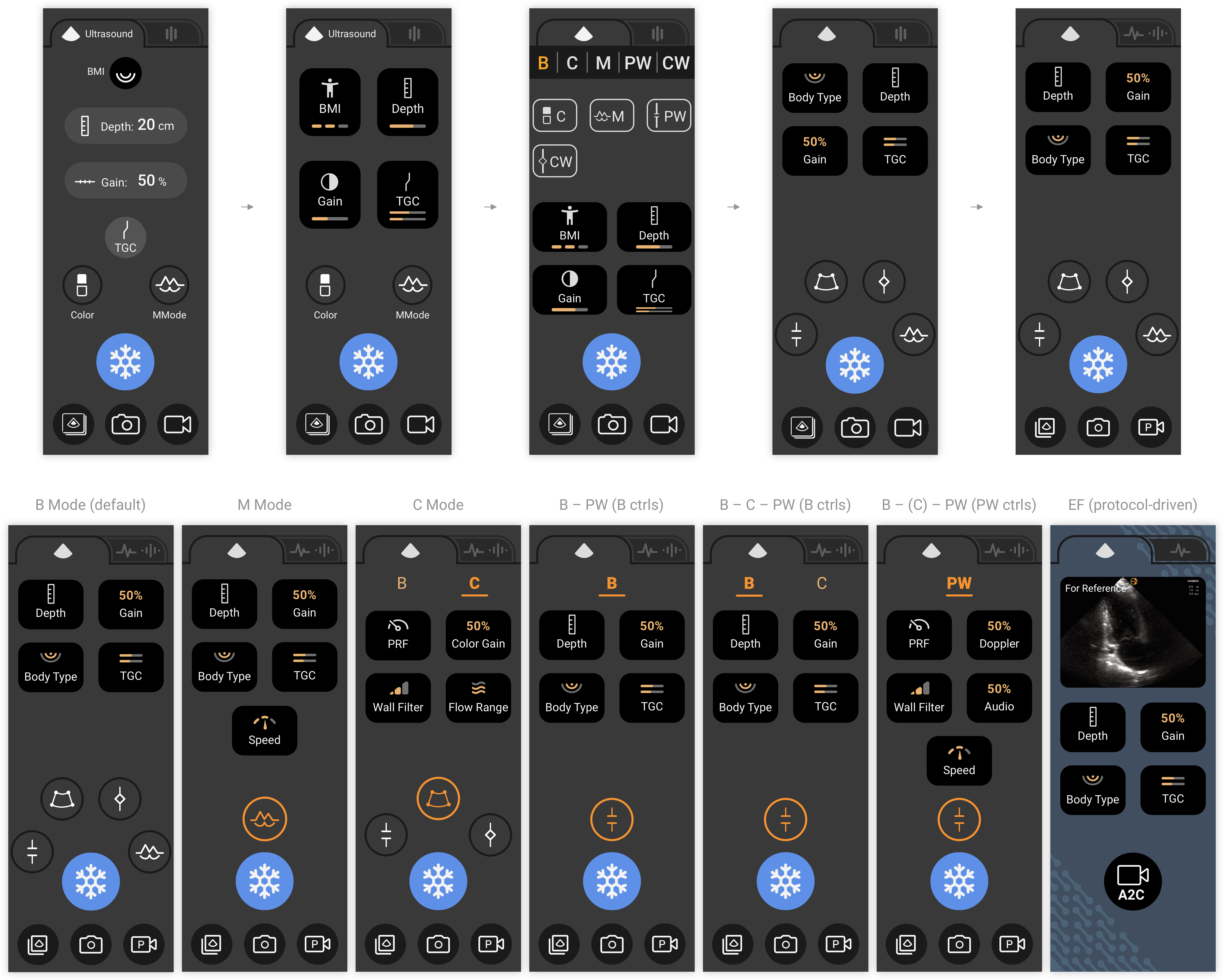
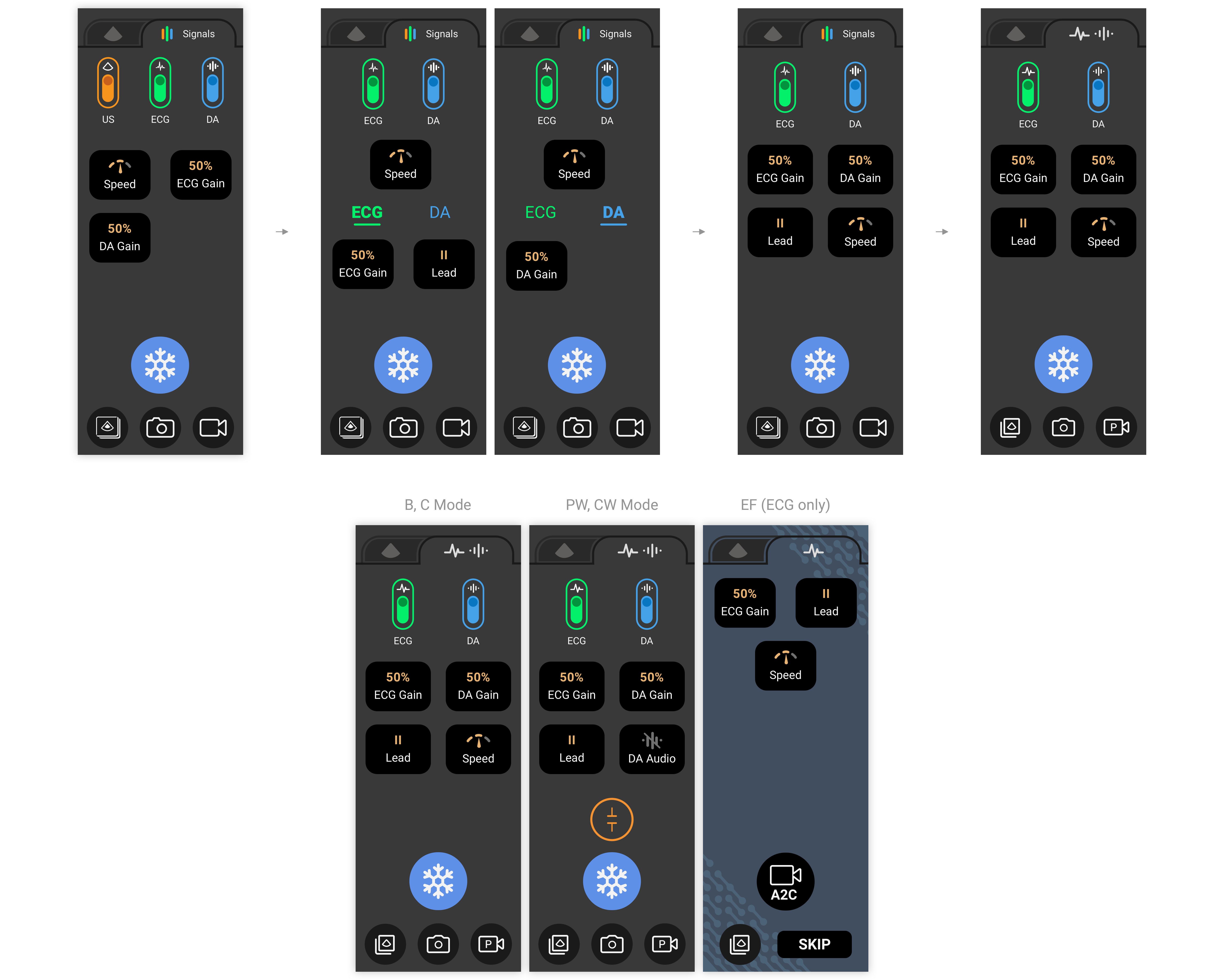
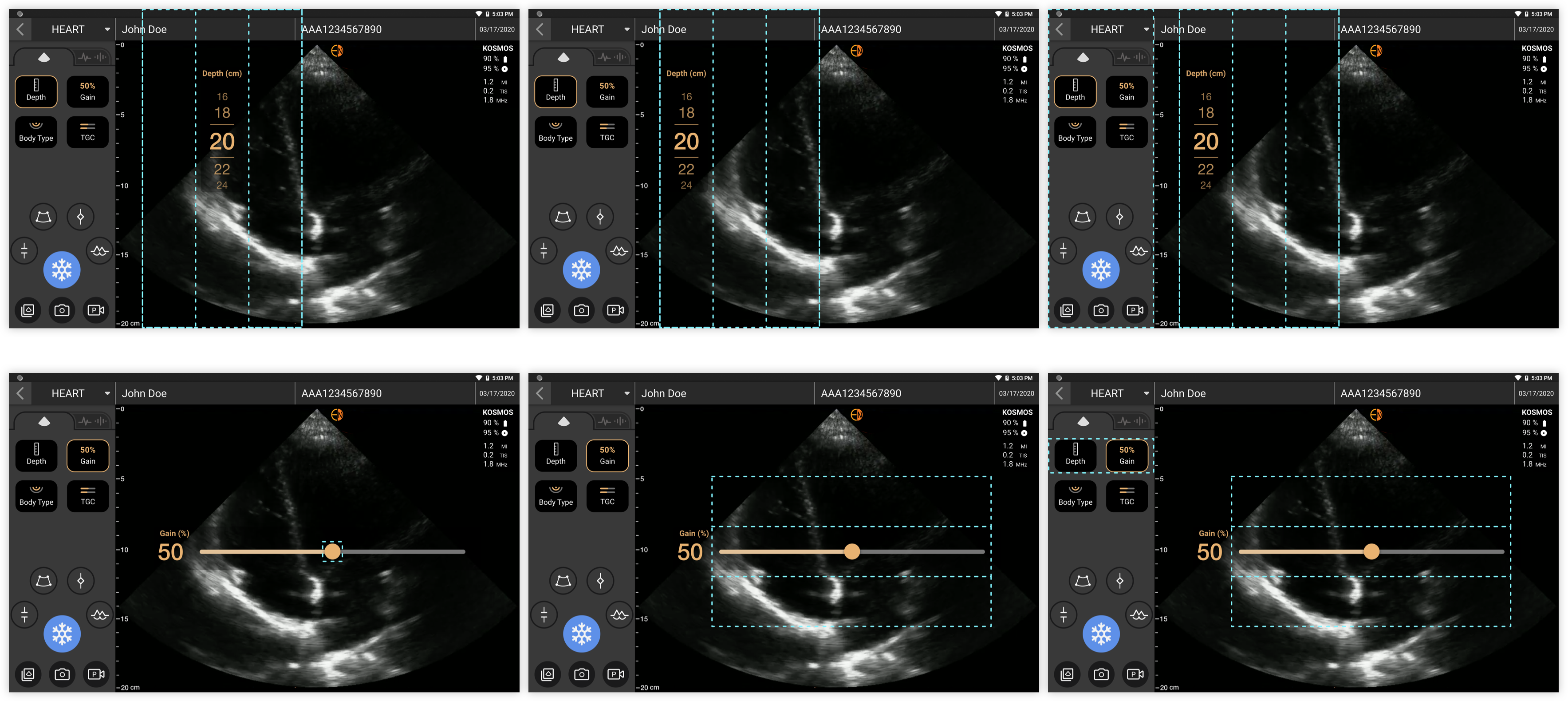
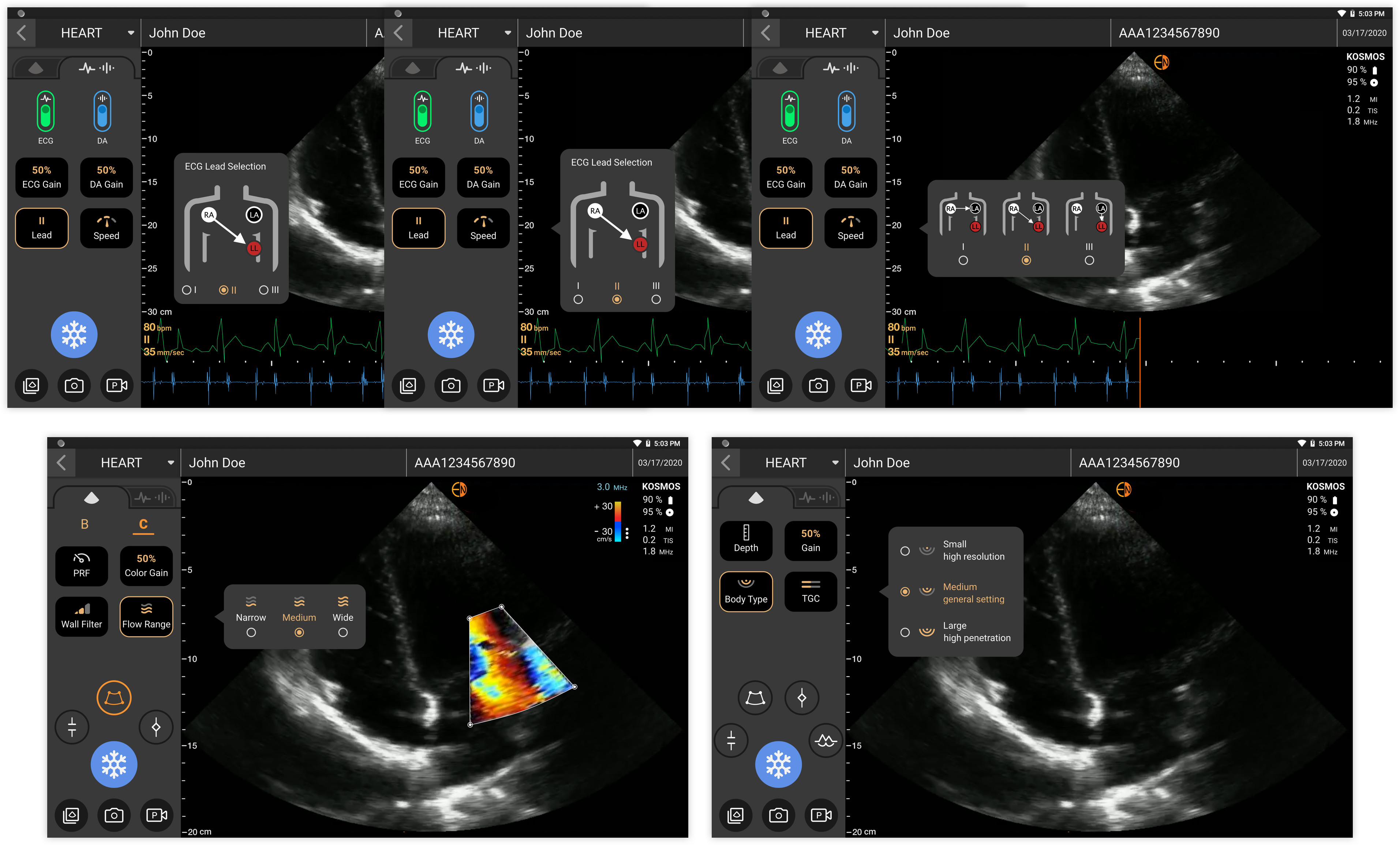
In addition to user types, I also clarified user workflows. For cardiologists and students, they scanned for education/studies, and exercises/assignments. Their workflow usually started with ultrasound scanning. They would save images and clips, and add annotations and measurements. After completing scanning, they might do some data management works (such as filtering, tagging, deleting, etc.) and could export the data to a USB drive or to the MedEd online platform, which was an educational cloud service for exam review and management (for both operators and reviewers) provided by EchoNous.

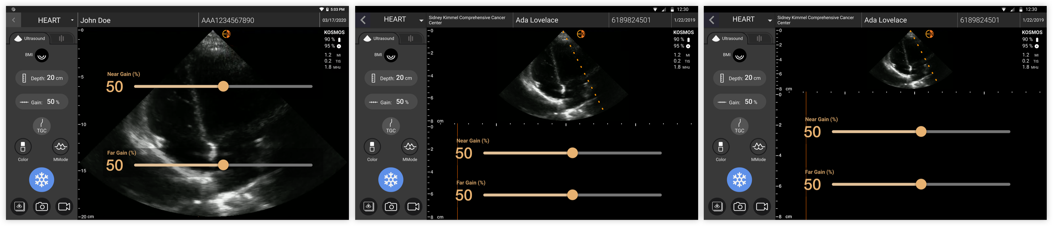
As for medical usage, creating patient and exam profiles were required. Users might do it before or after scanning, depending on how emergent the case was, and they could do it manually or import patient data from EHR (Electronic Health Record) systems. They would save images and clips, and add notes later or instantly. Eventually, they would review/edit/fill in patient info and exam info before archiving the data to PACS (Picture archiving and communication systems).
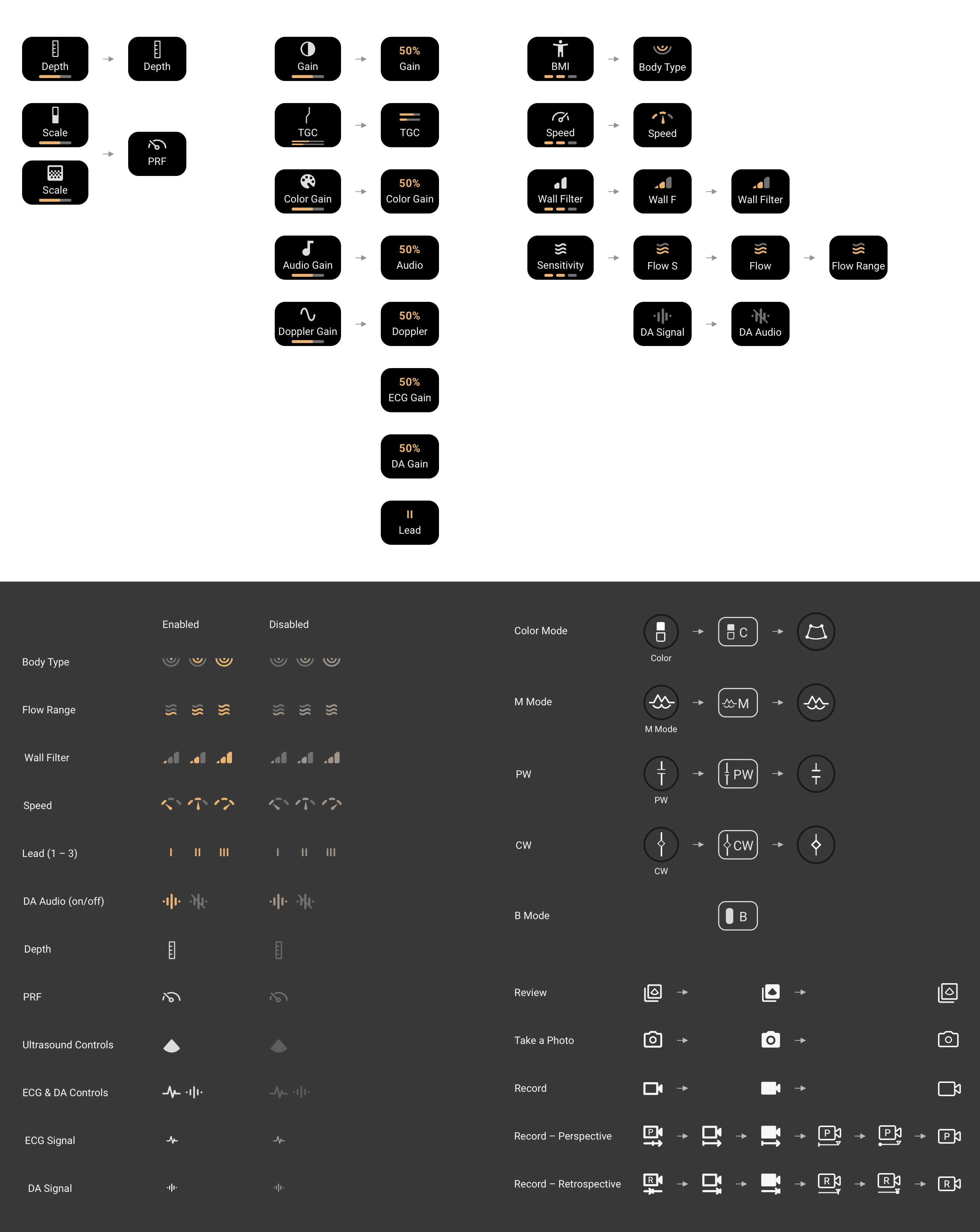
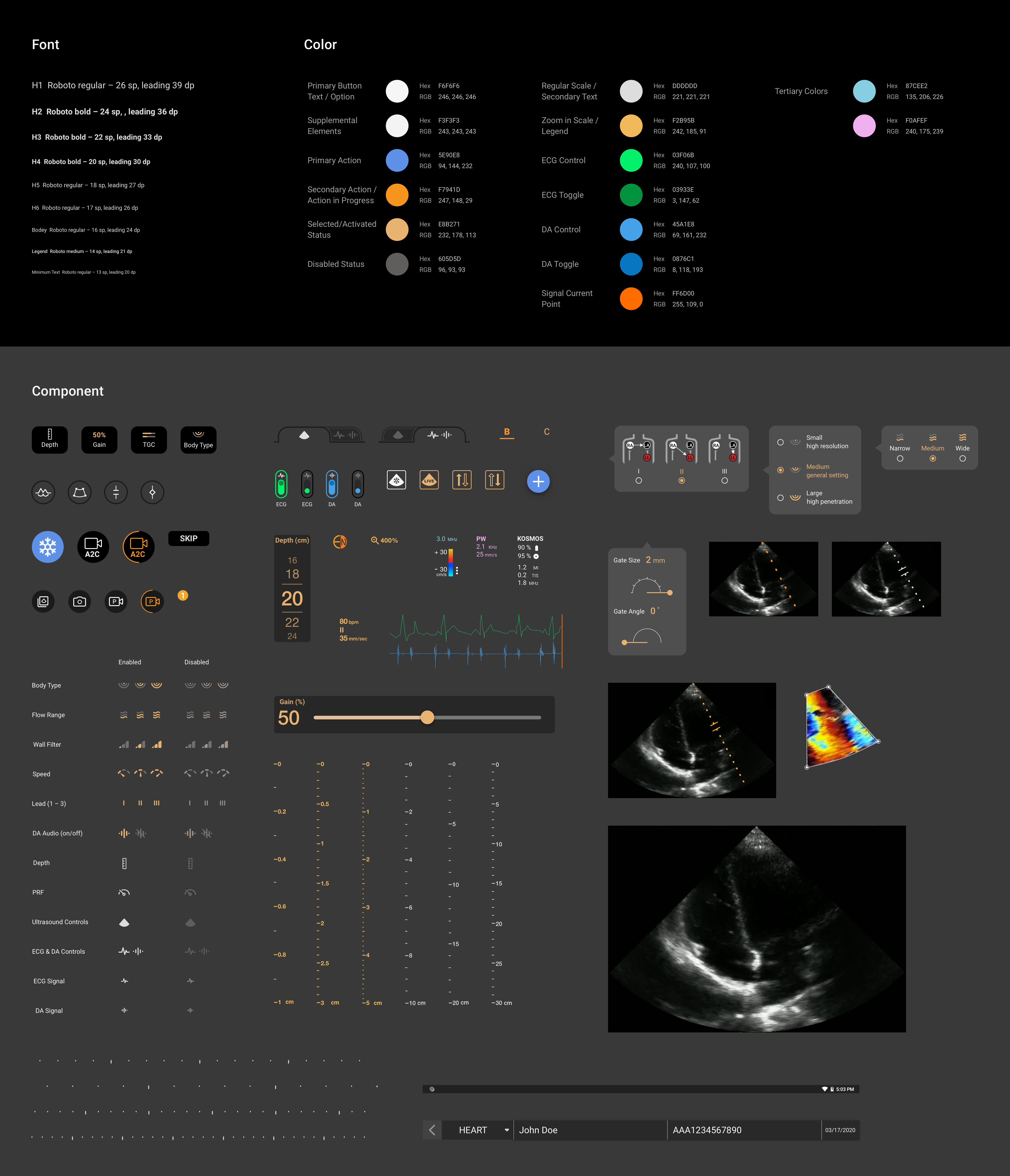
Main User Flow

From the above, we could know that a live imaging view was an entry point of ultrasound scanning exams, and its core functionalities were to serve users to easily find the views and acquire images and clips they need.

Competitive Analysis & Ideation

Create visual hierarchy for tick marks and define rules for breakpoints.

With the above understanding, I moved forward to the design stage. My first task was scale redesign, focusing on the depth scale first. Through reviewing other POCUS products in the market, I found that most of them had both major and minor tick marks, and not only threads but also dots could be used. Besides, showing numbers and the unit beside tick marks were helpful, and setting breakpoints for different ranges could help to present more scale details in a smaller range and fewer details in a larger range.

Competitive Analysis

Other software like Sketch, Illustrator, and Microsoft Word were also taken as references. They all had a more comprehensive rule for scale breakpoints.

Other Software as References

With some ideas in mind, I started ideating the design in both visual style and breakpoint rules two aspects.

Tick Mark Ideation

During the process, I had design review meetings and discussions with other designers, the PM, and both front-end and back-end developers very frequently.

Design Decisions

Take care of conceptualization, readability, and scalability.

After visualizing some initial thoughts, I double confirmed with the PM to ensure that I was on the right track before jumping to iterations. We made a couple of design decisions as a team:

Breakpoints Icon

Designing breakpoints for both depth scale and velocity scale to present tick marks aptly in different ranges.

Threads Icon

Using three-level tick marks with threads and dots to enhance visual hierarchy.

Number Icon

Applying numbers on the scales, always showing the start and the end numbers, and presenting the unit for user reference.

Zoom Icon

Using different visual style for the regular and zoom in status of the depth scale to help users to differentiate the two.

Digit Icon

Showing one digit behind the decimal point for both depth and velocity scales based on user needs.

Scalability Icon

Considering scalability in the new control panel design since more features with new controls might be added on in the near future.

Wireframes & Prototypes

Visualize ideas following the previously discussed task order, and collect feedback from team members and target users.

With the above decisions, I utilized hi-fi wireframes to present how the design could work in real situations. According to the aforementioned task order, the design was visualized and iterated based on team member and user feedback as below – the visual styles and rules for depth, velocity, and time scales; depth, PRF, gain, and TGC controls (transient sliders); ultrasound, and ECG & DA control panels for all the scan modes.

Wireframes

Iteration – Depth, Velocity, and Time Scale

Enhance usability and readability by shortening and thickening tick marks, apply special colors for particular views, and set different breakpoint rules for different window heights.

There were three types of scales in KOSMOS. The depth scale was primarily for sonographers to know the physical location and the size of the field of view (FOV) and assistance in making approximate measurements. The velocity scale was to present PRF in PW/CW. The time scale was for presenting both sweep speed in M mode and also ECG and DA trace. Below were key changes made during the iteration stage for scales.

Depth Scale Visual Design Iteration
Number 1

Regarding depth scale visual design, to create a clear visual hierarchy, I used longer and thicker threads plus emphasized numbers for major tick marks, shorter threads for secondary tick marks, and dots for minor tick marks. To let the scale easier to read but occupy less space, I made all tick marks thicker and shorter along the way, and picked colors that were not too dim or too bright for the regular and zoom in status (#DDDDDD and # F2B95B). As for numbers on major tick marks, by increasing font weight and changing the typeface from Roboto (the predefined one across the device) to Helvetica Neue, the readability was enhanced. We wanted to show both start and end numbers on the scale (with its original tick marks), so I saved a certain space (16 px distance) between the first/last tick mark to the top/bottom imaging area border for presenting the start/end number. In some cases, while users zoom in or move the imaging area, the first/last emphasized number on major tick marks would be too close to the start/end number, so I also defined a range (28 px) in which the start/end number would be hidden and only the first/last emphasized number would be visible.

Depth Scale Rule Iteration
Number 2

The rules for depth scale were also iterated for three times. In the beginning, which tick marks to present in which views was defined based on depth range and zoom in status with different imaging window sizes. In a design review meeting, I realized that the minimum range was 1 cm (depth 4 cm, zoom in to 400%), and the maximum range was 30 cm (depth 30 cm, regular 100% view). By defining how many major tick marks we wanted to show in a range could make tick marks presented more evenly in different ranges, and also help us systematically define the breakpoints. Therefore, in the second iteration, with other designers’ help, I defined five breakpoints for the major tick marks in the full image view, and combined the rules for secondary and major tick marks in the first version to create new rules for all the window sizes. This time, one more window size in the new PW/CW mode was involved. This version looked good, but we later found that in smaller views, when there were only major tick marks, it looked not ideal, and those for medium views could be redesigned as well. Thus, in the third version, I defined breakpoint rules for larger, medium, and smaller views separately. We got 5-7 major tick marks for the larger view (1080, 945, 810 px), 5-6 for the medium view (720, 540 px), and 4-5 for the smaller view (360, 300 px). Eventually, I made minor tick marks in the views without secondary tick marks to be secondary to make the scales consistent with velocity scales in PW/CW.

Velocity Scale Visual Design Iteration
Number 3

For the velocity scale for PRF in PW/CW, there was no zoom in status. I tried to apply the same visual style as what we had for the regular depth scale, but it looked unclear with imaging running behind. Therefore, I applied different colors that had color harmony with the theme colors of KOSMOS, such as orange and blue with different tint, shade, and brightness. Since they all looked a little bit eye-catching and distracting, we picked pure white (#FFFFFF) at the end, which was easier to be seen but not too standing out. Since the image in M mode was similar to PW/CW, we decided to use pure white for its depth scale as well.

Velocity Scale Rule Iteration
Number 4

Regarding the breakpoint rules, only two medium views (720, 540 px) in PW/CW needed to be taken care of, but the range was quite huge, from +-20 to +-600 (equals to 40-1200). I tried to tackle it with the same methods used for depth scale, and iterated two rounds to figure out a set of rules that could work effectively.

Time Scale Visual Iteration.png
Number 5

As for the time scale for sweep speed in ECG, DA trace and M mode, I tried to apply the same design concepts for depth scale here to make tick marks thicker, shorter, and brighter. The numbers were added on, different colors were presented, and the unit for speed was added in the description info section. Based on user feedback, they did not need to see numbers on tick marks to tell the time. The description beside was already sufficient. Besides, too many colors on the screen was distracting. Therefore, I eventually applied the same colors used for the depth scale, and removed the numbers on the scale and the icons in the description section to make the screen cleaner. Also, the visual style of the tick marks was modified a little bit to differentiate the major and minor tick marks apparently corresponding to the changes to numbers.

Iteration – Depth, PRF, Gain & TGC Control

Apply wheels for discrete sliders and regular sliders for continuous values, and support comfortable viewing experience.

After wrapping up the scale design, my next task was the control design. Since we already knew that transient sliders could be a direction to put effort on, and some products in the market also applied it and worked well too, I started the design work with this idea. Developers were also involved in an early stage to ensure design feasibility.

Depth Control Iteration
Number 1

For the depth control, in the beginning, two versions were ideated. One was a slider with an oval button to select the desired value, the other was a wheel for users to scroll and pick a value. Since the value options for the depth were predefined/selected numbers instead of natural continuous values, we decided to pick the wheel one which was more suitable for a “discrete slider.” In the following iteration, I switched the plus(“+”) and minus(“–”) buttons to make the slider easier to conceptualize, enlarged the font size and the space between numbers along the way to enhance readability and support smoother operation, and tried different colors that had color harmony with theme colors to make the wheel more popping up from the background image. Eventually, a brighter and softer color was picked with a translucent background for users to view it with clearness and comfort. Based on team member’s suggestion, I also removed the plus and minus buttons, so that users would not expect to see continuous values in the following numbers. In this stage, we also discussed two potential ways to trigger the control wheel – by tapping a button on the control panel or tapping the depth scale itself. Since the traits of velocity control for PRF in PW/CW was very similar to depth control, so we applied the same design to it.

Gain Control Iteration
Number 2

For the gain control, I also went through the same iteration as for the depth control, but it was more complex with another brightness and contrast control – TGC, required to be taken care of with gain control together. TGC had two controls – near gain and far gain. They allowed users to adjust the brightness and contrast of the top and bottom parts of an image separately. The gain value would be the average of the total near gain and far gain values. Based on these, I figured out two ways to trigger it. One was having a control button on the control panel, the other was showing the button only when gain control was triggered. The first one was later picked for it was more intuitive and convenient for users. Also, since brightness values were continuous from 0% to 100%, the slider design was eventually selected for both gain and TGC.

TGC Design
Number 3

With the gain control designed, I also created mockups for TGC controls to present how they look like in different mode views (with different window sizes) based on discussions with other designers.

Iteration – Control Panel

Combine icons and statuses to present trigger buttons concisely, arrange button orders to respect user behaviors, and enlarge touch-sensitive areas to support a smoother operation.

The last task in this project was the control panel redesign. We had new controls designed, and next, new approaches to trigger and dismiss the new controls were required. Also, space and readability issues of buttons were to be solved. In this part, I worked very closely with other two designers, had brainstorming sessions in the beginning, and took their advice to complete the design.

Ultrasound Control Panel Iteration
Number 1

To create a layout that could be applied to all scan modes across KOSMOS, I borrowed the idea from the PW/CW ultrasound control panel new design and tried rectangle buttons with icons, button labels, and statuses. The team had a great favor on this idea, so we started iterating from here. We tried different ways to present control buttons for both mode shifting (accessing) and control switching. In the end, we figured out a concise way to present buttons by combining icons and different statues into one. Also, we removed the text for mode buttons since they were self-explanatory based on user feedback. Starting with B mode, I finally applied the design to all modes. The button orders for each mode were also adjusted to align with the usage frequency and be more consistent across. We also enlarged the button label font size to serve user needs in looking at the screen from a certain distance.

ECG & DA Control Panel Iteration
Number 2

With the same approach, we also went through several iterations for ECG and DA control panels. In the beginning, we tried to remove the ultrasound toggle to help users more focusing on ECG and DA, moved ECG Lead control from the imaging area to the panel together with other controls, and separated ECG and DA controls by using tabs. Later, we figured out another efficient way to present ECG and DA controls by using just one tab but disabled the corresponding controls while the signal was turned off.

Touch Sensitive Area Iteration
Number 3

At this point, the touch-sensitive area for transient sliders was also discussed. At first, I proposed to place the depth wheel at around one-third of the imaging area, and allow users to scroll on both left-hand and right-hand side of the wheel to take care of both left-handedness and tight-handedness. However, the team had the concern that the wheel would block too much part of the imaging area, so later decided to place it closer to the imaging area border instead, and applied the same behavior to the gain and TGC slider. After collecting feedback from users, we realized that supporting scrolling on the depth button (the control trigger) itself would make the control easier since users normally had only one hand for operation (the other hand was used for holding the probe). Therefore, we enlarged the touch-sensitive area by allowing users to scroll vertically on the whole control panel after pressing the depth button and before the wheel dismissed. This design was also applied to gain control that users could directly scroll on the gain button horizontally in the control panel area. Besides, I also proposed two ways to dismiss transient sliders – auto dismiss and by tapping anywhere in the imaging area. After discussing with the team, we together defined the auto dismiss after user finger released for two seconds, and added one more rule of tapping any other control buttons to dismiss.

Popup Iteration
Number 4

With the concern that users may need some explanations to better understand each control, the design team decided to use a pop-up to tackle this issue. While users tapping on a button, a pop up would show up with several options (3-4) and the corresponding brief explanations for users to choose. In the end of this project, I also helped with the pop up design. We finally picked a set of designs that were able to present all the options clearly and better contain longer strings for option labels and explanations. We also tried to convey positive messages in each explanation to encourage usage.

Button & Icon Iteration
Number 4

During the design iteration, I also updated icons for mode and control buttons along the way to make them more intuitive, concise, and consistent. In the end, icons in all statuses were well organized in an art board, and uploaded to Zeplin as part of deliverables for developers.

Final Design

Demonstrate the interaction design of transient sliders, and how the new scale and panel control design work in different scan modes with different window sizes.

Through the above iteration, the new control and scale design were finally generated. The deliverables including Sketch wireframes and Principle prototypes were handed over to developers through Zeplin and Google Drive. Besides, to support the product development and better cooperation between designers with designers, and designers with developers in the future, I also updated the component library along the way.

Design Guideline

During implementation, I had meetings and discussions with developers and the PM frequently. We also collected feedback from sonographers and cardiologists based on their actual usage, and adjusted the design and implementation along the way. I also helped with testing the new UI through multiple APKs, and provided feedback for developers to improve the implementation to get closer to the actual design. Eventually, we got positive feedback in the onsite summative studies after the new interaction design release. The final design prototypes were presented as below:

Depth Control
Number 1

With the new control panel and control design, users were able to select the depth value smoothly in B mode and EF. By tapping the depth button, users could trigger the transient slider and scroll to adjust the depth value.

Gain & TGC Controls
Number 2

The interaction for the gain control was similar to the depth control. It was accessible in all modes. The gain value would be the average of the two TGC values (near gain plus far gain), which control was particular for B, M mode, and EF.

Ultrasound Controls
Number 3

With the new control panel design, users could see all the controls clearly. The mode shifting (accessing) buttons on the sidebar allowed users to easily shift back and forth between default settings (B mode) and other modes. In B mode, users could access M, C, PW, and CW modes; and in C mode, PW and CW were available. Regarding controls, each mode had its corresponding controls, and in each mode, the accessible controls were different. In C mode, users could access B mode controls in C mode, and switch between C and B mode controls. In PW, there were two situations. Users could come from “B – PW”, or “B – C – PW.” In the former case, users were allowed to switch between B mode controls and PW controls by tapping the freeze or live toggle in the B mode window on top. In the later case, users were able to switch between PW and C or B mode controls by the same toggle. While in B/C live, there were tabs on the control panel sidebar for users to switch between C and B mode controls. CW shared the same cases with PW.

ECG & DA Controls
Number 4

As for ECG and DA controls, they were accessible in all modes except M mode. In ECG and DA tab, the two signals had their own on-off toggles to show and hide ECG and DA trace, and enable or disable corresponding controls. In PW, users could also choose to turn off the DA audio and focus on the doppler sound.

Hi-fi Prototypes

Control Panel Design Exploration

Explore other potential layout possibilities.

After this project, I had opportunities to explore different layouts and visual treatments of control panels in live imaging views and cine review, trying to see if there were other ways to make the views look cleaner. Potential solutions could be hiding the mode shifting buttons in the second layer, and changing the background of the control panel to enhance the sense of unity. At that time, we did not pick these ideas with big changes to polish and move on due to time limitation and scope consideration, but they could be future references when we come back to refine the control panels again.

Wireframes

Impacts

Smoothen ultrasound scan operation.

The new control design has been well admired by our customers and many sonographers who participated in our usability testing sessions. We also heard that users were satisfied with the defined touch sensitive area for controls and the transient sliders for depth and gain controls, especially with high praise from elder sonography professionals.

Reflection

Limitation

Although we cooperated with many doctors and sonographers to collect feedback and support design refinement, we had not entered the market and did not have a large group of users at that time. More user studies on more user groups with various use cases would be helpful.

If given more freedom and time, different typographies could be applied to the control panel, which may bring to a more intuitive and cleaner experience.

Next Step

Invite different user groups, including doctors, EMTs, medical students, etc. to participate in design evaluation.

Refine the design with user feedback, and iterate it corresponding to future releasing features.

What I Learned

Providing visual elements in design as much as we could, and using the terms familiar to developers (e.g., “(h)dpi” and “sp” for dimension unit and font size in Andriod devices) could support smooth implementation.

Meeting with PMs on a regular basis is helpful in tracking project direction and time usage/allocation.

Talking with developers in an early stage is a good strategy for not only ensuring feasibility, but also guaranteeing release of implementation in time.