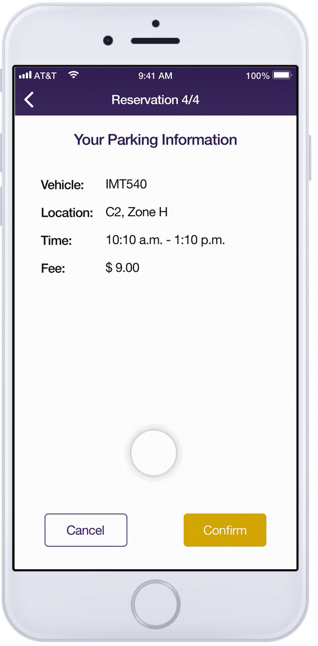
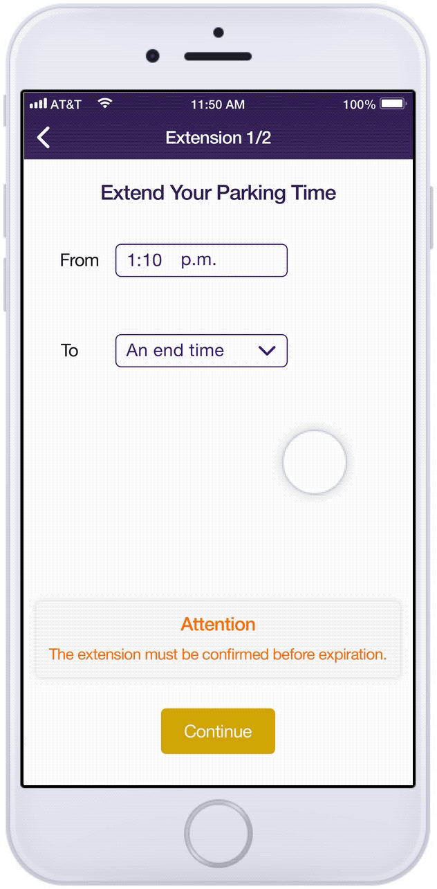
Parking Angel
Facilitating efficient parking.
Project Type: |
Design Methods for Interactive Systems course |
Duration: |
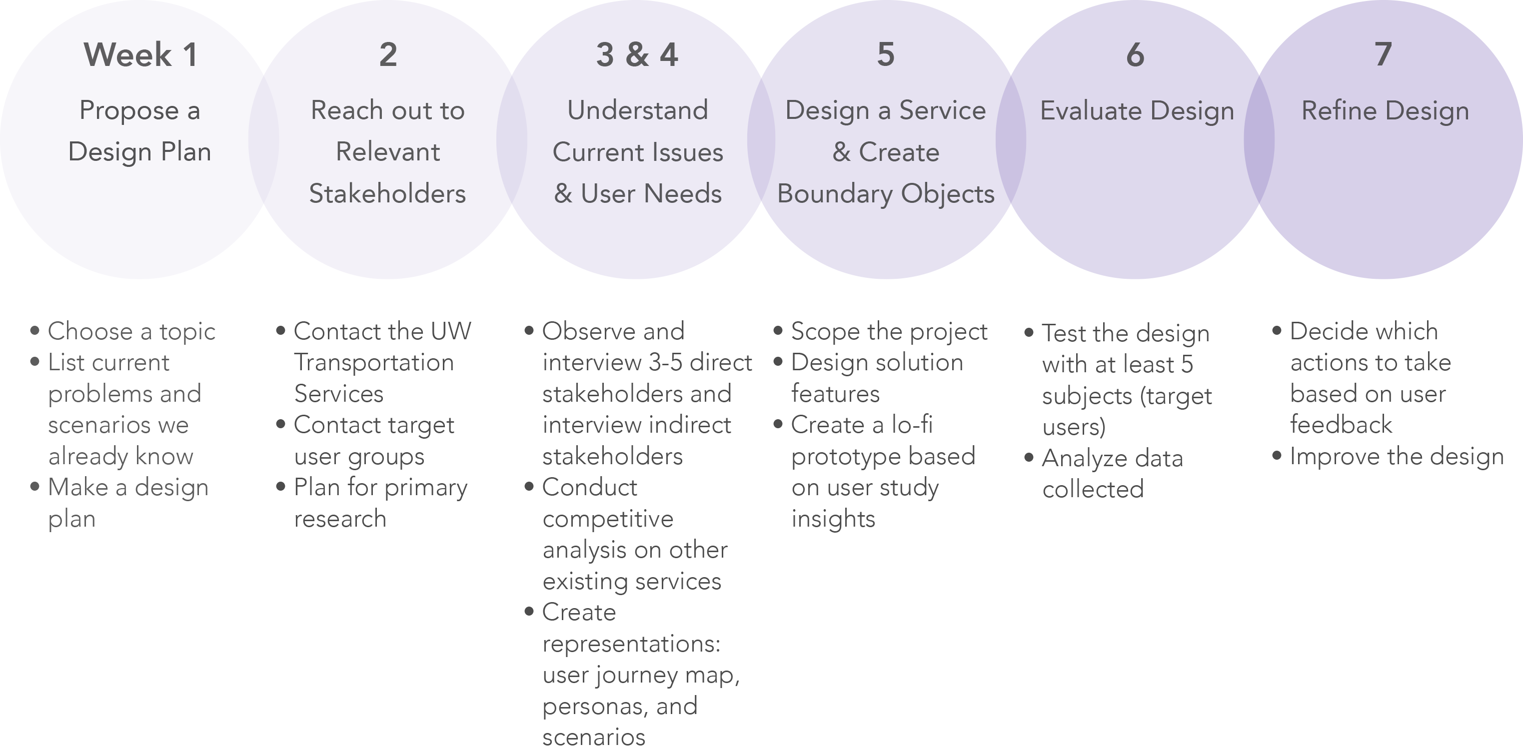
Jan. – Mar. 2017 |
Team Size: |
3 members |
Practice Areas: |
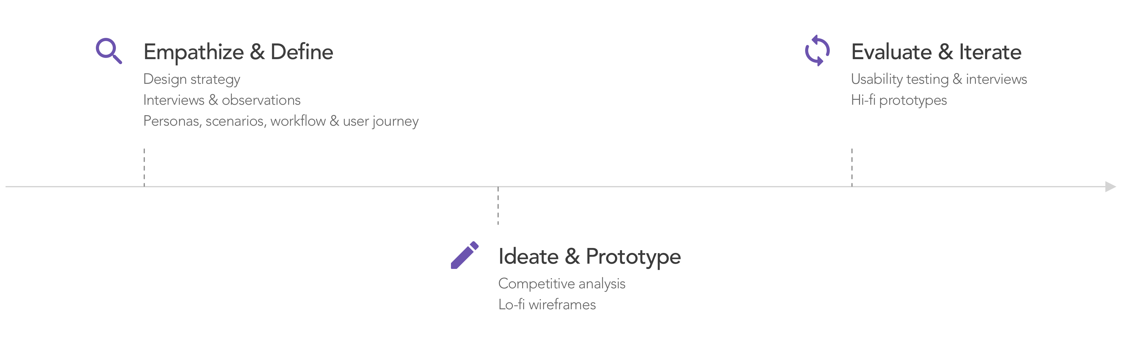
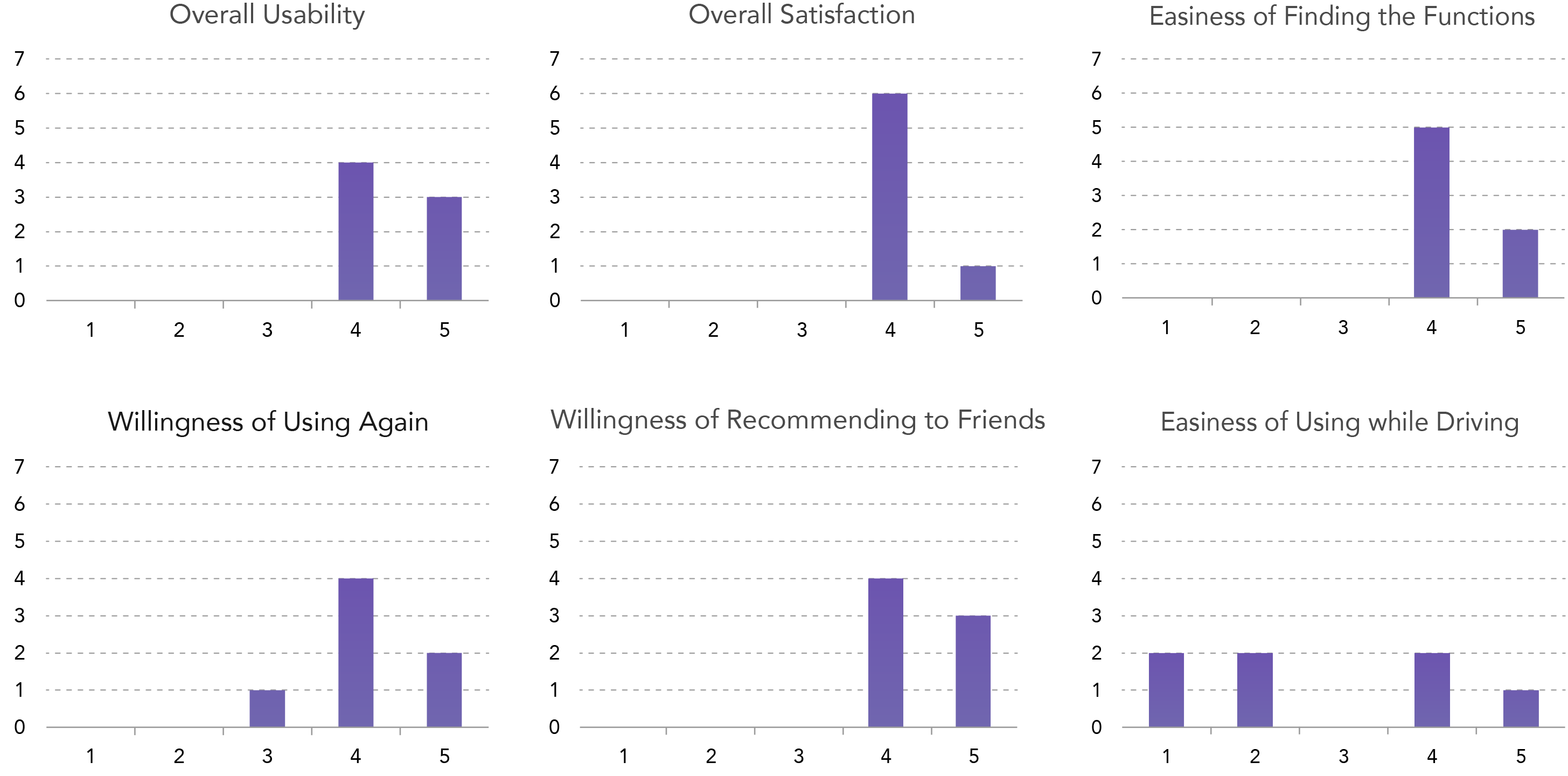
User studies, UX design, interaction design, visual design, usability evaluation |
My Role: |
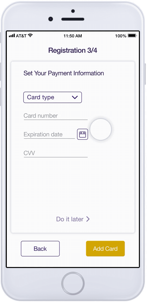
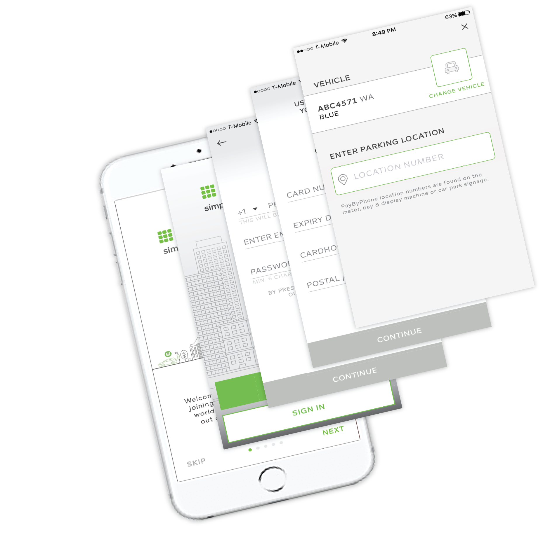
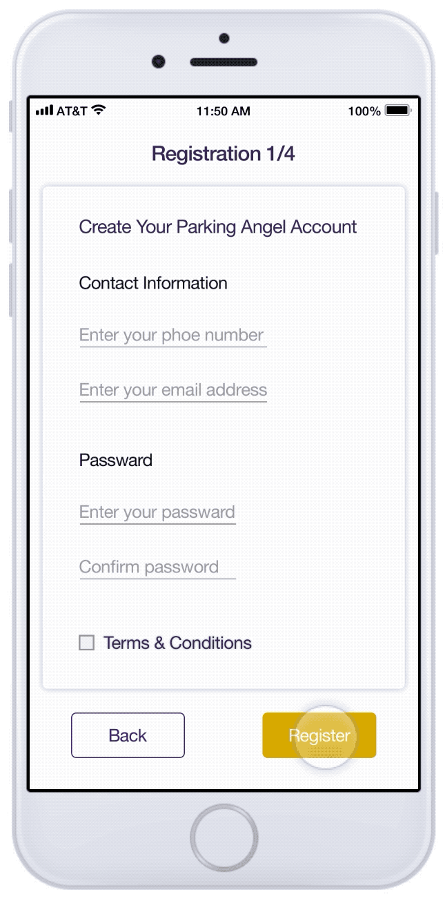
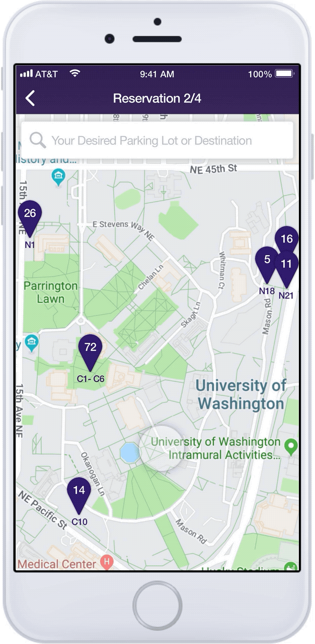
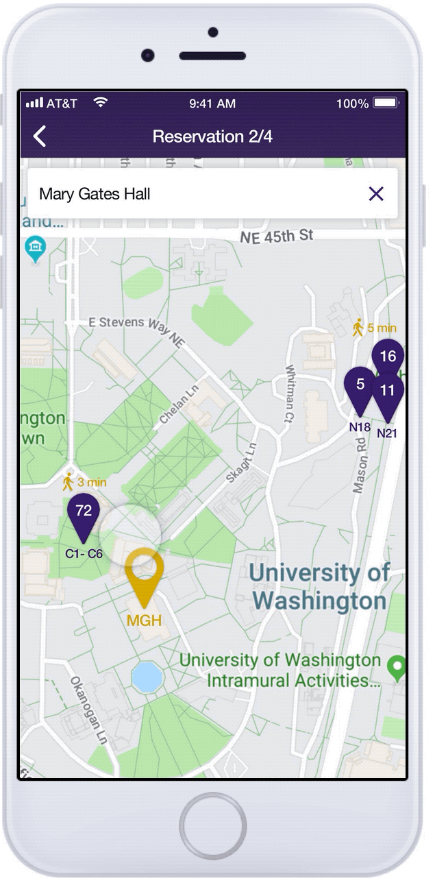
I led the user studies and the design evaluation. After the end of the project, I did one more iteration by redesigning the mobile app with hi-fi prototypes. |