KOSMOS – OTS Exam Review

Improving ultrasound exam content management.

Project Type:

UX Designer at EchoNous

Duration:

Aug. 2020

Members:

2 designers, 2 engineers, 1 PM

Practice Areas:

UX design, information architecture, visual hierarchy, interaction design

My Role:

I served as a design lead in this project, and co-worked closely with other designers, researchers, PMs, and engineers.

Project Vision

KOSMOS is a point-of-care ultrasound (POCUS) service combining AI technologies to facilitate ultrasound scans and disease diagnosis, especially for emergency cases, telemedicine, and medical educational purposes. OTS (Off the Shelf) was a project to enhance the product accessibility and increase the market share of KOSMOS app by transferring from Bridge (EchoNous’ standalone device) to Android devices, in which both landscape and portrait views needed to be supported. We took it as a great opportunity to solve the long-lived usability issues of the app by designing new layouts while enhancing user experiences at the same time. Among them, Exam Review was the section with the most issues, where user flow, interaction, and visual design were all improved.

Challenges

Both the ultrasound scan work flow of medical technicians and students/researchers need to be supported.

Extend the new design that could be adopted to not only KOSMOS Bridge and the landscape views, but also the portrait views of tablets (and even the split screen views).

Refine the interaction and visual design while following the predefiend design styles to ensure the consistency across the product.

Landscape View Exam Review Demo

Design Process

Design Process

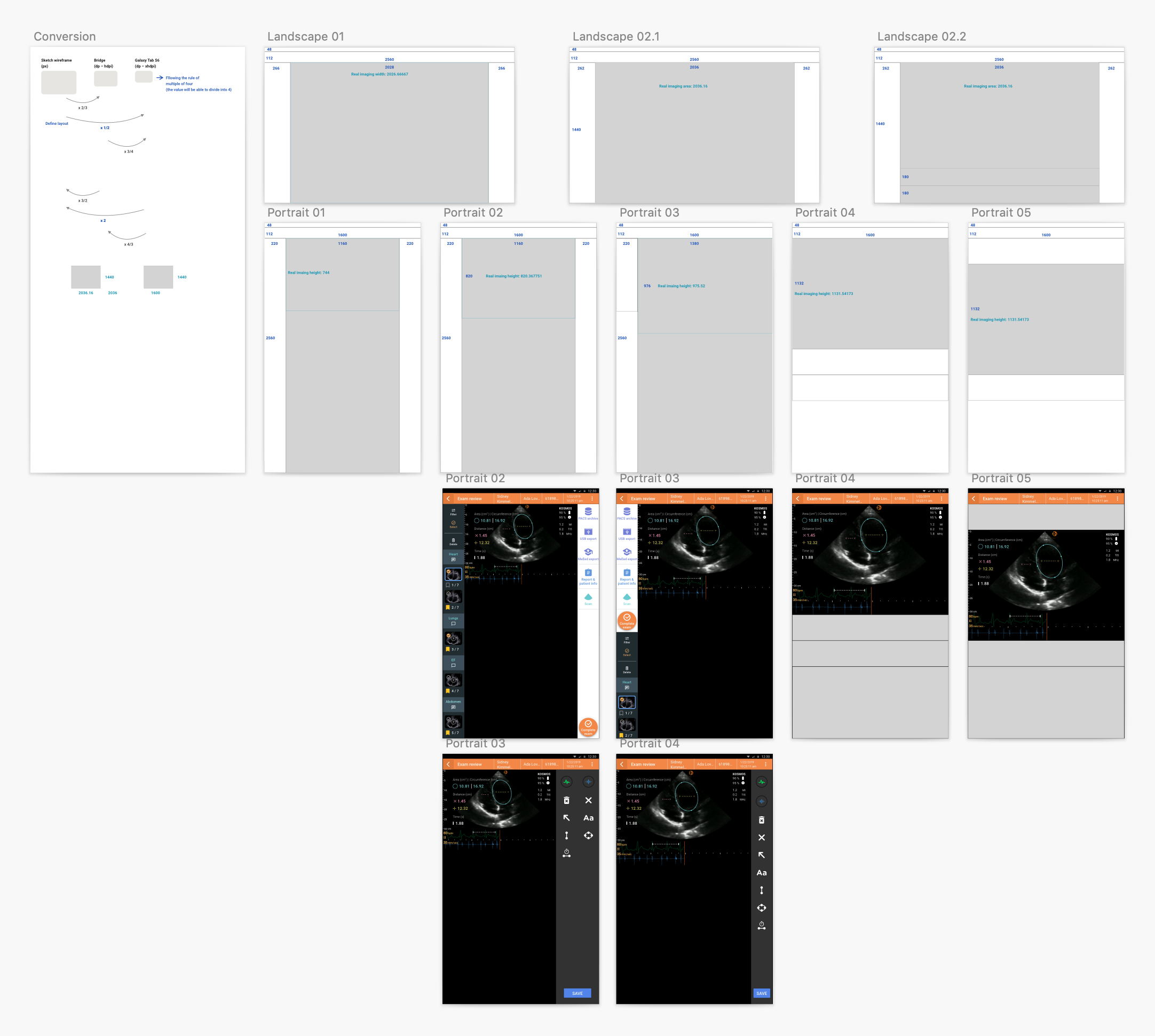
User Workflow & Current Issues

User flow, interaction, and part of the visual design need to be improved to support smooth ultrasound scan for medical technicians and students/researchers.

In the beginning, I clarified the ultrasound exam user workflow with PMs and other designers. I realized that KOSMOS supported ultrasound scans focusing on two main user types – medical technicians and students/researchers. For the first type, there were two main scenarios – emergency use cases and regular exams.

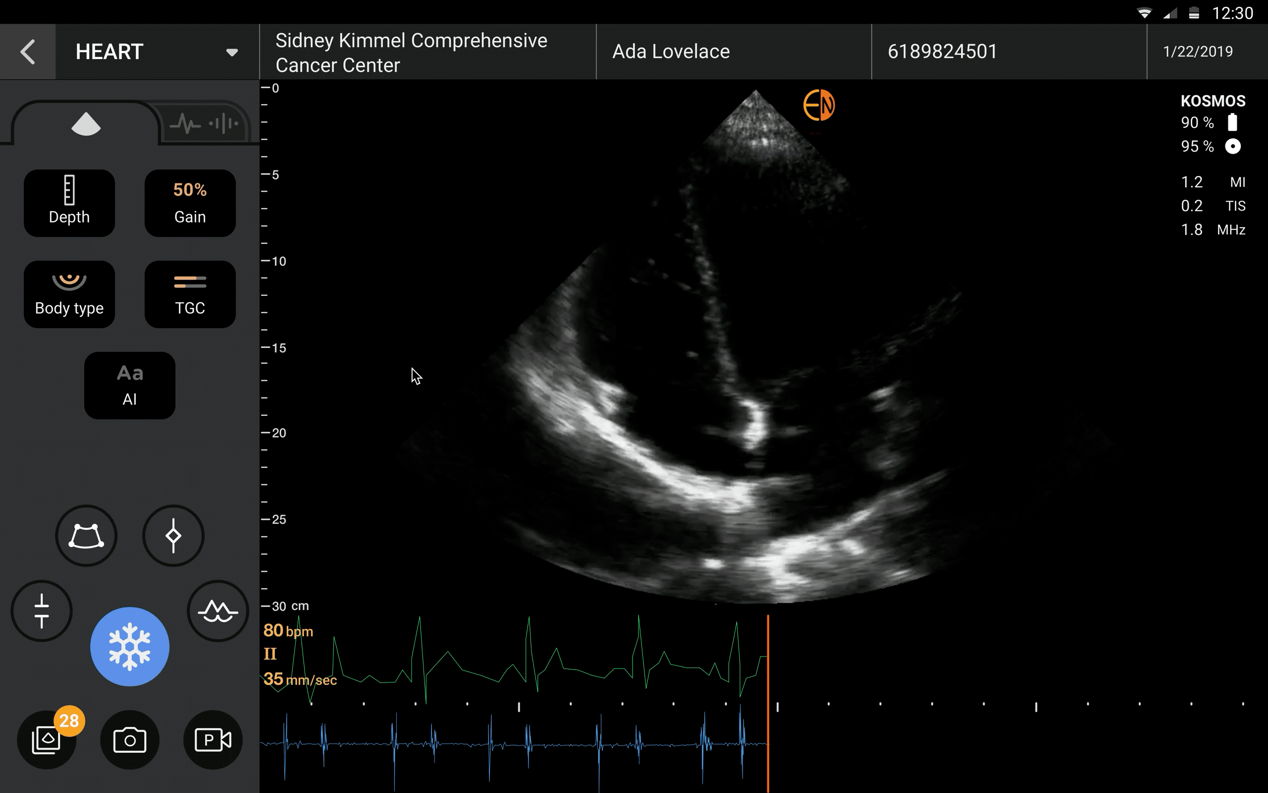
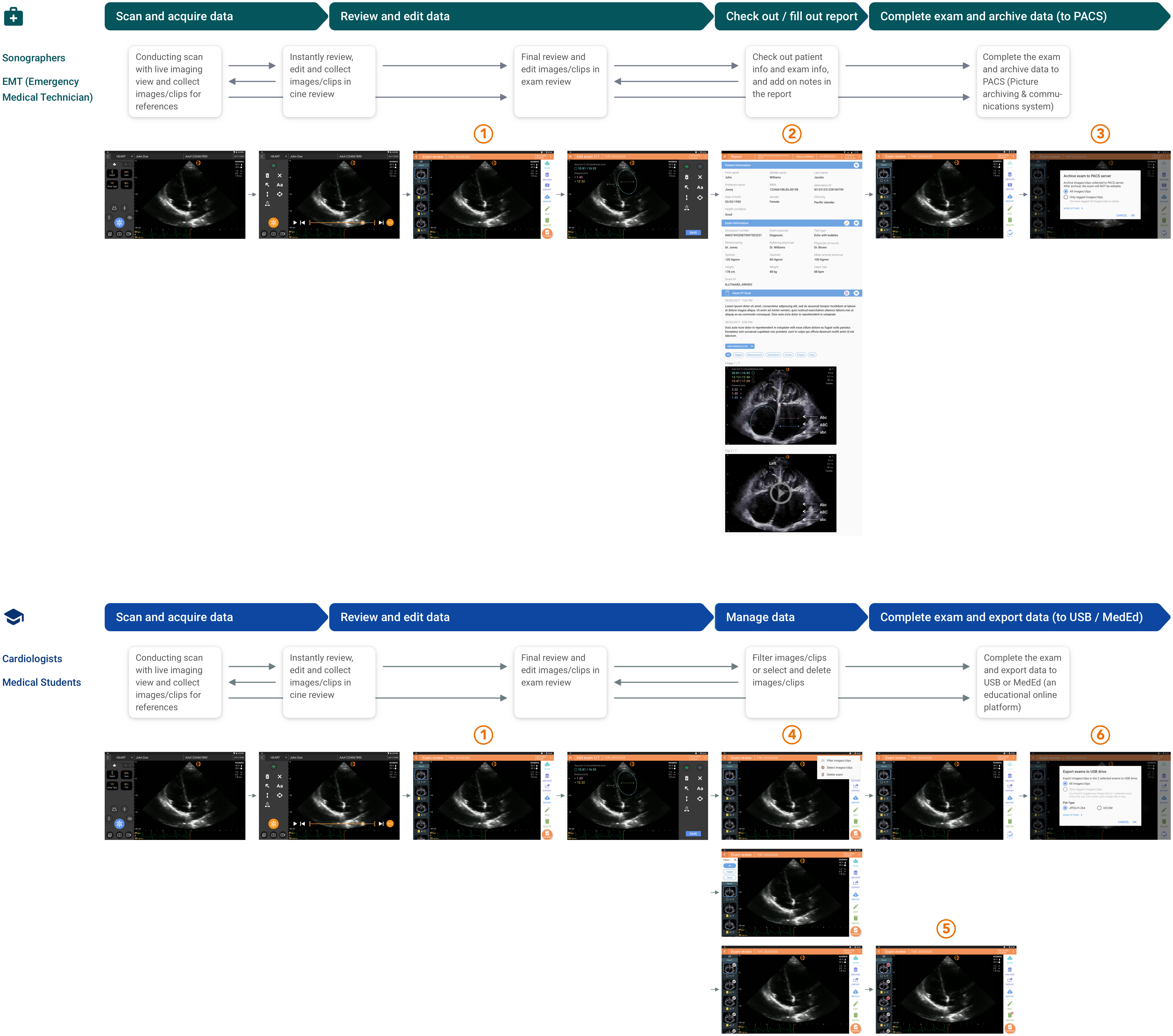
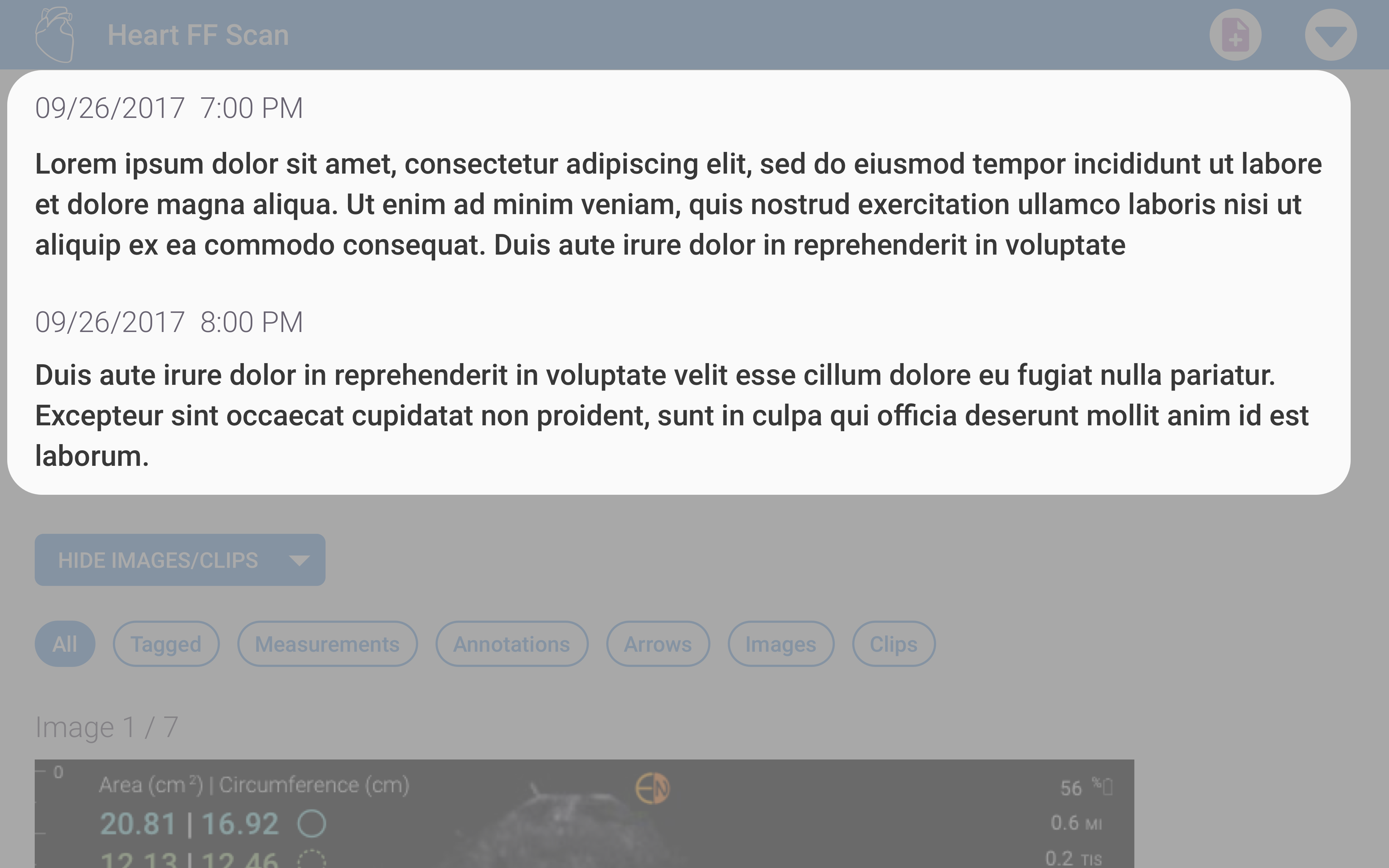
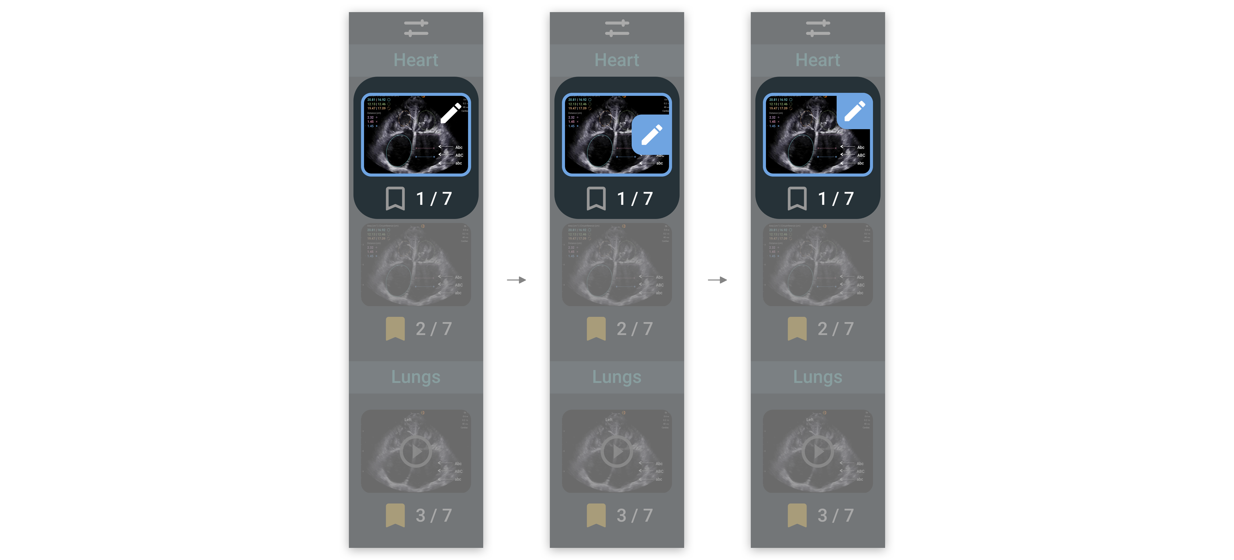
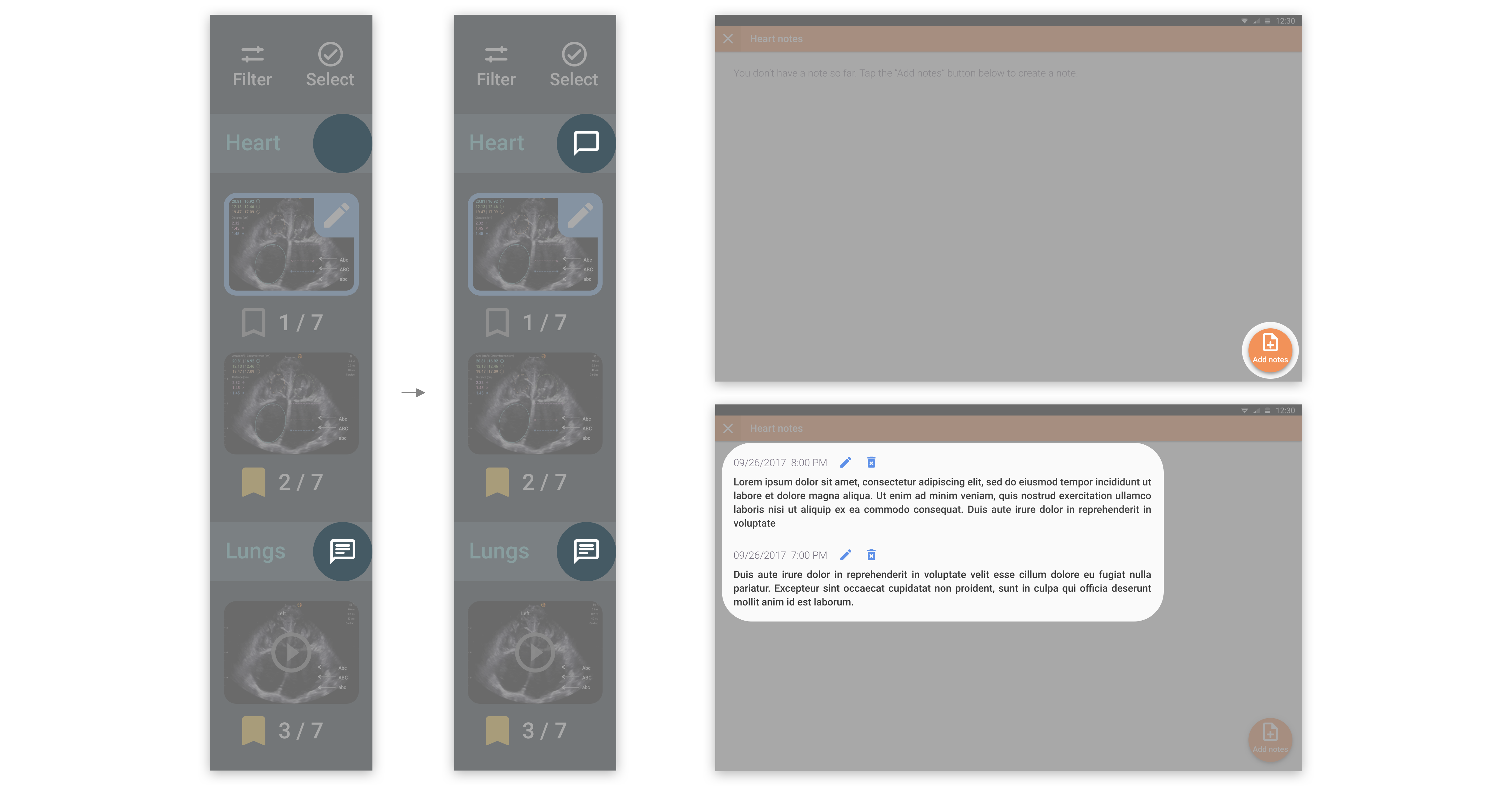
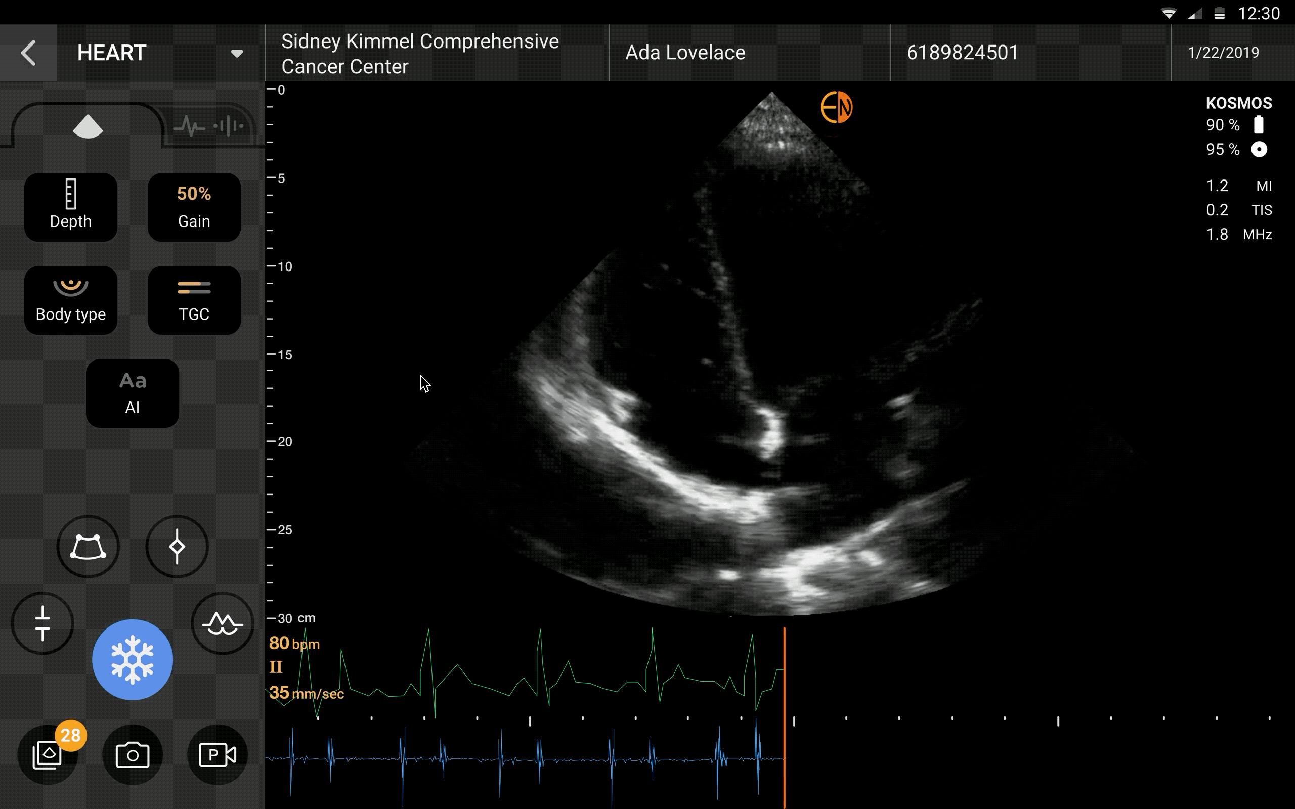
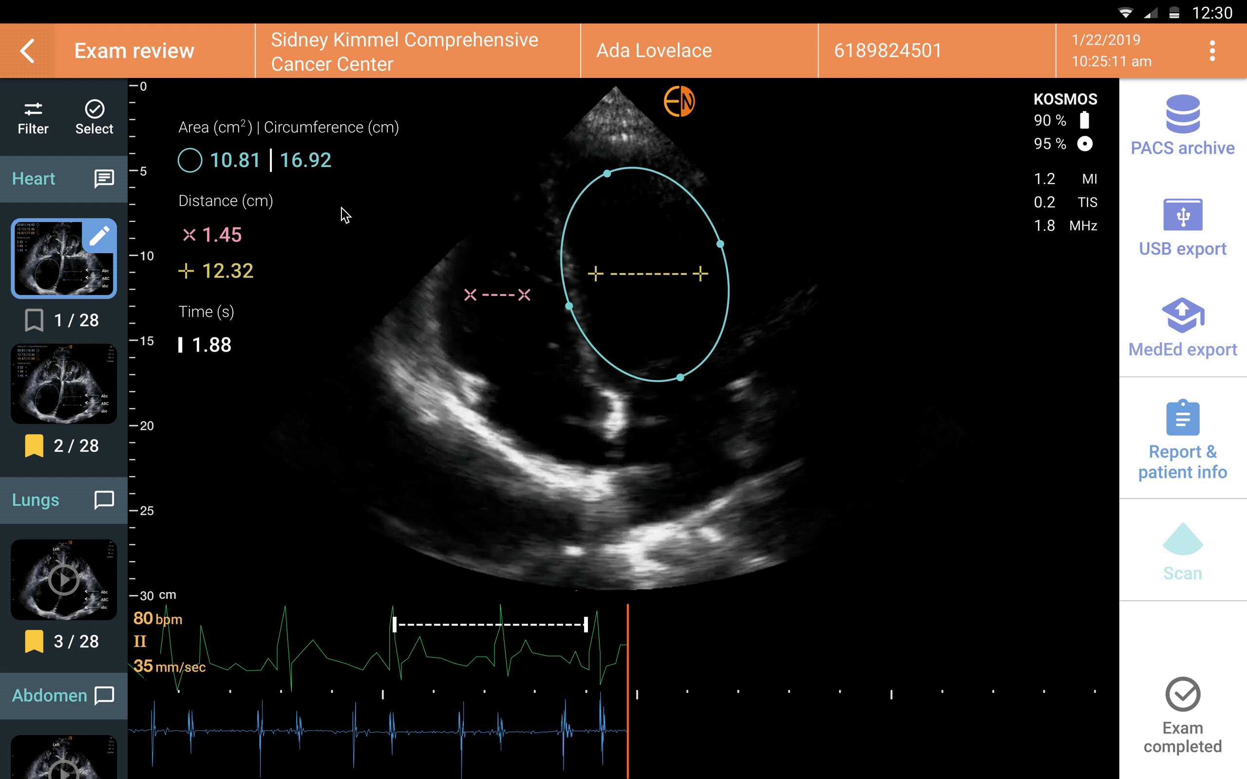
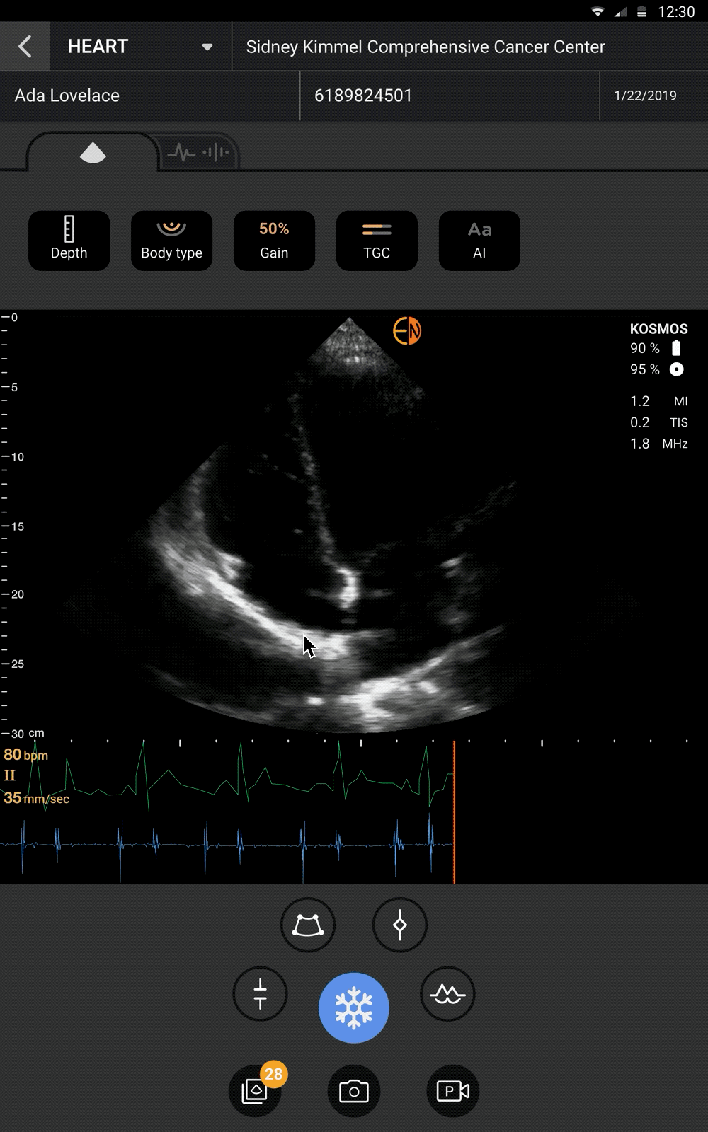
While conducting an exam, medical technicians may start with creating a patient profile or an exam profile, or start with ultrasound scanning directly. They would save images and clips, and add annotations 
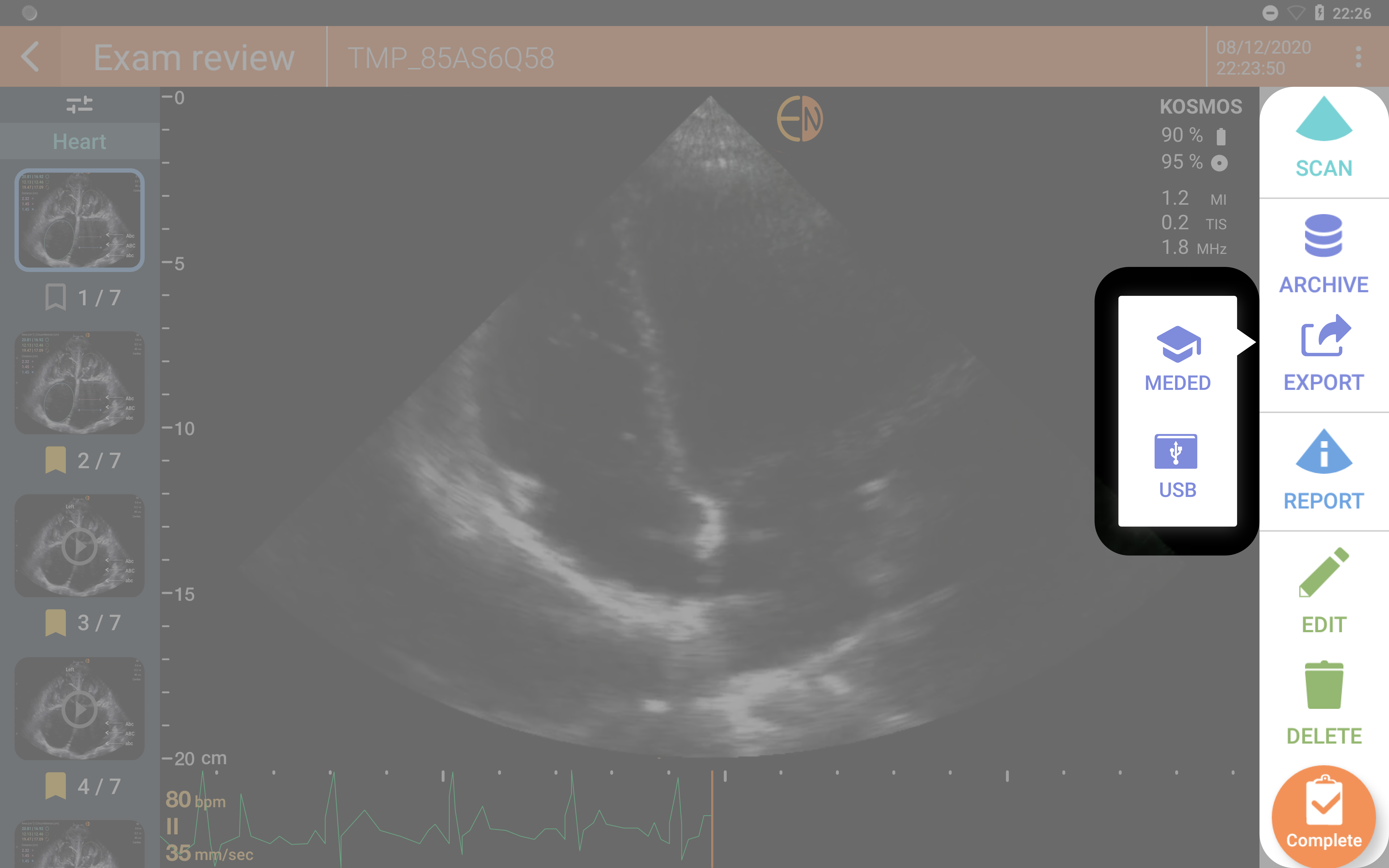
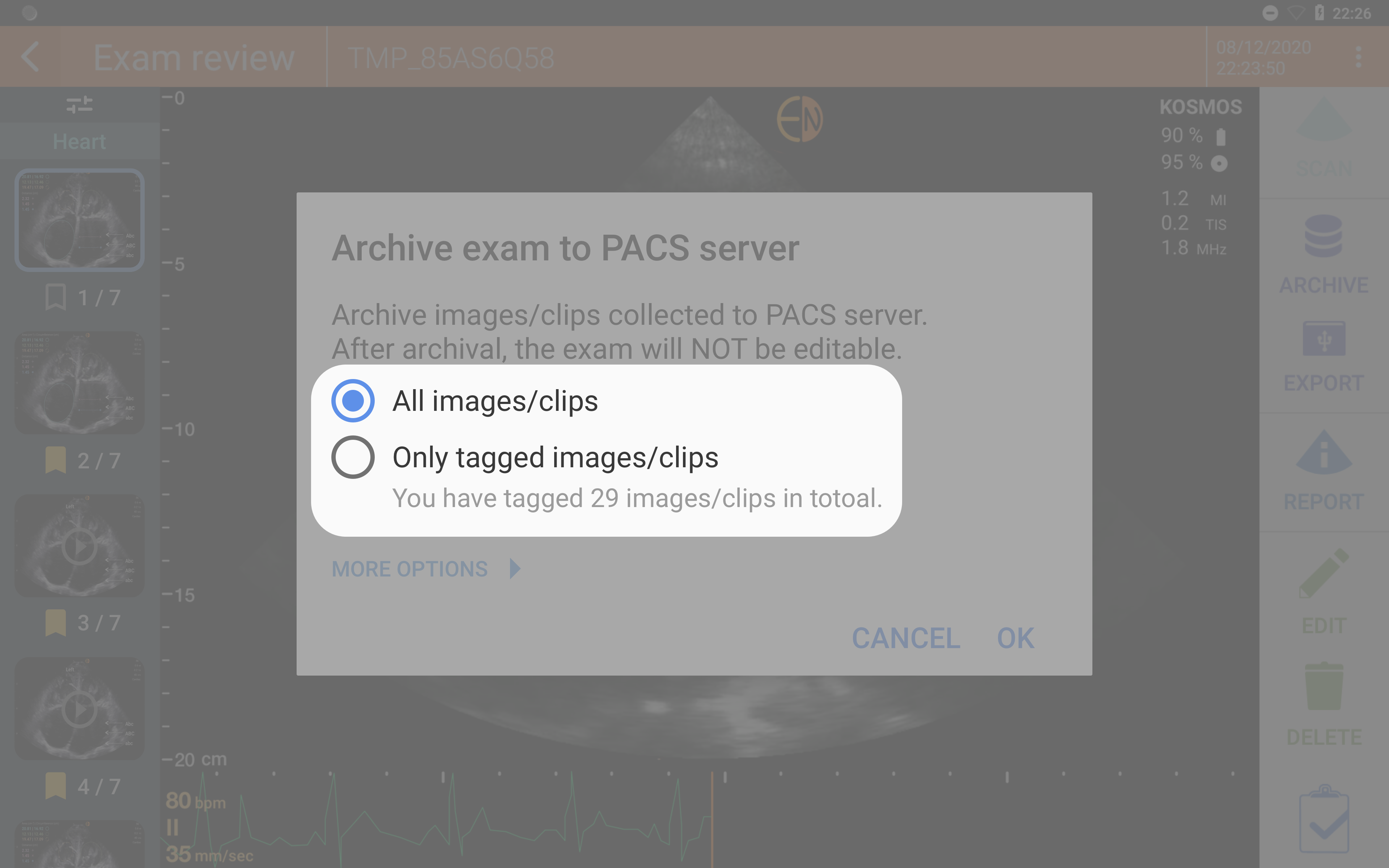
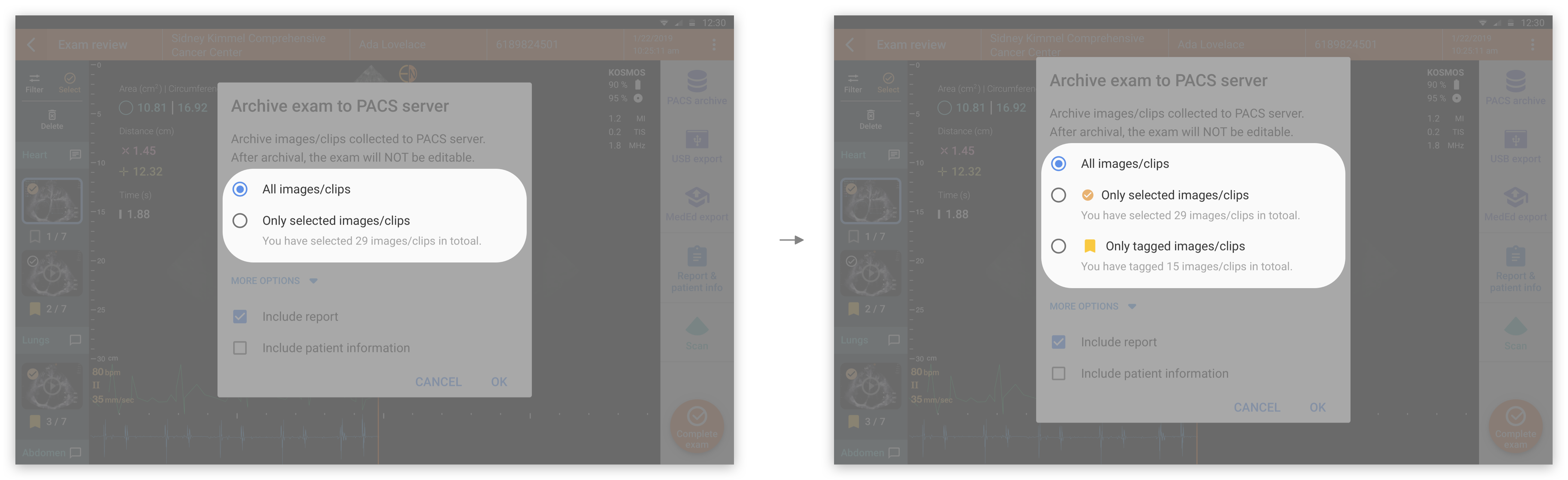
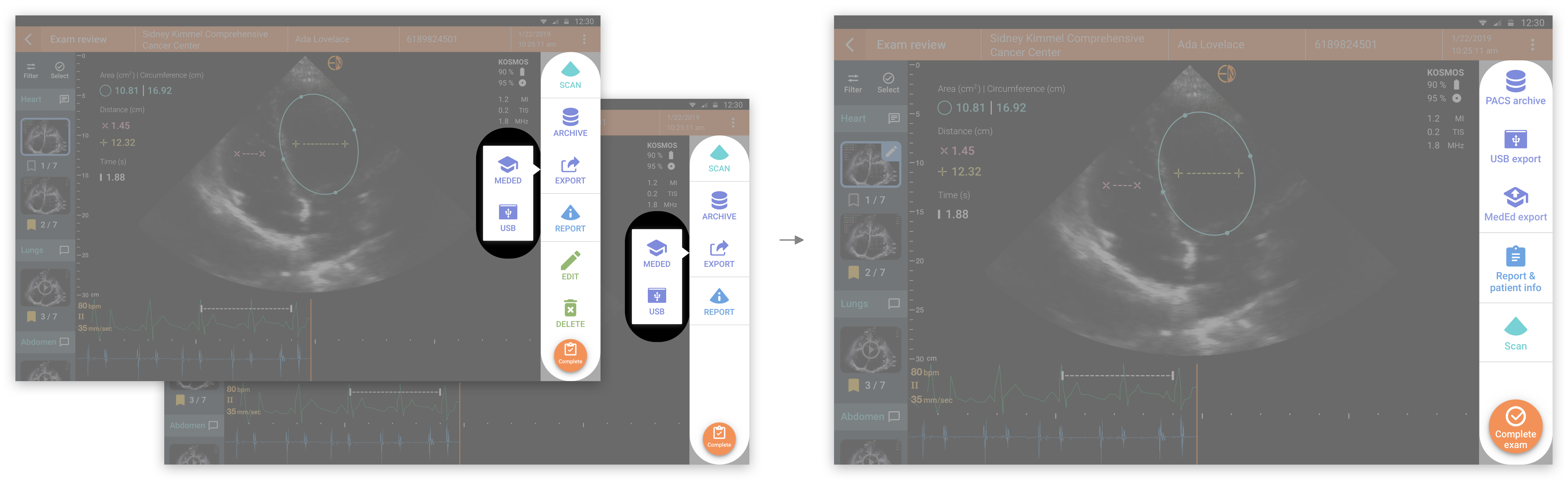
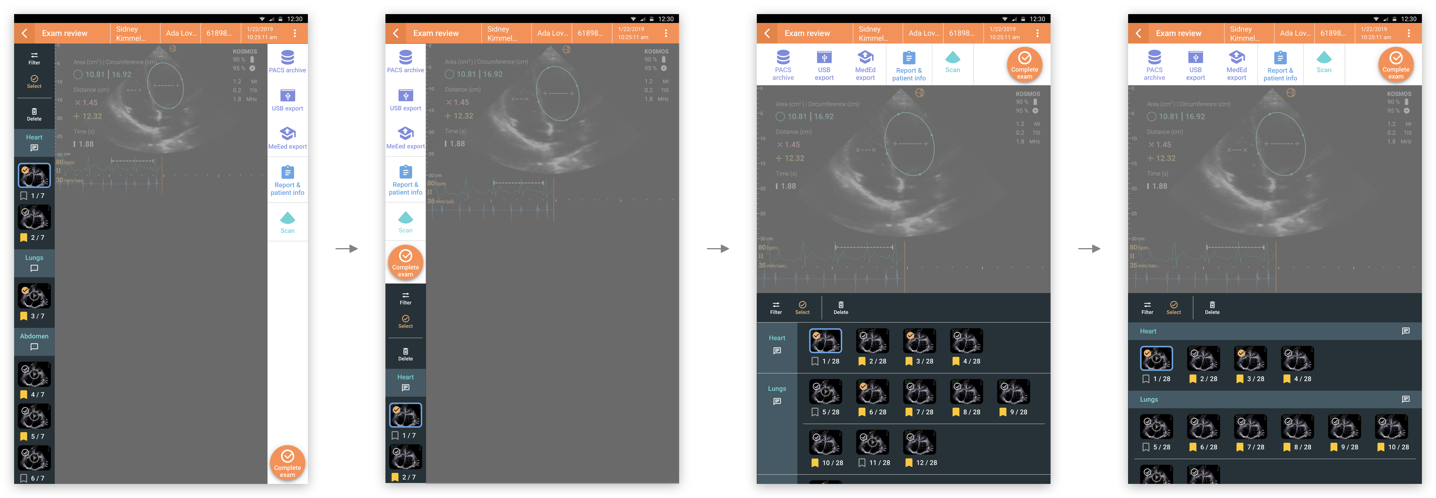
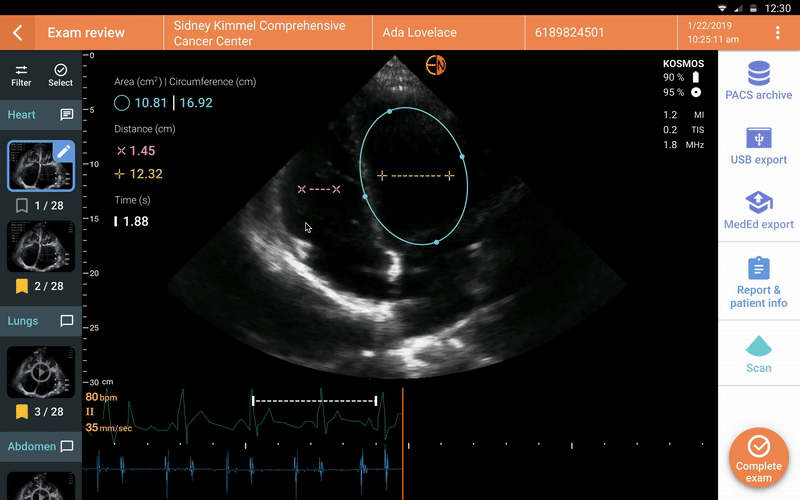
later or instantly. After completing scanning, they would review/edit/fill in patient info and exam info before archiving the data to PACS (Picture archiving and communication systems).

As for students and researchers, they scan for exercises/assignments and education/studies. Their workflows were similar to medical technicians, but creating patient and exam profiles were not required. 
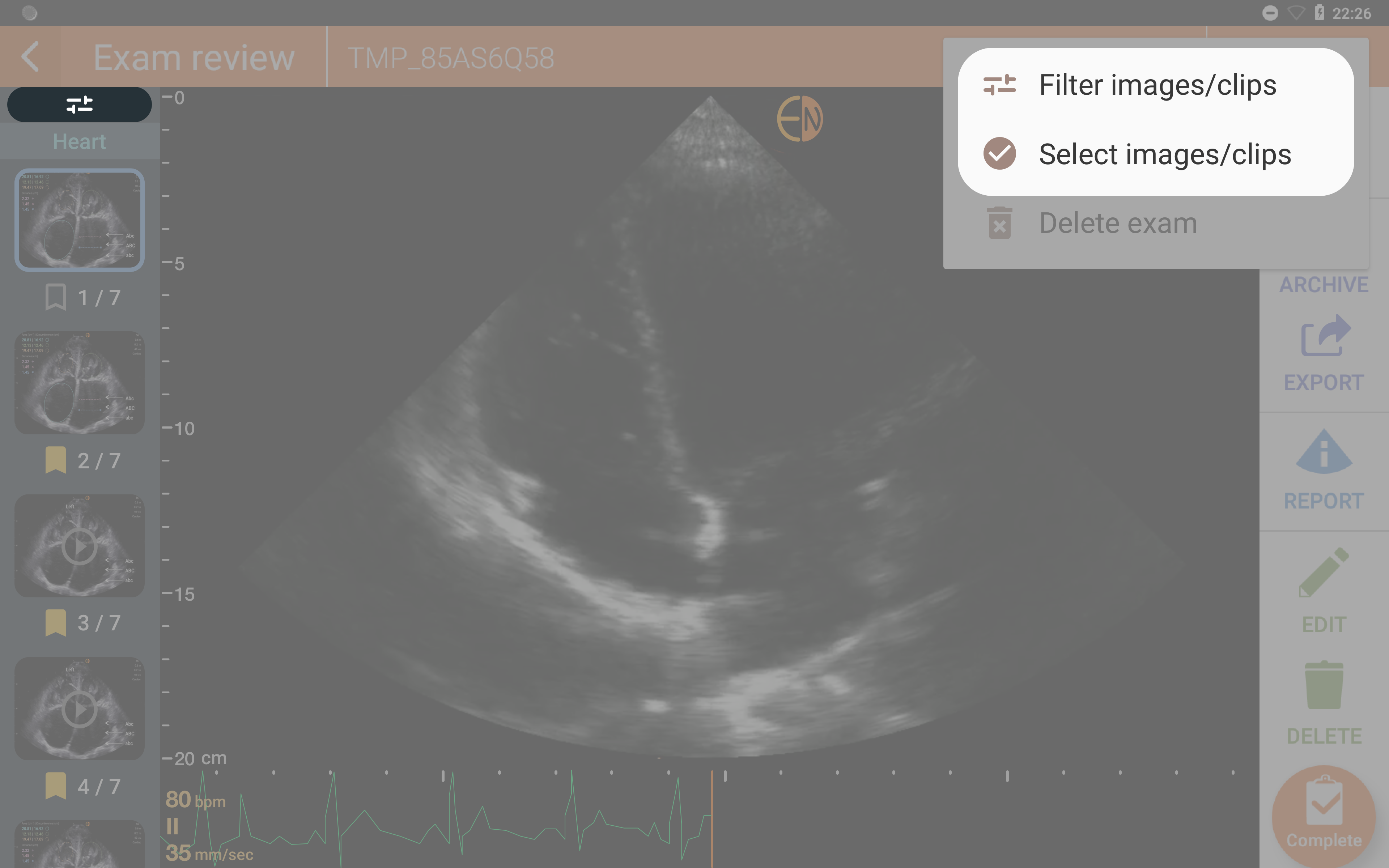
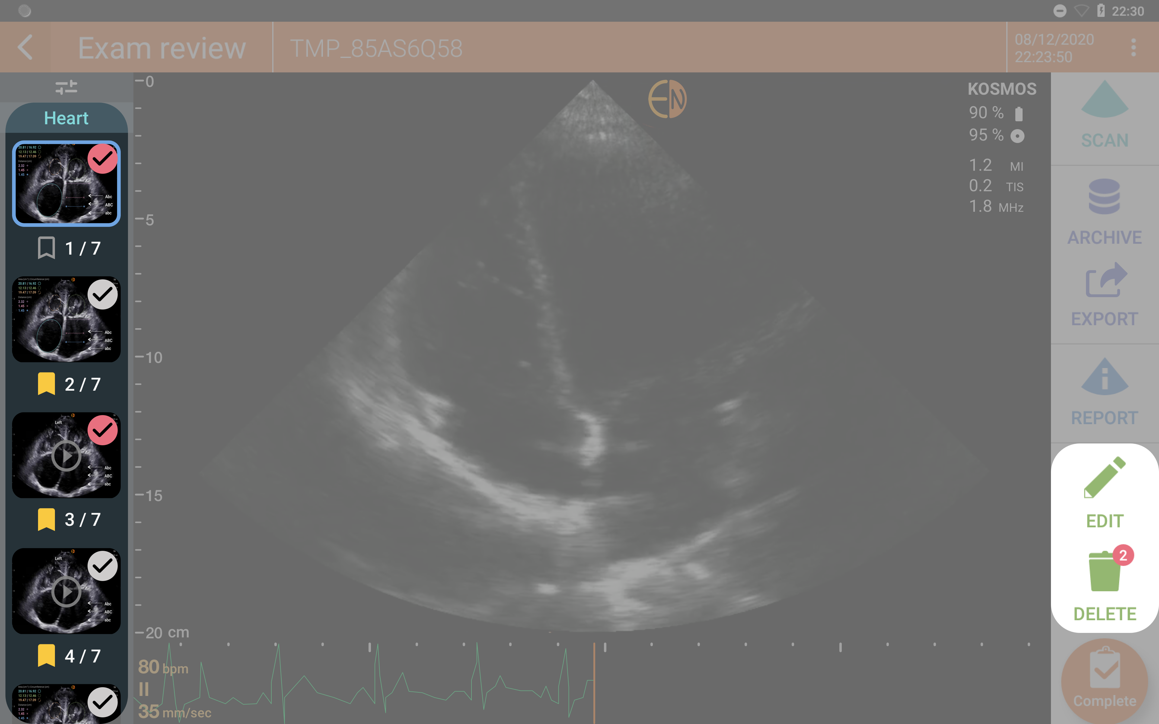
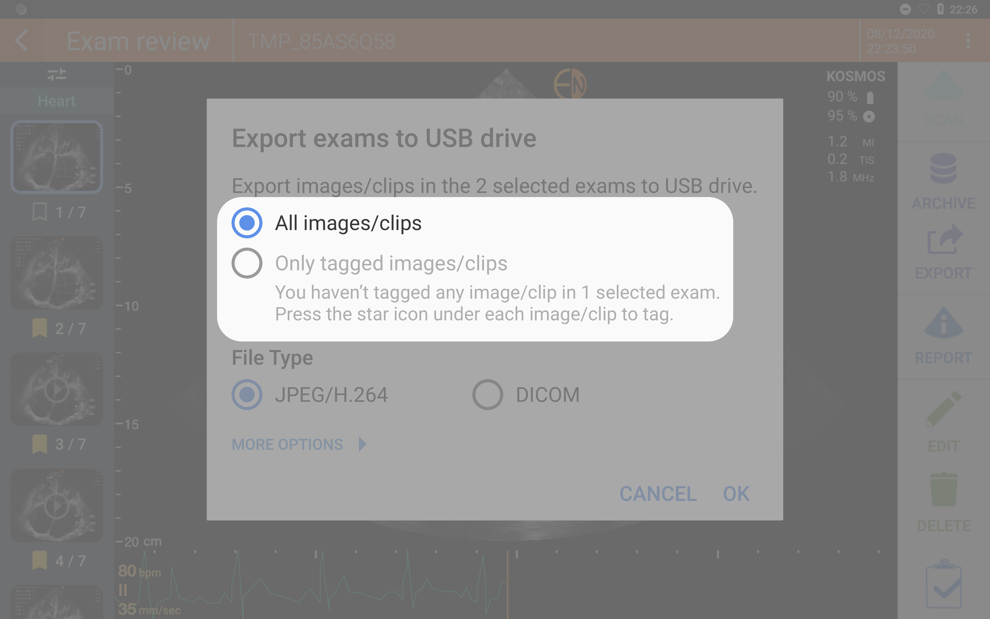
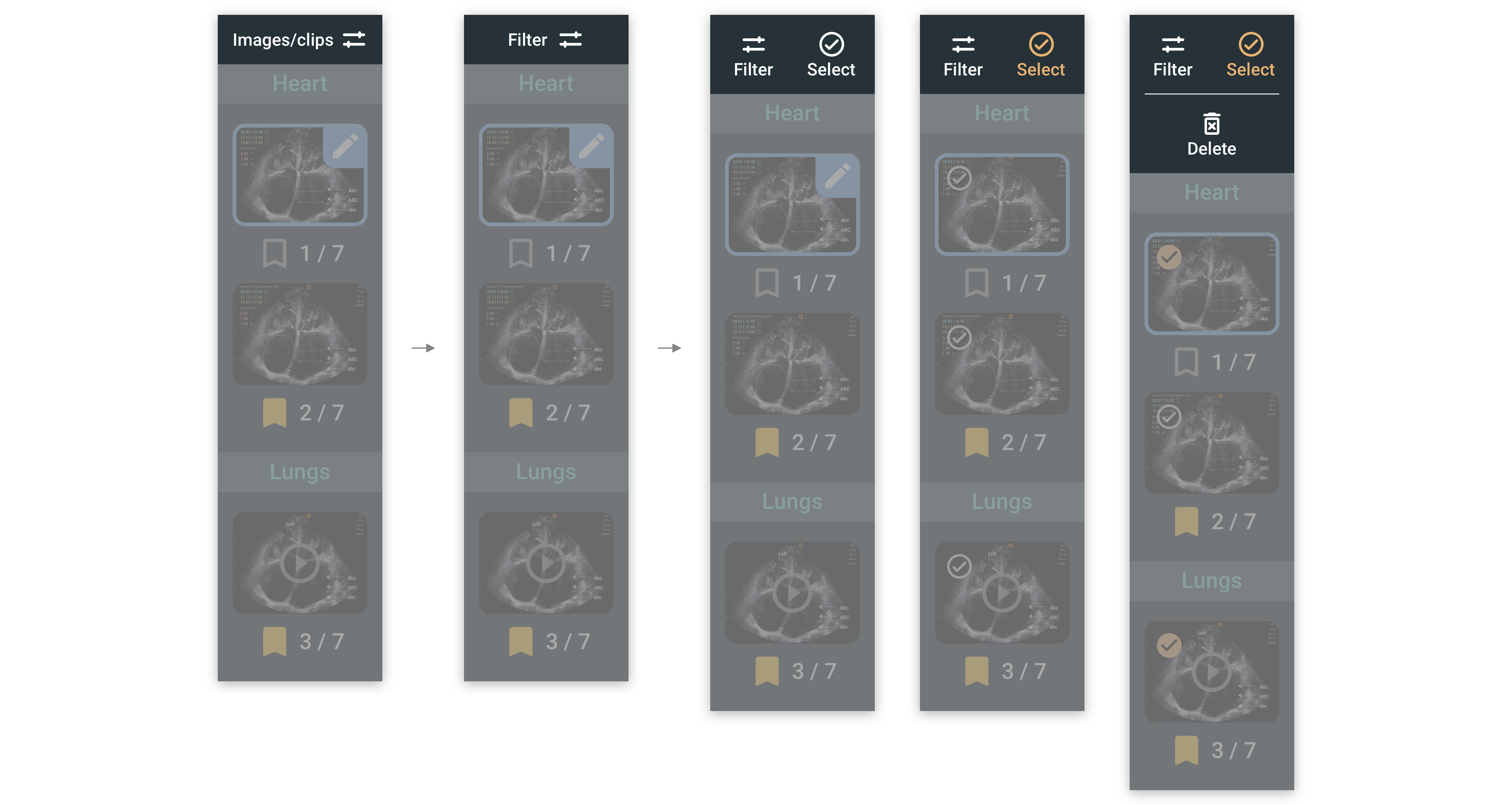
They may do more data management works, such as filtering, tagging, and deleting. Eventually, they would export data to a USB drive or to the MedEd online platform, which is an educational cloud service for exam review and management (for both operators and reviewers) provided by EchoNous.

Exam Review User Flow

KOSMOS scanning and exam review user flow was designed based on these user workflows to support patient info, exam info, and images/clips to be acquired, reviewed, edited, and exported. However, there were still couple of usability issues (user flow, interaction design, and visual design issues) to be solved based on discussions with designers and researchers. The main issues were located in the six pages below:

Exam Review
Number 1

Exam Review Main Page

The terminologies for "Archive," "Export," and "Report" (for patient info and exam info) features were not accurate enough. Users had a hard time accessing patient information.

Instead of grouping and hiding "USB export" and "MedEd export" in the second layer, we could separate and place them on top for users to easily access.

The edit feature was for the current image/clip only, and delete feature worked for current image/clip without selection. It was not ideal to place them on the control panel and use the same style as other action buttons that were applied to the whole exam.

The scan and complete buttons were both primary actions in this page. They could be placed closer.

The icon styles were inconsistent.

Report Page
Number 2

Report Page – Note Section

Notes were relatively important and users might want to check them out while reviewing images/clips, but they could only be viewed on the report page.

Listing notes from the oldest to the latest was inconvenient for accessing and reading.

Long press to trigger the edit and delete features for notes was not intuitive.

Archive to PACS
Number 3

Archiving to PACS

Only archiving tagged images/clips was allowed, instead of selected images/clips.

Using “Tag” as “selection” may cause confusion. “Tag” was usually used for “marking.” Selection was an action that users take to assign the following actions to particular items that they wanted to apply on.

Exam Review Actions
Number 4

Exam Review – Data Management Features

The current filter design (on the control panel and in the dropdown menu) was visually not obvious enough and hierarchically easy to be ignored.

The select feature in the second layer was hard to be noticed, and long press to trigger it was not so intuitive.

Exam Review Select Feature
Number 5

Exam Review – Delete Feature Interaction

It was confusing to users that the edit feature was available when the selection was activated.

“Delete” was used for both the current image/clip, and the selected images/clips, which was confusing.

The behavior of presenting a number for selected images/clips on the delete button was weird. This design was commonly used for “unread/action to be taken” status, and those features that the number of items belonged to the category. (E.g., notifications, messages, orders in the shopping cart, etc.)

The select feature could be applied to archive and export features as well. It shall not be exclusive to the delete feature.

Red was usually used for error and warning, which may lead to misconception when used for selection status.

Export to USB
Number 6

Export Features

Only exporting tagged images/clips was allowed, but exporting selected images/clips was not allowed.

Using “Tag” as “selection” may cause confusing. “Tag” was usually used for “marking,” while selection was an action that users take to assign the following actions to particular items that they wanted to apply on.

Project Goals & Design Requirements

Export, note, edit, filter, selection, and delete images/clips features need to be redesigned for three different layouts.

With a better understanding of the current issues, I discussed with PMs and researchers about the project goals and expectations based on our target user needs:

The information hierarchy and terminologies of the actions working on exams need to be improved to be more intuitive to users.

The interaction design for tag, selection, edit, and delete images/clips features need to be polished, and they shall be placed closer to the representation of the objects that the actions are going to work on.

The user flow for notes input and review need to be redesigned for users to easily access.

The visual design styles need to be refined and to be consistent with other parts of the product.

Since Exam Review existed in both KOSMOS Andriod apps and KOSMOS Bridge, the new design had to be able to work on both landscape view and portrait view of KOSMOS Andriod apps, as well as the KOSMOS Bridge view (1920 x 1200 px = 1280 x 800 dp in hdpi). In exam review, the functionalities supported in KOSMOS Bridge shall be applied to KOSMOS Andriod apps as well.

Ideation & Wireframing

Clarify screen sizes and pixel densities, and utilize real ultraound images and Samsung Tab S7 screen size to work on design ideas.

The plan was to release the app at the release time of Samsung Tab S7, so we took its screen size (2560 x 1600 px = 1280 x 600 dp in xhdpi) as an example to move on.

At that time, only phased array probe was supported, so we used the sector ultrasound images to support sketching and mockups.

Layout Ideation

I started with figuring out the dimension conversion between different screen sizes and pixel densities, clarified the height of Android status bar and toolbar, and went through several rounds of ideation and iteration to define the new layouts for both landscape and portrait views. Later, the new interaction and visual design were built on these new layouts.

Design Decisions

Consider consistency and accessibility from both branding and UX perspective.

During the ideation sessions, I had opportunities to discuss the core design concepts with PMs and other designers, and together we made three important decisions:

Layout Icon

Giving the maximum imaging area in both landscape and portrait views to support viewing imaging details clearly.

Devices Icon

Applying the existing visual style while polishing it at the same time to ensure the consistency between KOSMOS Bridge and KOSMOS Andriod apps, from both branding and UX consideration.

Font Icon

Following the Material Design guideline for space and font size definition to ensure accessibility and usability.

Design Iteration

Enhance the intuitiveness of interactions, place the action buttons working on same objects closer, and polish the terminologies for actions.

Following the above design decisions, I created mockups to visualize ideas and refined the design based on the feedback collected from design critique sessions with designers and PMs. Below are the six key design changes made:

Edit Iteration
Number 1

In order to create a stronger connection between the edit action and the object to work on, I tried to place the edit button closer to the currently presented image thumbnails. Based on team members' feedback, the first version was not obvious enough, and the second version was close to the sensitive area of the tag feature and would block a certain degree of the thumbnail which was not appreciated. Therefore, I came up with the third version, in which the button was placed on the top-right corner of the thumbnail with a blue background to make it obvious.

Filter Iteration
Number 2

Regarding the filter feature, I tried different typographies, and applied the same style on select and delete buttons. The functionalities of tag and select features were also redefined to make the interactions more intuitive and smooth. The selection was applied to not only the delete action, but also the archive and export features. Users would be able to archive and export all images/clips or the selected images/clips. When users tap the select feature, the selection button on each thumbnail will show up (edit feature for the current image/clip would disappear at the same time). The delete button will show up once users select an image/clip (using light orange for the selected status). When users scroll down, the action button section on the left control panel would still be fixed for easy access. The duplicated controls for both filter and select features in the dropdown menu were also removed.

Notes Feature Iteration
Number 3

To support users to quickly check out scan notes, I added a note feature beside each scan section title. In the beginning, only checking out was taken care of, but with other team members' feedback, I changed the design to support input, review, and edit all in one, with empty and filled dialog box icons to indicate users the content status. Once users press the button, they will see a notes page with input indication / previous input notes listed in the reverse chronological order, and an adding note feature. They can edit and delete notes at any time. The delete and edit buttons were also placed on the first layer for easier user access.

Export Pop-up Iteration
Number 4

As for the export feature, in the first version, we wanted to differentiate "selection" and "tag," so only exporting selected images/clips were supported. However, we later realized that making the tagged images/clips exportable might be more convenient for users. Therefore, I changed the design to support both of them and added icons in front of the selections to help users quickly tell the difference between these two.

Landscape Layout Iteration.png
Number 5

For the control panel layout in the landscape view, in order to help medical technicians easily access patient info, I replaced the button name “Report” with “Report & patient info,” and changed its icon to build a better connection. The terminologies for other action buttons were also rephrased to be more precise. “Archive” was changed into “PACS Archive,” and “USB Export” and “MedEd Export” were placed on the first layer. Besides, both primary actions – the “Scan” button and the "Complete" button were placed closer.

Portrait Layout Iteration.png
Number 6

The portrait layout was iterated to support the possibility of showing a maximum imaging area with the most efficient utilization of space. Through ideation and discussion, I came up with the third and the fourth version design. Based on developers' feedback, the third version was not supported in Android by default. It required extra effort and would highly possible to have typography and alignment issues after implementation. Therefore, we eventually moved on with the fourth version.

Final Design

Demonstrate the new interaction and visaul design for exam review with prototypes and a component library.

The final design mockups were handed over through Zeplin, and the interaction logic and requirements were documented down with Jira tickets. Through frequent meetings with developers and APK testings, we were able to ensure accurate design implementation for both KOSMOS Andriod apps and KOSMOS Bridge. Below are prototypes for the landscape view demo:

Edit Feature
Number 1

On the top-right corner of the current image/clip thumbnail, there was an edit button for users to tap and access the edit view.

Note Feature
Number 2

Users were able to check out and edit scan notes through either the note feature in the exam review or the scan section in the report.

Export Feature
Number 3

Through selection, image/clip delete, archive, and export could be customized.

In addition to the mockups, to support the product development and better cooperation between designers with designers, and designers with developers in the future, a component library with design guideline was also constructed along the way.

Component Library

Hi-fi Prototypes

Landscape View Exam Review Portrait View Exam Review

Impacts

Increase market share and make telemedicine easier.

With the release of the KOSMOS Android app, we were able to sell the app in the Google Play store and to help increase the market share. Besides, supporting telemedicine could be easier to achieve comparing with our original standalone device. As the exam review refined, it was easier for users to review and manage their scan data and materials. So far, we were happy to find the feedback were pretty good.

Reflection

Limitation

With a fixed release deadline, the design was conducted within a very limited time frame. If given more time, the iteration could be more comprehensive and the final design may be even closer to an ideal solution. Besides, it is possible to enlarge the project scope, to refine not only the user flow and interaction design, but also the whole visual design system which could be applied to both OTS (KOSMOS Andriod apps) and KOSMOS Bridge.

Next Step

Invite target user groups – medical technicians and students/researchers to participate in design evaluation.

Refine the design with user feedback and iterate it to fit with future releasing features, such as the split screen design.

Fix other visual design issues such as color contrast, and refine the overall visual style to align with the new branding style guideline.

What I Learned

Constructing a component library and design style guideline while creating components for the new design is an efficient way to build a standard from scratch. The component library file could be very helpful for future design cooperation and expansion.

Gaining experience in following and polishing an existing design style at the same time, and combining it with the Material Design rules to apply to Ardriod apps with a different screen dimension and pixel density.