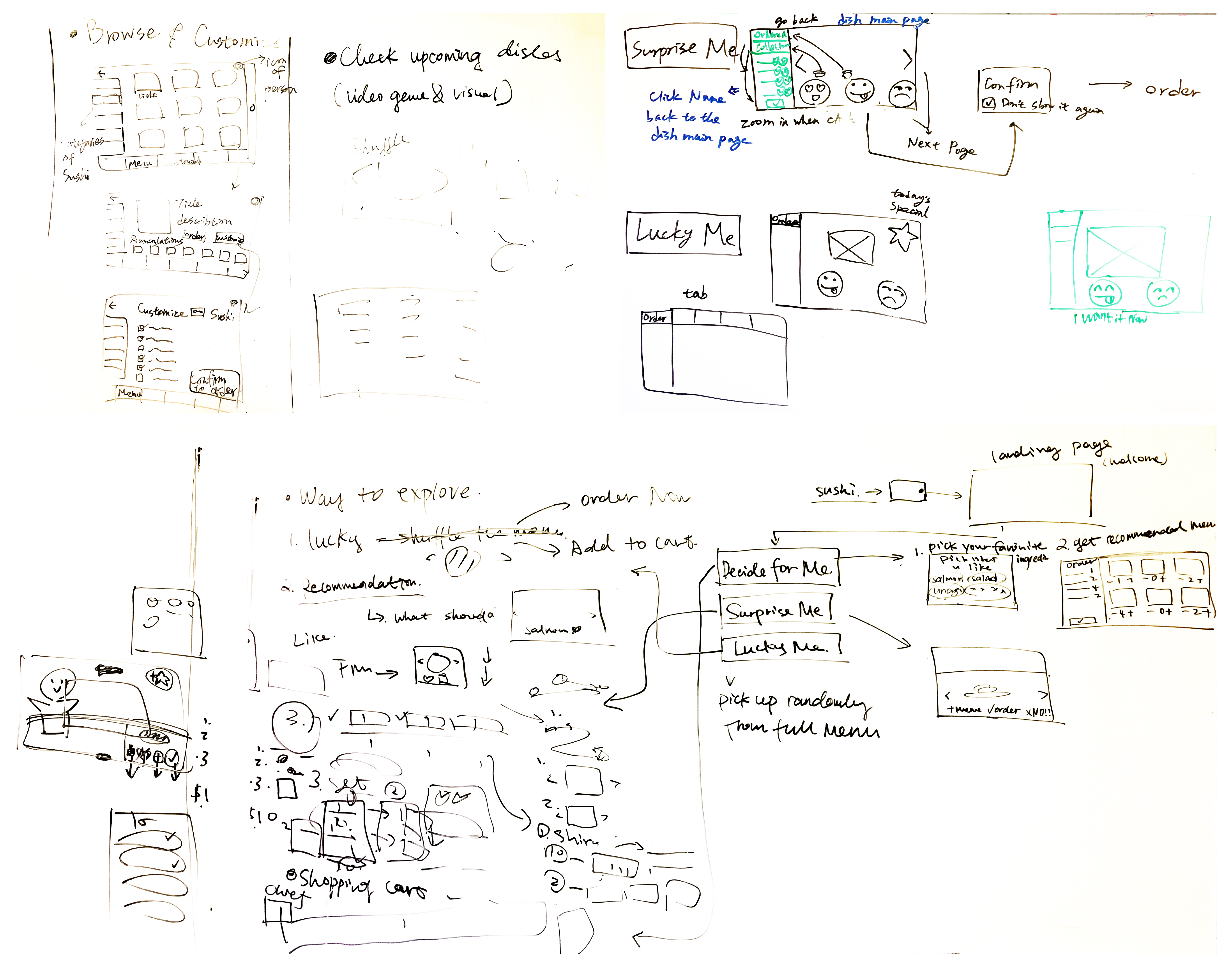
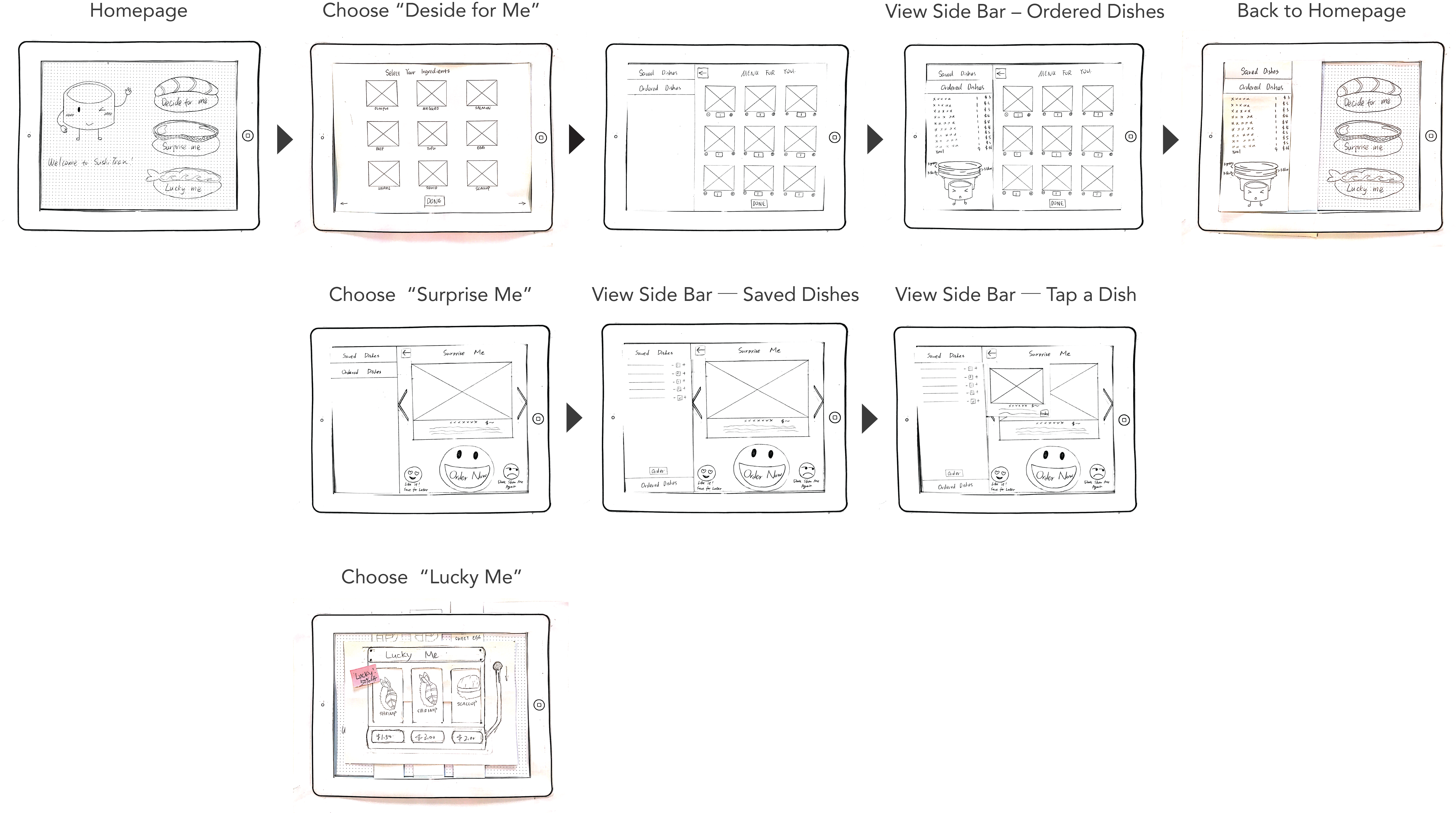
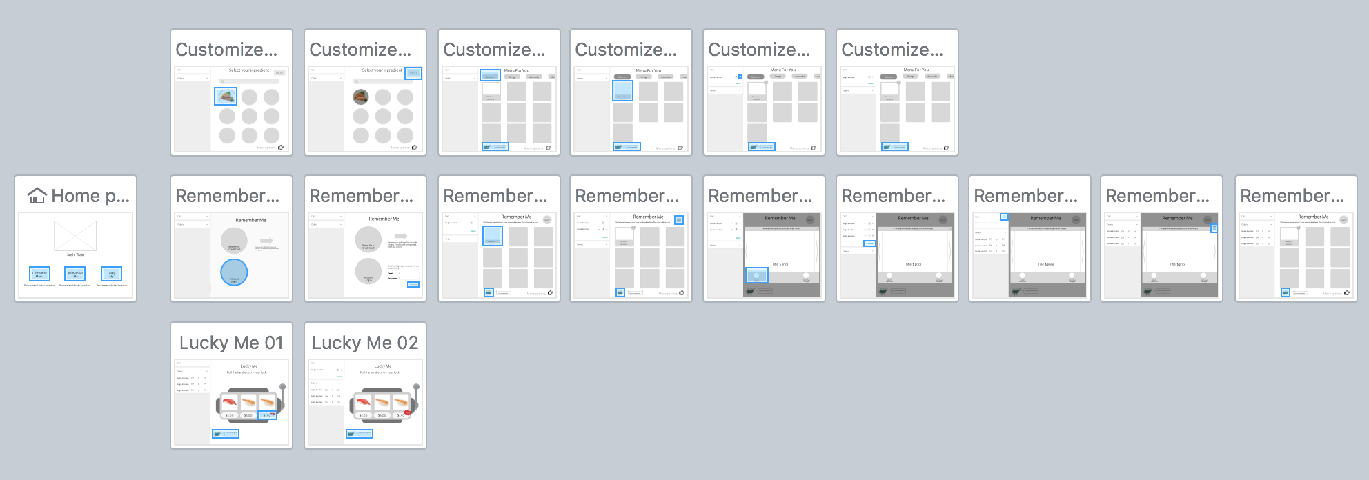
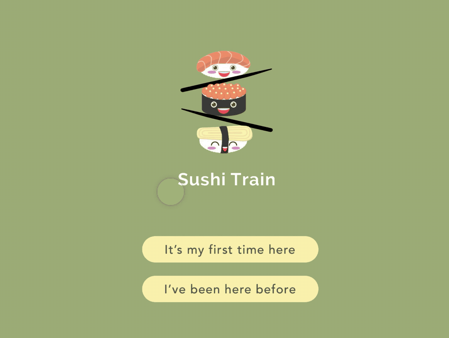
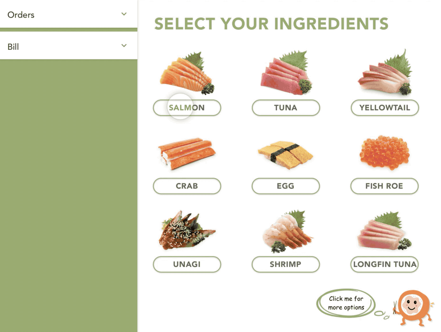
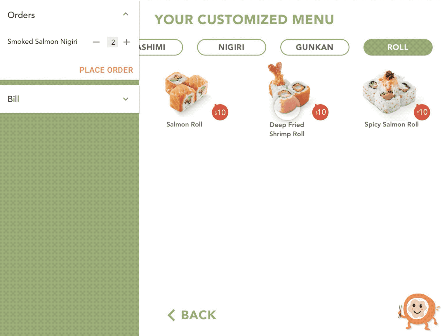
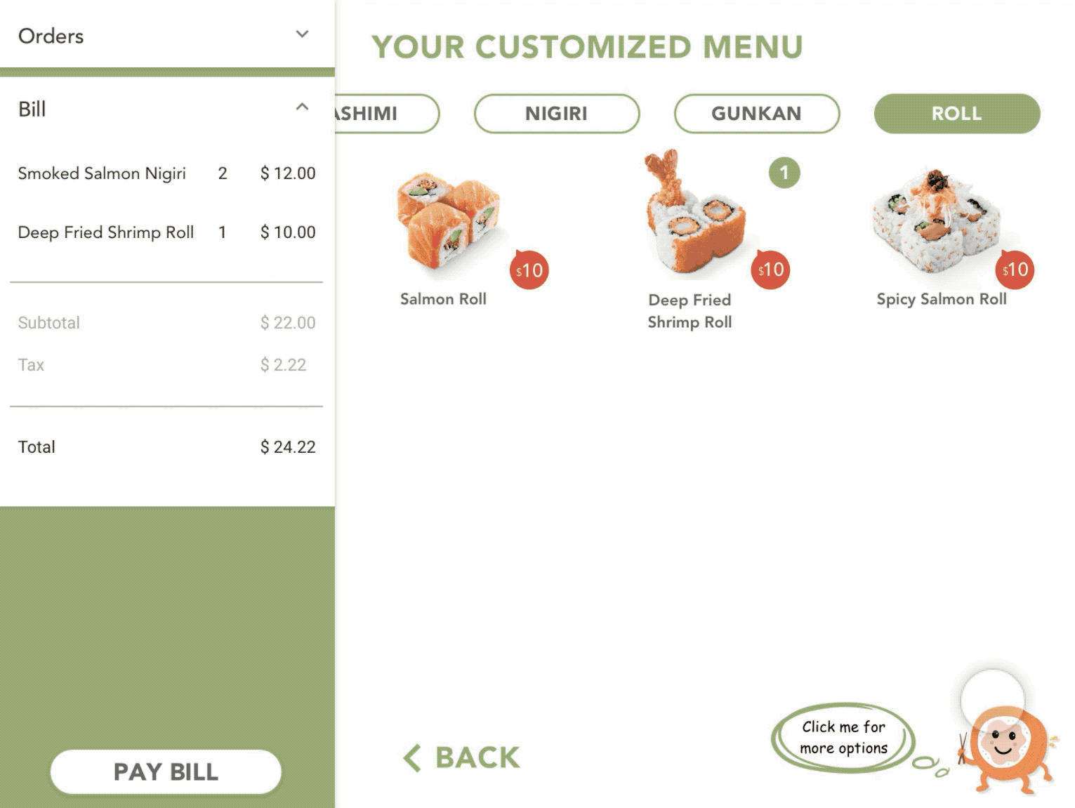
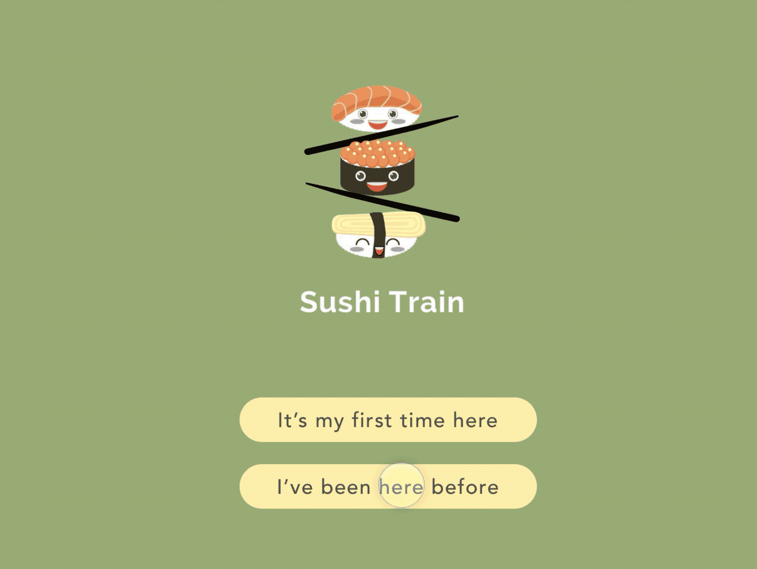
Sushi Train

Entertaining dining experience.

Project Type:

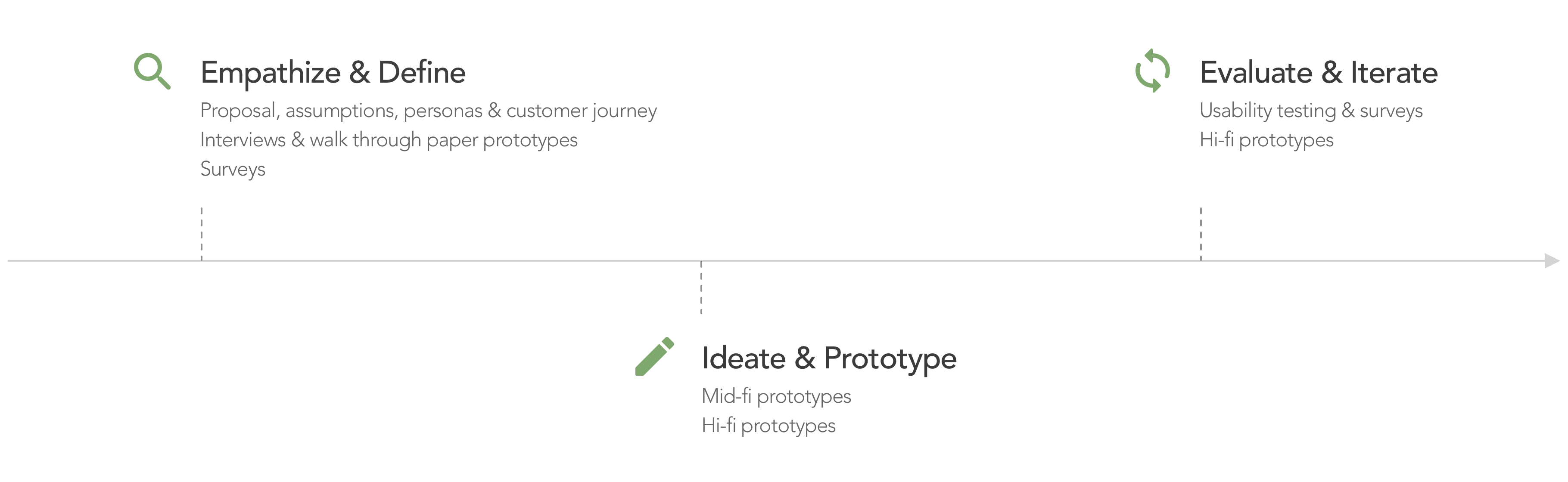
Advanced UX Studio course

Duration:

Mar. – Jun. 2017

Team Size:

3 members

Practice Areas:

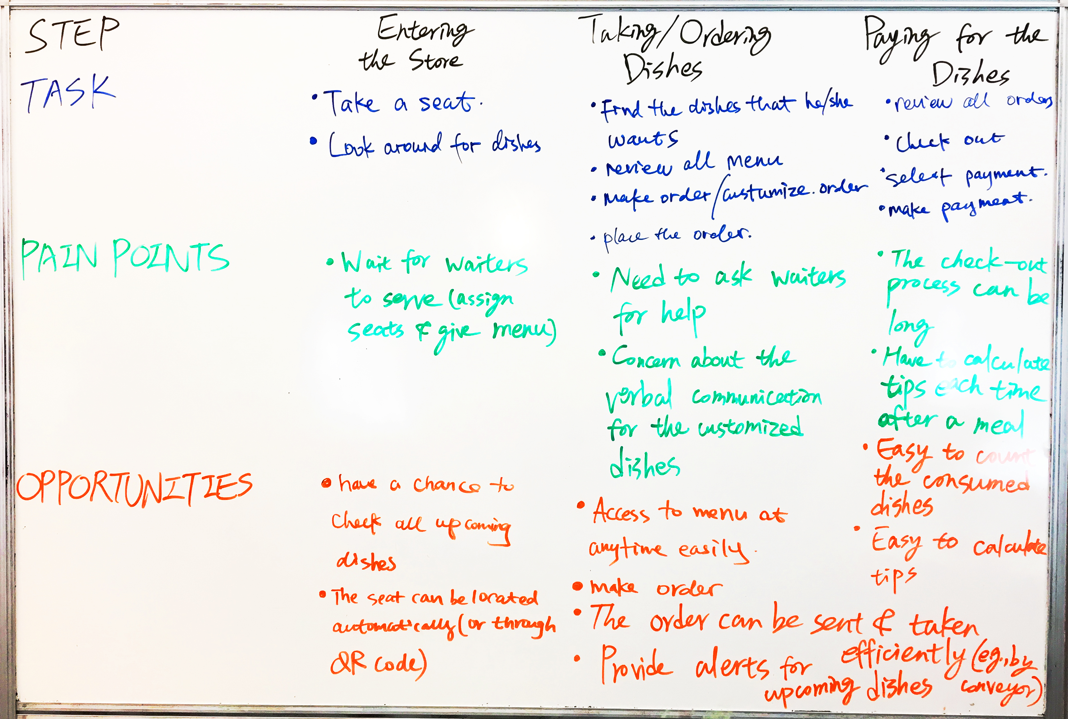
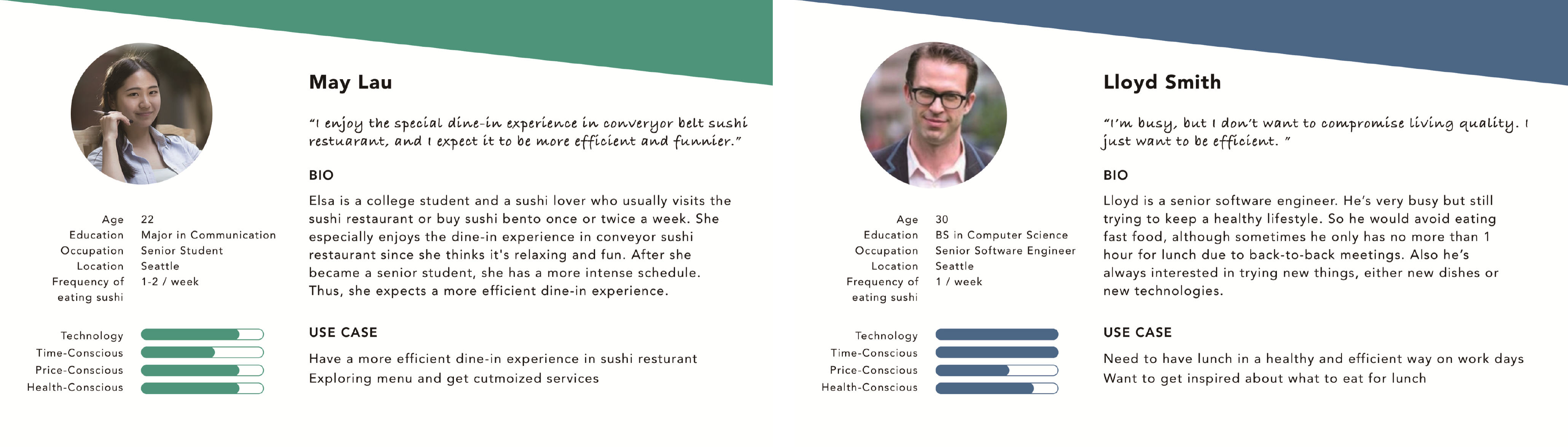
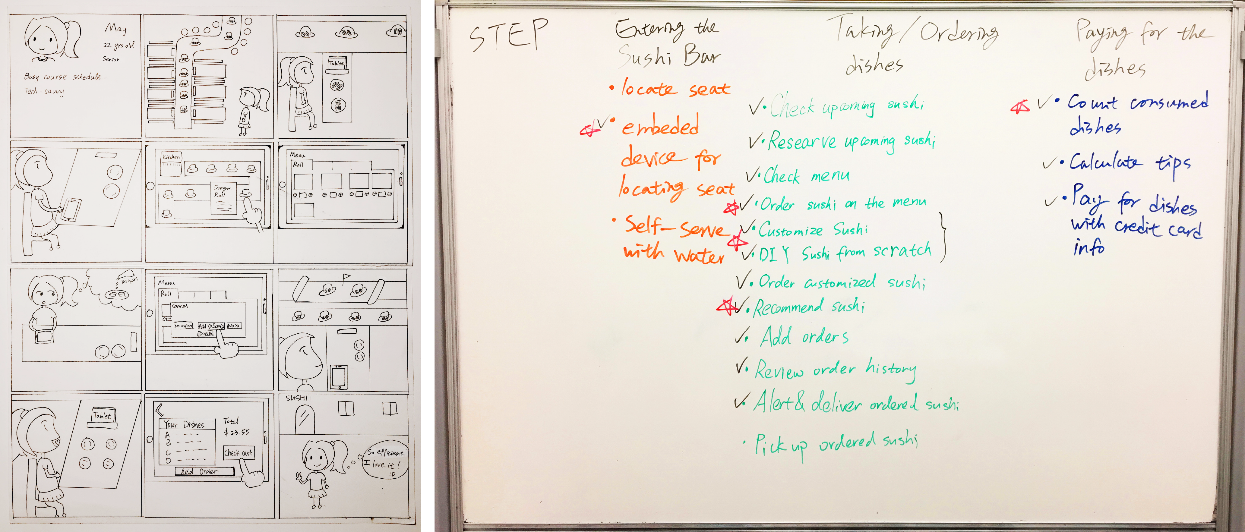
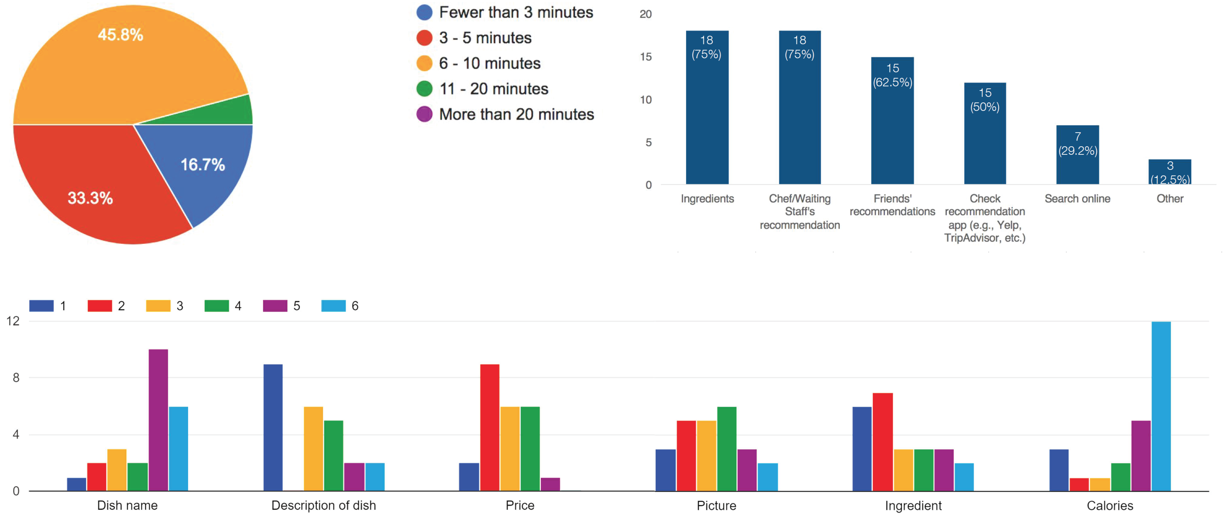
User studies, UX design, information architecture, interaction design, visual design, usability evaluation

My Role:

I served as both designer and researcher, participated in every step, and took charge of script design and data analysis of usability test at the end.

Project Vision

Sushi Train is an embedded service in conveyor belt sushi restaurants aiming to support efficient and fun dining experience. With inefficient experiences of dinning in conveyor belt sushi restaurants, we hoped to design a service with higher dining efficiency and pleasure for customers with quick-pace lifestyle. We focused on the digital side of Sushi Train service and designed an app that could be embedded in restaurant tables to accompany customers with its gamified making order and checking out features.

Challenges

Combine both efficiency and pleasure in one service to support better dining experience.

Provide customized serivces for both new and return customers.

Allow customized dishes for dietary restrictions and special needs.

Design clear navigation and instructions along the whole dining process.

Sushi Train overview

Design Process

Design Process

Project Scoping

Desire to enjoy meals efficiently at conveyor belt sushi restaurants.

In the beginning, we clarified the dining procedure and the common pain points that customers encountered in conveyor belt sushi restaurants based on our own experiences. These were what we planned to tackle in this project:

Unable to know what are coming next on the conveyor.

Long waiting time for wait staff and desired dishes to come.

Unclear about what will be served through the conveyor and what can only be ordered through waiters.

Pain Points & Opportunities

We also utilized personas to represent two target customer groups – busy students and employees.

Personas

Proposal & Prototypes

Infuse game elements to serve self-order, customization, and check out.

We later proposed an ideal service which could be efficient and fun for dine-in customers through a storyboard. We utilized gamification and discussed how the service could support both on-line and off-line tasks for dining at restaurants, including highlighted features such as self-service for order, customization, and check out.

Storyboard & Features

With these ideas in mind, we sketched down three major ways for menu exploration:

Decide for Me

– Dishes would be randomly recommended based on ingredients user selected.

Surprise Me

– Dishes would be recommended based on order history accessed by swiping a credit card.

Lucky Me

– Discounts for dishes would be provided through a slot machine game.

Wireframe Discussion

Based on the sketch, we made paper prototypes for concept testing in the next stage.

Paper Prototypes

User Studies & Concept Testing

Prefer self-order, order the same dishes again, and viewing ingredients and recommendations.

Through surveys, interviews, and walking through paper prototypes with our target users, we had a better understanding about user behaviors and how the concept could be improved to meet user needs.

Survey Samples

Our key findings were:

Self-service was preferred instead of requesting service from wait staff.

People wanted to order efficiently, and usually spent less than 5 minutes on order making at sushi restaurants.

Regular customers were likely to order same dishes again.

Ingredients and recommendations were helpful in trying new dishes.

Importance of information in menus: descriptions of dish > ingredients > prices > pictures > dish names > calories.

People had less experience in ordering food via apps, but they were willing to use digital menu, and expected to see pictures of dishes.

People tended to be accepting the idea of using credit cards to review previous orders, but some have concerns such as information security and identity theft issues.

Based on the above findings, we iterated the design and made mid-fi prototypes to make our service more ideal for users. At this stage, we modified the menu exploration features and made their names more intuitive by changing "Decide for Me" into "Customize Menu", and "Surprise Me" into "Remember Me."

Mid-fi Prototypes

Design Decisions

Streamline the dining process by combining an app and a paper menu to serve customers.

With a clearer view about what we were going to move on with, we made some important decisions through discussion and peer reviews to ensure an efficient and fun experience of browsing menus and ordering dishes:

Prioritizing Documentation & Presentation

Keep Concise

To avoid too much information crowded on the app, we removed the description below each picture and planned to provide paper menu for users as a reference.

Nondistracting & Engaging Experiences

Simplify Process

We replaced account login with email and password with phone number only, and added on check out features to streamline dining process and save user time.

Robust & Savvy Style

Consistent Visual Design

We hoped the visual design could be consistent with the general impression of Japan, so we used a concise style, chose matcha color, white, dark grey, and orange as theme colors, as well as adopted cute sushi mascots.

Design Iteration

Provide desired information based on user preference and refine the interactions based on user habits.

With the decisions in mind, we created hi-fi prototypes and iterated the design through two rounds of online usability testing and peer review sessions. We found issues mainly in interaction design, and improved the design to support more intuitive and engaging experiences. The key changes we made were:

Landing Page
Number 1

The homepage was confusing, and The Yes/No question was not a good way to guide users, so we modified it to be more intuitive and help users to explore dishes in the most suitable way.

Select Type
Number 2

In “Customized Menu,” after selecting preferred ingredients, users expected to have a way to filter preferred sushi types, so we redesigned the filters to support the need.

Pop-up Details
Number 3

Users expected to see detail information of dishes, so we showed the ingredients of each dish through a pop-up window triggered by tapping on the picture.

Menu
Number 4

It was more convenient for users to shift between different exploration ways by tapping the mascot directly, instead of going back to the homepage.

Remember Me
Number 5

We changed the design of "Remember Me" to meet user expectations of being able to see both order history and recommendations. The dishes ordered before were directly shown on the page, and “Guess You Like” feature was added on to recommend similar dishes.

Lucky Me
Number 6

Users might not order the discount dishes directly, so we changed the flow into adding to shopping cart first. We also found that users did not aware that they have received one and only one discount dish for one run, so we refined the discount tag and informed users through the sushi mascot to make it obvious.

Check Out
Number 7

Appling online shopping mode to dish ordering at sushi restaurants confused users. They were not sure whether the dishes would be served after adding to cart or adding to orders. Therefore, we replaced the terms “Cart > Order > Orders > Check Out” with “Orders > Place Order > Bill > Pay Bill” to make ordering and purchasing process the same as people usually do at restaurants.

Hi-fi Prototypes

Reflection

Limitation

There was a lack of chance to conduct primary research on stakeholders such as restaurant owners and wait staff.

The app itself could not fulfill a complete service to serve customers. Other facilities such as an express sushi train for special orders, a paper-based menu, a physical service request button, etc. may be required.

Next Step

Validate the refined design.

Align the visual design with the particular style of restaurants we would like to serve.

Cooperate with restaurant owners and test the design in real dining context.

What I Learned

Making assumptions and testing the concepts (with boundry objects) first is one way to conduct project in real industry.