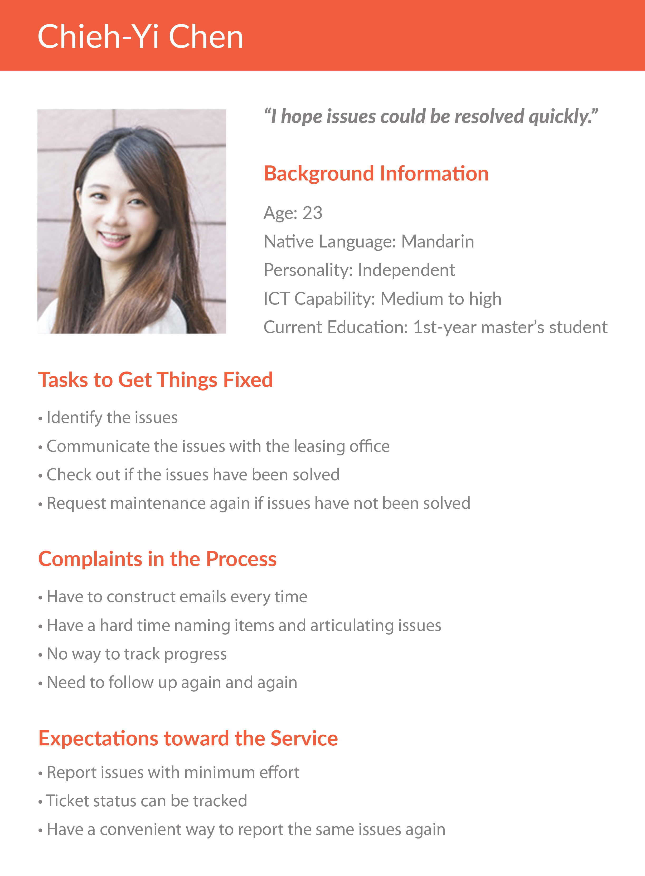
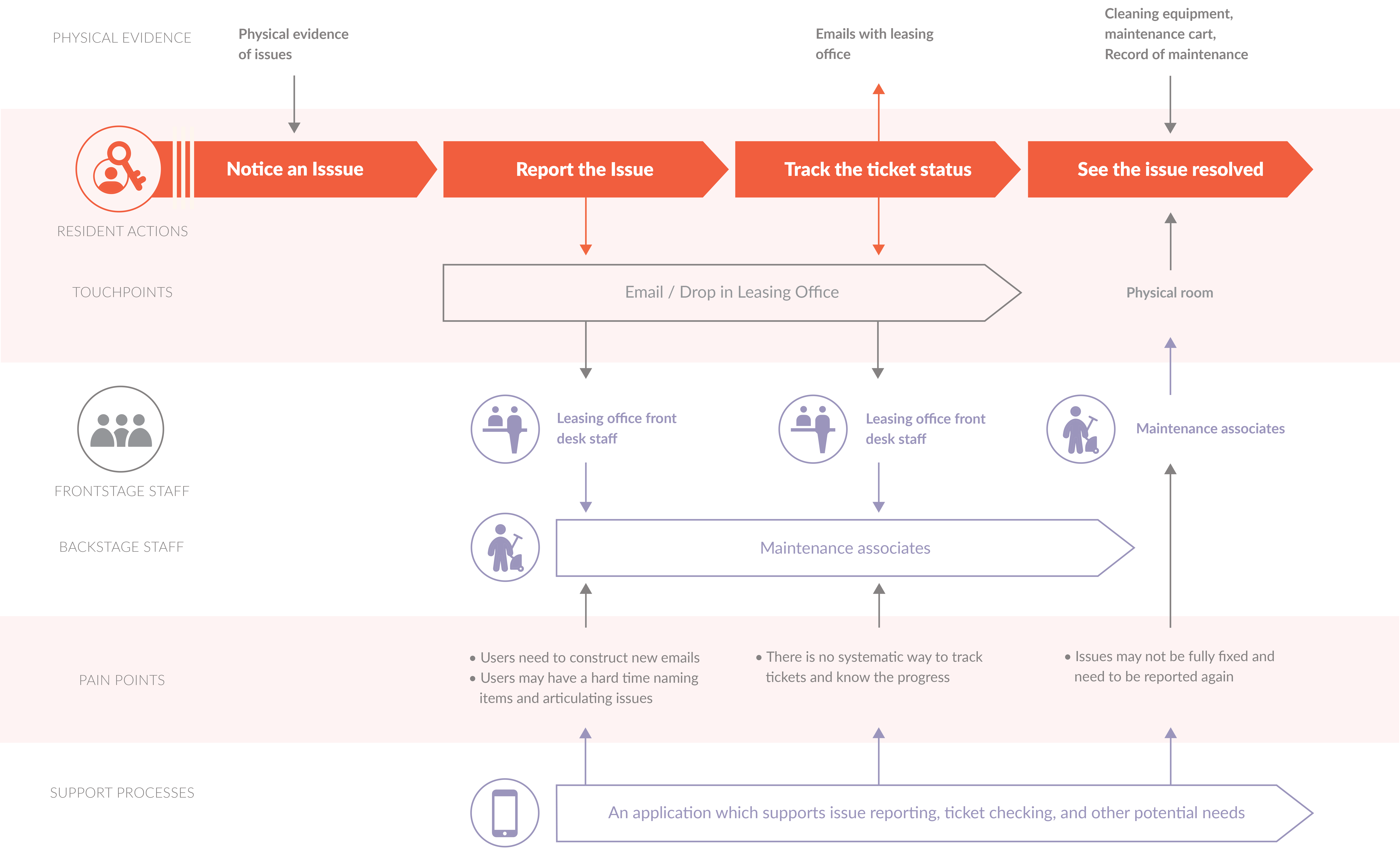
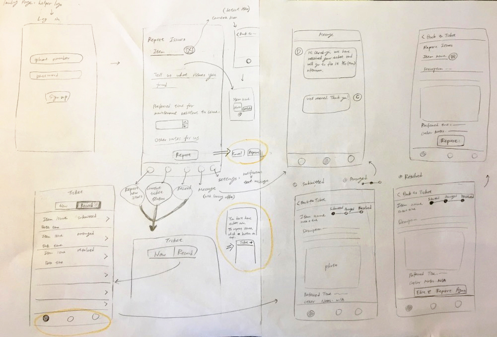
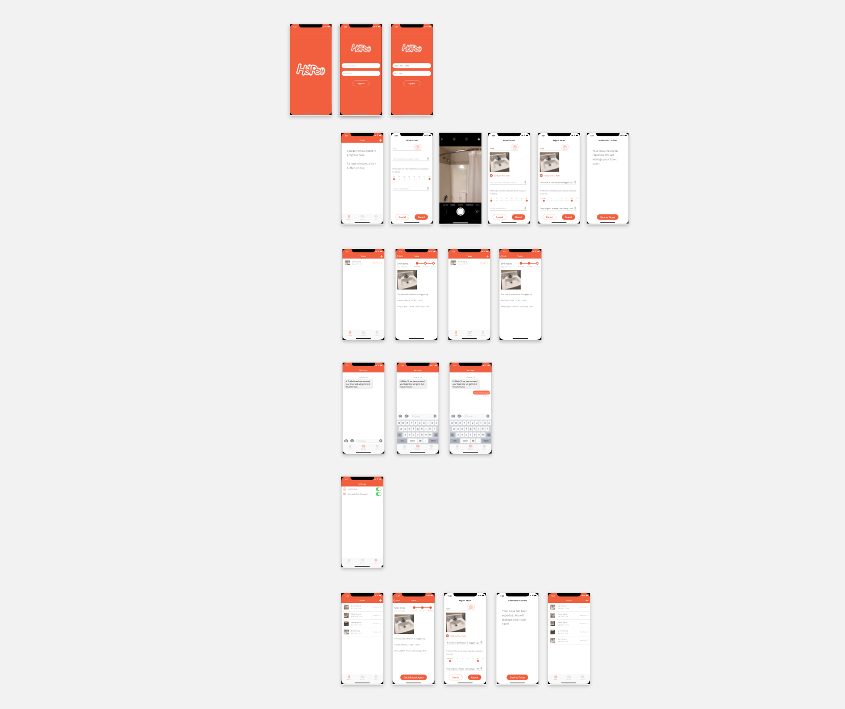
Helper

Integrating issue reporting.

Project Type:

Design Challenge

Duration:

Mar. 2019 (5 days)

Practice Areas:

User studies, UX design, interaction design, visual design, design pitch

My Role:

I took ownership of this individual project.

Project Vision

Helper is a system that can support ticket submission, tracking, and management for both residents and leasing offices. One of the given topics of this design challenge was "Community Issue Reporting." I chose student dormitory since people around me and myself had suffered from this issue for long. I took this exercise as a great opportunity to provide an ideal service to solve people’s daily issues. I focused on the resident side with a solution of Helper app, and tried to support easy issue reporting and tracking so issues could be quickly resolved.

Challenges

Create smooth and time-saving interaction.

Present clear issue status for users to track.

Support users to easily report issues again when needed.

Helper Overview

User Studies

Need an efficient way to report and track issues.

My first step in this project was conducting user studies to collect user feedback on current services and their expectations toward an ideal service. Within very limited timeframe, I interviewed three students living in different dormitories, and created a persona to help me focus on target users while doing design.

Persona

Below are my key findings and assumptions based on the research:

Pain Points

There was no systematic way to report issues. Users needed to construct new emails every time.

There was no way to track tickets and know the progress.

Users might have a hard time naming items and articulating issues, especially international students.

Issues might not be fully fixed and had to be reported again.

Preferences

Students were busy. They hoped the system could save their time and effort.

Students had time preference in a day for maintenance associates to come and fix the issue (E.g., They did not like to be waken up in the early morning or be interfered during phone interviews).

People would like to know if the ticket had been received or managed.

Students used mobile devices quite often, and they tended to be using them for simple tasks.

With the above insights, I also made a service blueprint to present the current service and demonstrate how an ideal system could serve users.

Service Blueprint

Ideation & Sketches

Propose a mobile-based ticketing system with a well-defined input format, tracking, and notification features.

With issues clarified, I started ideating possible solutions based on user needs and preferences. My initial thought was a mobile-based ticket management service that could support residents in reporting issues and tracking status. Leasing offices could also manage tickets and interact with residents through the system.

I sketched down ideas focusing on resident interface, took other apps as references for interaction design, and iterated several rounds to condense the procedure and to ensure a fluent enough user flow even in edge cases.

Sketches

At this stage, four key features were ideated:

Well-defined Ticket Format: Users could report issues through digital tickets and did not need to construct emails anymore. Time preferences could also be selected in this format.

Camera Detection: The system could detect and name items through a camera which provided user convenience in elaborating issues.

Progress Visualization: Users could track ticket status through the app. If issues were not completely fixed, users could resubmit tickets again.

Message & Notification: Leasing offices could double confirm scheduled time with users. The message feature could also be used in an urgent use case.

Wireframes & Prototypes

Support issue reporting through voice input and camera detection, and status tracking and schedule confirm right in the app.

Based on the sketches, I drew hi-fi wireframes to present how the app could work to serve users, and took iPhone X as an example.

In order to design intuitive interfaces for users, I used iOS Sketch library, followed the layout guideline, and also, took Material Design guideline as a reference. They were the most common guidelines that users may be more familiar with.

In terms of style, I tried to emphasize readability, made the interface soft and clean, and brought a vigorous, energetic, proactive, and supportive visual impression by choosing red-orange and white as theme colors.

Hi-fi Wireframes

I iterated one more round before moving forward to prototyping stage. Below are the four main steps for students to use Helper app:

Report Issues
Number 1

Report Issues: Users can create a ticket on Ticket page after logging in. Information such as item name, issue description, time preference, and other notes for the leasing office could be filled. A microphone icon and a camera button were designed to encourage users using voice input or camera detection to save time and provide evidence of issues for maintenance reference.

Track Status
Number 2

Track Status: After submitting the ticket, users can check out the submitted information and ticket status through a visualized progress bar. When a ticket is under processing, the status will be changed from "Submitted" into "Arranged."

Confirm Schedule
Number 3

Confirm Schedule: Once a ticket is scheduled, the leasing office will send a message to users, and they will receive a notification. The leasing office can reach out to users through the message feature to confirm time with them. Users can also send a message when needed.

Report Again
Number 4

Report Again: After the maintenance associates come and fix the issues, the ticket status will be updated as "Resolved". If issues have not been completely fixed or happen again, users can retrieve and resubmit the tickets.

Hi-fi Prototypes

Reflection

Limitation

More user studies were needed to collect more user preferences, edge cases, and validate design assumptions.

A comprehensive competitive analysis could be conducted to see if there were similar products in the market, to clarify the market niche, and to borrow good ideas and avoid mistakes made.

Next Step

Evaluate the design through usability testing and design walkthrough in real scenarios to collect feedback from target users.

Iterate the design based on research insights.

Bring in other project stakeholders to ensure the design could eventually find a balance among usability, feasibility, and viability.

What I Learned

If designers are careful about color balance, even bold colors can make an engaging and appealing design.

User studies and design evaluation are critual in human-centered design. The former helps designers make decisions and provide solutions based on user needs. The later supports fulfilling important values, such as usability, accessibility, satisfaction, etc., for users.